
 Come together with the global Drupal community in Rotterdam, 28 Sept – 1 Oct 2026. Sessions, contribution, connection, and Early Bird savings until 8 June.
The designer in me really needs to tweak this form, and clean up the jankiness in the spacing that crept in over time.

| Comment | File | Size | Author |
|---|---|---|---|
| #16 | bartik-jangy-comment-feilds-2.patch | 4.49 KB | Jeff Burnz |
| #14 | bartik-jangy-comment-feilds.patch | 4.4 KB | Jeff Burnz |
| #14 | bartik-comment-form-extra-fields-fixed.png | 15.33 KB | Jeff Burnz |
| #13 | bartik-comment-form-extra-fields.png | 14.66 KB | Jeff Burnz |
| #8 | BartikCommentsFormChromium10.0.617.0.Linux_.png | 35.34 KB | Tor Arne Thune |

Comments
Comment #1
jensimmons commentedAFTER:
I just gotta roll the patch...
Comment #2
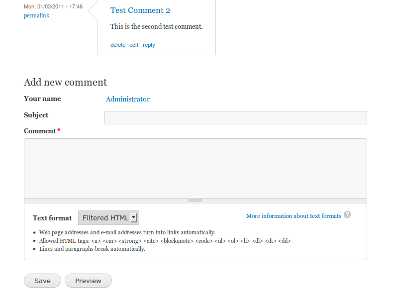
jensimmons commentedSome of CSS I wrote affects other things as well — like the filters (text format options) everywhere. Here's a screenshot of how the same CSS works on the node submission form:
(There are some other things on this node submission form that need help, but that's a different issue.)
Comment #3
jensimmons commentedHere's the patch.
Comment #4
Jeff Burnz commentedThis is pretty much a duplicate of #845728: Improve Bartik's display of forms , which was moved to D8 so it went off the radar...
I think trying to fix these issues for forms in lots of little issues is going to result in lots of special cased CSS without attacking the really big picture - if form elements had robust CSS default's we don't need any special casing such as for one form. That is what #845728: Improve Bartik's display of forms was supposed to be all about. I would very much favour simple killing these individual issues and hammering it all in one big patch (this has worked very well in the past where we had some huge patches for fixing the header, font sizing and other things).
Regarding the patch:
font-size: 85%;This should be in em's, post font size rewrite patch everything uses em's and proper font scaling.
Comment #5
jensimmons commentedActually #1000688: Bartik's node add form needs some help is the duplicate. Or maybe they both are.
I'd still like to just fix this. We could debate forever whether to do it all in one patch or many.
Comment #6
Jeff Burnz commentedOK, no argument from me Jen, I think we'll find some more form/field issues so I brought #845728 back to D7 to run like a bit of a meta issue.
I know in past when I have added or removed fields from comments things did not go so well, it would be worth us checking with many added fields/re-ordering the fields and so on.
Comment #7
jensimmons commentedThis needs review! Let's try to get this committed before the D7 release.
Comment #8
Tor Arne Thune commentedTested this on Chromium 10.0.617.0 and Firefox 3.6.13 on Linux. See the attached screenshots.
Comment #9
tim.plunkettRTBC from me pending IE testing.
Comment #10
aspilicious commentedIE6-IE9 all OK
Comment #11
aspilicious commentedforgot to set status
Comment #12
Jeff Burnz commentedNeeds work, this is a good start but needs more:
1. Vertical alignment of the labels to input / user name (logged in) are not aligned well, this looks terrible.
2. When logged in the user name is still misaligned to the following input field.
3. NO % font sizes, these result in wrongly scaled text, 85% should be 0.857em (12px exact).
4. The "more information about text formats" is misaligned to the icon, it should be centered vertically
If no one picks this up by the end of the day I'll get it done, also we need screen-shots with lots more fields added to comment forms, again this is critical, when I did this previously the forms looks horrific.
Comment #13
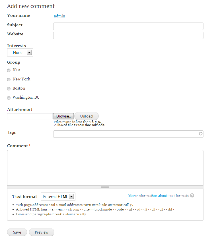
Jeff Burnz commentedHere is what I mean about extra fields not working in this form - there is no accounting for other field types, which is really bad, I think this is exactly how people will use comments in Drupal 7 and they should at least be usable, whereas this is just a mess.

Comment #14
Jeff Burnz commentedLets have a crack with this patch, I have added all sorts of fields and make account for them (RTL also) everything looks good in IE6/7/8, however the file field input is borked in IE7 (it was like this before the patch, but I ran out of debug time).
I took a different approach for the text field lengths - setting these in pixels depending on the sidebar configuration, this could run into trouble if someone sticks comments in a block (we could account for that also).
This is not prefect, but its a hell of lot better than the current situation which is pretty woeful.
Comment #15
tim.plunkettWrong number of spaces. Not a big deal, but if it needs a re-roll...
Would this be worth moving to the only other similar font-family declaration? (body, #site-slogan, .ui-widget)
Otherwise, I'm okay with this patch. I just hope it's not too late!
Powered by Dreditor.
Comment #16
Jeff Burnz commentedGood spotting Tim, fixed the spaces (dam copy/past from firebug...) and moved the font family.
Comment #17
tim.plunkettYes! Awesome.
Comment #18
dries commentedCommitted to CVS HEAD. Thanks.