
 Come together with the global Drupal community in Rotterdam, 28 Sept – 1 Oct 2026. Sessions, contribution, connection, and Early Bird savings until 8 June.
Problem/Motivation
Active tabs have an oddly shaped outline to them when highlighted; it looks like the tab has been broken up. The reason for the tab breaking is an extra span inside of the li element that seems to indicate which tab is active. This problem spans across several browsers. Several earlier solutions have been proposed, but accessibility became a concern.
Proposed resolution
Patch #77 is the proposed resolution that meets accessibility guidelines. It has been tested on Mac: Safari, Firefox, and Chrome and Windows: IE 8, IE 9; the patch was successfully applied and fixed the issue at hand. Screenshot below (more screenshots in #82 and #85).
Mac, Chrome, Bartik, Before Patch #77
Mac, Chrome, Bartik, After Patch #77

Remaining tasks
None.
Original report by [hgurol]
When I click on the vertical tabs, the active tab has a yellowish border which flows outside, underneat the other tab below.
Please see "ver_tabs1.jpg" and "ver_tabs2.jpg"
Well, at first I thought I can live with that. But the problem becomes a lot more annoying when I use some horizontal tabs with the Field Group module.
Please see "annoy1.jpg" and "annoy2.jpg"
Now I have tested this with IE9 Beta, Firefox 3.6 and Chrome 8/9. Chrome browser is the only one gives me this headache.
Still, Im not sure if this is a browser related problem and I should file a bug report there?
Thanks...
| Comment | File | Size | Author |
|---|---|---|---|
| #97 | element_invisible_chrome_safari.patch | 425 bytes | tarekdj |
| #97 | element-invisible.png | 13.7 KB | tarekdj |
| #91 | windows-ie7-before.png | 6.85 KB | geerlingguy |
| #91 | windows-ie7-after.png | 6.66 KB | geerlingguy |
| #88 | mac-chrome-21-after.png | 10.52 KB | geerlingguy |

Comments
Comment #1
bfroehle commentedI've experienced this as well.
Comment #2
rjgoldsborough commentedI can reproduce as well. This is caused by the webkit browser engine. You may also notice this happening on Safari. I don't have a Mac so I can't say for sure.
The reason for the tab breaking is an extra span inside of the li element that seems to indicate which tab is active.
We could either fix it so the focus around the tab isn't broken and jagged, or we could just remove the focus outline altogether.
This removes the highlight completely for the selected tab, which is the only broken one
This removes the highlight completely for all the tabs
And this will fix the broken-ness of the tab if you don't want to remove the border
(While I admit, this probably isn't the best way, it seems to work while a better solution is decided upon)
Comment #3
hgurol commented@rjgoldsborough,
I have tested with Safari 5 on a Mac and the problem is not there.
Comment #4
bryancasler commentedsubscribe, same problem
Comment #5
rjgoldsborough commented@hgurol - do any of the fixes help your chrome issue?
Comment #6
hgurol commented@rjgoldsborough
If you please tell me where to put in those code pieces, then I can test.
Comment #7
rjgoldsborough commented@hgurol - you can put those in your theme's css file. Each of the three will do something different.
Comment #8
hgurol commented@rjgoldsborough
All 3 solutions works well for me. Though, I liked #2 more than the others...
Comment #9
bfroehle commentedRetitling and recategorizing to make this about Seven's treatment of Vertical Tabs in Google Chrome.
Patch attached which implements the suggestion #2 in comment #2. This makes the behavior in Chrome (Mac) consistent with the behavior in Safari (Mac) and Firefox 3.6 (Mac).
Comment #10
bryancasler commented#9 Worked for me!
Comment #11
rjgoldsborough commentedI agree with #9 and think that making this consistent with other browsers is the best idea.
Applied and removed the focus outline on vertical tabs in Google Chrome.
Comment #12
webchickDang. That indeed looks pretty nasty. :\ Glad to see this fixed.
However, can I please get confirmation that this causes no ill effects in other browsers (especially IE 7-9)?
Comment #13
bryancasler commentedNo Problems in IE 8.0.7...
Comment #14
rjgoldsborough commentedIE 6 and 7 check out. As does Opera 11
Comment #15
mrfelton commentedDoesn't fix for me in Chrome 9.0.597.102 on the Mac.
Comment #16
mrfelton commentedSorry, my issue is actually with Bartik. Attached patch does resolve for seven.
Comment #17
bfroehle commentedComment #18
Shadlington commentedThis fixes seven but bartik has the same problem!
Comment #19
Jeff Burnz commentedThe first two suggestions in #2 reduce accessibility, the 3rd option will possibly cause issues in RTL.
This issues makes me think we need to review the element-invisible class, although this is probably an isolated failure of element-invisible.
There has to be a better solution than reducing accessibility or potentially causing issues with RTL (needs testing).
Comment #20
Jeff Burnz commentedThis should fix it, but needs accessibility review:
Needs to be applied both to core vertical-tabs.css and Sevens override.
Comment #21
bfroehle commentedPer #18 and #16, this should be solved in both of these CSS files:
Comment #22
bfroehle commentedImplementation of Jeff Burnz's suggestion in #19.
Attached screenshots of Bartik & Seven in Chrome 11 on Mac OS X. Seven looks great, Bartik seems to be effected by another issue which obscures the outline on the right.
Comment #23
Jeff Burnz commentedbfroehle, have you seen the same issue as Bartik in other themes in Chrome, wondering if its Bartik issue or a core issue, I think we did have some stuff in Bartik for vertical tabs but my memory is fuzzy.
Comment #24
bfroehle commentedStark is fine. Garland is nearly okay. (Even though the screenshots don't show it, the outlines aren't obscured by the elements to the right like in Bartik).
Comment #25
bowersox commentedTo fix Garland as well as Stark, this seems to work:
Not only does that set the height of the span to zero, but it shifts it up one more pixel higher so the border is fixed. Screenshot attached is for Chrome 10.0.648.133 on Mac.
For the record, my gut instinct is that this is a Chrome bug with the "clip" property that seems to clip the content but not clip its container. We're introducing some slightly ugly CSS to work around that problem, which is probably the right solution for now but maybe we can get rid of this some day if Chrome changes its behavior.
Comment #26
Shadlington commentedIs this any closer to a fix for Bartik? The patches here do not fix it.
Comment #27
bowersox commentedThe solution in #25 fixes Bartik's bottom border. But it does not fix the separate issue in Bartik with the obscured right side outline (see #22).
Comment #28
Shadlington commentedOkay, yes. I tried #25 and that does fix the bottom border. However, I don't actually have the obscured right outline problem. Odd.
Comment #29
psynaptic commentedThis works for us since there is already an outline set by core for these list items:
Definitely think this should be done in core rather than in each theme.
Comment #30
hgurol commentedHey folks, what needs to be done to get the fix submitted?
I would love to see this fixed in 7.1, which seems to be out in 2-3 weeks time.
I can test, just tell me which patch....
Thanks...
Comment #31
mgiffordSo just to recap here.
In 29 there is a specific call on focus (which is the problem, right?) but taking away the outline will reduce visibility for keyboard only users:
Which is similar to but does not replace what was proposed in 25 (sadly this doesn't address the issues on the right hand side of the outline but perhaps it could be just edited a little)
#22 is more simple, but likely won't deal with the right margin either:
This seems to affect all core themes, but in particular Bartik but also misc/vertical-tabs.css
#9 is applied to just themes/seven/vertical-tabs.css but this too would take away accessibility for keyboard only users:
One of the first proposals was in #2 a create a work-aroud for current element-invisible, but this may well pose problems for RTL users:
And this may also be a problem with Chrome that will get eliminated in the next upgrade.
I'm not sure how to best proceed here, but thought a bit of a summary/comparison might help.
Is it possible to add some other visual identifier rather than the outline so that there isn't a loss of accessibility on focus to help users determine where they are?
Comment #32
Shadlington commentedAccording to http://webchick.net/node/85 7.1 is planned for May 25th.
It would nice if this could get in before then.
Comment #33
mustanggb commentedThis is working best for me right now
Comment #34
Jeff Burnz commented#33 breaks accessibility thus defeats the purpose. OK if you are the only one using the system, not suitable for core.
Comment #35
mgifforda solution involving display:none; will make those items inaccessible to people with screen readers unfortunately.
Maybe we should get in the habit of just creating a public google spreadsheet for problems like this. A table of solutions & problems seems like it could move us ahead.
Maybe we could implement another mechanism rather than an outline to show focus here:
div.vertical-tabs ul li.vertical-tab-button:focus {
  outline: 0;
}
It could be any change here I think. Simply changing the background color would be sufficient for accessibility. It just needs to verify it works.
I don't think that this should be applied anywhere but in the misc/vertical-tabs.css which is loaded by all the themes. It's a common problem and can be overridden if required, but should be fixed in the source.
Comment #36
hgurol commentedI applied the patch at #35 and it doesnt seem to solve the problem on Chrome 11.x / windows. Though, there is a high possibility that I might messed up during applying the patch and/or testing. I will give it a try with a fresh install by tomorrow.
Does anyone successfully applied the patch and saw that it fixes the problem?
Thanks...
Comment #37
bryancasler commentedJust tested it with (Chrome 11/Windows 7) on a clean D7 dev install. Fixed the problem.
Comment #38
Jeff Burnz commentedMike, I'd avoided that fix as I always thought it would not fly for accessibility (removing the outline), you think this is OK? If so I can go ahead and give this some serious cross browser testing.
Comment #39
mgiffordHey Jeff,
You're right. I'd overlooked that. Given that there's already several indications about which tab a keyboard user only was on I figured this would be a good enough justification. Took a look at it a bit further:
http://24ways.org/2009/dont-lose-your-focus
http://outlinenone.com
http://webaim.org/blog/plague-of-outline-0/
But even with outline:0 I still found some inconsistencies. Mind you, by just inserting a new style for the outline I am getting much better results and providing a better example.
I needed to add in the div.vertical-tabs-processed definition because I believe it's being added in afterwards and so was cutting off part of the screen.
It's still not 100% perfect as when you click on a tab and hold it down the outline still isn't perfect. However, I think this is sufficient for our purposes.
Comment #40
mgiffordOh ya, outline: 0 is presently used in core:
misc/ui/jquery.ui.core.css
themes/bartik/css/style.css
themes/garland/style.css
themes/seven/jquery.ui.theme.css
themes/seven/style.css
themes/seven/vertical-tabs.css
modules/overlay/overlay-child.css
modules/toolbar/toolbar.css
Defining a pattern for focus/active/hover may well need to be something that is considered for future core themes.
Comment #41
geerlingguy commentedSubscribe. I simply disabled the outline on one of my sites, though this might not be the most accessible way :-/
Comment #42
mgiffordI got this feedback from @jared_w_smith http://twitter.com/#!/jared_w_smith/status/73593446220308480
"I may misundertand, but the focus indicator should be more than color alone for user that override colors."
We are just using colors at this stage (well, greys) and those could be over ridden. Is there another way that we could demonstrate focus?
Comment #43
Jeff Burnz commentedHonestly the only thing I can really think of is to underline the link on hover/focus, we do this in other places in Seven (use underline to highlight hover/focus), I think this can work.
Comment #44
mgiffordThat would work for me. Especially if there is already a precedent for it.
Comment #45
mgiffordThis has to get into d8 first.
Comment #46
hgurol commented@mgifford
Why?
Comment #47
geerlingguy commented@hgurol - All new development and bugfixes go into 8.x first, and then can be backported to Drupal 7 (this ensures that Drupal 8 isn't released with old Drupal 7-era bugs :-).
Comment #48
hgurol commentedI don't understand.
I understand the "all new development" part, but I certainly don't understand the "all bug fixes" part??
Can you tell me why I'm not going to the issue tracker and move 1337 D7 bug reports to D8 ?
Comment #49
geerlingguy commented@hgurol - I suggest you move further discussion off to #drupal in IRC, so as to not clutter up this issue anymore, but basically, if the bug is not a glaring, critical, stopping-drupal-dead-in-its-tracks bug, it should technically be resolved for Drupal 8, and then Drupal 7 at the same time or shortly thereafter (if at all—it always depends on whether a developer is interested in making the effort to make the patch ready for D8 & D7 both). It's always better to backport patches than to forward-port them, especially when the functionality being discussed is a minor display issue.
Comment #50
Jeff Burnz commentedThis can be committed to both D7 and D8 at the same time when this is RTBC, for now:
Use shorthand and a space between the colon and the value.
Shorthand + space.
Why are we removing focus styles?
18 days to next Drupal core point release.
Comment #51
bryancasler commentedJeff, I applied the changes you suggested in #50 and I got this http://snpr.cm/Qfi9sC.jpg
The changes were applied to the Drupal 7 Dev build from yesterday. Should I be applying your changes over another patch?
Comment #52
Jeff Burnz commentedIn my admin theme I decided to take a different approach. Since the element in question is not a focusable element I decided to move it off-screen instead of bothering with fickle CSS workarounds or attempting once again to forge an omnipotent element-invisible.
I'm already overriding vertical-tabs.js in my theme so it was a simple change to use my ".offscreen" class to solve the problem:
That's my take on it for now. I don't think we're ever going to have an all powerful all knowing element-invisible and moving a non-focusable element offscreen is perfectly legit in my book.
Comment #53
mgiffordThis could work, but probably should be labelled .element-offscreen for consistency
I've also noted that this is a possible css class that should be added here:
http://drupal.org/node/1158426#comment-4998716
Comment #54
cbrasfield commentedI experienced the yellow border highlight using Chrome 16 and 17; however, only on applied focus (ie I had to right click on the tab to get it show).
The outline:0 does not seem to make a difference for
div.vertical-tabs ul li.vertical-tab-button a:focusSetting
div.vertical-tabs ul li.vertical-tab-button { outline:none; }removes the border for all states.Comment #55
mgiffordRelated issue:
#1328970: element-invisible class does not work properly in Chrome and Safari for inline elements
Also, other issues around element-invisible classes in D8:
#1158426: Generalized CSS Classes for Focus, Invisible & Hidden - Accessibility Enhancement
Comment #56
chi commentedBartik and many contributed themes have the same problem. I think we should fix it in vertical-tabs.css.
Comment #57
jacineThis is a bug with
.element-invisible. The code in HTML5 Boilerplate is what I've been using in my themes to fix this: https://github.com/h5bp/html5-boilerplate/blob/master/css/style.css#L258We already have a couple of open issues for this, which is not a good thing. I've marked #1328970: element-invisible class does not work properly in Chrome and Safari for inline elements as duplicate of this, and here's the comment I added there:
This fix needs to be tested for accessibility though. Anyone willing to do that?
Comment #58
chi commentedThe styles from #57 work for me.
Comment #59
bowersox commentedPlease test the attached patch for screenreader compatibility.
I've implemented @Jacine's suggestion. I agree with her that the proper fix for this is with
.element-invisibleitself. I've chosen a minimal set of CSS rules that appears to do the job on all browsers.Testing Needed:
JAWS, NVDA, and any other screenreaders as well as keyboard-only users. Also, it would be great to test with Field Group's horizontal tabs. That is in contrib, but was mentioned in the original issue.
Testing Done:
This issue solves the vertical tab weird border on Chrome and Safari. I tested in Bartik, Stark and Seven on Safari, Chrome, Firefox and IE 9 on Mac and Windows. See attached screenshots. I also verified that the Skip To Main Content link still works when tabbed onto. In Bartik there is still an issue with the right side of the vertical tab border, and that is a separate issue as discussed above.
Drupal 7 Note:
Once this is finished for Drupal 8, we still need to go back and add IE 6 and 7 support and also add Garland support. D8 does not support IE 6 or 7 (#1217788: Drop IE7 support in Drupal core). It also does not have Garland. So the D7 version of this patch will need more backwards-compatibility.
Background Reading:
http://snook.ca/archives/html_and_css/hiding-content-for-accessibility , https://github.com/h5bp/html5-boilerplate/issues/194 , http://webaim.org/techniques/css/invisiblecontent/ , #718922: system class: .element-invisible does not work with VoiceOver on OS X Snow Leopard.
Comment #60
bowersox commentedHere is the screenshot showing the Skip To Main Content link when tabbed onto. It still works after the patch in #59.
Comment #61
aspilicious commentedie7-ie8 screenshots needed
Comment #62
mustanggb commentedIE7 isn't supported anymore #1217788: Drop IE7 support in Drupal core
But should probably still test with IE8
Comment #63
aspilicious commentedIE7 should be tested for the D7 backport
Comment #64
geerlingguy commented@aspilicious - D7 backport patch to come later (we're still working on D8-dev right now), so probably don't need any IE7 screenshots just yet.
Comment #65
bowersox commentedThe following tests have also passed for me:
Testing still needed:
Comment #66
Jeff Burnz commentedI've been using the same as Jacine in #57 for a while, havent noticed any problems and its very robust. It might be worth testing it also, in more depth, given this is going to D8 and we really dont want to come back to niggly issues like this again. Thoughts?
Comment #67
bowersox commented@Jeff Burnz, my thought was to use the least CSS that does the job. If 2 lines of code works in all browsers, why use 6 lines?
All I added was
overflow: hiddenandheight: 1pxin the proposed patch:http://drupal.org/files/drupal8-weirdborder-1057912-59.patch
I understand that the code @Jacine suggested also applies a border, padding, width, and a negative margin. But the downside of that is that we end up with more code to maintain and more messy consequences. The negative margin could cause unintended layout consequences. Also, if we set an explicit
padding: 0that forces themers to do more work when they want to override it. For example, in the.element-focusablestyle that overrides.element-invisiblethemers will need to set an explicit value for padding. It would be cleaner if a themers' original defaults for padding could just cascade through.If you or others feel strongly otherwise, the next step would be to roll a patch and get it tested in browsers. But my opinion on this is that "less is more."
Comment #68
hgurol commentedIs the patch @67 ready for testing?
If so, Im ready to do some tests.
Comment #69
bowersox commented@hgurol: Please do test it and consider marking it RTBC if it looks good to you. The patch in 67 is identical to the patch in 59. We have actually been testing that same patch since comment number 59. The most important remaining test that has been suggested is testing in IE8. Many other browser combinations have already been verified with screenshots.
Comment #70
hgurol commentedI can not apply the patch.
I have downloaded the latest 8.x-dev.
Downloaded the patch file @59 directly to the ".../core/modules/system/"
Used the "patch < file_name.patch" command
This is the error message I get...
Hunk #1 FAILED at 235.
Hunk #2 succeeded at 246 (offset 1 line).
1 out of 2 hunks FAILED -- saving rejects to file system.base.css.rej
Am I doing something wrong or the patch is not applicable anymore?
Comment #71
bowersox commentedRe-roll is attached. No changes compared to the patch in 59 above, just differences in the context. Please test.
Comment #72
hgurol commentedAlright, 8 screen shots.
All on Windows XP.
4 browsers; IE8, Chrome 21, Safari 5.1.7 and Firefox 14.0.1
2 themes; Seven and Bartik.
Results: There are some problems on Chrome & Safari when the theme is Bartik.
Everything seems to be perfect when the theme is Seven.
Comment #73
bowersox commentedThe issue with the right border being obscured in Bartik is a separate issue (see comment 22 and others above). However, your Bartik screenshots also show that we have a new issue with an invisible rectangle sticking out of the left side of the vertical tab. I'm wondering whether that is caused by this patch or whether that is a bug that has been introduced into D8. Can you send a Bartik screenshot in Chrome or Safari without the patch applied?
Comment #74
hgurol commentedSeems to be a new problem brought by D8.
Screen shots without the patch applied.
Comment #75
bowersox commentedIt looks like the patch that broke that was this one: #1192044: Convert Bartik's layout to mobile-first and responsive
This new problem should be reported in that issue and presumably it would be fixed there. We could put a note there to cross-reference that it impacts the work being done here.
Comment #76
hgurol commented@bowersox
I have reported the problem in the issue #1192044: Convert Bartik's layout to mobile-first and responsive
Whether it should be fixed here or there, or how it should be fixed is beyond my skills and knowledge. I believe the people who actively works on this issue and on the other issue needs to talk about it. I did my messenger work though.
Comment #77
tarekdj commentedHere is a fixed patch from #59. It works with last patch of Issue #1192044
Comment #78
hydra commentedThis is looking promising! I actulay don't like the fact, that the outline is gone some where, but I donÄt think this is the right place to put it back. So this patch is resolving the issue for me. Would realy like to see this in D7 as well, because we have several issues with fielg_group module as well, depending on this issue.
Comment #79
BrockBoland commentedNeeds issue summary
Comment #80
aspilicious commentedScreenshots needed :) (before, after)
Comment #81
xjmComment #81.0
irunflower commentedAddition of new issue summary
Comment #82
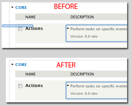
irunflower commentedTested Patch #77 on Mac with Firefox, Chrome, and Safari with both Bartik and Seven themes. Firefox does not have an overlay to begin with as seen in the screenshot. I did not include screenshots of Seven, as it was identical to Bartik.
The bottom and right border in Bartik seems to be fixed.
Patch #77 needs further testing in the Windows environment. Please attach before and after screenshots if testing in Windows.
Comment #82.0
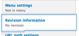
irunflower commentedUpdated issue summary, added screenshots
Comment #82.1
irunflower commentedChanged screenshots in Issue Summary to images instead of links
Comment #82.2
irunflower commentedAdded headers for screenshots in issue summary
Comment #82.3
irunflower commentedCorrected mistake in issue summary. Changed 'before' to 'after' before 2nd screenshot.
Comment #83
mgifford@irunflower any reason you didn't mark this RTBC? Seems like it should be good with the screenshots.
Comment #84
geerlingguy commented@mgifford - probably needs testing in IE8/9. I'll do it now.
Comment #85
geerlingguy commentedNeither IE8 and IE9 display any kind of border when someone clicks on the tabs, so this is RTBC (see attached screenshots—patch makes no difference).
Comment #85.0
geerlingguy commentedRevised remaining tasks
Comment #86
geerlingguy commentedAdded screenshots, updated issue summary.
Comment #87
webchickAwesome, thank you so much for the manual testing!
Committed and pushed to 8.x. Marking to 7.x as a backport.
Comment #88
geerlingguy commentedTested patch on Safari + Chrome, attached Chrome screenshots.
Comment #89
aspilicious commentedfor drupal 7 this needs to be tested at least on IE7
Comment #90
geerlingguy commentedI knew someone would say that... I'll boot up a copy of XP and test.
Comment #91
geerlingguy commentedThere we go. Looks the same either way.
Comment #92
irunflower commentedThanks for adding all the screenshots for Windows geerlingguy! I am marking this RTBC.
Comment #93
webchickCommitted and pushed to 7.x, too. Thanks!
Comment #94
HostedInUSA commentedI was setting up different tab types for my themes, htabs (horizontal tabs), btabs (horizontal tabs on bottom), and vtabs (vertical tabs). I was using the jqueryui library and themeroller. I noticed a border around the anchor and was having trouble getting rid of it. After some trial and error I found what I needed. I added .ui-tabs-vertical a:focus { outline: none;} to the css and the outline went away. Originally I tried setting the border to none, and 0px on the a.active pseudo tag. None of that worked. Hope this helps someone.
Comment #95
psynaptic commented@HostedInUSA: That solution isn't accessible because it removes the outline which is a useful indication for certain users of which element is currently focussed.
Comment #97
tarekdj commentedFound that borders keep displaying on module list page.

The patch attached is inspired by this cool article
Comment #98
Bojhan commentedI can remember there being another issue for this. Can't find it atm
Comment #99
webchickWell that definitely looks much better. :)
Committed and pushed to 8.x. Thanks!
Comment #100
Bojhan commentedeh, this wasn't RTBC?
Did we actually fix it everywhere now? I know there was another issue, that it also shows on vertical tabs.
Comment #101
mstrelan commentedIt's the same issue? But renamed in #97?
Comment #102
webchickLast I checked, core committers could still review a patch. :P~
Can you re-open this when you find an actual bug? I don't see any problem with vertical tabs. I used to, but it was apparently either fixed by this patch or something else.
Comment #103
tarekdj commented@Bojhan it's the same Issue but renamed : the patch fixes bug for both vertical tabs and module list.
Comment #104
Bojhan commentedI tested this again, and it fixes the problem - never really understood why we need these borders. I know its a11y, but if it is actually needed is something I should figure out.
@tarekdj I didn't notice that at first, thanks for clarifying :)
@webchick I know, I just thought it was a non-practice to commit straight from needs review.
Comment #105
mgiffordThe borders are there to tell a keyboard only user where they are in the interface. It's really easy to tab through hundreds of links in a page and suddenly not know where you are. It's a quick visual queue to show you where you are in the vertical tabs and it also mirrors the behavior of a hover over with a mouse.
Comment #106.0
(not verified) commentedRemoved remaining todo, added notes about IE8/9 screenshots.