

 The 2026 Drupal Business Survey is open. Your response will help shape the future of the Drupal business ecosystem.
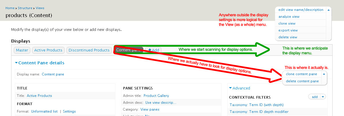
I'm not sure how to best describe this, but the individual display menu feels naturally "out of place". Because the "displays" bar area is grey, we scan across it for options. The way Views 3x is visually structured, we have to scan across & down to find the display settings.
In my opinion, it would be more natural to users if the "View menu" were somewhere in the top of the screen (as my attached image shows), and the "Display menu" were in this grey bar.
I would be interested to see what other users of Views 3.x think about this.
| Comment | File | Size | Author |
|---|---|---|---|
| views-7x-3x-display-ux.jpg | 102.18 KB | wjaspers |

Comments
Comment #1
merlinofchaos commentedHm. I'm not sure I agree about the naturalness of that, but I'll let Jeff Noyes comment.
Comment #2
Noyz commentedI agree with Merlin. While I agree there might be a problem here, i don't think this is the solution.
The design originally put a lot of emphasis on closing up the query so that people could work on the display. While this is the way that it is in Gardens, Merlin didn't want to do that to the actual release (possibly a smart move on his part). That said, this collapsing is the reason why we:
1) show the display name in a pill
2) repeat the display name in a collapsible fields set.
3) repeat the display name underneath the collapse trigger.
https://skitch.com/jeff.noyes/r4yu1/views-7x-3x-display-ux.jpg-1202x406
All of which creates for redundancy. I think the true solution lies in reducing some of the redundancy, and possibly placing the "individual display settings" underneath the pill.
https://skitch.com/jeff.noyes/r4yw2/views-7x-3x-display-ux.jpg-1202x406
This solution however assumes the collapsing of the query is removed, which I'd prefer not do. I'd like to come up with a solution that solves both
Comment #3
merlinofchaos commentedrfay posted http://drupal.org/node/1126666, also with an image, to say the same thing. Marked that as a duplicate of this.
Comment #4
rfaysubscribe. Thanks for your work on this!
Comment #5
Noyz commentedMost likely an issue, but don't think the solution outlined is the solution. I'll give it some thought.
Comment #6
mustanggb commentedI think it's best to keep it how it is for better synergy with D8.