

 The 2026 Drupal Business Survey is open. Your response will help shape the future of the Drupal business ecosystem.
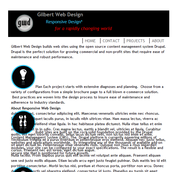
I've created a subtheme of omega 7.x-3.0-rc5. The responsive grid performs as expected in the wide, normal and narrow modes. When I reduce my browser window to mobile size the sidebar content overlays some of the main content. I thought the sidebars are supposed to stack below the main content when the browser window is reduced below say 420px. I've attached 2 screenshots to illustrate: 1. the narrow grid (narrowgrid.GIF) 2. the mobile grid (defaultgrid.GIF). Hopefully I've just missed some configuration setting rather than having discovered a bug.
I'm on Drupal 7.7 with omega 7.x-3.0-rc5
| Comment | File | Size | Author |
|---|---|---|---|
| narrowgrid.GIF | 36.53 KB | screeno | |
| defaultgrid.GIF | 38.48 KB | screeno |


Comments
Comment #1
screeno commentedWow, this is embarrassing. I just made a few changes to the content and now the grid is responding perfectly for the mobile (default) grid. Anyone have any idea what might have happened? I spent a few hours trying to "fix" this last night.
Comment #2
screeno commented