On this page
Using the "Field Group" to manage content display.
“Field group” has a long history. In drupal 6 the “field group” is nested in as part of CCK. When the “fields element” moved to core, some sub-modules of CCK were left out and we had to take on the challenge to make field group a contribution. Now field group is a module and available for drupal 7.
It is important to know that the intention of the “field group” is to group “fields” together providing a wrapping or container around them. There is the ability to nest the groups with each other. Its intent is not to handle any logic on fields (for example the ability to hide or show a field group depending on a condition). We chose to have this as display tool by design.
Features
- A new feature is the unlimited nesting. There are no restrictions to the nesting of field groups.
- API to create custom field group format types or alter existing ones.
Field group types
field_group has a six different format types to display the fields in a group setting. Following is a description and options of the different types:

- View
- Currently there is an error in this option preventing the processing of the data. Information on how this option works will have to be added after the problem has been corrected.
Following are the available options:- Weight is visible when the display "weight" is selected and is used to determine the element order within the grouping.
- Parent is visible when the display "weight" is selected and is used to define which tab group the element is part of.
- Field Group Label. Note the “item” element label is the only visible label.
- Group “Open” or “Closed” is for the “item” element and the top item box will be open
- Description is for the “item” element
- Extra CSS Class definition
- Div
- The Div format is processed like Division tag and are only available on front-end nodes. Following are the available options:
- Weight is visible when the display "weight" is selected and is used to determine the element order within the grouping.
- Parent is visible when the display "weight" is selected and is used to define which tab group the element is part of.
- Field Group Label. Note the “item” element label is the only visible label.
- Fieldgroup Setting. Options: Open, Collapsible, or Collapsed. Note atleast one element will be set to "Collapsible" to insure there is one visible view.
- Description is for the “item” element
- Effect is used to define the visual aspect when the field is being opened or closed. Options: None or Blind
- Speed controls the speed at which the data is opened or closed. Options: None, Slow or Fast.
- ExtrarCSS Class definition
- Fieldset
-
The Fieldset format is the simplest display type which forms a box around the data fields placed with in its region. Following are the available options:
- Available on node details and node form
- Configurable to be open (normal fieldset), collapsible or collapsed
- Supports CSS files.
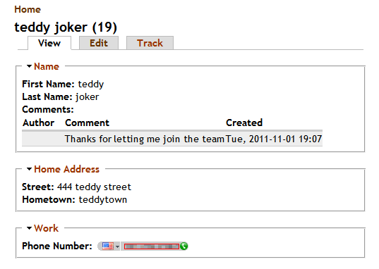
Sample Field Definition:

Sample Output:
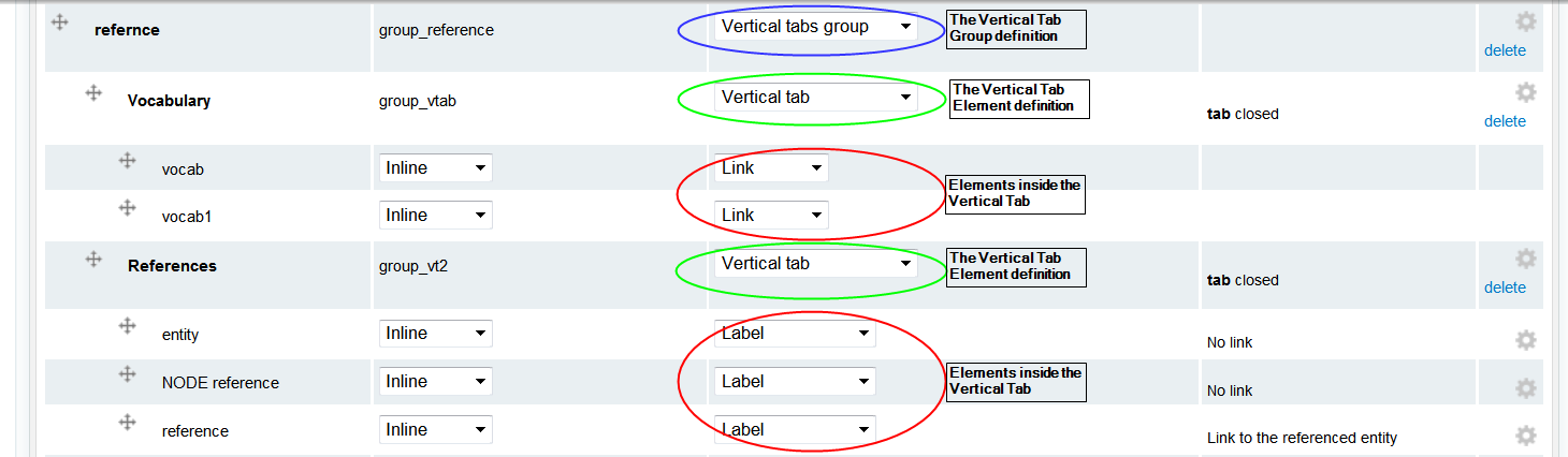
- Vertical tabs
- The Vertical Tabs format allows you to create a vertical tab box. This concept is from drupal core; however some alters were needed to obtain the vertical tabs on front-end nodes. This function works in the same manner as the accordion format where there is a container (wrapper) and an item and you can nest them. First the container is defined using “Vertical Tabs Group“, then create the “Vertical Tab” to create the different tabs. After the “Vertical Tabs” have been defined the fields can be added by dragging them under the tab entries. Following are the available options:
- Weight is visible when the display "weight" is selected and is used to determine the element order within the grouping.
- Parent is visible when the display "weight" is selected and is used to define which tab group the element is part of.
- Field Group Label. Note the “tab” element label is the only visible label.
- Group “Open” or “Closed” is for the “tab” element and the top item box will be open.
- Description is for the “item” element.
- Extra CSS Class definition
- Remark Note: You could set tabs without a wrapper, this will make them appear in the node forms default vertical tabs section.
Sample Field Definition:
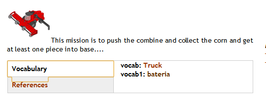
Sample Output:
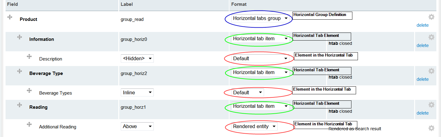
- Horizontal tabs
- The Horizontal Tabs format allows you to create a horizontal tab box. This concept is from drupal core; however some alters were needed to obtain the horizontal tabs on front-end nodes. This function works in the same manner as the accordion format where there is a container (wrapper) and an item and you can nest them. First the container is defined using “Horizontal Tabs Group“, then create the “Horizontal Tab” to create the different tabs. After the “Horizontal Tabs” have been defined the fields can be added by dragging them under the tab entries or changing the "Parent" depending on your view. Following are the available options:
- Weight is visible when the display "weight" is selected and is used to determine the element order within the grouping.
- Parent is visible when the display "weight" is selected and is used to define which tab group the element is part of.
- Field Group Label. Note: The “tab” element label is the only visible label.
- Group “Open” or “Closed” is for the “tab” element and the top item box will be open
- Description is for the “item” element.
- Extra CSS Class definition
Sample Field Definition:
Sample Output:
- Accordion
- The Accordion format allows you to create horizontal boxes that can be opened and closed. This format has a container (wrapper) and item approach. First the container is defined using “Accordion Group“, then create the“Accordion item” to create the different pieces of the accordion. After the “Accordion Items” have been defined the fields can be added by dragging them under the item entries. This is required to so multiple accordion sets can be created on the same page, as well as, eases the JavaScript controls and handling. Following are the available options:
- Weight is visible when the display "weight" is selected and is used to determine the element order within the grouping.
- Parent is visible when the display "weight" is selected and is used to define which tab group the element is part of.
- Field Group Label. Note the “item” element label is the only visible label.
- Group “Open” or “Closed” is for the “item” element and the top item box will be open
- Description is for the “item” element
- Extra CSS Class definition
- Note: Most format types have a translatable label, however, the accordion, vertical tab group and horizontal tab group do not use a label for display. The label of these group types is used when you are using the "Show Weight" display option and they define the parent. The translatable labels of the "group items" are displayed as the headings.
-
Field group provides a library very parallel with vertical tabs in core. Default configuration requires that at least tab item is set open just like vertical tabs.
Help improve this page
You can:
- Log in, click Edit, and edit this page
- Log in, click Discuss, update the Page status value, and suggest an improvement
- Log in and create a Documentation issue with your suggestion
