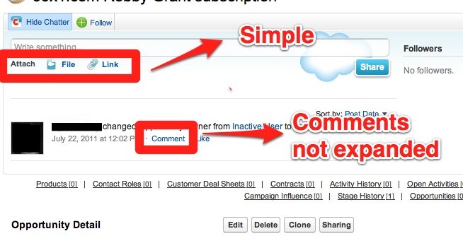
The UX of the activity logs in Commons is a bit overwhelming at times and provides too much clutter. An example of how it could be improved is by looking at SalesForce Chatter. The main aspects that I took away from my experience are the following:

  • The comment textarea is hidden by default which reduces clutter
  • The hook_link() equivalents are simple and have small icons to help identify what they do
  • Simple button that exposes a popup with help text on how the status streams are used

See the images below for more details:

chatter-ui-comment.jpg

chatter-ui-help.jpg

CommentFileSizeAuthor
chatter-ui-help.jpg87.77 KBcpliakas
chatter-ui-comment.jpg69.02 KBcpliakas

Comments

lsolesen’s picture

Version: » 6.x-2.22
Issue summary: View changes