

Closed (fixed)
Project:
Views Bulk Operations (VBO)
Version:
7.x-3.x-dev
Component:
User interface
Priority:
Normal
Category:
Task
Assigned:
Unassigned
Reporter:
Created:
12 Jan 2012 at 11:54 UTC
Updated:
22 Aug 2012 at 15:21 UTC
Jump to comment: Most recent file



Comments
Comment #1
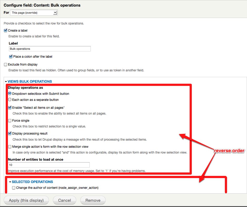
bojanz commentedMy only concern is that the list of operations might get very long (a site with a ton of rules, for example), so the users might never scroll to the options.
I agree that we should downplay the options, and put them in a fieldset collapsed by default, just wondering if that would be enough without moving it after the operations.
Comment #2
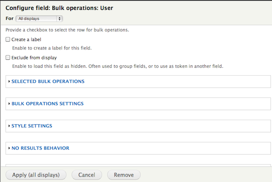
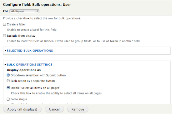
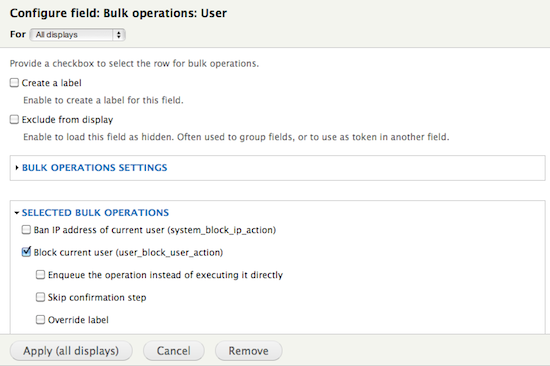
bojanz commentedHere are some screenshots of what I have in mind.
We kill the VBO fieldset, have selected operations in one, and settings in another. The settings one is collapsed by default.
I like overview2 better at the moment (settings goes before selected operations, but collapsed. So the user knows it's there, but doesn't need to look at it).
Labels are rough. Especially the "bulk operations settings" one. Have a better idea? I thought about "settings for bulk operations" as well, didn't sound right.
Comment #3
amateescu commentedI agree with @bojanz, the operations list can be huge and the user will never find the settings area. I think the best way to go is to split them and collapse the settings fieldset by default.
So my vote goes to overview2 as well :)
Comment #4
DjebbZ commentedI like overview2 better as well, for the same reasons than you. I like the better UX it provides.
As for the labels. What about "Display options and list settings" to replace "Bulk operations settings" ? Or "Display options/settings" ? Or why not even grouping Display related options together and listing options together ? Not necessarily in yet another fieldset or nested fieldset, reordering could be enough. So my proposed order, that goes even further than what I just said :
1. How the user is going to select the items : "Enable 'select all'" and "Force single"
2. How the user is going to act on them : "Display operations as..." and "Merge single action form ..."
3. How the process is going to happen : "Display process result" and "Number of entities to load"
This order is based on how the final user is going to use the VBO view : 1. select items, 2. select action, 3. process.
What do you think ?
Comment #5
damiankloip commentedI think that having a clear 'Bulk operations' type thing in the fieldset labels is good, just having something like 'Display options' seems like something views would have natively, The current proposal is really clear about what the vbo options are.
You may have a point with the order of the display options, but I think they are fine as they are.
I also think number 2 is good :) The only problem could be that if we shift around the structure of the form, it will mess up peoples current configurations for vbo settings.
Comment #6
bojanz commentedFirst patch, untested.
Comment #7
bojanz commentedCommitted.
Comment #8
damiankloip commentedNice.