

Closed (fixed)
Project:
Translation Management Tool
Version:
7.x-1.x-dev
Component:
User interface
Priority:
Normal
Category:
Task
Assigned:
Reporter:
Created:
15 Feb 2012 at 23:17 UTC
Updated:
8 Jan 2013 at 12:00 UTC
Jump to comment: Most recent file






Comments
Comment #1
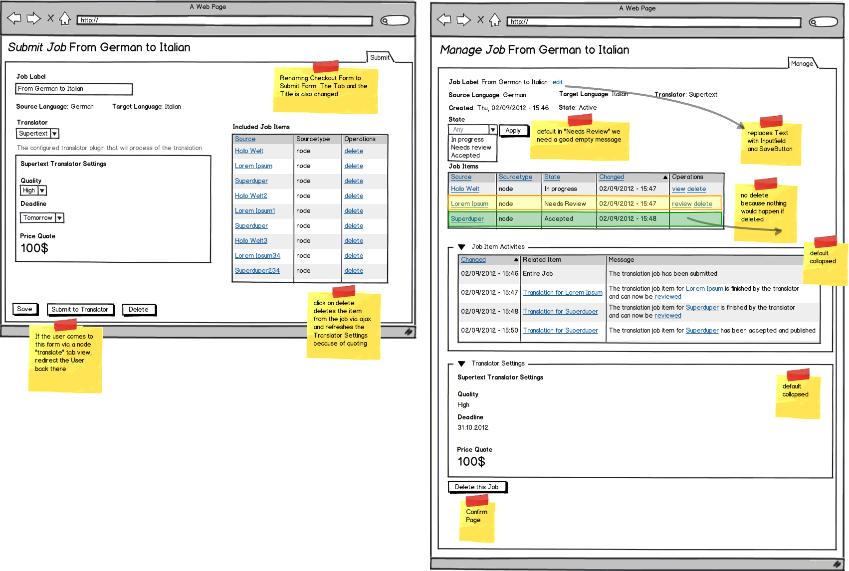
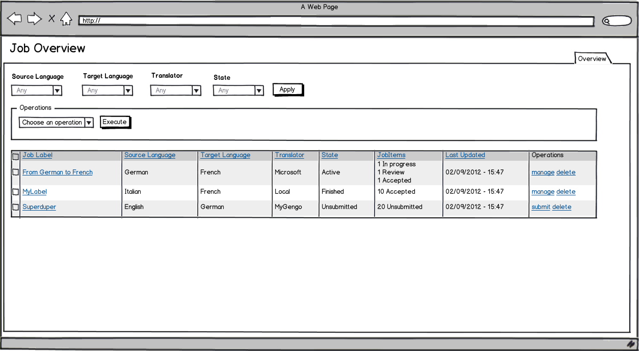
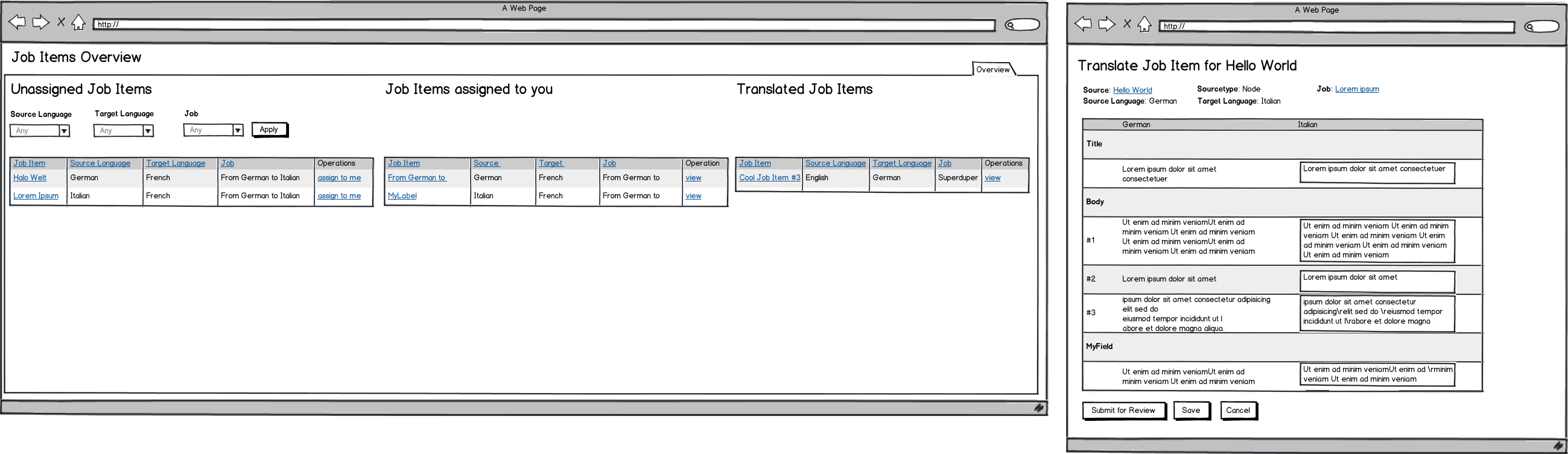
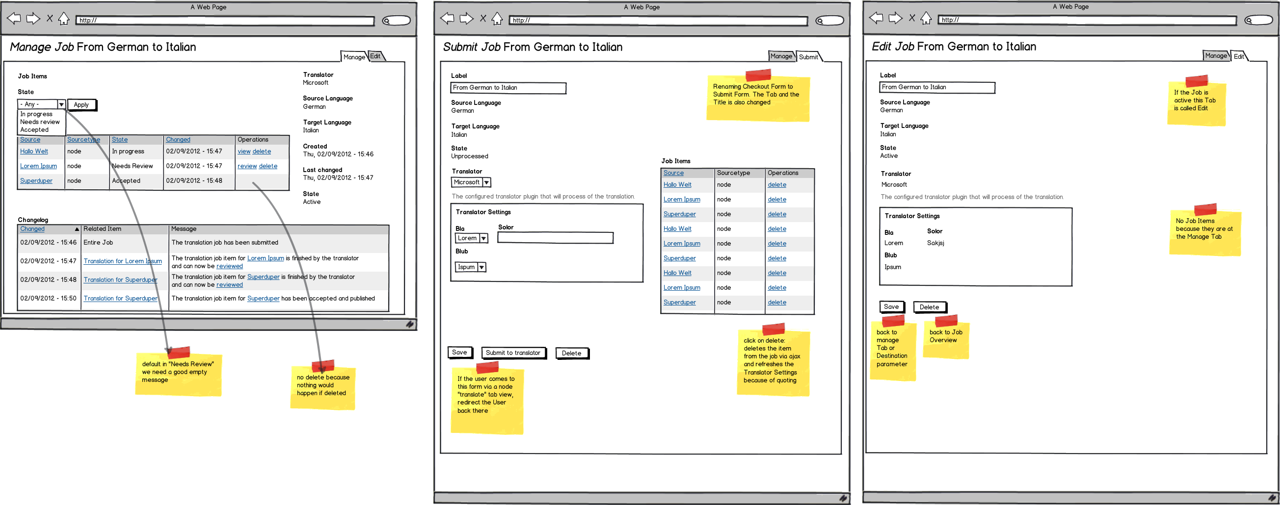
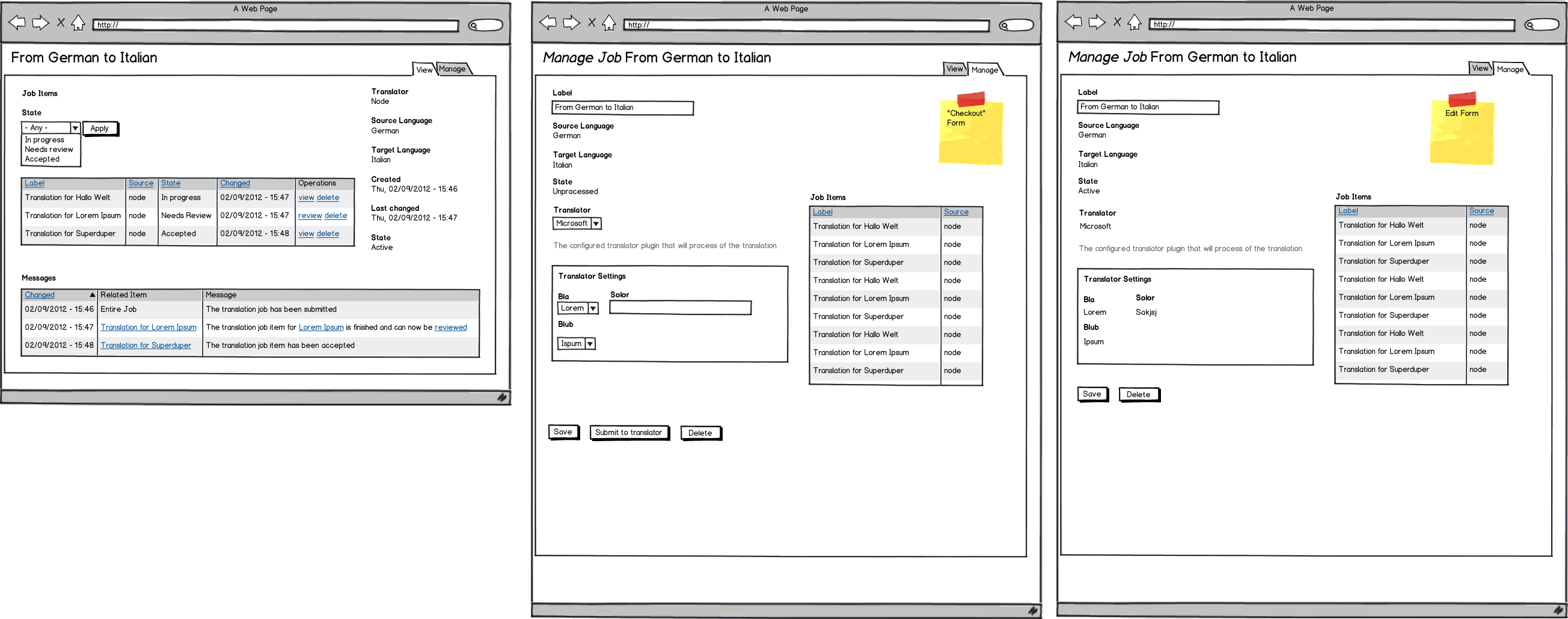
schnitzel commentedUpdated the Wireframes.
Short Changelog:
- Changed "Messages" to "Changelog". Testperson thought this is a possibility to attach Messages to a translation job
- Fully refactored the Tabs for the JobItem. The first tab is now called "Manage" all the time. The second Tab changes his name according the Action the User can do there
- Changed "Checkout" to "Submit"
- Added "Delete" links in the Submit Form for JobItems (has to be done via Ajax)
- Removed the Label "Translation for XXX" because the User probably better works with Source and Sourcetype which is also clickable. And because the Label cannot be changed it would be too many times "Translation for" be there
- Changed the Review form with Label Rows, also added Delta Fields
- Added some context informations for Review Form
- Changed the buttons in the Review Form to make more clear that with Accepting something will be published
- Also added some Notes about redirect, button destionations, etc.
Still ToDo:
- Review form with Comments per Field / per Item
- Local Translator Overview
- Local Translator Job View
- Local Translator Job Item Translation View
Comment #2
mazze commentedJust a few thoughts on the mocks from my dummy/newbie perspective...
- from a UX point of view, be careful when having different labels on the same tabs, depending to the editing status. People are usually not aware of this. Deactivated buttons (gray shaded or so....) might be a better way.
- to me (read: newbie user), the difference between "manage job" and "edit job" is not clear
- since translation is a process, a progress indicator (as seen in registration or commerce checkout processes) might be helpful, in order to show the user that he's in 2nd step, with 3 more steps to come. Maybe the upper right tabs could serve as kind of indicator...?! But should be compatible with Drupal's UX policy, on the other hand...
Anyway, thank you for the terrific job you're doing
Comment #3
fubhy commentedWe only have "Manage" and "View". For this sketch it was irrelevant so I guess he didn't really care for the labels on the tabs.
Comment #4
schnitzel commented@mazze
thanks for your review!
@fubhy
well every single string in these Wireframes have a reason :P ! So also the "Manage" and "Edit"/"Submit", I take my job serious :P
The Problem was before, that with "View"/"Manage" the people I tested with also did not understand what they could do in "Manage" because in "View" they already can delete Items, etc which is a "managing" job. This is why I changed to "Manage" and "Edit"/"Submit", but looks like this is not the perfect solution.
Question @mazze, how would you describe the Tab labels? I changed the "Edit" Tab to "Submit" at the first Stage because If the User would look into the tabs (and I agree there are normaly not really seen), he could be confused why is there an Edit Thing because he never created anything like a Job (it was done for himself). So "Submit" makes in this case more sense, but it does not after he actually submitted it, then "Edit" makes more sense.
But maybe we should completely change the devide of the Tabs? Why do we even need two Tabs after Submitting? Actually the only reason why it is there, is that Job Label which could be changed, and also that the user can see what he has entered in the Translator Setting during Submit. Because in the JobItem the Delete Button is also in the "View" Tab (there is no Edit Tab there). So maybe we could completely remove the "Edit" Tab for Jobs and make everything in the "Manage" Tab? Thoughts?
@mazze
For the Idea of the stepper: The Tabs cannot be used for the Step Indicator. But overall the Step Indicator is quite hard, because two Steps (Submit and Review) are actually not needed for a Job and could be skipped by settings, rules, etc. And to automatically adapt the Stepper to the configuration, this could be Really hard.
So we do it like in the Drupal Commerce Default: We show the different Status/Steps the Job and JobItems are in the Overview, but not the next/previous step.
Or maybe you could give me an example what you mean with the Commerce Stepper?
thanks
Comment #5
mazze commented@Schnitzel: indeed the progress tracker might be difficult to implement, without breaking the "drupal way" on how users are used to navigate. My comment came from a real first time user perspective (where am I, what can I do here, why should I...). Gimme some time to dig deeper into the subject, I actually have a multilingual client project starting today:-)
A lot of progress indication examples can be found here, but they might not be really helpful at the moment:
http://www.smashingmagazine.com/2010/01/15/progress-trackers-in-web-desi...
The drupalcommerce way seems to be a very good way to move on.
Comment #6
fubhy commented@Schnitzel: I know that you take your job serious. All I meant was that it was irrelevant for thes wireframes as the one thing that we wanted to achieve was a good overview for the review items, not the menu on top of it :).
Maybe you are right and we can remove the job "View" tab and merge it all together into one page where you see the details of the job AND are able to edit it.
Comment #7
fubhy commentedBut that would somewhat limit the permission granularity that we can build on top of that. Hmmmm.
Comment #8
schnitzel commentedComment #9
schnitzel commented2 days
Comment #10
berdir@Schnitzel: I'm pretty sure you have more recent wireframes than what's attached in comment #1. I know we discussed it in IRC sometime after that comment. Can you upload them?
Comment #11
schnitzel commentedattached the newest ones.
These are Usability Reviewed by 4 People, with these skillsets:
- Drupal Code Contributors
- Drupal Sitebuilders
- normal Drupal Users (editors, a bit translation knowledge)
Here are the Balsamiq Mockup files
https://www.dropbox.com/sh/lhzbbi13r9apois/7xCgu0bGV4
Comment #12
ethanethan commentedThe proposed job overview looks great, love the statuses! Will the same info be reported on the Node Source tab also? Because currently thats the only place you can do bulk operations on the items you see.
Comment #13
corvus_ch commentedHere comes some improvment for the review form.
I used http://drupal.org/files/JobItem_1.png as a foundation. Technically it schould be possible to handle an infinite hirarchy only limitet by the space on the display.
Who ever has time please try this out anf give me some feedback. I intend to come back to this on next thuesday.
If you are wondering yuourselve about the colums Status and Actions, this are preparations for #1594416: Reject translation.
Comment #14
berdirLooks nice, some remarks below.
@param is missing the variable name and the descriptions needs to be moved to a new line.
No need for adding \n. Core is not doing this anywhere that I know of. And if that is left out then we can use single quotes which removes the need for \".
Also, some trailing spaces on the second last line.
Same here.
Some more trailing spaces.
Can you add a comment here why we're doing this? Also add a @todo or create an issue to document the allowed characters in a text item key.
Missing . at the end of the comment.
Every addTranslatedData() call leads to a save(). Let's try to optimize this by creating the array structure for all texts and then call addTranslatedData() once, outside of the array.
Also, tests for this would be great as we found out that saving translated data is currently completely missing. There's some coverage of this form in the Node source UI tests I think.
Comment #15
corvus_ch commentedComment #17
corvus_ch commented#15: tmgmt-1441648-15.patch queued for re-testing.
Comment #19
corvus_ch commentedComment #20
berdirYour patch currently reverts the counter patch that was commited, you need to rebase you feature branch.
Comment #21
corvus_ch commentedComment #22
corvus_ch commentedThe review form is now prepared for styling. Please have a look at #1605980: Discuss the need for styling of the review form.
Comment #23
berdirFurther action on the review form will happen in the following issues:
- #1606038: Improved review user interface
- #1606030: Status and actions for translation data items
Comment #24
berdirComment #25
berdirAnother UI related issue, should be easy to fix if someone wants to help:
#1606296: Hide the broken and currently useless job dashboard
Comment #25.0
berdirAdd related Issues
Comment #26
berdirLooking through the mockups (especially the notes in them) to identify remaining tasks
job.png (submit):
- #1667648: Move job checkout/item review to view removes those tables completely and merges both pages into one.- Moving the items to the right, only show delete action and no view, could be solved by not showing a view link if the item is in state new
- The redirect issue is solved I think
job.png (manage):
- Will probably require a different view (display?) for the job items
- Filter might be tricky (only useful if there's more than x items, default needs review is problematic if there's nothing to review yet, maybe better to wait with this and gather more feedback on real sites. Easy to add yourself. => follow up to discuss
- Messages and checkout info in a collapsed fieldset.
- Instead of edit link, we currently have a checkbox that displays an input field and a save button at the bottom. I think this is ok as well for the moment. => follow-up to discuss
- Not sure about renaming the delete button just because we have more space (Delete vs. Delete this job). IMHO wrong.
- Created is currently also missing.
JobItem_1.png:
- I guess we'll merge the view and review pages as well here, although that might be tricker than on the job. => separate issue for this part.
- Need to check if accept without destination actually leads back to job.
- The review form otherwise is actually better than what's in the mockup I think, except maybe the buttons at the bottom, not sure about them yet.
JobOverview.png:
- I like renaming view (checkout) to either manage or submit. Could also be done in the merge view/manage issue linked above. Otherwise we're good I think, with the progress and word count columns that we now have.Comment #27
berdirTask: Implement the suggested UI improvements from the mockup in #11. Make sure to read my notes in #26, explanation of the formatting there:
deleted: already done
bold: can be done now, in this issue
italic: Should already be ok but needs to be checked
normal: Not sure about what to do, most state that a separate issue should be created to discuss that point in detail.
Comment #28
berdirComment #29
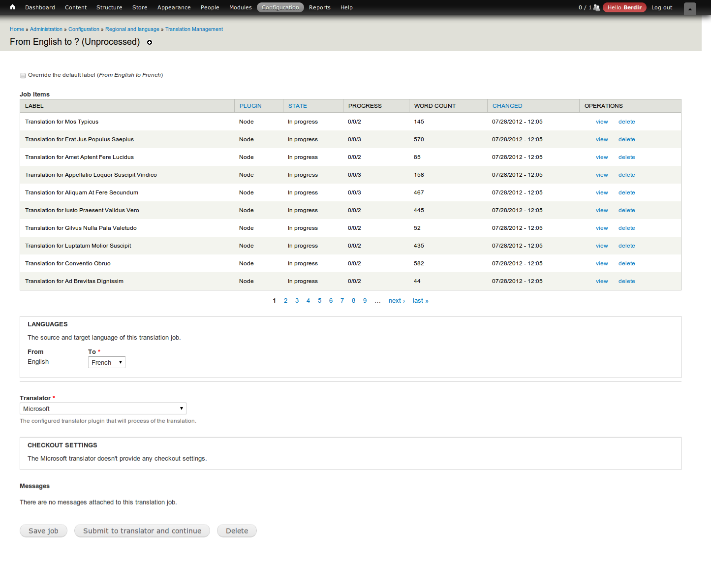
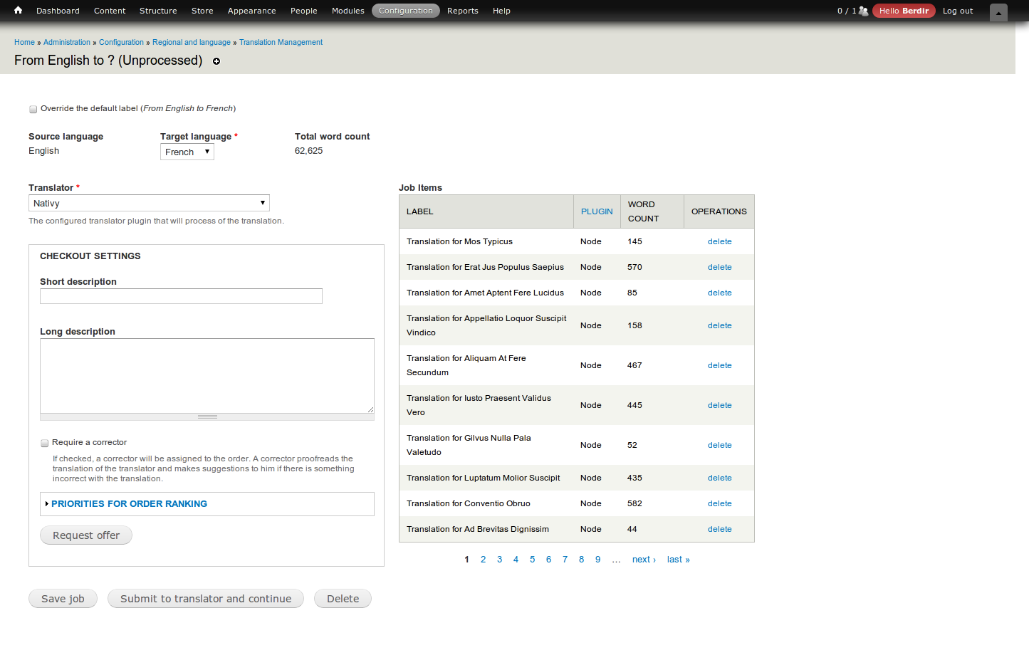
berdirOk, not perfect yet but I think this is quite a nice improvement.
Changes (unsorted, based on patch):
- Removed default empty checkoutinfo fieldset (this will require a small change in the translators which provide something here, which I think is just file (already fixed), mygengo and nativy.
- Moved all info-stuff at the top, floated so that it shows as many items on line line as it can to save space. Label's are not inline yet.
- Added total wordcount and created (only shown in manage mode) to that info bar
- Changed language fieldset to two simple info items as well.
- Moved disabled translator select in that mode up there for manage mode as well.
- Removed view link in job items link. That page is completely useless and will be merged with the review form at a later stage.
- job items and checkout form are now displayed side by side in submit mode, job item view simplified to only show label, plugin (don't like that, want to change that to item type and change item type of node source to bundle), word count and the delete link
- delete link for job items isn't shown anymore for accepted items
See attached screenshots. Please test the patch and provide feedback. If someone want's to improve the markup/CSS, you're very much welcome to do so.
Comment #30
cgalli commentedApplied patch, works fine.
the job creation page looks fine, much less overloaded than before
in manage page I did not see the changes first....
its a change in design, much less cluttered, but now the reamining pages look different :-)
Comment #31
berdirOk, commited. Back to active to improve the job item UI but I want to close this issue afterwards, no point in keeping this open forever.
Comment #31.0
berdirList more related issues.
Comment #32
berdirOk, this isn't perfect yet, but I think it's a nice start.
* Merged view and review pages together
* Slightly changed the behavior of needs review and pending states. An item is now moved back to pending once a item is rejected.
** However, it is now possible to review an item as soon as there is at least one translated and not approved data item in it.
** The accept all button is only visible if an item is in needs review state
** the save button is only visible when the job item has not been accepted yet.
* Added the info thingies above the review form, the message as a collapsed fieldset below.
This has some minor path changes, which result in a test fail in MyGengo, so that one will need to be fixed once this is commited.
Comment #34
berdirThe default source plugin did not return a valid $uri array in getUri(), this should fix this.
Comment #35
ethanethan commentedYou say it's possible to "review an item as soon as there is at least one translated and not approved data item in it."... Do you mean >1 data items within a job item? I have a job item thats 0/1/1; should there be a review button in this case?
Comment #36
cgalli commentedInstalled and tested the patch. Works fine but I encountered a few things worth mentioning. Not all are directly related to the patch but became visible during testing:
- When requesting a new translation, the 'view' link is already visible in the operations column. Clicking it leads to this message: Fatal error: Call to a member function reviewForm() on a non-object in /var/www/tmgmt/sites/all/modules/tmgmt/ui/tmgmt_ui.module on line 579
- After saving the job (without submitting), the 'view' link leads to a greyed-out view/review pane. There is (obviously) not translation there yet, but the check button is active and leads to the 'checked' flag to turn to green. In the jobs list, the item turns green (= translated)....
- There can be a situation where all items have been checked and thus the job lights green 100% approved. BUT the translations have not been submitted back to the node. Doing so with the 'approve all button' submits the translations back, but the display in the job list remains the same.
- I tried to test the status change when an item is rejected. Hmmm, I do not know how to reject a translation. Am I missing something?
The presentation of Jobs/Items is better than before.
Comment #37
berdirFinally a re-roll :)
1. Fixed, view is no longer visible on checkout.
2. & 3. By design, for now. Having access to a greyed out review form is the point of this issue. How to improve the UX of those check buttons will need to happen in follow-ups.
3. Same here, we discussed this, this behavior is not exposed nor introduced by this patch, so we shouldn't attempt to fix it here. I'll open a separate issue, I think what we agreed on is introducing another state for saved translations, we need a color and label for it, do you remember if we agreed on something? :)
4. Reject can be tested with the test translator (drush en tmgmt_test). A reject button is then visible. Note that after applying the patch you need to clear the caches to update the menu link, otherwise there won't happen anything when clicking on the reject button.
Comment #38
cgalli commentedThis will have to wait until tomorrow.
In the meantime I wish you a merry X-mas.
Comment #39
cgalli commentedInstalled and tested the patch. Works as expected.
#1 ok
#3 hmmm, we did indeed discuss the option of defining a 'published' state.
We could define a node (= job Item) as translated when all data items are clicked to green. And use the 'approve all' step as publishing. Useful for management of larger tasks. Logically, we would need to present a filter for the 'translated' state in the jobs list as well as a VBO 'publish' command. A manager could prepare all translations and release them into the wild at a given point in time.
#4 Tested. Worked fine but the resulting messages are somewhat malformed (Rejected data item [body][0][value] for job item 23 in job 21.) But that probably belongs to another issue.
Comment #40
berdir#3. Opened #1873828: Add Reviewed state, rename Approved to Accepted, Rename Approve all to Save as completed. to discuss (and implement) this.
#4. That job message is by design and is displayed by the test translator. This is the internal identifier of that job that we use for the tests. Each translator is responsible for displaying an appropriate message.
Commited and pushed, thanks for testing.
Comment #41.0
(not verified) commentedAdded issue reference for the 'Job label'.