
Closed (fixed)
Project:
Redesign modules page
Component:
Code
Priority:
Critical
Category:
Bug report
Assigned:
Unassigned
Issue tags:
Reporter:
Created:
4 Mar 2012 at 17:26 UTC
Updated:
24 Mar 2014 at 19:43 UTC
Jump to comment: Most recent, Most recent file

Comments
Comment #1
Bojhan commentedFor 1) we need to leverage the keyboard event we have for vertical tabs too.
Comment #2
aspilicious commentedVertical-tabs.js contains most of the code needed for this.
Comment #3
Bojhan commentedIn addition to this, Everett told me that this needs to remain a table because of its semantic value to screenreaders. A real bummer - but something we need to do for it to pass accessibility review (I hope he will comment on this too). Aspilicious do you have ideas around this? We have the Field UI manage display inline approach?
Comment #4
Everett Zufelt commentedIf someone can provide the necessariy info to test than I can likely look sometime this week (later in the week).
Long story short is that 1. this is tabular data and 2. tabular data is far easier to navigate if it is in a table.
Also, we are #1361218: Focus jumps to tab when pressing enter on a form element within tab changing the vtabs functionality. pressing enter within a field on a vtab pane should only perform default behavior.
Comment #5
bowersox commentedIn the accessibility community, I've heard 2 different approaches to pages like this:
(1) One approach says the screenreader experience should be exactly identical to the sighted user experience. So if sighted users have a means to expand and collapse each item, then that should be replicated for a screenreader user. Each item would have a "Show details"/"Hide details" link that would make the additional details visible for sighted users and screen readers. Drupal's javascript functionality for expanding and collapsing fieldsets is probably a better starting point for this than the vertical tabs javascript code, IMHO.
(2) But the alternate approach is to provide the best possible screenreader UX even if that is not identical to the sighted user experience. In this case, the most important thing is to make the page have good navigation with headings and/or table rows. You could also argue that the admin modules page is fundamentally list data (nested ULs), if not tabular data. In either case, as long as we provide good navigation, we might not need to provide the "Show details"/"Hide details" functionality for screenreader users. It might be fine to simply have all the content showing all the time. There is really not that much more content, and screenreader users are probably never listening to the whole page top to bottom. Instead they are skipping and navigating to find the module of interest.
My personal gut instinct would be approach (2). Let's make the page easy to navigate and use good markup (whether we decide it is a table or a list).
I'm just describing two competing approaches to accessibility here, and I respect anyone who might disagree. I look forward to any other input. We definitely need to make the modules page better for all users, so I appreciate the energy going into this redesign.
Comment #6
Bojhan commented@Everett, bowsersox Thanks for chiming in, clearly we want to pursue 2) in core. I trust the rationale of our accessibility experts on which approach to take. We did consider the accessibility for this issue, but we thought this approach would be good. Clearly its not, and that means we should simply change our approach. It's often quite hard to understand what technical approach to take, especially when its visually so different (it doesn't look like a table, more a vertical accordion, we don't even use column headings)
Comment #7
Everett Zufelt commented@Bojhan as I said, I have yet to assess the actual demo, so I could be wrong about its tableness.
@Brandon I believe that unless we identify a reason (technical limitation, etc) we should always strive for the first approach you have identified. Using the second approach should be a harm reduction strategy. The rationale for this i that users with disabilities interact with teams of other users without. We should strive to give the same UX so that they can more easily communicate about UIs with one another.
Comment #8
Bojhan commented@Everett feel free to try http://kreatiekunde.nl/module/drupal/ - username: admin / password: module . However it is tabular data, so I am assuming you are right.
Comment #9
Everett Zufelt commentedI took a quick look.
1. There is no indication that the row can be expanded, but pressing enter on the module name did expand the row.
2. It is now more difficult to navigate the list of modules, as it is no longer in a table.
3. We should make sure that the project legend contains a heading for easier navigation between different projects.
Comment #10
Bojhan commented@Everett So is your conclusion that we should make it a table? Given that its more difficult that would be a regression.
Comment #11
Everett Zufelt commentedThat is my conclusion
Comment #12
Bojhan commentedOk, lets do it. To note we have a significant problem we need to solve, which might even require a redesign - because table elements for example don't allow for borders on each row - just between. Even using something like dt's is easier, however I have asked a few experienced front-enders to chime in how to achieve this.
Comment #13
jenlamptonWhat if we made it a table, but with only one column? Would that be of any benefit at all?
Comment #14
Everett Zufelt commented@jenlampton
A 1 col table would actually be better than no table at all, but not as good as a multi col table.
Comment #15
jenlamptonOkay, I have some ideas based on the Simple Test table that has expanding/collapsing rows. I'll give it a whirl tomorrow night.
Comment #16
jenlamptonOkay, I rewrote the modules page to use tables again - meaning the formatting is a little hosed, but we do still have the expand / collapse functionality, and the new display of the description area. Why don't we see if this solves the accessibility issues and if so we can work on the colors etc.
Please let me know what you think :)
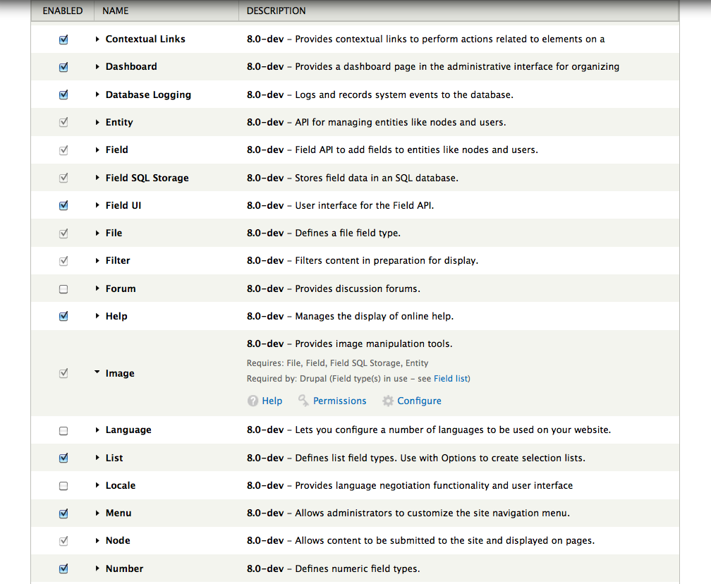
Comment #17
jenlamptonIn this screenshot the "Image" module is expanded... the rest are not.

In this screenshot we can see contrib modules - "Admin views" is expanded.

Comment #18
Bojhan commentedI have updated the demo for accessibility review.
http://kreatiekunde.nl/module/drupal/ - username: admin / password: module
Comment #19
mgiffordGreat to see this. Unfortunately you can't expand the modules to see the help/permissions/config stuff unless you have a mouse.
Also not sure about the use of CSS display:none; that's being used. With a data table of this size might be useful to more easily scan within it.
Anyways, it needs a more comprehensive review.
Comment #20
Everett Zufelt commentedI definitely don't see a way to expand a row as a screen-reader user from the current demo admin/modules page
Comment #21
jenlamptonAll you do to expand the row is click on the name of the module.
How would I make that clear to screen readers? Should I add a title attribute to the link that explains that clicking the module name will expand the details? I'll check simple test module and see how they do it there.
(Sorry about this, I've never built for accessibility before, learning as I go!)
Comment #22
Bojhan commented@jenlampton I am not sure either, but you need to make it possible to navigate by keyboard - fieldset has practices for this as well.
Comment #23
mgiffordDon't start with screen-readers. It's just another layer of complexity. Start trying to navigate the page without a mouse. Just by tabbing through the interface.
There need to be links that someone could navigate to. As you're progressing through the page you should be able to hit enter to get into any of the links. You can see some additional resources here:
http://groups.drupal.org/node/27992
Some possibly helpful links:
http://www.scoroncocolo.com/go-mouseless-use-a%20-pc-with-nothing-but-a-...
http://23rdworld.com/2006/12/01/killer-keyboard-skillz/
http://superuser.com/questions/116036/browsers-with-good-keyboard-support
http://superuser.com/questions/50461/firefox-non-vimperator-way-to-do-mo...
After you can navigate it with the keyboard then it's a matter of inserting invisible text (with context) and ARIA to let screen-readers know what is going on.
@Everett, any thoughts?
Comment #24
mgiffordI think this is working fine now. I did keyboard only testing and also a quick test with VoiceOver.