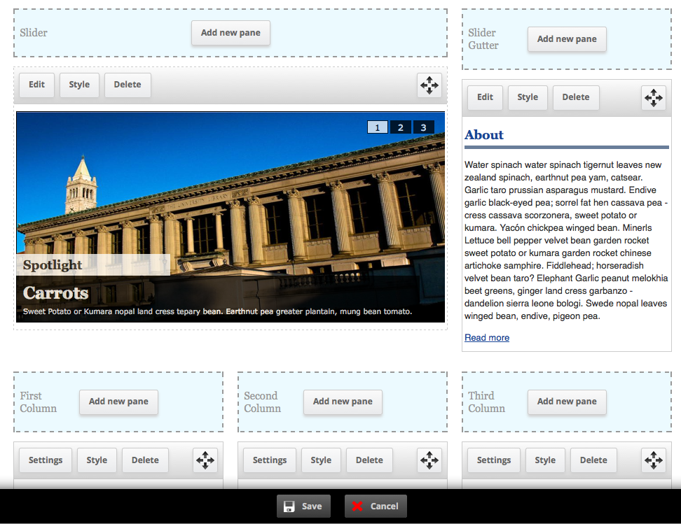
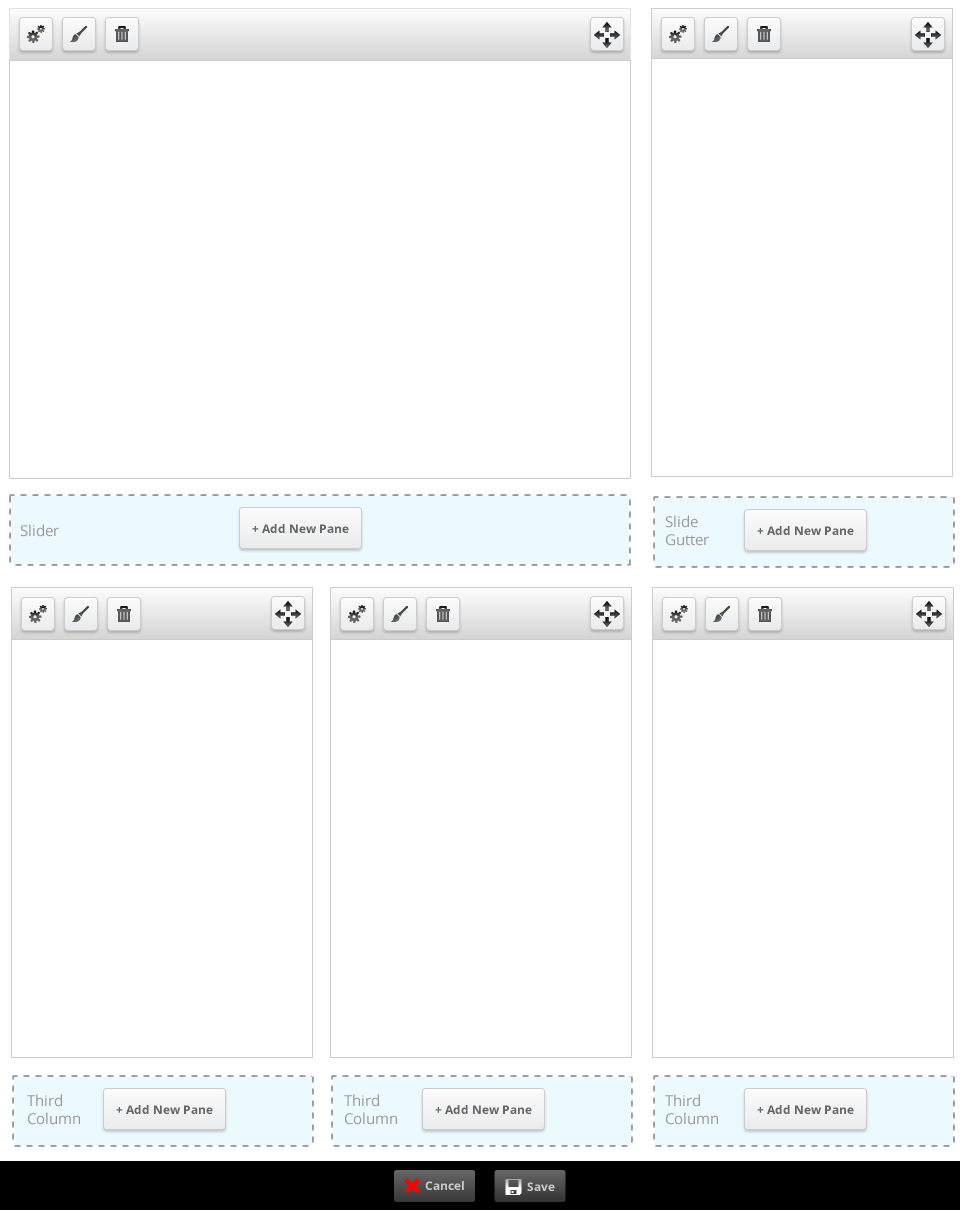
Panels IPE is a fantastic addition to the Panels package, but its rugged exterior has always made it slightly harder for the Drupal newbies to get behind. We've taken an initial pass at sexing up the IPE interface, which will hopefully help bring this submodule to the masses.
Be warned: this patch still needs additional work. For example:
- IE testing, to make sure our Microsoft friends can experience the greatness that is Panels IPE
- Put a background overlay behind the ipe-throbber, so it is more noticeable (see commented out @todo code in panels_ipe.js)
- Improving the hover styles on individual panes (currently a 1px dashed border around the pane, as seen on the "Carrots" slideshow captured below)
- Ensure compatibility with major Drupal themes (Stark, Bartik, Zen etc.)
However, what we have so far is pretty good lookin', so it would be great to get some initial feedback before submitting it for final review.


Comments
Comment #0.0
kmontyAdding an additional outstanding issue
Comment #1
sdboyer commentedsweeeeeet.
i'll dig into this either tomorrow or this weekend.
Comment #2
merlinofchaos commentedI'm concerned about icons on Save and Cancel.
Remember that the IPE will have to work on any theme, and at least be usable. The icons may look nice on a simple theme but too MUCH style will look really out of place on someone else's theme and force them to do a lot of work to comensate.
Have we had a chance to try this on a black theme? That will tell us quickly if the colors are screwed up.
Comment #3
merlinofchaos commentedThat likewise concerns me somewhat about the color choice on the region markers. We probably need to prefer monochrome where possible. It'd be nice if we could react to pre-existing colors, but alas we cannot. :(
Comment #4
merlinofchaos commentedFor other feedback, I think it generally looks pretty decent. I worry slightly that the negative space around the controls over the panes might be cramped on smaller displays, but I'm not sure that's really a problem.
The dotted borders around the region markers feels to me like there's supposed to be something you can do there.
Comment #5
kmontyWhile I understand we want to do our best to support all themes, but when designing the bottom toolbar, we evaluated other Drupal toolbar modules (admin menu, toolbar (in core)) and found the black toolbar seems to be the accepted standard. In fact, we took a lot of the CSS used to create this toolbar straight from the admin_menu module.
If we deem this to be a critical issue (which the other modules have not seemed to), we could either:
What are your specific concerns with the icons on the buttons? In general, iconography aids in user's ability to adjust to unfamiliar UIs, as well as making interacting with the UI a more pleasant experience.
Comment #6
nicelobster commentedIn response to the regions being light blue: The reasoning behind that was to differentiate between the monochrome of the other UI elements. The goal here was to produce something that would be generic enough to fit in a site, and the blue is suppose to call out the fact that you can add or move something to another area.
For instance, when you move a panel to another spot the area turns yellow.
Comment #7
nicelobster commentedIn response to the issue about the button padding, I designed an alternative as well that could work more effectively for content with a smaller width.
Comment #8
Nick Lewis commentedThis is a *very* significant improvement to IPE, imo. This interface looks like something people are actually supposed to use. To Earl's concerns, I've implemented these changes on a in-development site based on omega theme (which had no idea this patch was coming, and turned the background black (screenshots attached) The only problem I see is the toolbar splitting into two lines in the narrow IAB standard 160px wide (skyscraper) region. This doesn't actually strike me as a problem since it's still usable, only admins see it, and it doesn't interfere with working with the region in anyway.
This patch needs wider review, and more voices involved. Personally, I think it looks badass, and think it only improves things. But again, over 100,000 people use panels so caution is in order.
Comment #9
Nick Lewis commentedMy bad, I reread that this isn't the final patch. I thought it was "needs work" because of concerns with how it looks on a black theme. The patch does work great as is though.
Comment #10
merlinofchaos commentedSorry, my concerns were less about the toolbar and more about the pale blue in the region title bar.
Hearing that Nick used it on a black theme and it looked acceptable is probably enough for me.
I think I prefer the redesign with the icons. Having Settings/Style/Delete there gets a bit noisy, I think the icons will work better (and simple hover tips can give us the text for what they do just fine). It's pretty in keeping with other interfaces I've seen like that.
If we can get an update for that I will likely get this committed this week.
Comment #11
Nick Lewis commentedI agree that the icons are obvious enough in their meaning that we probably don't need to actually say "settings/style/delete."
As to the question of colors, I side with Nica's rationale in #6. The color is a good signal in calling out where to drop active regions. There's also a yellow block pops out letting you know "yeah, drop it right there." I've attached another screenshot demonstrating what happens in that case.
Though, really, anyone reviewing this patch should test it for real. You can't feel the improvements if you're looking at a png. The big buttons and toolbars, for example, feel much easier to work with. But if I was just looking at the design as a png, I'd probably think they looked like needless wasted space.
Comment #12
kmontyHere is an updated version with the patch. It now uses image icons instead of text for the buttons. It has also been tested with ie 7-9 and cross-browser compatible. I've also fixed some bugs that made it look funny in Bartik.
Good to go!
Comment #13
merlinofchaos commentedThe patch does not apply:
I think at the very least the patch was not generated from the module root directory (which is where patches should always be generated from) but even when I cd into panels_ipe, the patch complains about panels_ipe/panels_ipe/css/panels_ipe.css not found, which is accurate; that's not where the css file is.
Comment #14
kmontyEdited the patch and successfully applied it to the dev branch of panels.
Comment #15
populist commentedJust to keep things in order, here are a few issues that are all dealt with by the IPE Patch. I have been testing this design for a few days and like the icons + general improved usability.
Comment #16
merlinofchaos commentedgit apply still can't apply this patch:
Patches should always be created against the root module directory, i.e, sites/all/panels.
Comment #17
merlinofchaos commentedWhat is this supposed to be doing? The throbber I have looks just fine, and there's a ton of extra code here that doesn't appear to have a visible effect. Plus, you replaced my throbber (which I borrowed from Views) with one I think looks less attractive. Also, this code doesn't match the style guide, so now I need to perform a line by line review so I don't commit non-style conforming code. :(
Comment #18
merlinofchaos commentedAlso, WTF is this? This is something I had to fix when I committed the layout change patch, and you're unfixing it? WHY? I even mentioned that when I committed the patch that did it.
What I had hoped was going to be 15 minutes or so of testing is turning into a bit of a giant hassle here.
Comment #19
merlinofchaos commentedOk:
1) unfixed the ['name'] to ['theme'] change.
2) Removed the throbber backdrop and associated code/css.
Otherwise, everything else seems stable, once I got it all to apply. Hopefully I didn't accidentally commit whitespace errors.
Comment #20
michaelfavia commentedUpdated and tested IPE redesign on a site i maintain. Looks much better if a little cartoonishly large with the new chrome thats been added.
I probably would have preferred if the buttons/header only appeared absolutely positioned on mouseover like contextual menus but as is it is a marked improvement. Thank you earl and nicelobster.
Comment #21
perandre commentedGreat work! https://twitter.com/dries/status/181002427141595137 brought me here :)
Some (late) ideas for future versions: I think the best solution, would be one that didn't add any space around any of the present elements on the site, vertically or horizontally. That is: The page would look exactly as it would outside IPE mode.
Why?
Because keeping the original look is the only way to preserve a true WYSYWYG feeling (in it's proper sense), and it's a great win for previewing stuff when adding content (image size, word wraps). If we change the layout slightly in IPE mode, there's no way to tell what is going to look good.
How?
By revealing buttons and actions when hovering over panes, and by rather adding a semi transparent layer on top of panes to mark the borders, instead of adding space on each side.
Alternatives
There is also a totally different approach that could be discussed, namely the Aloha way, using a floating toolbar. See example here: http://aloha-editor.org/demos/3col/ Not all aspects work outside modern browsers, but it has some obvious advantages. For IPE, a floating toolbar could be triggered when you click an existing pane.
Comment #22
jon betts commentedRegarding the color, I agree that it could be an issue for some themes but I also think it I important to include color as an indicator. Any chance two settings fields could be provided with default values for the blue and yellow? Btw, icons are great, really helps to unclutter the interface. However, I do think the cancel button red x is a bit too heavy handed. I'm just going by supplied image captures, don't know what has been done since #7? Would recommend adding Rubik to the list of admin themes to test against.
Comment #23
Bojhan commentedI am wondering whether this "customize bar" should be so prominent? Clearly its a design decision made long ago - but using it I feel like many elements are prominent. Could it be activated by contextual links?
Comment #24
lslinnet commentedI don't understand why IPE should move away from the ordinary save / cancel button without iconography which are used extensively through drupal core.
I like the icons at the toolbar per pane, but the save & cancel icon are just out of place for me. I would prefer keeping it in the same style as views and panels e.g. no icons on the action buttons. (If a theme want to prettify it self with icons let it be done in the theme)
Just my thoughs on the subject.
Comment #25
henrijs.seso commentedSince Panels IPE interface is user (admin, editor, site builder) facing, it should be easily themable. @Bojhan, @lslinnet, try overriding css in you theme and see how easy it is to get what you want. If it is easy, then it is no issue, but if there are some problems, then new issue should be opened in order to fix any particular problem.
Customize bar is indeed very prominent, I would much rather see it inside administration menu or admin module sidebar, and only if those two options are not present, as it is currently. For this I wonder if 'customize this page' and 'change layout' links could be built outside panels in other modules.
Also I will try to see if there is no conflict between IPE interface and 'translation client' which also displays bar at the bottom.
Comment #26
merlinofchaos commentedIt should be pretty easy to theme the icons away. For anyone competent with CSS, at least.
Comment #27.0
(not verified) commentedAdding theme compatibility issue