I'm using Footheme based on Pixture Reloaded, and in mobile view and also when I resize the window in a standard browser, the main menu displays vertically. Not such a big deal on a normal browser as the window has to be narrowed significantly to cause the issue, but the mobile view (tested on iPhone) looks awful as you have to scroll down past the menu to view any content.
This happens with standard and also with Superfish menus, have tested in my Footheme and also in the bare Pixture reloaded theme and the same happens.
Can anyone offer some assistance with this? I'm no CSS whizz and I don't know where to start.
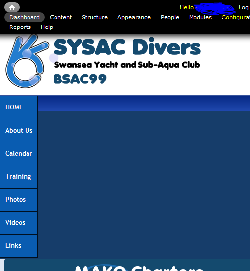
A screencapture is attached, and the site in question is here.


Comments
Comment #1
Jeff Burnz commentedBug, pure and simple.
I have been thinking of better ways to support narrow screens with these menus and I have come up with a number of ideas:
1. Turn them into select lists.
2. Hide them behind a single menu "button", when tapped it opens the entire menu in an overlay that takes up the full screen - very similar to how Android displays a select list.
3. Simply let them wrap and fall where they may, meaning - do nothing - you would end up with maybe 2 or 3 lines of links depending on how many you have.
Other ideas? Please chime in.
Comment #2
Jo_ commentedNumber 2 (android style select lists) sounds very nice. Wrapping also would be better than the current display, but I think would take up too much room if there were more than a few options.
Comment #3
ydahiHi Jo,
The issue of the vertical menu:
- it seems that the threshold for the "mobile" version for your menu is < 769px
- this means that your menu will show vertically (i.e. in mobile phone mode) on tablets (or anything with a viewport of < 769px)
- Removing the code for the menu at the media query will ensure your menu is showing the default horizontal menu for viewports > 480px
- Also recommend adding width: 100% for .sf-menu for the media queries targeted for mobile phones to ensure you have a better looking menu for mobile phones
The issue of menus/navigation for narrows screens:
- I've been employing a reductionist approach:
- basically prioritizing elements of the site and showing only that which is mission critical
- i.e. strip images, graphics, colors, content
- navigation is always at the forefront, just a matter of working together a solid information infrustructure
- the end result is a 'light' version of the website
- keeping only enough functionality for the user to get what they want
example: http://www.amazon.com/gp/aw/kindle/storefront/
hope that helps! cheers.
Comment #4
Jo_ commentedHi, thank you for taking the time to comment and help - I will look into the suggestions you've made and try them out in the next few days!
Jo
Comment #5
Todd Young commentedKinda side issue, kinda related: For those of you having trouble seeing the replacement menu at all, make sure you are not running jQuery Update 1.10 - I reduced mine to 1.7 and the menus appeared. Didn't try other versions yet, but FWIW...
Comment #6
Supreeth Rao commentedI always use jQuery update set to 1.7 and haven't faced any issues. Recently I started using Responsive menus with Footheme on Pixture reloaded and it works well.