
 Come together with the global Drupal community in Rotterdam, 28 Sept – 1 Oct 2026. Sessions, contribution, connection, and Early Bird savings until 8 June.
Problem
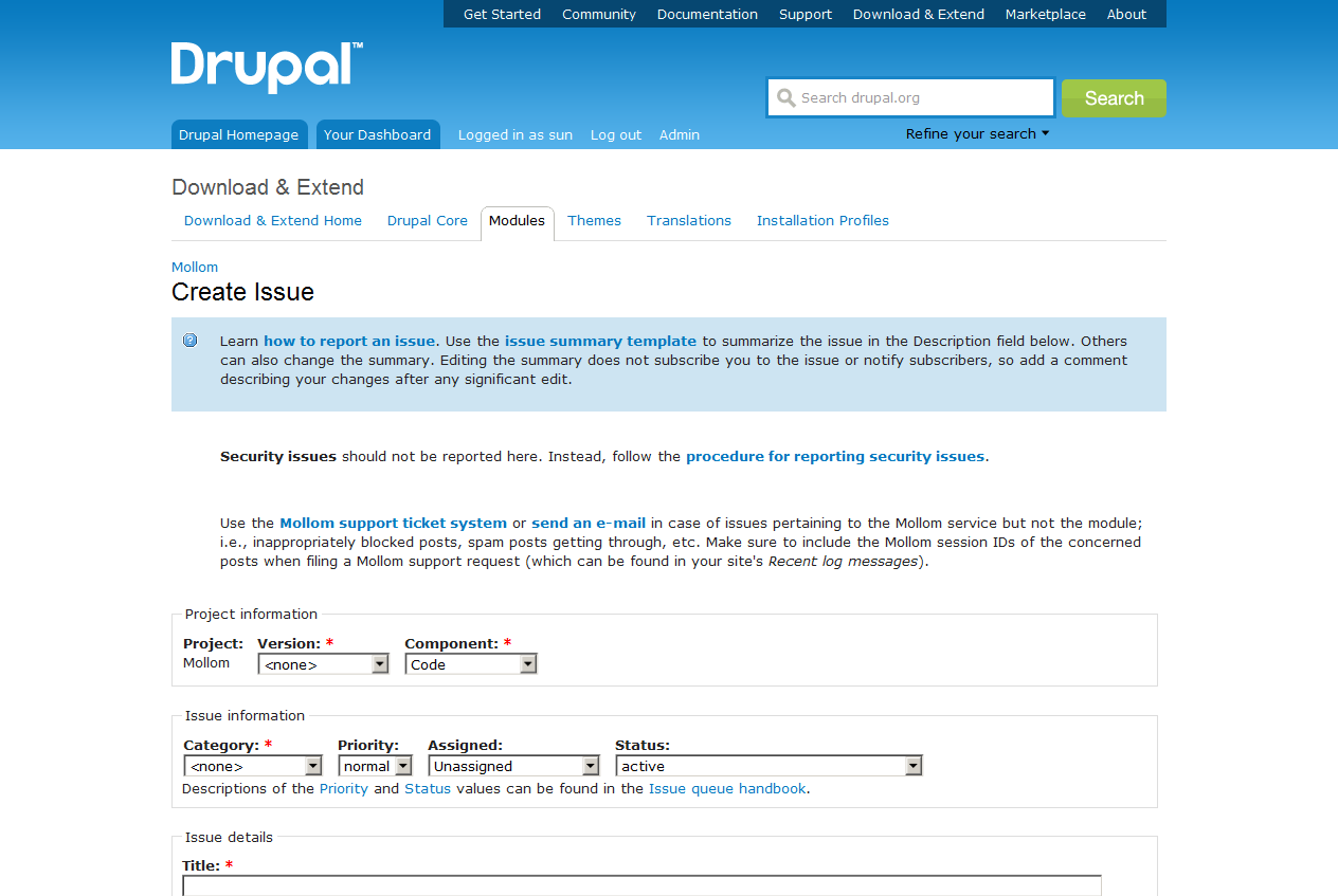
- Guidelines on the project issue creation page present the most unimportant information first, important information appears as string garbage, and users stop reading the wall of text before reaching the project-specific guidelines.
Goal
- Show important guidelines first.
- Use visual styling to highlight important guidelines.
- Shorten and clarify the always identical site-wide guidelines.
Before

After

Tasks
- Change project_issue module to use a CSS class of .warning instead.
- Change ? module to not output the issue summary guidelines via hook_help(), and hook_form_alter() the text into the project_issue node form instead, using this markup:
<div class="messages help"> check_markup([help text]); </div> - Fix bluecheese theme to not destroy margin and padding on ULs in DIV.messages.
| Comment | File | Size | Author |
|---|---|---|---|
| project_issue.add-form.0.patch | 1.04 KB | sun | |
| issue-add-after.png | 45.34 KB | sun | |
| issue-add-before.png | 45.3 KB | sun |

Comments
Comment #1
dwwRe: #2: Issue summary guidelines are currently defined at https://drupal.org/admin/content/node-type/project-issue thanks to #1036132: Provide a mechanism for issue summaries. We could move that crap into a form_alter in drupalorg_project if we wanted. That'd be a separate drupalorg issue, I guess.
#3 is a separate issue, as well.
So, this patch is just for #1, right?
Comment #2
dwwAlso, tagging for the d.o UX team to take a look... I don't want to move forward on this without their okay...
Comment #3
dwwFrom IRC:
[3:42pm] yoroy: My biggest issue is the leading with what not to do. It's off-putting
[3:43pm] sun: we could change the order, but that wouldn't resolve the issue for projects which don't have project-specific guidelines
[3:44pm] yoroy: sun: could be solved by rewording the actual message too
[3:44pm] sun: yeah, my shortening made it stronger
[3:50pm] yoroy: sun: is there currently a problem with too many security issues being reported the wrong way?
[3:51pm] sun: AFAIK, it happens rarely, from time to time
[3:51pm] yoroy: I'm not sure we should want this yellow flag to be up there all the time when it only rarely applies
[3:51pm] sun: whether that's "too much" or just the expected insanity of trolls, I can't tell
[3:52pm] dww: it does happen a fair bit, although it's unclear if this warning text would help of course...
[3:53pm] sun: and of course, with the current order of messages we're presenting, even I am stopping in the middle of the first
[3:53pm] yoroy: sun: ha, yes
[3:54pm] yoroy: https://drupal.org/files/issue-add-before.png in a way has more focus on the sec. issue sentence
[3:54pm] yoroy: since it's the first *normal* piece of text, leading with a bit of bold
[3:56pm] sun: so, ideally, I'd put the project-specific guidelines first - because they are the only that might differ when reporting issues
[3:56pm] yoroy: sun: sounds fair yes
[3:57pm] sun: didn't do that in the after mockup, as I wasn't sure whether that would be accepted
[3:58pm] yoroy: sun: dww I gotta go. As you noticed I'm on the fence with this
Seems like this needs more thought and work before it's ready to go...
Comment #4
dwwWhoops, just found this: #939714: New issue “Security issues …” message should be a warning
Comment #5
dwwBah, sorry, not really duplicate. That other issue can be for bluecheese changes related to this.
Comment #6
Bojhan commentedThis is really interesting, I have always hated the demeaning "message that takes half of my screen" - when I am not the target audience.
Realistically, can we cut this to just one message? The Security, and how to report an issue? We can surely allow individual modules to add a message, but should also push them to keep it short?
Comment #7
Bojhan commentedThanks for this tag, really helps me find stuff.
Comment #7.0
Bojhan commentedimages