
Closed (fixed)
Project:
Project issue tracking
Version:
5.x-2.x-dev
Component:
Issues
Priority:
Normal
Category:
Feature request
Assigned:
Unassigned
Reporter:
Created:
2 Jun 2007 at 06:32 UTC
Updated:
28 Nov 2007 at 06:01 UTC
Jump to comment: Most recent file

Comments
Comment #1
ChrisKennedy commentedHere's a slightly more ambitious version that also: moves the original issue fieldset to the bottom and collapses it. I think this reflects the proper UI priorities of the followup form.
Comment #2
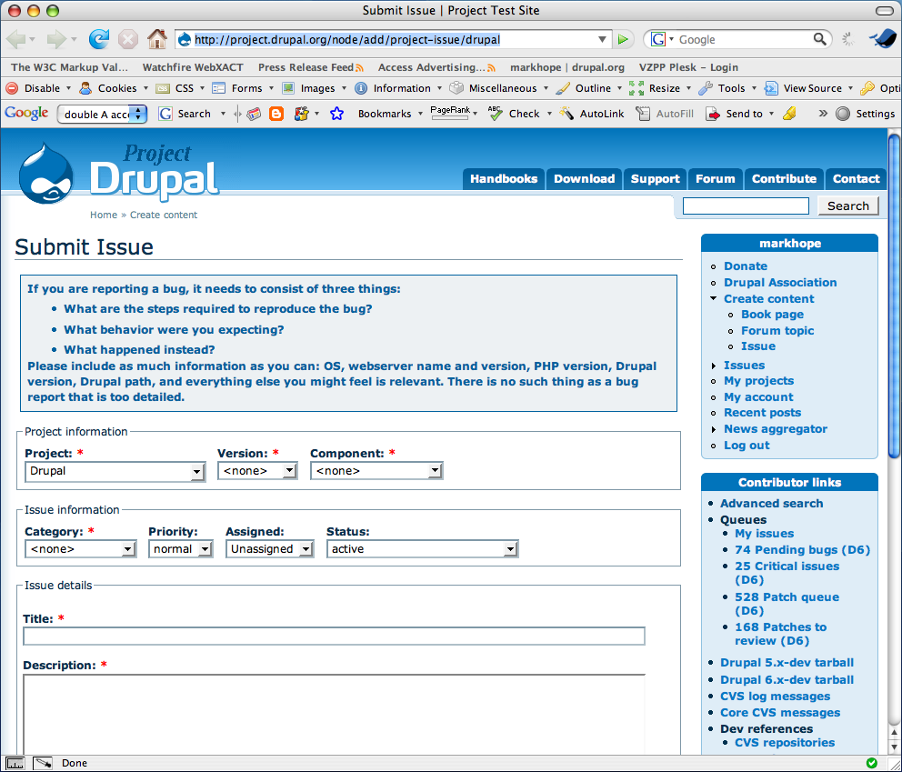
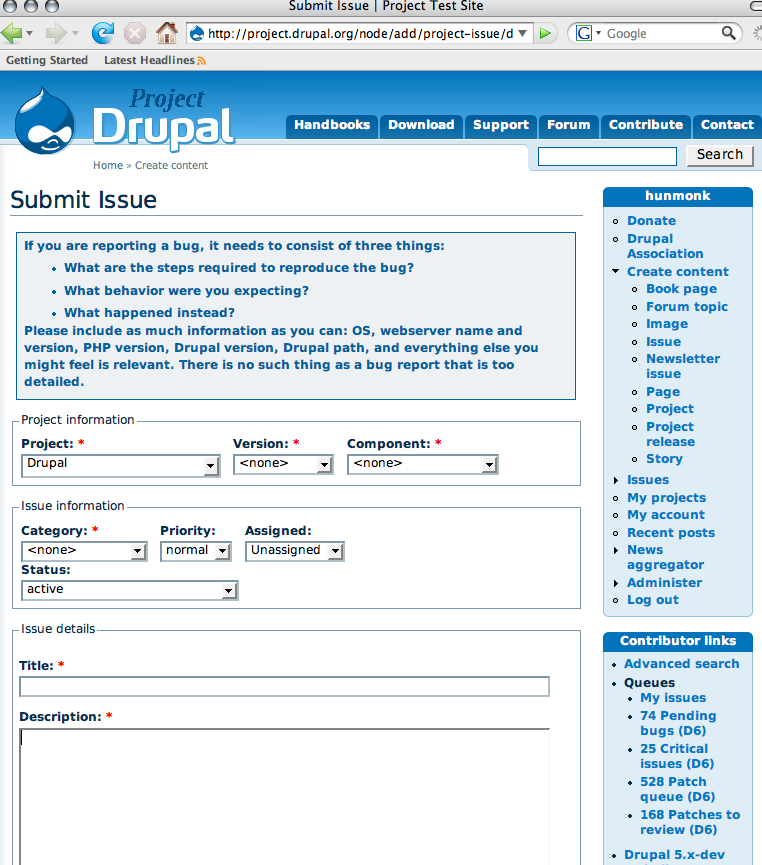
ChrisKennedy commentedScreenshot - closed.
Comment #3
ChrisKennedy commentedScreenshot - open.
Comment #4
dwwthis is quite interesting, and definitely in line with ideas i've had in the past for cleaning this stuff up. mostly, this seems like a good move. my only concern is that changing the status of the issue is something that happens frequently, and i think regular users of the issue queues will rebell at having an extra click and more space between the status and the description. however, it breaks the nice clean approach of your proposed UI if we move the status out to the per-issue (non-collapsed) fieldset, since the status really is issue-wide, not specific to the followup. i'll have to sleep on this and see what i think in a day or two, but overall, i think the benefits of this new UI outweight the drawbacks...
thanks for the patch!!!
-derek
Comment #5
hunmonk commentedwould an effective compromise be to simply leave the collapsible fieldset open?
Comment #6
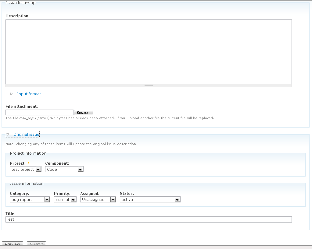
ChrisKennedy commentedAh yes, this issue. Here is a re-roll with the fieldset open by default.
Comment #7
hunmonk commentedComment #8
ChrisKennedy commentedI think I originally chose $node->title because that's the variable that is currently checked in project_issue_form() to see if it's a followup or not. I see your point though. I'll defer to anyone who has a strong opinion either way (esp. Derek of course).
Yeah, I eventually leaned towards leaving in the collapsed key, probably so it would be extremely easy to switch back to TRUE (9 keys in vim: "cwTRUE:wq"). If removing the line entirely is preferred by anyone, that's fine with me.
Comment #9
hunmonk commentednid just seems like a more stable test to me, as it has to exist -- while somebody could do something crazy like form_alter out a title. so let's use it unless there's a real reason not to.
i could go either way on the extra collapsed key there...
Comment #10
ChrisKennedy commentedGood point about form_altering. I went back to change it, and while testing realized that the original version wasn't correct anyway. So it should actually be !$node->body.
I removed collapsed => FALSE while I was at it.
Comment #11
hunmonk commentednow that http://drupal.org/node/18920 has landed, this needs to be refactored a bit. also, i noticed that the 'Original issue' fieldset was appearing on page one of the form (which appears if you visit node/add/project-issue), which is definitely not what we want.
Comment #12
ChrisKennedy commentedUpdated patch.
Comment #13
hunmonk commentedmm, still not quite there. now the order of the info is:
i think it should probably be either:
or:
Comment #14
ChrisKennedy commentedI have a slight preference for 1. Comment, 2. File attachment, 3. Issue data. Updated patch.
Comment #15
hunmonk commentedmuch better, imo. i'm going to leave this for dww to commit, in case he has any remaining objections/suggestions.
Comment #16
dwwThanks for the progress on this. 4 things:
A) The "Original issue" fieldset should itself be collapsible (but not collapsed) to be visually more consistent with the other fieldsets (like "File attachments") and to at least allow folks to hide all that junk if they want while composing a reply.
B) I'm still torn on how "far" the status is from the comment, as per my comments in #4. Overall, I think this is a good move, but I'm worried that updating the status, which is probably the most common/important part of an issue followup, is now effectively buried as the last field in the last (nested) fieldset on the form. :( It's true that separating that out makes less sense in terms of the consistency of the "Original issue" fieldset, but I wonder if there's a clean way to lay them out such that the issue meta-data isn't so burried...
C) While "Original issue" makes sense in one sense, it's also potentially confusing. It's not so much original as issue-wide values. In fact, now that we have IFAC, we actually store the original values and could display those with the original issue post, in addition to the current issue-wide values. I'd like to think of a better name for this fieldset. Something like "issue-wide values", except something that doesn't suck as badly as that title. ;) Suggestions welcome.
D) Given the basic thrust of "issue-wide settings" or whatever we call it, and having "Issue title" in there, perhaps we should restore the ability to title your own comment? If you do, the comment # gets prepended automatically. If you leave it blank, you get just the comment #. But, given how widespread comment titles are in the usual Drupal UI, perhaps we should't special-case issues like this, especially if the original issue title is as clearly represented as it is in here. This should probably be a separate issue after this one lands, with a separate patch, but I at least wanted to raise the point here while we're thinking about the other things.
Attached patch already fixes (A). However, this is CNW for at least (C), if not also (B)...
Thanks,
-Derek
Comment #17
hunmonk commentednot sure sure i agree with B. after all, you have to get down there to click 'Submit' anyways, so i don't think it's that out of the way. my feeling is that it would just take people a bit of time to adjust to the new layout.
i'm definitely opposed to D, as i think it will make the issue queue layout look much more noisy. i've always hated the comment auto titling crap, and i really don't want to see the issue queue polluted with those in the case where people don't put in a comment subject. also, i don't think it's appropriate to compare the way comments are used elsewhere with the way they are used in the issue queue -- IMO it's clear that it's a pretty specialized usage.
Comment #18
dwwre: (D) I'm just asking. And, if you read what I said, I specifically mentioned it should NOT behave like the usual default comment title if you leave it blank... in that case, you'd *just* get the comment number, not the evil auto-generated "teaser" for your comment. Yes, obviously, issue comments are different than regular comments, but given how often people *try* to title their comments when following up, I don't think it's insane to allow it in general. But, as I said, this debate probably belongs in another thread -- didn't mean to cloud the waters in here.
re: (B) I just said I'm torn. I'd like to still keep at least status, if not all of the "Issue information" fields more prominent. I agree, having the fieldset expanded by default is a huge step forward from the original patch/UI I reviewed above, but I'm still feeling a little uneasy about it. In the end, I'll probably commit this basically as-is, but I wouldn't mind waiting a day or two first to see if anyone has any great ideas before we do. Obviously, we can always change it later once we roll it out on d.o and start getting feedback, if something better comes along...
Re: (C) Any bright ideas, Chad? ;) I think that definitely needs a little work before we commit, and I suspect you'd agree with me on at least that much. If you have a chance and come up with any proposals, please post them here...
Thanks,
-Derek
Comment #19
hunmonk commentedre: D) whoops, you're right -- i missed that section of your comment about auto-titling :) i think we're in agreement here that this should be shuffled to another issue, so case closed for now...
re: B) we can always change it later if people hate it. IMO this patch is an overall improvement, and we can tweak it going forward. also, keep in mind that while the status might be further away than where you'd ideally like it, it's also consistently placed with respect to how it looks on an initial issue post. i think you might end up trading a slightly better UI on the followups for slightly more confusion b/c the layouts aren't consistent -- not to mention the additional code that it would take to wrestle the form elements around.
re: C) i didn't originally mention anything because i agree, and didn't have any better ideas than you at the time... ;) although it seems non-standard to use an action-oriented label for a fieldset, i'm going to throw that out as a possible solution here. something like "Change issue settings" or "Edit issue settings"?
Comment #20
hunmonk commentedattached changes the fieldset title to 'Edit issue settings'. along with the displayed description, i think this does a good job of clearing up what this fieldset pertains to.
@dww: also, re: B -- i'm now in total disagreement w/ your assessment ;) i actually think the workflow is better now, and the project issue metadata is in the right location. i can't tell you how many times i've submitted an issue and forgotten to update the status b/c it was nowhere near the submit button. now it's located there so you can do a quick check of the metadata right before you submit.
i'd like to see this issue take one of two directions going forward:
while i understand the desire to include this in the initial ifac rollout (making all our UI changes at once), i also think it's perilously close to scope creep regarding the deployment of ifac. so if we really need more time to feel comfortable with a solution, then let's not hold up what we already have that's ready to go.
Comment #21
dwwIt's not worth holding this up. We can *always* tweak this more later, if we come up with anything better.
So, I just committed a slightly modified version of the latest patch... I changed the description on the "Edit issue settings" fieldset to read:
"Note: changing any of these items will update the issue's overall values."
I liked that better than this talk of "update the original issue description" which didn't really make sense to me...
Thanks, Chris, for being persistent with this. ;) If anyone has any better ideas or further suggestions for improvement related to this, please re-open this.
Cheers,
-Derek
Comment #22
dwwDries writes on the devel list:
My replies:
- The comment form, however, is a mess
3 minor UI tweaks (one of which is a bad idea) hardly constitutes "a mess"... ;)
a. The netsed fieldsets for the issue settings (i.e. 'Project information' and 'Issue information') drive me crazy. There is no need for the nested fieldsets as the title of the inner fieldsets add very little value. Can we remove the nested fieldsets but keep the form elements?
We could. It's true that the nested fieldsets add more noise than signal. However, the result would be even less consistent with the form for submitting the issue in the first place. Plus, one of the nice things about the current layout is that the outer fieldset clearly indicates that if you change anything in there, you're modifying the whole issue, not just your comment. This was a frequent source of confusion in the past.
However, I suppose we should just admit that the followup UI is going to be different than submitting an issue, and we should optimize both UIs, even at the expense of making them less like each other. And, I guess we could keep the "Edit issue settings" fieldset and description, and just remove the inner fieldsets, and it should all remain fairly self-explanatory.
b. The 'attach new file' fieldset could be collapsed. Often times, you don't attach a file. I don't feel strongly about this; it's minor. Feel free to leave it as is, if you feel strongly about this.
I disagree. Attaching files is a vital part of the issue queue. Not everyone changes the status of the issue in their followup, either, but I'd be strongly opposed to collapsing that fieldset, too. File attachments should be clearly visible as an option, and easy to use for those who are uploading something. This always used to be expanded and visible in the issue and followup UI, I see no reason to hide it now. Just because you never attach patches to issues anymore doesn't mean the rest of us don't do it all the friggin' time. ;)
c. The issue settings should be above the textarea for the comment bottom. Having them on the bottom doesn't work for me. The reason is that I find myself using the issue settings to get an overview of the current status of the issue. I don't always change these settings, but I *always* find myself *reading* them before I comment on the issue. You might expect people to scroll up to read the status of the issue, but that's not what I'm doing. Putting the issue settings above the comment textarea would make it flow better, and make things easier for me.
The specific order was also debated at length above. I don't feel that strongly about this, so I'd willing to re-arrange a little bit (e.g. issue settings, comment body, then file attachments). However, I'll let Chad comment on this, since he (and ChrisKennedy) were the ones most strongly in favor of the current order.
- The fact that you can add a comment/follow-up without having to click a 'follow-up link' is a nice improvement. Good idea.
This is just the core setting for where to display the comment form. Chad gets full credit for thinking of configuring d.o like this (and the patch to core that allows us to control this per node-type, instead of having it a global, site-wide setting).
Can we try to tweak it a bit and try using a tweaked version for a while?
Sure. Someone is welcome to post a patch here. The changes are going to be quite minor, since these are very small tweaks to the UI you're talking about. Anyone with any FAPI skills at all is qualified to write this patch, you don't have to know anything about the inner workings of the whole project* suite. Just look at the patches above if you need any help finding the code to modify.
Comment #23
hunmonk commentedi think derek's post above covers everything well, and i'm in agreement with it.
regarding the order of the form, i can't recall receiving any complaints about the ordering from other folks -- most people have been pretty receptive of the new layout. i'm not opposed to reordering, but i think i'd like to collect some votes from the community first on that -- perhaps a quick survey on the devel list? i'm suggesting this because i'm most in favor of a solution that "works best for the most people", because so much work is done by so many people in the issue queue.
Comment #24
dries commentedI think we should give people the chance to _try_ alternative suggestions. Using an alternative solution for a while puts you in a better position to make comparison. For that reason, I used the new form for several days before I provided feedback.
Comment #25
hunmonk commentedthat's a very good argument :) how about we alter the form according to your suggestions, leave it up for a bit, then get some opinions?
Comment #26
hunmonk commentedattached should do what we need. tested and seems to work fine for both new issues and issue comments, but i'd still like a CSS guru to check my work there :)
Comment #27
sunI agree with Dries, issue settings should be above the comment field.
However, having the file attachments below the comment field fixes the "will add a patch (later)" issue. So I vote for keeping the file attachment fieldset where it is now (below the comment field).
Besides of that, great work guys!
Comment #28
hunmonk commentedhow about a side-by-side comparison? i've got the patch above installed on http://project.drupal.org, so folks can play w/ that and compare it to what we have now.
FYI, i think i'm also moving into the 'issue metadata above' camp ;) but i still think it's a smart idea to get a bit of community feedback before we change something that we just changed eight days ago :)
i'll post to the devel list so that people can compare...
note: you may need to clear your browser cache to get the display on project.drupal.org looking the way it's supposed to.
Comment #29
mfer commentedI just took at look at the layout on project.drupal.org and I prefer that setup.
Thanks for the side by side comparison.
Comment #30
dwwhttp://project.drupal.org/node/add/project-issue/drupal is all screwy with the CSS. :( I cleared browser cache repeatedly, but it's still fubar.
Behold the attached screenshot.
Comment #31
hunmonk commentedhmm... is this possibly some kind of safari weirdness?? check out ff and opera -- they're fine.
Comment #32
beginner commentedLooking at http://project.drupal.org/.
1) I like the split with the Issue Settings above the comment and the File attachment below it.
2) However, I miss the 'Project information' and 'Issue information' fieldsets. It's better to have them back:
a) it looks more orderly.
b) more importantly, as dww rightly pointed out, they help newbies to understand that those settings will affect the whole issue, and not their comment only. We cannot blame them for being confused: in most UI for bulletin boards, the 'title' field only applies to the new comment. Drupal.org issues (project_issues.module) is the exception. E.g. many users will downgrade an issue from HEAD to D5 or D4.7 because they only want to say: yeah, I experience this bug on the version of Drupal that I am currently using. The fieldset titles help a little to avoid this type of confusion.
Comment #33
dmitrig01 commentedAt project.drupal.org, I get this
http://myskitch.com/dmitrig/let_a_user_delete_their_own_account___projec...
The scroll bar is a bit ugly. can we set overflow: hidden in CSS?
Comment #34
aclight commentedIn #33 dmitrig01 didn't say what browser this is in, but I see the same thing when using FF2 on Windows but oddly enough NOT when using IE6.
Comment #35
sym commentedThe problem with be something do do with the floated div.form-items in each fieldset, maybe overflow:auto on the fieldset would sort it.
I can't see the problem on any of my browsers, so I can't test.
Comment #36
Lityi commented/* Avoid jumping around due to margins collapsing into collapsible fieldset border */
html.js fieldset.collapsible .fieldset-wrapper {
overflow-y: hidden !important;
}
maybe this helps...
also, a .inline-options {clear: both;} wouldn't hurt, since it places the second line of pulldowns (Categfory, etc) nicely into place in IE6
(note: I'm not @ home, so I just provided a quick fix, maybe somebody else could find a more elegant way)
Comment #37
mortendk commentedthis fixes the problem
the problem is in safari with the .project-issue .node-form div.inline-options .form-item divs that all is float left and then the fieldset dosnt get that its a block :/
Comment #38
adrinux commentedI don't have a D6 testing setup to really play with this, but:
Safari 3 is ok apart from a scrollbar at the right.
Safari 2 I can't test now I've updated to Leopard...but I assume that's where the problems lay.
It is indeed the float clearing that causes the problems, I can suggest two possible solutions:
1. we already have a class 'clear-block' in defaults.css, ideally we should be applying that to the inline-options div. I'm not sure how easy it is to pass a class to a specific form element in D6...
2. failing that I'd suggest applying the entire 'clear-block' css from default.css to the fieldset, not just part of it as this patch currently does, so we'd replace:
with the following:
If that didn't work I assume we'd have problems with Safari all over Drupal.
Comment #39
markhope commentedFirefox 2.0.0.9 Mac
Safari 3.0.3 Mac
both look OK to me.
Safari 2.0.4 Mac is broken
Comment #40
webernet commentedNote: The Firefox issue with the scrollbar appears on the comment form on the node itself (for example: /node/148712), and not the new issue page (for example: /node/add/project-issue/drupal)
Comment #41
hunmonk commentedattached seems to fix both the fieldset and scrollbar probs on opera, ff, safari -- this was all tested on a mac.
Comment #42
adrinux commentedSeems to work ok, though I haven't tested in IE. Can't help feeling this could be refined somehow, but I'm not set up to test this properly.
If this new patch is also applied to project.drupal.org I could test in IE too.
Comment #43
hunmonk commentedok, well i'm throwing up my hands here. i've taken this patch as far as i can. latest is applied on project.drupal.org. if anybody wants to try and clean up the CSS any more, go for it and post a patch.
Comment #44
dwwRe-rolled to correct another CSS problem I discovered -- by rearranging the classes and ids and such, we've lost the CSS that limits the width of the project selector, so on d.o, with a handful of insanely-long-named projects, the box gets way too wide. See attached screenshots for a demo (the "just-right" version includes the FF edit css tab on the side, since that was the easiest way to show both side-by-side pointing to project.d.o -- don't let that confuse you).
I'm content with the rest of the changes in hunmonk's patch. If someone like m3avrick came along and wanted to throw down some CSS-fu, great, but otherwise, this seems to fix all the problems in all the browsers, so that works for me. The (in)elegance of the CSS in project* never bothered me nearly as much as the PHP, and CSS is the land of browser bugs and incompatibilities, which almost always require stupid hacks.
@adrinux: This is all D5. Project* (and therefore d.o or project.d.o) are still far away from a completed D6 port: http://groups.drupal.org/node/6180
Thanks all,
-Derek
Comment #45
hunmonk commentedchanges look sensible to me. applied the latest patch to project.drupal.org. would be nice to get a bit more feedback to make sure this resolves all problems in all browsers. anybody, feel free to RTBC if the tests turn out ok.
Comment #46
hunmonk commentedwith some IRC help, tested the display in all major browsers, and no problems. fixed in HEAD, applied to drupal.org
Comment #47
(not verified) commentedAutomatically closed -- issue fixed for two weeks with no activity.