

Closed (fixed)
Project:
Drupal core
Version:
8.0.x-dev
Component:
Seven theme
Priority:
Normal
Category:
Task
Assigned:
Unassigned
Issue tags:
Reporter:
Created:
18 Mar 2012 at 23:28 UTC
Updated:
29 Jul 2014 at 20:29 UTC
Jump to comment: Most recent, Most recent file


Comments
Comment #1
lewisnymanFirst go at a patch. I've left the visual styling very similar to how it was before.
We need to discuss feedback from touch and hover devices but I'd rather get a code review first I had to write php(!)
Comment #2
lewisnymanComment #3
johnalbinTagging this as novice.
Comment #4
Fr0s7 commentedTested, and works nicely, but because of the new markup nesting, the hover states looked ugly on the description text. This patch:
Comment #5
jtwalters commentedI tested out the patch and it works for me in the latest Chrome, Opera, and IE 8.
Comment #6
johnalbinUsing proper mobile-novice tag
Comment #7
johnalbinComment #8
johnalbinThere's no reason we have to change the wrapper of the description from a div to a span. In HTML5, <a> tags can wrap block elements and still validate.
We need an
a:activeselector there as well (as the earlier rulesets already include). :hover is only for desktop.Comment #9
jtwalters commentedFirst try here...so let me know if I'm doing this wrong.
Attached is the new patch and the interdiff.
Comment #11
jtwalters commentedOops, should have named that interdiff.txt.
Comment #12
johnalbinI'm not crazy about the yellow styling on hover; it's not a part of Seven's current color palette. I tried white for hover styling it worked much better.
I looked at the CSS for this and realized that the CSS before the patch was more complicated then it needed to be. There were lots of unused selectors and redundant properties.
So I took the patch from #9 (Thanks, Joel!) and simplified the entire set of CSS. That's why there's so many minuses in the patch.
Comment #13
jtwalters commentedI like the simplicity and harmony of the white color background as well.
I tried out the patch in #12 and it is working fine. Thanks, John Albin!
Comment #14
johnalbin@jtwalters Maybe mark it as RTBC? :-D
Comment #15
droplet commentedThis is not left aligned, looks a bit strange to me. If this is increase the click area. I suggest add more top&bottom padding. and it also adding extra space to all admin pages.
Other admin pages have not hover effect. It broken theme style's consistency.
Comment #16
lewisnymanIt should be noted that most other admin listing pages do not use the mark up for admin lists but rather use tables. Converting them over to the same mark up is being handled in #1276908: Administrative tables are too wide for smaller screens. Once all listing pages are using the same mark up we should achieve consistency.
Comment #17
Bojhan commentedCan I get a screen? Please mark it for Usability whenever it changes anything visually.
Comment #18
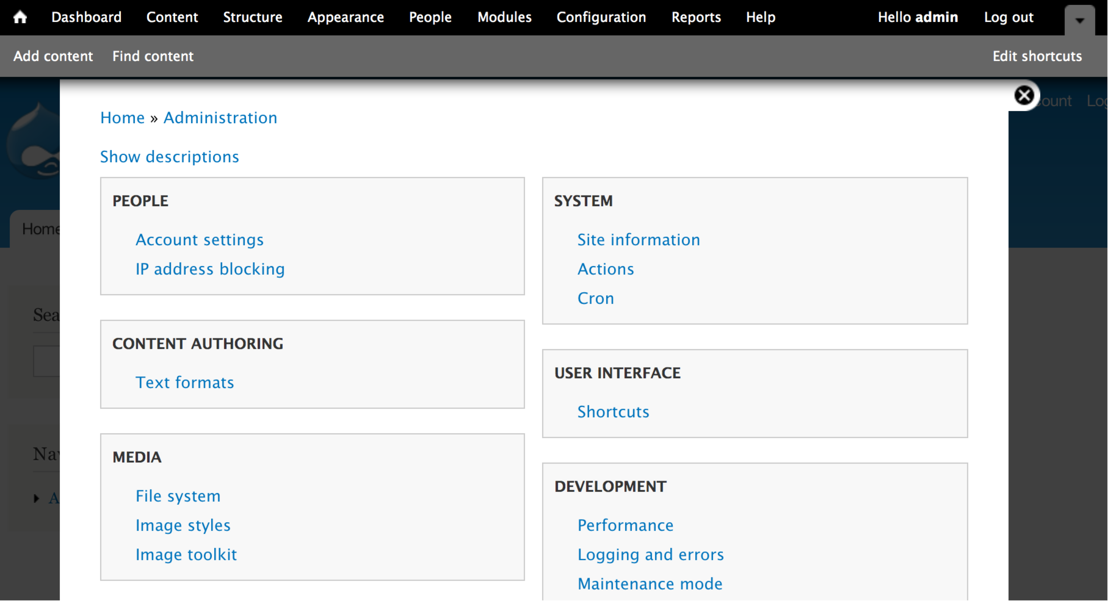
jtwalters commentedHere are some screenshots with the patch from #12
Comment #19
droplet commented@jtwalters,
what's your system ?? your fonts are bigger than mine a lot.
Comment #20
jtwalters commented@droplet this was from a retina macbook pro so I guess the screenshots were dimension doubled. e.g. 200% zoom
Comment #21
mcjim commented#12 looks good to go.
Have tested in IE8/9, FF, Chrome, iOS Simulator.
Comment #22
catchI tested this quickly and it seems fine to me. I'm not 100% about underlining the links on hover as well as the white background, but no-one else brought it up so it might just be me, and it's very minor compared to the rest of the changes in the patch. Committed/pushed to 8.x.
Comment #23
catchActually no, I wrote that comment before I committed/pushed the patch, and it no longer applies.
Comment #24
mcjim commentedRerolled patch.
Comment #25
jtwalters commented#24 applied cleanly to latest 8.x and looks good to go
Comment #26
mcjim commentedComment #27
Bojhan commentedWait, wtf, why are we adding this styling?
Comment #28
mcjim commentedAfter discussion with @bojhan, removed background change on hover.
Comment #29
Bojhan commentedComment #30
ken hawkins commentedJust a quick chime in that it applied well here too and looks like a general usability win.
Comment #31
jtwalters commentedconfirmed #28 applies. looks good to me. i don't really care either way about the background color, since the underline is enough of a hover indicator.
Comment #32
edward_or commentedPatch looks great so far. It does not, however, apply as you would expect to the node/add page (the node add page has its own theme function theme_node_add_list) as the a tag in the node add list does not wrap the description.
This patch changes the markup from seven_node_add_list to match the output of seven_admin_block_content this patch creates.
Comment #33
mcjim commentedWell noticed :-)
It does perhaps raise the question of whether we should have theme_node_add_list() and not use theme_admin_block_content()…
Patch changes vertical tabs on the node/add form to collapsible fieldsets. Was this cross-pollination from another patch?
Comment #34
mcjim commentedRe-rolled to include changes to seven_node_add_list() from #32.
Comment #35
edward_or commentedWell spotted :)
Thanks for fixing that.
Comment #36
h4rrydog commentedLooks good to me.
- Confirmed #34 applies.
- Touch targets have been enlarged as previous.
- Vertical tabs on node/add form remain vertical tabs.
Comment #37
dries commentedMissing spaces around $item['title'].
Also, if 'html' is TRUE, text is no longer sanitized. I think his patch may be introducing a security vulnerability.
Comment #38
mcjim commentedPatch attached corrects missing spaces around
$item['title']$content, which is the first argument forl(), uses$item['title']and$item['description']. These are now both passed throughfilter_xss_admin().Comment #40
moshe weitzman commentedThese lists will be deemphasized by the mobile toolbar but this is still worth doing.
Comment #41
mcjim commented#38: 1488962-38-admin-list.patch queued for re-testing.
Comment #42
Bojhan commentedIn the testing we did so far, these listings are by no means deemphasized. People end up on them all the time, especially in configuration where we have no depth beyond the items.
Comment #43
webchickHm. While we're at it, does this need to be check_plain()ed?
Comment #44
chellman commentedcheck_plain sounds like a good idea to me. Patch re-rolled.
Comment #46
chellman commented#1798732 was reverted, so the test actually succeeded.
Comment #47
Bojhan commentedComment #48
catchLooks sensible. Committed/pushed to 8.x.
Comment #49.0
(not verified) commentedImproving issue description