
 Come together with the global Drupal community in Rotterdam, 28 Sept – 1 Oct 2026. Sessions, contribution, connection, and Early Bird savings until 8 June.
I would like to see a small improvment to the UI.
Currently the UI looks like in the attachement.
the proposed UI will be added in the follow-up.
| Comment | File | Size | Author |
|---|---|---|---|
| #12 | copyright_UI_improvements_1.patch | 3.16 KB | Bèr Kessels |
| #11 | licence_new_situation_v3.png | 13.15 KB | Bèr Kessels |
| #3 | copyright_UI_improvements_0.patch | 2.79 KB | Bèr Kessels |
| #2 | copyright_UI_improvements.patch | 2.7 KB | Bèr Kessels |
| #1 | licence_new_situation.png | 34 KB | Bèr Kessels |

Comments
Comment #1
Bèr Kessels commentedI think this is a much better approach. the next follow-up will contain the patch.
Comment #2
Bèr Kessels commentedthe pacth for the abovementioned UI improvments.
Comment #3
Bèr Kessels commentedoops. forgot a print_r(). this patch should be correct.
Comment #4
sulleleven commentedThe only problem i can see with this is if/when there are several custom licenses added. Maybe should remian, but place it up top where you suggest.... and maybe when each menu item is selected, a layer will appear to the right displaying the link to view license, license logo (if any) and any other pertinent data for the user to see before submission.
Might need a bit of js, however.
thoughts?
Comment #5
sulleleven commentedi wish i could edit my replies. anyway, i mistyped alittle so excuse the seemingly poor grammar.
Comment #6
Bèr Kessels commentedI cannot see the difference with what you propose though.
My solution will foreach trough each licence option, be it custom or default. It will create a () for each licence option. Just like your options in the dropdown.
Or am I misunderstanding your concern?
Comment #7
veridicus commentedI like the look of the new design. My main concern is the list will be too long. There are many licenses. If all types are allowed a user would have public domain, all rights reserved, 3 or 4 CC licenses, 1 or 2 FDL licenses, and maybe others I just don't see often. The admin can add as many as he/she likes. So that's why I made it a drop-down.
As for being at the top instead of below, my assumption is that most node authors will not choose an alternate license most of the time. There will of course be some sites where there are many contributors and each are very strict about licensing, but I would imagine this isn't too common. Personally, as a node author, I like the Title and Description to be as near the top as possible. When I click Create Content/Story I have an idea I'm itching to write down, so the sooner I get it down the better.
What do you think? I always strive for the best UI possible. So I'm open to all ideas.
Comment #8
sulleleven commentedBer, i was trying to convey what veridicus mentioned... too long a list, in some cases. I figured dropdown is safer bet to appease all situations, or it could all go in a new 'copyright' tab ?
Comment #9
Bèr Kessels commenteddropdowns are really considered bad UI. They strive against all UI guidelines, when used for optional chioses.
in the case of optional chioces, a user *must* be able to see all, or at least a part of, those options in a glance.
On OSCOM/ drupalcon I will lead the HIG (hun=man interface guidelines) group. a.o. this select issue will be addressed there. I suggest we be ahead of that, and use a div with overflow (it looks similar to an iframe, but is w3c compliant) containing a list of radio-options.
see attachement for the new proposed UI.
Hell, we might even add some easy JS. do you know menu_otf? it uses JS to hide and show its form. please contact me in private (berkessels at gmx dot net) for a temporary account on a development site where this module is enabled.
btw: even worse UI is a dropdown with default " --- choose licence --- ", just a sidenote.
Comment #10
veridicus commentedInteresting. I hope the outcome of your work will be to eventually document some of the common UI standards we should follow for Drupal.
Div "with overflow" is new to me. If it is what I imagine then it sounds like a good option. I'll look into it to learn more about it. As for JavaScript, I like to have as little as possible because I feel it gets very ugly, but that's just me.
I'll play with a few various methods for these UI improvements as soon as I get a chance. Then I'll come back with a solid suggestion of how I feel we should proceed. Thanks for the variety of ideas.
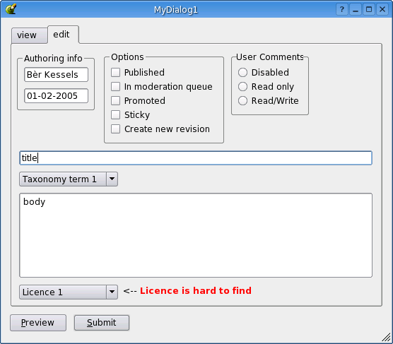
Comment #11
Bèr Kessels commentedhere is a SS of the new proposal
Comment #12
Bèr Kessels commentedand this is patch for that
Comment #13
veridicus commentedOk, I applied the patches (and made the necessary fixes ;) I also added a css file. I'll tweak the css more later. It's all in cvs.
Even showing only 2 lines of licenses it seems to take up too much space. Maybe I should modify my theme to bring radio buttons and check boxes closer together and shrink the margins, but I'm using mosly pushbutton settings, which is a very popular theme. If you get a chance try it with pushbutton and tell me what you think.
I'll consider making the placement of the form an admin option. Then the code can determine whether to generate the form in "pre" or "post".
For the moment it'll only generate links to the full license texts for local urls. I'll adjust that later.
Thank you very much for the patches.
Comment #14
Bèr Kessels commented* I plan to make the form themeable, with the options as argument.
* please do not make the placement admin configurable. there are far too many config options already. It is considerd bad UI to force a user to decide on things he has little clue about. Look at macinstosh: "it just works [tm]". WE, the designers should decide on the best palce and stick to that.
* i think i forgot to patch the css file then, for I made one. Never mind.
Comment #15
veridicus commented* Making the form themeable - Sounds good. Could there be some generic "fieldset" theming so they could set overflow for any sort of options (i.e. something relatively generic for the drupal theme core)? Or are you thinking of a copyright-specific theme function? I would think themability for option groups would be quite useful to everyone.
* Placement - Ok, you're right. I'll play with CSS to see if I'll ever be happy with it at the top of the node form.
* CSS file - Yup, patches don't include new files by default (can they ever?). Once the form is themable will we keep the CSS file in case the theme doesn't do its own formatting? If all (or the core) themes supported our needs our CSS file wouldn't be needed.
Comment #16
Bèr Kessels commentedI had it at the top, but when you have admin rights that pushes the real form, the one its all about, below the fold. Thats a real bad UI. I beleive under the nodeform is the best option.
Comment #17
(not verified) commented