Closed (fixed)
Project:
Drupal core
Component:
user.module
Priority:
Normal
Category:
Task
Assigned:
Reporter:
Created:
25 Jan 2005 at 19:06 UTC
Updated:
8 Feb 2005 at 21:15 UTC
Jump to comment: Most recent file

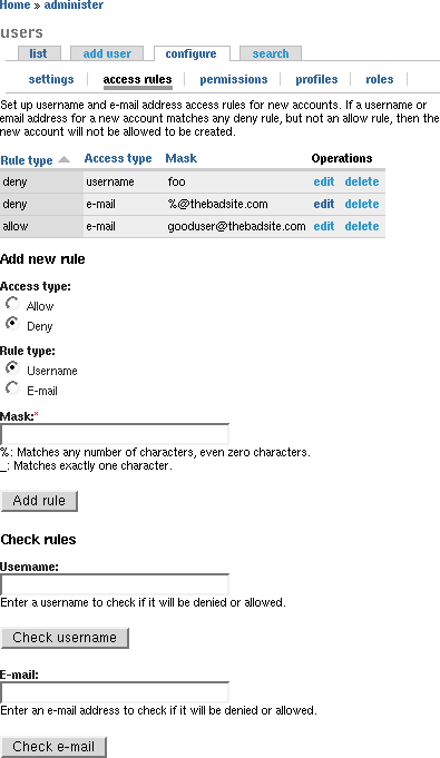
Here is a screenshot.
| Comment | File | Size | Author |
|---|---|---|---|
| #6 | screenshot_1.png | 9.35 KB | drumm |
| #5 | user.module_12.diff | 10.83 KB | drumm |
| #1 | user.module_11.diff | 9.99 KB | drumm |
| screenshot.png | 9.7 KB | drumm |

Comments
Comment #1
drummThis patch implements http://kika.trip.ee/images/drupal_tabs_accessrules-183.png.
Differences from mockup, most are noted in the mockup as something unclear or needing more work:
- The columns are ordered such that when read from left to right they make sense.
- The form is ordered the same way.
- The two radio button groups are not side by side.
- The help text is better.
- There are no nice icons. (The watchdog 'stop' icon is nice, but it has 'watchdog' in the filename. There is nothing green.)
- Used an h3 tag instead of a form group, which is more consistent across Drupal.
- Added the check rules UI at the bottom.
Comment #2
drummSetting status to patch.
Comment #3
dries commentedTres cool!
However, I do think form_group()s might help unclutter the interface. On your screenshot (and on my local test site using Chameleon) it is hard to see where each part of the page starts (and ends). The visual difference between the headers and the form titles are too small to be confortable. I like Kristjan's form_group()s better.
Comment #4
dries commentedBTW, it looks like you switched 'Rule type' and 'Access type' in the overview table.
Comment #5
drummFlipped around the overview table column titles.
Made the fields side-by-side using an extra id, 3 divs, and some drupal.css.
I'm still not sure form_group is right. To be consistwent with the input formats admin it should be h3. And a form group is really for grouping things within a form, not a whole form.
Maybe this page should be moved so it has top level local tasks for these actions. Fitting all three things on one page is a bit much.
Comment #6
drummAnother screenshot.
Comment #7
dries commentedCommitted to HEAD. Thanks.
Comment #8
(not verified) commented