
 Come together with the global Drupal community in Rotterdam, 28 Sept – 1 Oct 2026. Sessions, contribution, connection, and Early Bird savings until 8 June.
Problem/Motivation
Change workflow if user approval is not required.
Existing workflow:
- Register
- Drupal logs in
- Redirects to front page, "Registration successful" message displayed.
Proposed resolution
Add a new splash page to the user entity, instructing the user how to use his account on the site.
Proposed workflow:
- Register
- Drupal logs in
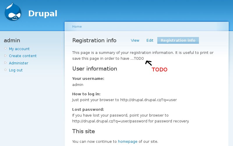
- Redirect to "Registration info" page. (Screenshot)
Registration info and Activation email should be very similar. Therefore when activating account via email, this email stands as a "registration info" (but links to it also), when logging in directly, registration page is printed.
This page allows user to have static information about his account, he can save/print it.
User interface changes
Add a new splash page to the user entity, instructing the user how to use his account on the site:
See screenshot:

The page would include information such as:
- Your username
- the url where to login
- the url to go for password recovery
Original report by meba
Based on discussion with Marek Prokop, czech usability expert, i would like to propose enhancement for D6, which will allow user to display registration information on special page. This is not API or DB change.
Current workflow is:
If approval is not required -> Register -> Drupal automatically logs in -> Redirect to home page -> Display message "Registration succesful" (See http://drupal.org/node/161496)
If approval is required -> Register -> Wait for email -> Log in or reset password
Workflow after this patch should be:
If approval is not required -> Register -> Drupal automatically logs in -> Redirect to user/UID/registration-info (See screenshot: http://www.drupal.cz/files/registration-info.jpg)
If approval is required -> Register -> Wait for email -> Log in or reset password -> Redirect to current destination -> Set message "You may want to see registration info..." if first login
Registration info and Activation email should be very similar. Therefore when activating account via email, this email stands as a "registration info" (but links to it also), when logging in directly, registration page is printed.
This page allows user to have static information about his account, he can save/print it.
| Comment | File | Size | Author |
|---|---|---|---|
| #18 | registration-info.jpeg | 45.37 KB | dpi |
| #8 | registration.png | 25.45 KB | meba |
| #8 | user_registration_info.patch | 3.05 KB | meba |
| #5 | user_89.patch | 9.56 KB | meba |
| #3 | user_88.patch | 9.29 KB | meba |

Comments
Comment #1
gábor hojtsyIMHO this is a good idea, but as with other tabs, we should think about a shorter title for it.
Comment #2
meba commentedJust a note: URL user/UID/registration-info is unique which allows to track registrations using Google analytics, etc.. (If you have email approvals turned off).
Comment #3
meba commentedAttaching a first version of the patch. Still needs to think about shorter title (I have no idea).
Comment #4
cellane commentedNot applied against HEAD (Hunk #3 FAILED at 1532), but after „manual patching“ works correctly.
Comment #5
meba commentedRerolling against HEAD
Comment #6
catchNo longer applies.
Comment #7
catchComment #8
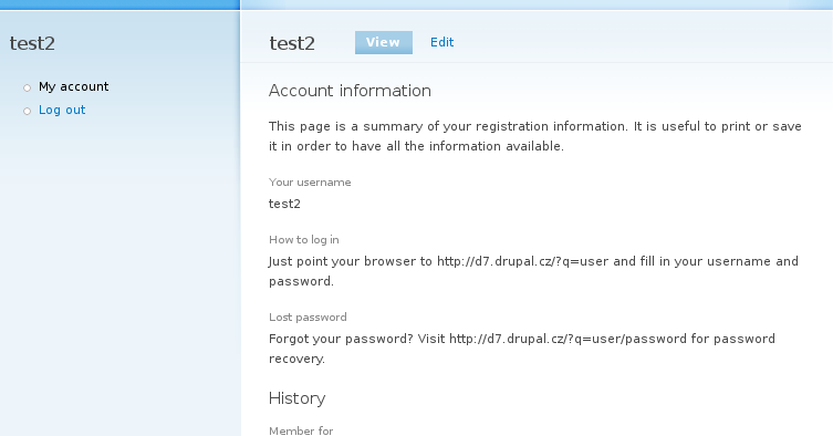
meba commentedMuch simplified and rerolled against HEAD (Bumping to 7.x).
I used new a approach and displayed registration information directly on user account page. This page is too lightweight now I think, displaying "History: Member for..." is just useless.
Workflow hasn't changed now.
See screenshot: http://drupal.org/files/registration.png
Comment #9
meba commentedComment #10
lilou commentedPatch no longer applied.
I prefer tab solution : http://www.drupal.cz/files/registration-info.jpg
Comment #11
sutharsan commentedMoving all usability issues to Drupal - component usability.
Comment #12
meba commentedComment #13
yoroy commentedI much prefer http://drupal.org/files/issues/registration.png over the extra tab.
What I see added is only a few bits of text that should fit nicely on the (rather empty by default) "my account" page.
- The "This page is a summary of…" text is unneccessary, the info speaks for itself. Ommit needless words.
- repeating the username in the body of the page looks good. Just having it as the page title like we do now, it's not very clear that that actually is the user name.
- The how to login and lost password text, isn't that "Help"? The long explanation for this might move into the new help system if you really want to tell the story of it, otherwise, you could say this with fewer words, and without headings for each:
- The redirect to the account page instead of the homepage makes sense to me.
- But do we really need a permanent link to the homepage here? Maybe once as a status message is enough, if at all?
Comment #14
Tor Arne Thune commentedStill a valid issue.
Comment #15
jhedstromComment #18
dpiReformatted issue summary into issue template.
Comment #19
dpiI dont think I've ever seen such a page on the internet. This info is best kept in a welcome email. Or the user can just attempt to login, he will be prompted with lost password anyway.
This doesnt need to be in core, it can easily be solved by a redirect after login and a new route.
Marking as wontfix