

Closed (fixed)
Project:
Commerce Kickstart
Version:
7.x-2.x-dev
Component:
User interface
Priority:
Critical
Category:
Feature request
Assigned:
Reporter:
Created:
9 Jul 2012 at 11:03 UTC
Updated:
14 Aug 2012 at 10:21 UTC
Jump to comment: Most recent file



Comments
Comment #1
guguss commentedComment #2
guguss commentedoups... wrong issue ^^
Comment #3
hazaCould you please provide us more info about that ?
What do you really want to be displayed on the splash screen ? Do you still want an accordion ? Do you have the text ? It should be 100% the same as the first section of the current getting started ?
Comment #4
guguss commentedLet's remove the accordion on the "first steps" page and display each step as a static block. Then add a link to access the Getting Started from here. The Getting Started link from the admin menu remains the same.
Comment #5
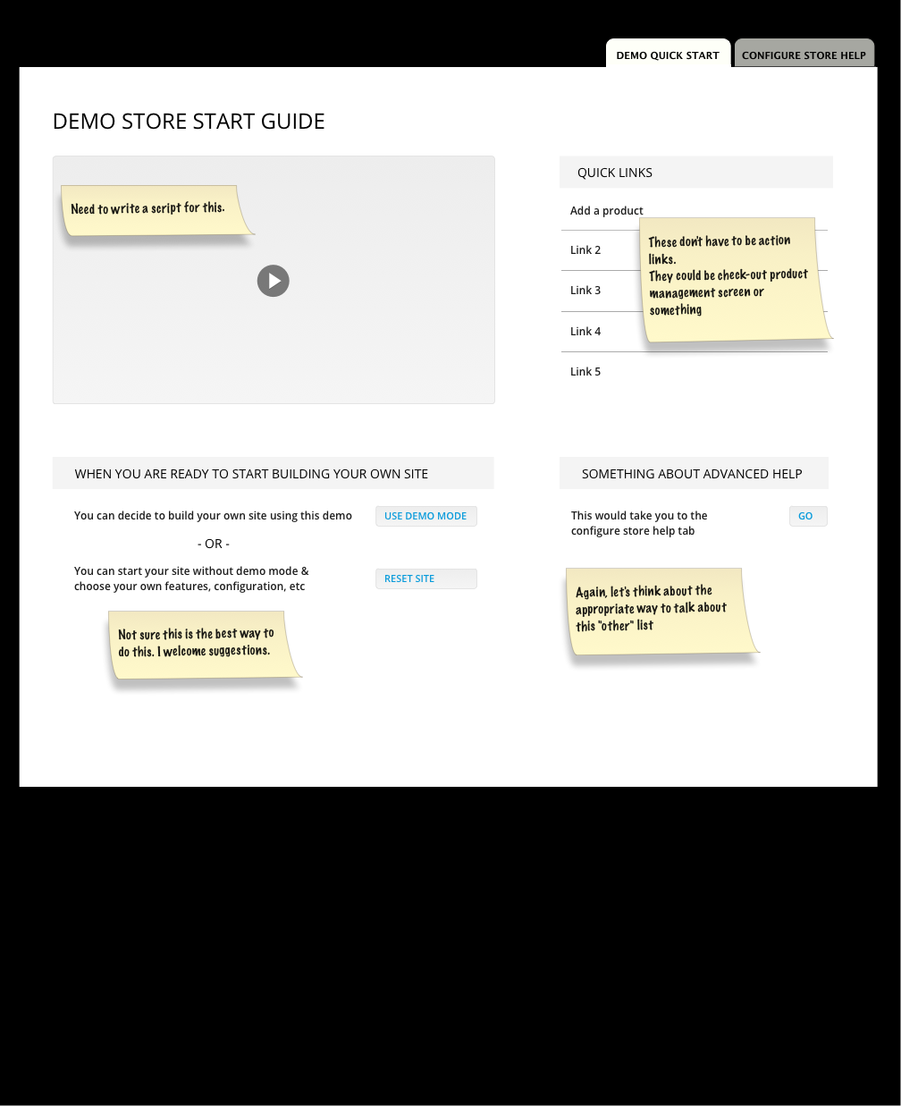
joshmillerThe mockup below is Allison's redesigned version after our discussion a few days ago.
It includes:
I am currently working through some of the content including a more detailed run down of what we are building for the videos and what should be listed in the links.
Comment #6
joshmillerI've sent @aleighs a 3 page outline for this page that includes more detailed look at the content we can put in here. Additionally, I am starting in on scripts for videos that are roughly organized this way:
Comment #7
joshmiller--duplicate post--
Comment #8
hazaThe "problem" if we add videos here is that
- if the video is hosted on vimeo/youtube/, you need to have a internet access to see that.
- if we ship the video in kickstart, people will have to download 200Mb to get kickstart...
Comment #9
joshmillerHaza - Agreed. Maybe we can provide a simple fallback with a note that says "Sorry, we can't load our hosted videos. Use this quick link to see the Getting Started videos on a live connection."
Comment #10
theo_ commentedI am just wondering what is the action under "Use demo mode" button ?
Comment #11
guguss commentedThe "use demo mode" will disable the demo module to keep the current site as it is.
The "reset site" will redirect to the page where the user can effectively reset the site (ie : restart a fresh install)
Comment #12
guguss commentedThe links on the admin menu bar should be like this :
Getting Started (mouse hover dropdown that will open the following links)
-- Introduction (link : first tab of the getting started)
-- Kickstart Advanced Help (link : second tab of the getting started)
-- Reset your Demo Site (link : admin/demo)
From josh: "I'm going to write a first draft of the content that we will display on the "kill me" page. Until we've nailed down exactly what this function does, I'm going to simply write a paragraph/warning to the user to make sure they know the consequences. Email will be sent with link to a google doc."
(from that post : http://drupal.org/node/1673550#comment-6247818)
Comment #13
joshmillerNote: The "Getting Started" page is now a "section" with three pages. One of those pages is the "Reset Site" page and the comment below is in regards to that page.
Follow-up on @GuGuss's note. I've sent an email to GuGuss and aleighs for feedback on new text for the "Reset Site" page. Below is the current "Reset Site" page.
Comment #15
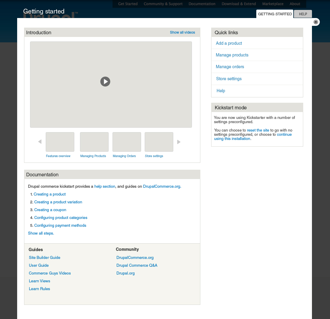
Bojhan commentedI have just done a first pass over the design, I am not entirely happy with everything yet but given the deadline of tomorrow I wanted to get this out asap.
I decided to add documentation links and links to the configure store help/kickstarter tips section in one block. I feel it makes sense to group these links, and to expand to more than just links to the other help. Primarily because people will be using this as their jumping board, providing two places to go to seek for help is confusing. That's also why I labeled it "Getting started" and "Help", if they are too similar or to vague on their purpose it might cause confusion.
I have decreased the visual prominence of reset/continue using this site. Although this could still use some work, I felt its important to move away from attention-grabbing items like a button to something less prominent like a link.
I have tried to keep it simple and clean. I look forward to any feedback, I should have time to incorporate it tomorrow.
* Creating a coupon should be Creating a discount.
* The text for Kickstart mode block text needs some work, it should give the impression that reset makes your site naked with no content.
Comment #16
guguss commentedThat's perfect for Alpha 3 !
We'll embed the vimeo channel.
Comment #17
joshmillerMuch improved! I do wish we could do something with our big white open space on the bottom right...
Would you be adverse to moving the "guides" and "community" blocks to the right sidebar?
Josh
Comment #18
bojanz commentedMerged the current version prior to tagging alpha3.
Let's continue polishing this.
Comment #19
dudenhofer commentedAdded some style fixes here: https://code.drupalcommerce.org/#/c/203/
This includes fixing the yellow box issue, the menu dropdown being cut off, and adds the styles back to the tipsy tooltips.
Comment #20
bojanz commentedI've merged the style fixes.
Comment #21
guguss commentedWe're good for now with that screen.
Some more polishing will happen to the other screen : #1702490: Advanced Help