Reviewed & tested by the community
Project:
Layout
Version:
7.x-1.x-dev
Component:
User interface
Priority:
Major
Category:
Bug report
Assigned:
Issue tags:
Reporter:
Created:
10 Aug 2012 at 10:49 UTC
Updated:
20 Aug 2012 at 21:40 UTC


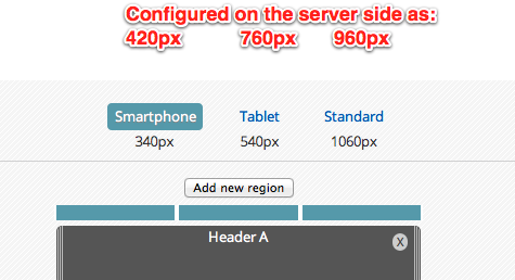
The steps are provided to the editor, the names are properly displayed but the pixel values have no relation to the server configured values:

| Comment | File | Size | Author |
|---|---|---|---|
| StepWidth.png | 34.18 KB | gábor hojtsy |

Comments
Comment #1
jessebeach commentedSo, this ended up being an issue of how the breakpoints are defined. The breakpoint definition of the smallest, default step (what many people call mobile), is zero, not 320px or whatever it's upper bound is. The responsive design approach would dicate that the basic step starts at zero and applies to any size screen to infinity. By declaring a breakpoint along that infinite ray, we define the upper bound of the first step -- zero to the breakpoint. Now we have two steps. and the second step starts at the breakpoint and continues to infinity. Ideally, the last breakpoint in a progression should not have an upper bound.
In our case, all of our breakpoints defined upper bounds, not lower bounds. So the calculation of the step size was off, even though the algorithm to describe the sizes was correct.
I've fixed this issue in a branch that will be incorporated into 7.x-1.x shortly.
http://drupalcode.org/project/layout.git/commitdiff/8e1fcb35f47cdd4b2b7f...
Comment #2
gábor hojtsyMore correctly explained, our steps explained points in-between, not upper or lower bounds per say. So the lowest step was the upper bound for the first step, the highest step was the lower bound for the last step towards infinity. The breakpoints were really just the points inbetween and the system computed the ranges based on the interim points.
The committed change makes the steps define the lower bound at all times.
Comment #3
webchickJesse and I had a quick whiteboard session today, which resulted in this as a suggestion:
Changes would be:
#1: Remove the default "Standard" size breakpoint, since anything above Tablet size is standard.
#2: Expose the user-defined sizes for these sizes on the front-end, and make those the things you click on to change the view. The px/em sizes just are there are visual guidelines.
#3: Add a Desktop (or Standard or whatever) size that's always there at the end (basically representing "infinity").
#4: Change the terminology "breakpoint" to "responsive step" in the backend.
Comment #4
mustanggb commented+1 on not having to define the standard/default to infinity breakpoint.
Not sure why the suggestion to change the terminology though, breakpoint seems more of a standardised way to refer to media query "boundaries".
Comment #5
jessebeach commented@akamustang, totally agree. The term breakpoint refers to the boundary. The term step refers to the distance between the boundaries. So, given a ray that stretches from zero to infinity, we have zero breakpoints and one step. This step is the default step that all layouts have. We'll call it mobile.
0 ------- (mobile) ----------------------------------------------------------------- ∞
If we introduce one breakpoint, we then have two steps.
0 ------- (mobile) -------------| 320px |------------- (tablet) --------------------------------------- ∞
And so on.
0 ------- (mobile) -------------| 320px |------------- (tablet) -------------| 760px |------------- (desktop) ------------- ∞
We always have one more step than breakpoints because we started with one step and zero breakpoints. So when a user defines a boundary (a breakpoint) they're really describing a new step. The breakpoint describes the lower bound of this step.
Comment #6
mustanggb commentedMakes sense, thanks for clarifying.
Comment #7
jessebeach commentedComment #8
tkoleary commentedI have updated the designs to match Angie and Jesse's idea.