Hi!
I've noticed a nasty but easily fixed bug in Fusion default configuration. It happens on my multi-monitor setup.
Steps to reproduce the bug:
- Enable the responsive mode of your Fusion subtheme.
-
Browse the website using a computer that has a screen less than 1200px wide:
- Find an old 1024px-wide monitor and attach it to your computer as a secondary monitor.
- Configure a widescreen monitor to rotate 90° so that it's horizontal width is less than 1200px.
- Use a cheap netbook.
What should happen
The website should scale correctly. It should not go to mobile mode (with all regions stacked vertically) unless browser window is less than 768px wide.
What actually happens
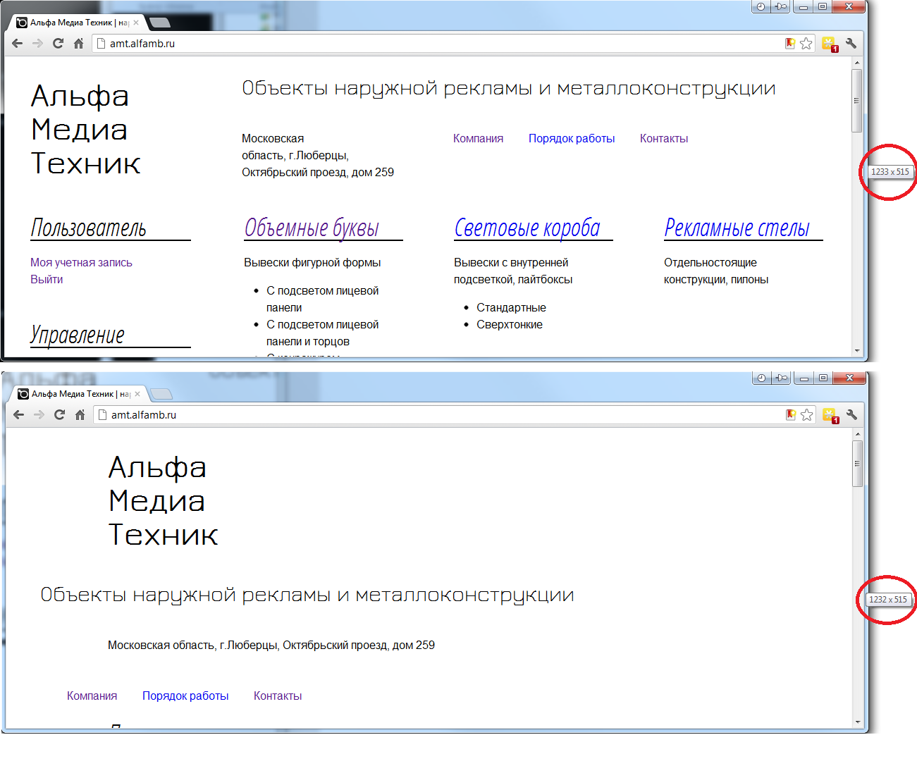
The website goes to mobile mode unless browser's width is greater than 1200px (actually, 1232px... scrollbar and window borders maybe?).
The 768px and 960px modes are completely unavailable!
See the attached proofpic.
Suggested fix
I've examined the portrait media queries and discovered, that removing the and (min-device-width: 1100px) portion resolves the issue. Now my website scales to 768px and 960px fine even when i've got a narrow monitor attached.


Comments
Comment #1
lolmaus commentedPS Windows 7, Chrome and Opera
Comment #2
Poieo commentedThe min-device-width is intentional. The goal of these media queries is not to support outdated monitors, but rather to support modern mobile devices.