I noticed today that when I have submitted a form that has an error the item gets special css treatment (generally making it red) and is highlighted on the page.
However, I still have to click on that form element to get to fix it.
It would be nice if the focus were set to the first form element which is in error so that it can be quickly edited. If multiple elements are in error, I think the first one is the best place to set the focus.
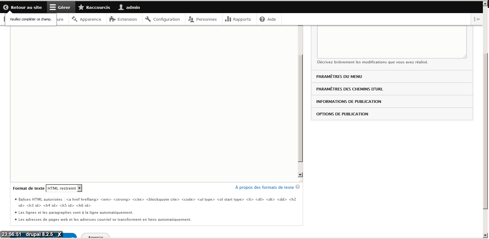
This issue is present also in D8, exactly when adding media image, the scroll does not make first input in error in focus.


Comments
Comment #1
bradlis7 commentedA simple jquery call would be simple.
Comment #2
gregglesLet's see what the accessibility folks say about this.
Comment #3
Everett Zufelt commented#447816: WCAG violation: Relying on a color by itself to indicate a field validation error
Comment #4
mgiffordEverett, I don't think that link refers to the resolution being discussed. I suspect that there's now an icon there as well as the red message that @greggles was describing. However, it's about setting the focus that a user would automatically start typing into the field that contains the error.
@greggles I think this would be fine from an accessibility standpoint. Might have some usability issues, but changing focus as @bradlis7 suggested (in 2007!) should be just fine as far as I am aware.
Comment #5
Everett Zufelt commentedI'm not certain that tit is necessarily the best practice to set focus on the ffirst field with an error. This would not necessarily be expected behavior and could confuse some users, perhaps some screen-reader users, who now have to do more work to build up context for where they are on the page.
I'm not saying that we shouldn't do this, just that it needs to be discussed further to make sure that it is in the best interest of all users.
Comment #6
mgiffordLet's put this off for D8 then.
Comment #7
bowersox commentedWould setting focus cause browsers to scroll down to that point to bring the field on-screen? On long forms this could cause the toolbar and status/error messages to be off-screen.
I believe that setting focus mid-page would also cause screen-readers to start reading at the point where focus is. Is that correct?
For D8 I would like each form field with an error to have a link in the error message that jumps down to that field. We got that done for required fields for D7, but not for all other field errors. FAPI needs to change to support that.
Comment #8
Everett Zufelt commented@Brandon
This would cause screen-readers to focus on the field on page load.
Pretty much against this since it is not expected behavior and will cause problems for some users.
Should anyone feel strongly about putting this in Core (it can be added in contrib) please re-open with rationale.
Comment #9
nasser_Comment #16
pameeela commentedHmm, this was closed by @Everett Zufelt in 2011, and only reopened in 2017 without any comment. I think that this has been superseded by a number of other issues discussing form validation including #1797438: HTML5 validation is preventing form submit and not fully accessible, and since this hasn't had any further discussion I'm going to close it again.