
Closed (fixed)
Project:
Drupal core
Version:
8.0.x-dev
Component:
views.module
Priority:
Critical
Category:
Bug report
Assigned:
Unassigned
Issue tags:
Reporter:
Created:
8 Oct 2012 at 02:28 UTC
Updated:
29 Jul 2014 at 21:17 UTC
Jump to comment: Most recent, Most recent file

Comments
Comment #1
xjmComment #1.0
xjmUpdated issue summary.
Comment #1.1
xjmUpdated issue summary.
Comment #2
xjmComment #2.0
xjmUpdated issue summary.
Comment #3
xjmComment #4
Bojhan commentedThis needs to specify which color contrast ratio we are validating against. The gate doesn't seem to specify.
Comment #5
xjm@Bojhan, see "More info about color and contrast," linked above, and right here: http://drupal.org/node/464500
Comment #6
xjmWeird untagging?
Comment #7
Everett Zufelt commentedAs a rule of thumb Drupal targets WCAG 2.0 AA. Updating gate page.
Edit: Someone else can feel free to update the appropriate documentation, I don't have time this morning and the task will get lost :)
Comment #8
Bojhan commented@Everett Thanks, now people should be able to do a full review. I have adjusted all appropriate documentation.
Comment #9
mgiffordSome other good tools to make this easier:
Comment #10
Bojhan commentedSo this will be the first critical, to hit the core queue. I have not done a full review, but upon start, I did notice that the views main landing page does not have sufficient contrast and uses color as the only way to communicate meaning.
Foreground color: #999999
Background color: #f3f4ee
Contrast Ratio: 2.6:1
WCAG AA: Fail
WCAG AAA: Fail
Comment #11
tim.plunkett#1802678: [META] Views: accessibility review is one critical to cover all of the sub issues. Otherwise thresholds will be completely destroyed :)
Comment #12
Everett Zufelt commentedSetting back to critical as per #1805996-41: [META] Views in Drupal Core.
Comment #13
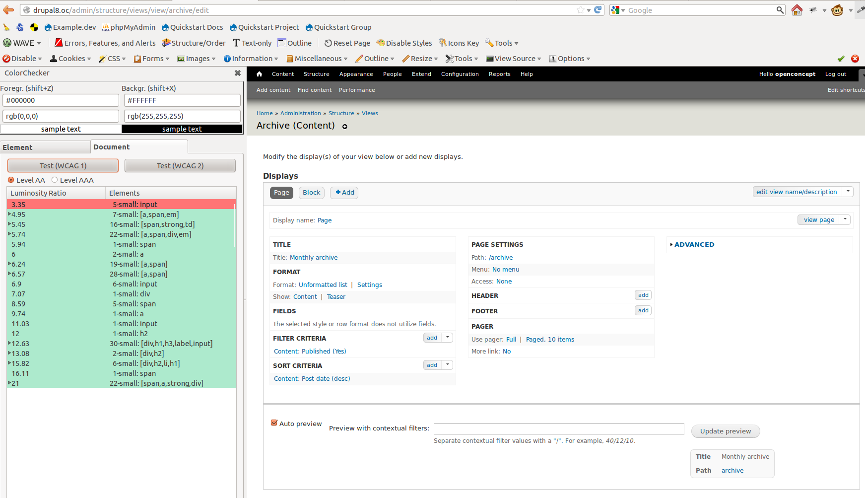
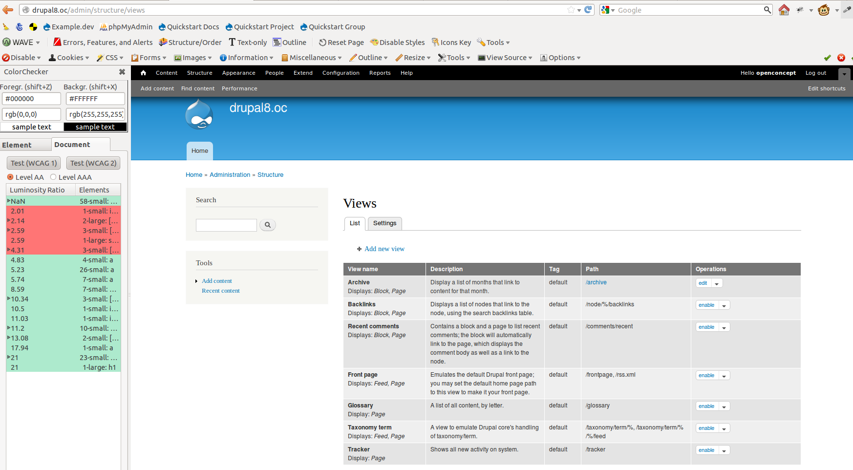
Anonymous (not verified) commentedAt present I don't have a a test environment in 8, but if anyone has a development box where I can login I'd be happy to check against 8 as well (as well as help with some of the other accessibility issues in the cue). I couldn't find information on which admin theme will be used in 8. Has a definite been set yet? So if someone can bring me up to speed I'd be grateful. Just to kick things off here is a test of 7 with the admin theme Seven (as benchmark) as well as address the issues in #10:
Main landing page
From what I can tell with testing with the Niquelao's Mozilla extension recommended in #9 the main view in views passes on the active divs, but fails on the disabled divs.
My recommendation would be to keep the same color scheme as is Seven for Drupal 7 in Drupal 8, but instead of greying out the colors have a Enabled and Disabled section with the same colors. This could also tie in with making navigating accessible, as well as address the issue in #10 with only being able to navigate through color.
Split the views landing page in enabled and disabled keeping the same color scheme for both
Enabled Views
View 1
View 2
Disabled Views
View 3
View 4
Further test results for the main landing page
Passes, except for:
Add new view
Passes, except for:
Add view from template
Passes, except for:
Import
Passes, except for:
View itself
Passes, except for:
Please note that I don't know if there can variations in data or output that need to be tested? Maybe it's good to have some common use cases, we can test against.
Views Settings Basic
Passes, except for:
Views Settings Advanced
Passes, except for:
Please note though:
In general there is a pattern of small:options failing, usually there is only one of these per tested page, but I can't see in the tool where those are. Does anyone have an idea where I should be looking for those?
Because it would save me some time tracking those down in Firebug.
The other question I have is why not use the the same color scheme of the admin theme in 8, and make sure this is WCAG compliant, and that all modules take over the css? Wouldn't that save a lot of work?
It's advisable to check these results, as I don't know how good the Niquelao's Mozilla extension is, it is a first round, and I may have accidentally overlooked something. It could be handy to save the views section pages as html pages, so that we can run these through different tools, as well as check them manually (this goes for heading structure, etc, as well.) If we could post those, than people don't need to git 8. It could help testing.
Comment #14
xjmThanks @Bojhan, @Everett Zufelt, and @DesignDolphin. I think we need to now reclassify this as a critical bug, unfortunately.
Comment #15
xjmComment #16
xjmWe have a couple core mentoring participants looking at this issue this week.
Comment #17
ramkumarr commentedI reviewed the views UI Screens(Admin Listing Page, Views Add/Edit Page, Edit Popups) in Seven 8.0-dev (admin theme), using the tool Contrast-A
Views Admin Listing Page
Background color: #FFFFFF
WCAG AA: Pass
WCAG AAA: Pass
Background color: #FFFFFF
WCAG AA: Fail
WCAG AAA: Fail
Background color: #F3F4EE
WCAG AA: Fail
WCAG AAA: Fail
Background color: #F3F4EE
WCAG AA: Fail
WCAG AAA: Fail
Add/Edit page
Background color: #666666
WCAG AA: Pass
WCAG AAA: Fail
Background color: #666666
WCAG AA: Fail
WCAG AAA: Fail
Background color: #FFFFFF
WCAG AA: Pass
WCAG AAA: Pass
Background color: #FFFFFF
WCAG AA: Pass
WCAG AAA: Fail
Background color: #FFFFFF
WCAG AA: Pass
WCAG AAA: Fail
Background color: #E7E7E7
WCAG AA: Fail
WCAG AAA: Fail
Edit Popup Screen
Background color: #F3F4EE
WCAG AA: Pass
WCAG AAA: Pass
Background color: #FFFFFF
WCAG AA: Pass
WCAG AAA: Pass
Background color: #FFFFFF
WCAG AA: Pass
WCAG AAA: Fail
Comment #18
Bojhan commentedReally surprised to see the dropbutton background is not valid. What is the minimum gray background on our current blue link foreground, we can have that validates?
Comment #19
Bojhan commentedComment #20
tim.plunkettThe core gates say we only need to meet WCAG AA, so about four of those above are Pass, not Fail.
Comment #21
iflista commentedI'd like to help with testing if still needed, but I'm not sure what I have to do.
Comment #22
webchickLooking at Priority levels of issues, can someone clarify whether this lack of contrast renders the system completely broken and not usable at all (critical) or merely makes it difficult to use (major/normal)?
Comment #23
webchickFor now, demoting to major until we get an answer to that question.
Comment #24
Bojhan commentedIt has a relatively two simple reasons;
1) It is a hard gate requirement, we resolved (as far I know) all WCAG contrast compliance's in D7 so this would be regression.
2) It satisfies the critical requirement, that it has such an impact on legibility that people with certain deficiencies will not be able to read the text. We cannot show this, because as far I know deficiencies beyond just color are hard to simulate thus no tool does it accurately.
From the WCAG guide, http://www.w3.org/TR/UNDERSTANDING-WCAG20/visual-audio-contrast-contrast... :
So it is not possible to use for a portion of our userbase. I don't really dare to change statuses anymore, so feel free to mark this whatever you guys want.
Comment #25
mgiffordI don't really want to get into a discussion about priorities here either. Ultimately i want to see Views (and all of Drupal 8) meet WCAG 2.0 AA.
I think there are about 5 places that the CSS would need to change. This should be a relatively trivial to do given that @ramkumarr has done such a great job identifying where the interface fails due to Contrast-A.
Ultimately if we're building D8 for mobile, then AA is really got to be the minimum. More than ever folks are going to be administering Drupal from their mobile devices & heck, maybe from the beach on a nice day. Ensuring there is sufficient contrast helps everyone.
Comment #26
tim.plunkettEither I or someone at the VDC sprint will work on getting us to WCAG AA.
Comment #27
catchBojhan's summary of why this is critical looks reasonable to me.
Comment #28
dead_armPostponed on #1826574: Move Views theme-specific CSS to their respective themes, since some of Views color styling is overriding the themes', and once refactored may resolve this issue.
Comment #29
yoroy commented#1826574: Move Views theme-specific CSS to their respective themes is committed so back to active here
Comment #30
mgiffordGreat, how's this work for folks. Believe it addresses all of the WCAG 2.0AA points.
Edit: Some of the changes are with Dropbutton and are made in Bartik & Seven.
Comment #31
dawehnerThank you for working on that!
I guess someone should post a report again, so it's sure that the patch fixes it.
Comment #32
tim.plunkettCan we see that in action? Before/after
Comment #33
tim.plunkettThat patch is not rolled against HEAD, it was blocked until #29 for a reason :) All of those files are gone now.
Comment #34
dead_armGrayed out styling of disabled views on /admin/structure/views. Views display tabs on the views /edit page are in progress.
Before
After
Comment #35
dcmouyard commentedI would prefer if we shoot for AAA for color contrast. Not only does it help those with vision problems, but also mobile users who happen to be outside.
Comment #36
aspilicious commentedHmmm I'm not a fan of the proposed solution...
Comment #37
mgiffordI wanted to get a patch started so we could get this issue rolling. It really shouldn't be a hard fix. For the most part it's a matter of emulating what's already done in core.
Dropbutton has some bad colour contrast, so does Views. Core (prior to Views) may still have had some areas that weren't WCAG 2.0 AA. Can't recall off hand.
@dcmouyard tonnes of good reasons to shoot for AAA - let's see if we can make it happen. But let's make sure we get AA first.
@aspilicious - please give details or improved patches. The after patches don't look like what I saw locally, but then again, apparently "patch is not rolled against HEAD"... Gotta look into that.
Comment #38
aspilicious commentedI mean just visually based on the screenshot. I know we want to improve the contrast but if it's possible we should keep it "prety" at the same time. No clue how to improve it I think it's a metter of trial and error untill you find the "best" combination.
Comment #39
xjmWell, #30 needs to be rerolled against HEAD (some of the CSS has been moved into the respective themes) and then combined with #34. For what it's worth, I think #34 looks great if it has an acceptable ratio.
Comment #40
yoroy commentedI think it would be better to seperate active and inactive views out into their own tables. Would gives the 'empty pattern' in the blank slate situation. The proposed solution puts visual attention to the disabled ones, it's visually very heavy. Splitting into two tables would allow us to *not* having to use color to indicate status.
Comment #41
tim.plunkett@yoroy, it's funny you should mention that approach. We spent at least a half an hour debating if the UX maintainers would think that it was a good idea, but it was the same one we came up with :)
However, that should be it's own issue, and is completely unrelated to color contrast. So, I've opened a follow-up issue: #1830822: Split the Views UI listing into two tables for enabled and disabled
This issue should focus on meeting the color contrast standards of WCAG AA.
Comment #42
yoroy commentedsplitting is indeed another issue. It does help us here in removing the contrast bug without having to express state.
Comment #43
mgiffordThis should work better. With this patch Views color contrast will be better than Bartik's.
I'll open a follow-up post about Bartik.This was using the Mozzilla Plugin ColorChecker which gives a nice summary.Edit: The main issue I ran into with Bartik was with the header and depending on where it is in the background gradient it does or does not meet WCAG 2.0 AA. At the bottom of the font it doesn't, but it does around the middle. The validator went by the base color.
Comment #44
tim.plunkettThis looks wrong :)
This is unrelated to the issue and should be removed.
Comment #45
dcmouyard commentedFound some invalid CSS in views-admin.contextual.css:
I'll continue checking the color contrast ratios.
By the way, my favorite color contrast tool is http://leaverou.github.com/contrast-ratio/
Comment #46
mgiffordI'll change the border-radius issue for sure.
But isn't shortening (and for that matter making the upper/lower case formatting consistent) of the CSS a good thing. I didn't need to include it but it was bothering me and doesn't affect the design.
Can only help performance.
Comment #47
tim.plunkettNope. Just a coding style, which is not part of this issue. That's called scope creep, or patch context switching
Comment #48
dcmouyard commentedSome the color contrast changes go beyond AAA contrast. I'll work on a patch that has the least color contrast that still passes AAA.
Personally, I think cleaning up CSS to match Drupal Coding standards should happen whenever we touch a style sheet.
Comment #49
tim.plunkett#48, this issue is only about meeting WCAG AA.
Cleaning up any specific lines you touch is fine, but not any random part of the file.
Also, this issue is still assigned to @dead_arm, and I think she has a patch she was working on.
Comment #50
dcmouyard commentedOkay, then is there an issue for cleaning up Views UI CSS?
Also, there are some color contrast issues due to the Seven theme that aren't Views specific. Should those be fixed in this issue if they're visible within View UI? Or is there a separate issue for making Seven have sufficient color contrast?
Comment #51
tim.plunkettNo, you can open one for post-feature freeze if you'd like.
No, since that's a pre-existing problem, that shouldn't be grouped into this issue.
Comment #52
dcmouyard commentedThis patch fixes color contrast issues that are in Views only. It does not address other color contrast issues that are already in Seven or Bartik, even though they're visible on some Views UI pages.
I'll be posting screenshots later.
Comment #53
dead_armCross-linking #1830822: Split the Views UI listing into two tables for enabled and disabled
Comment #54
dcmouyard commentedViews Table
Seven Before & After
Bartik Before & After
Views Edit Page
Seven Before & After
Bartik Before & After
Views Dialog Popup
Seven Before & After
Bartik Before & After
Comment #55
xjmRelated: #1830822: Split the Views UI listing into two tables for enabled and disabled
Comment #55.0
xjmUpdated issue summary.
Comment #56
mgiffordWe've now got lots of good screenshots of the patch. We just need someone to mark this RTBC? Need a usability review? Looks like we're almost there.
In looking at the CSS I did wonder about:
Is adding the bottom border going to have a UI change?
Comment #57
tim.plunkettWe should not be removing the zebra striping or changing the background colors at all on the views listing page. Just removing the greyed out text color is enough.
Comment #58
dcmouyard commentedNo, it just helps visually separate the disabled views.
Comment #59
dcmouyard commentedI think having a different background helps differentiate between enabled & disabled views.
I wouldn't be opposed to reverting back to zebra striping on disabled views in #1830822: Split the Views UI listing into two tables for enabled and disabled.
Comment #60
tim.plunkett@dcmouyard This issue is about color contrast. That change is unrelated to color contrast. All it does is complicate that other issue.
Comment #61
yoroy commentedAgreed with Tim. This is a critical, lets be strict about the scope and *only* fix the issue at hand.
Comment #62
dead_armAttached patch removes the greyed out background I added in #34, and the original greyed out text because with #1830822: Split the Views UI listing into two tables for enabled and disabled a separate table with black text provides enough contrast.
Screenshots are attached with contrast changes that use Seven's colors on the views edit display tabs and header. I removed the change to the views-admin.contextual.css because the context in preview feature is currently not usable and contrast will be handled if necessary at that time.
Comment #63
xjmThis seems like a good strategy to me, since we are adding a semantic, more usable and accessible way of differentiating disabled views in the other issue. I'd be in favor of committing #62 and opening followups for any remaining issues that are not views-specific. (See #13 and #17 for the followups).
Comment #64
aspilicious commented+1 for me. I disliked the grey background. I'm happy with this.
Comment #65
Bojhan commentedI gave this a visual review, seems like its far more consistent with Seven now. That's great! There are a few places, where we could tweak the other colors, but frankly that's much better to do in tiny follow ups and not accessibility related.
Lets get this critical out of the way and commit it.
Comment #66
dcmouyard commentedThe patch in #62 doesn't address color contrast issues in views-admin.contextual.css or Bartik. It also misses some issues in Seven, particularly link colors.
Several of the CSS changes don't match Drupal CSS coding standards.
Also, some of the color changes have nothing to do with color contrast, but they do make it more consistent with Seven.
Comment #67
dcmouyard commentedThis patch is based on #52. It removes the disabled views styling (color and gray background) and incorporates some of the design changes in patch #62.
Comment #68
tim.plunkettNote to committers: The patch in #62 is RTBC.
@dcmouyard, please take a screenshot of how your changes to views-admin.contextual.css appear. Because they currently don't violate color contrast.
Comment #69
dcmouyard commentedTake a look at this CSS:
That gives us a color contrast ratio of only 3.9 whenever you hover over that link, which doesn't pass WCAG AA.
Using #c9edff for the link color makes it pass.
Comment #70
dead_armRe-rolled patch from #62 to follow Drupal coding standards for color hex values and removed extra lines added. Leaving RTBC as no other changes were made.
Comment #71
tim.plunkett@dcmouyard you clearly did not test those changes, because it is physically impossible to do so: #1837982: Contextual links within the Views UI preview are broken
We have an RTBC and finished patch, we shouldn't be trying to fix color contrast for something that doesn't even show up on a screen.
Comment #72
webchickOk, I'm quite confused by the last few comments, but it looks like there's at least some agreement on #62/#70, so...
Committed and pushed to 8.x. Thanks!
Comment #73
xjmLet's please file those followup issues and link them here?
Comment #74
ryan.ryan commentedI'm not sure about the comments from #67 and #71, but here is #1840896: Views UI CSS Cleanup, a followup to #51.
Comment #74.0
ryan.ryan commentedUpdated issue summary.
Comment #75
xjmSee #13 and #17 for a full list of the accessibility violations found during testing, many of which were not Views-related.
Comment #77
xjmThe followups still didn't get filed. Leaving open as an active task until they are. :)
Comment #78
mgifford@xjm for clarity the follow-ups are the color contrast issues in the Seven theme.
from issue #13:
https://drupal.org/node/1806022#comment-6628290
and issue number #17:
https://drupal.org/node/1806022#comment-6655620
Which came out in the patches above, but were removed here because they weren't directly tied to Views.
I think that's tied to this code, but wanted to clarify before opening the follow-ups.
Comment #79
dead_armComprehensive list of follow-ups:
On the Views landing page 1, 2, 3, and 4 pass. 5 has a follow-up in the Seven theme here #740756: Ensuring Proper Color Contrast for Seven and Dropbutton has a follow up here #1858206: Dropbutton background with gradient does not meet WCAG AA standard.
Follow-up for Views contextual color contrast from comments #44, #66 - #69, #71 here #1837982: Contextual links within the Views UI preview are broken.
Follow-up for Views UI meeting CSS coding standards from comments #46, #50, and #51 was created in #74 and is here #1840896: Views UI CSS Cleanup
Follow-up from comments #13 and #17 that were not addressed in the final patch for this issue:
Comment #80
xjmThanks @dead_arm!
Comment #81.0
(not verified) commentedUpdated issue summary. Adding resolution and updating related issues.