Closed (fixed)
Project:
Openlayers
Version:
7.x-2.x-dev
Component:
OL Layers
Priority:
Normal
Category:
Feature request
Assigned:
Unassigned
Reporter:
Created:
18 Oct 2012 at 17:24 UTC
Updated:
16 Jan 2013 at 11:00 UTC


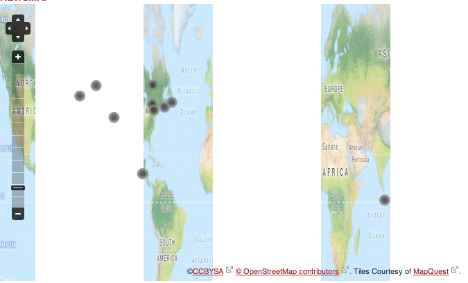
I just updated to the latest dev version and also updated to the 2.12 library. Now, all my mapquest maps look like the following image (squished and missing parts)...any help?

| Comment | File | Size | Author |
|---|

Comments
Comment #1
ishadakota commentedI'm having the same problem - I recreated an OpenLayers Data Overlay view and the OpenLayers Map view and the problem persisted. I can resolve by downgrading the library to 2.11 (but retaining the latest dev of the module).
The previews in both the OpenLayers Map admin and in the Views admin display in correct proportion, it's only in the final rendered view (page or block) that the issue occurs.
Comment #2
ishadakota commentedThanks to #1818436: CSS crashes the img tags, I realized that in my case this is caused by using in responsive theme (Zen Responsive) where all images are set to max-width:auto.
In my case, implementing the following css resolves the issue:
Of course, this only allows a non-distorted, but also non-responsive, map within a responsive layout.
@Rob_Feature, if this fixes your issue, I suggest that we change this to a feature request with a title like "Support Responsive Maps in OpenLayers." It was suggested in the roadmap for 3.x in #1353122: 3.x Goals
Comment #3
Rob_Feature commentedYup, I'm using a responsive theme with max-width: 100% as well. So this appears to be the issue...
Comment #4
polHello,
I'm not against including the CSS bit fix, but I don't want to loose the responsive feature.
Any idea on how to fix this in a elegant way ?
Comment #5
dasjoin my opinion this issue isn't about making openlayers maps responsive, but fixing their appearance when using a responsive theme that declares
responsive maps are a separate topic in my opinion, as just setting images to scale won't work for slippy maps that are compound of a grid of images.
thus i recommend:
- create a separate issue if you want responsive maps
- fix this issue by adding the following code to openlayers.css or add a note that for responsive base themes you need to declare this in your theme manually:
hope this helps
Comment #6
ifrikIn any case, it would be usefull to add some documentation on this - if only to point out why there is a problem with responsive themes.
Comment #7
polFixed.
Comment #8
dasjocool.
just a note: i saw from your commit that you are using 4 spaces for css indentation. would be better to keep with 2 spaces, as coding standards recommend.
Comment #9
polFixed again :) Thanks !