
 Come together with the global Drupal community in Rotterdam, 28 Sept – 1 Oct 2026. Sessions, contribution, connection, and Early Bird savings until 8 June.
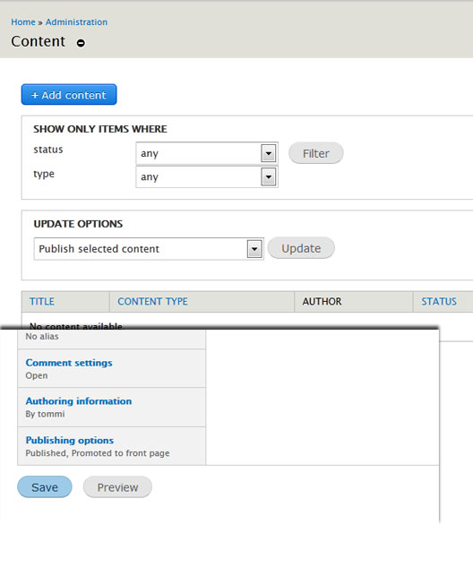
A picture says more than a thousand words:

As much as I like the strong "punch" of the new primary actions button (sorry if I use the wrong terminology for it), it does not correlate with the other buttons in shape and color.
It is using two different visual languages and creating design mess.
More importantly, after getting used to the stronger primary actions button people may miss the save button, as it is weaker.
It may well be that one if the buttons is stronger than the other, or the save button needs more emphasis, but this needs a solid reasoning behind it.
| Comment | File | Size | Author |
|---|---|---|---|
| Blue-Buttons.jpg | 34.61 KB | eigentor |

Comments
Comment #1
Bojhan commentedLets not do a per-case, syncing of styles. We need a general style guide, and then we sync all of our styling.
E.g. I dont even think we want either of these styles.
Comment #2
yoroy commentedEigentor: that means you make a good point, but lets plan for the general overhaul first. This one is definately on that list :-)
Comment #3
sunSummarized/continued over in #1848292: Consolidate Seven button styles