#1870944: [Meta] Mobile friendly admin pages
Problem/Motivation
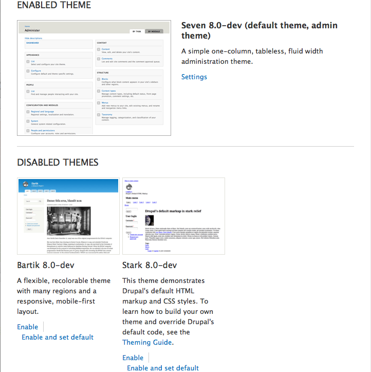
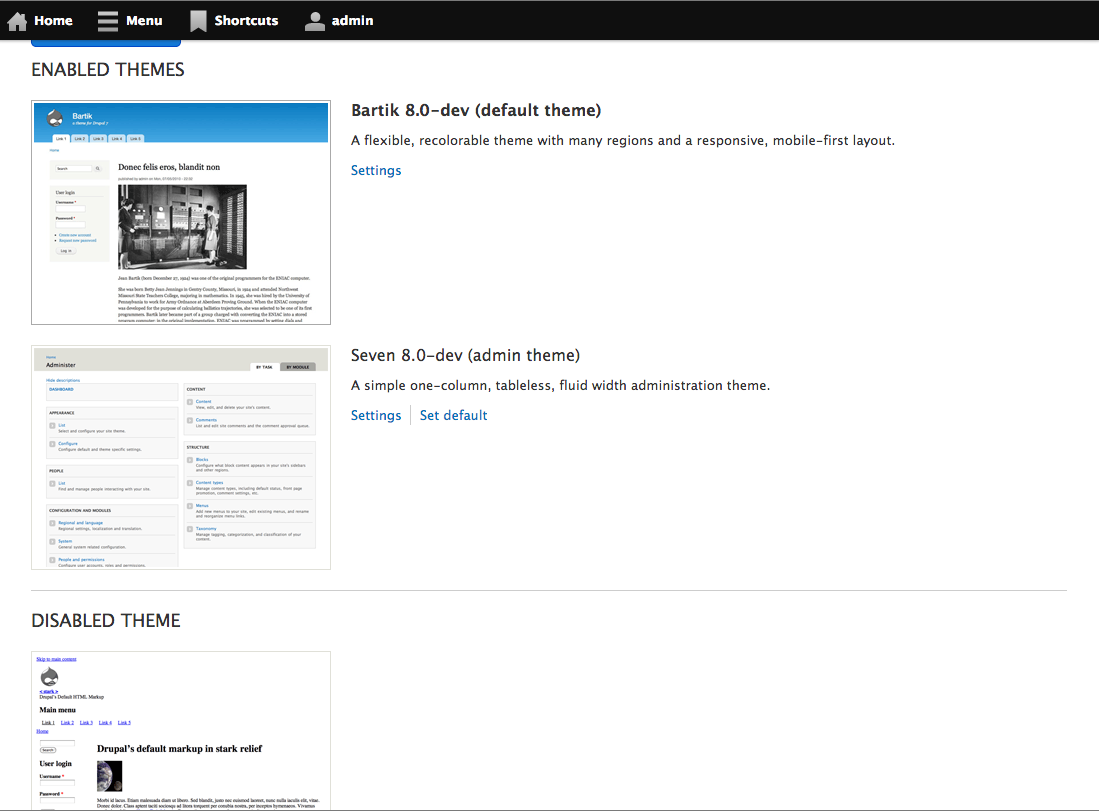
The Appearance page doesn't display properly on small screens. The enabled themes section of the page has text that wraps very weirdly on mobile-sized screens making it difficult to read and presenting severe usability problems.
The main source of this problem is that the text is fixed to the right of a 300 pixel wide image, so screens smaller then 600 pixels start to squeeze the text into smaller and smaller space until it starts wrapping beneath the 300 pixel image.
Proposed resolution
The Appearance page uses 2 different grids. The enabled themes section has a fixed 300 pixel wide image, with a fixed 20 pixel gutter and a fluid "description" column. The disabled themes section uses a fixed 300 pixel-wide column with 20 pixel gutter, but images are scaled down to 200 pixels wide to show a submissive status with regards to enabled themes.
- We should use a single responsive, fluid grid for the entire page.
- For larger screens, use media queries to have 3, 4, or 5 columns. The enabled themes section should be limited to the first 2 columns; image in 1st column, text in 2nd column. The disabled themes section should be similar to now with images above text, but we should no longer limit the image size to 200 pixels wide.
- For smaller screens, use media queries to have 1 or 2 columns. On 2 column-sized screens, the enabled themes section will use the same layout as above. For 1 column-sized screens, an enabled theme's text will be below its image.
- Making the disabled themes use larger images (see point #2 above) means they will compete with the enabled themes for dominance. So I think we should add a light grey background to the disabled themes section. (This idea was proposed too late in the original Appearance issue.)
Remaining tasks
All of them.


Comments
Comment #1
Bojhan commentedSounds good :)
Comment #2
webchickMoving to a task, rather than a bug report.
Comment #3
johnalbinIssue tags aren't Twitter hashtags. doh!
Comment #4
mcjim commentedPatch to kick things off.
I think it works in a functional sense. Not sure about aesthetically.
Anyway, it's a start.
Comment #5
webchickSince #1870944: [Meta] Mobile friendly admin pages is a major task, downgrading this one so we don't overload thresholds with this one particular sub-initiative.
Comment #6
shyamala commented+dmux8-admin tag
Comment #7
shyamala commentededited tag
Comment #8
shyamala commentededited tag
Comment #9
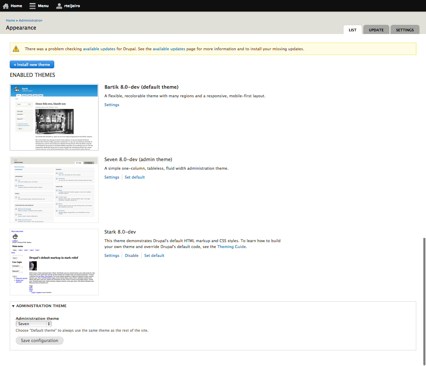
rteijeiro commentedHi all.
Applied #4 patch and looks well except for a small blank space on the right side. I can see it in Opera, Firefox and iPhone.
Take a look at the attached iPhone screenshot.
Hope it helps.
Comment #10
lewisnymanNovice tags
Comment #11
lewisnymanGood stuff guys, nice to see this page getting some love!
The fix was minor, a margin-right needed to be removed.
Comment #12
rteijeiro commentedNice, tested the #11 patch with Chrome, Firefox, Opera, Safari and also with iPhone and it seems to solve the issue with Seven as administration theme.
Maybe it should be considered as RTBC.
Great work :)
Comment #13
Bojhan commentedHmm, does this change anything visual on the desktop?
Comment #14
rteijeiro commentedReviewed with desktop screen sizes in Chrome, Safari, Opera and Firefox and everything seems ok.
Should I review something else?
Comment #15
Bojhan commented@rteijeiro Its common to provide a screenshot so that others can review the visual change. Atleast the last screenshot I see, has quite some visual changes .
I dont think its RTBC, untill we can give it a good review.
Comment #16
rteijeiro commentedHi @Bojhan, I have attached a full page screenshot. Thank you for your comments :)
Comment #17
Bojhan commented@rteijeiro Would it be much trouble to also attach the full width desktop version?
Comment #18
rteijeiro commentedOf course not, @Bojhan.
I have attached screenshots for the full width desktop version without expanded menu and with both vertical and horizontal menu expanded ;)
Comment #19
lewisnymanLooks good to me
+1 RTBC
Comment #20
Bojhan commentedHow could this be RTBC? The disabled section doesn't look at all like D7? I don't think the design decision to use a gray background is a useful one, we had the right design before using positioning and size - there doesn't seem to be any reason why we cant make that responsive.
Comment #21
lewisnymanOk, so I rewrote this patch from scratch, for me it was easier to do that then to take what we already had and undo the design changes. Rough screens attached for the curious.
Points of interest:
Comment #22
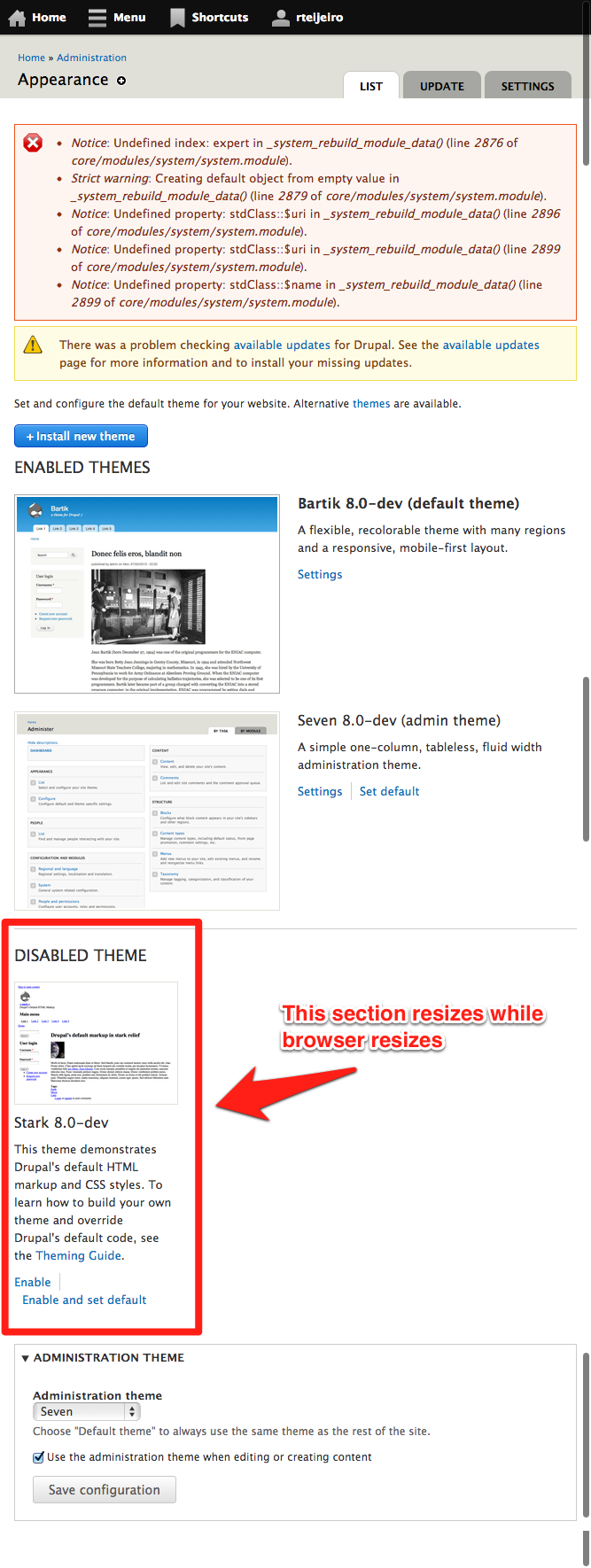
rteijeiro commentedTested the #21 patch and found some issues:
- The theme screenshots should be centered in mobile size.
- When you are resizing the browser, the disabled section also resizes (see screenshot)
Comment #23
rteijeiro commentedProblems with the screenshot :(
Now attached.
Comment #24
lewisnyman#22:
I'm not sure I understand this point? It should resize, it's fluid.
Comment #25
rteijeiro commentedYes, I agree with you but it resizes differently than the enabled section. If you look at the screenshot you will notice that the theme screenshot in the disabled section is smaller than in the enabled section.
Comment #26
lewisnymanThat's actually by intent. The enabled screenshot doesn't need to resize, there's no benefit to that. The disabled screenshot does have to resize because it's set in three columns
Comment #27
rteijeiro commentedOk, now it makes sense. I tried with more disabled themes and looks nice (see screenshot).
It's a RTBC for me.
Comment #28
echoz commented#22, I don't think the theme screenshots should be centered when stacked, it looks good lined up with the text.
I see in the beginning of the "Appearance page" section of system.admin.css is "table.screenshot" which must be an artifact from the past, as there is no table there (or Lewis would have nuked it!). The class .screenshot is covered lower in the stylesheet. I realize this is more of a general cleanup point and is debatable whether it's part of this patch, otherwise looks good to me, nice work Lewis.
Comment #29
webchickI think this is what Bojhan is saying (screenshots would be helpful in future comments :))
In D7 the page looks like this:
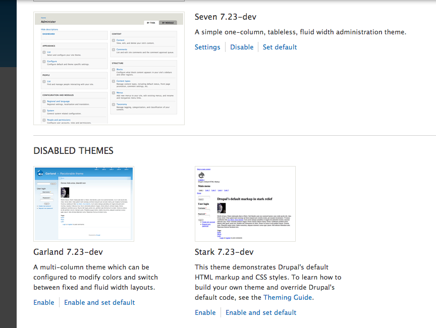
The disabled themes are diminished in importance relative to the enabled themes in desktop width.
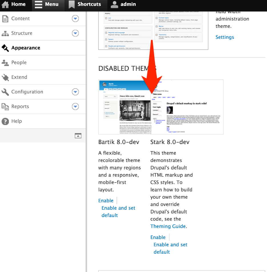
In D8, the page (at least for me) looks like this:
So we lose that strong distinction between enabled/disabled, and instead have to pick out a tiny header in amongst BIG SCREENSHOTS THAT ATTRACT EYEBALLS to tell the difference.
We should fix this I think.
Otherwise, looks great!
Comment #30
rteijeiro commentedYes, I have tried also with one only disabled theme to see if the theme preview screenshot resizes and it seems that the theme preview screenshot size is always: 200px X 150px
Comment #31
lewisnymanOk, I realised that I removed a set width on the disabled images and replaced it with max-width 100%. I've replaced this with max-width 75% to make the screenshot smaller.
I've also added one div to the no-screenshot container to make the CSS a lot simpler. Yay!
Comment #32
rteijeiro commentedNow it seems smaller but I think the right size is max-width: 60% to look the same as in Drupal 7.
This screenshot is with max-width: 75%
This screenshot is with max-width: 60%
Do you agree with me?
Comment #33
rteijeiro commented#31: responsive-appearance-page-1861702-31.patch queued for re-testing.
Comment #34
rteijeiro commentedI have done the change I commented in comment #32 but with a width of 55% (hope that Lewis Nyman doesn't care and agree with me).
Now the disabled theme screenshots are the same size than in Drupal 7 version.
Comment #35
echoz commentedIt doesn't work to have the disabled screenshot a percentage of its container when that container itself is a percentage, because as the width of the viewport changes, the screenshot needs to range from 100% of it's narrowest container (1/3 of viewport = ~55% of enabled screenshot), to 55% of it's widest container (viewport wide enough so 1/3 = enabled screenshot).
I don't have a solution. Changing disabled screenshot to max-width 100% when parent is 1/3 partly fixes it, but makes it equal to enabled screenshot at wider viewport. The way it is now, the disabled screenshot gets way tiny, but can also be same width as enabled screenshot.
Enter a local test of the patch at http://responsinator.com/ to see how all viewport widths are not ok.
Comment #36
echoz commentedI do have a solution. I realized the disabled screenshot needs a consistant width (as the problem in #35 describes). This patch gives max-width: 194px; to the disabled screenshot. That is the only change since Lewis's #31 patch, where it was previously max-width: 75%;
Comment #37
echoz commentedScreenshots showing consistent width for disabled screenshot:
Comment #38
webchickOh, that looks much better! :)
Comment #39
rteijeiro commentedGreat!! Thans echoz, it seems that all the problems are solved.
Tested with Chrome, Safari, Opera and Firefox with awesome results ;)
Thats a RTBC for me.
Comment #40
lewisnymanI'm not sure how setting the image to a fixed width helps the page be responsive? We need these screenshots to be fluid, otherwise they start to overlap:
Comment #41
echoz commentedThanks Lewis, I was hoping for your input and also hoping someone could test an extra disabled theme, I couldn't get a copy of Stark to show up (prob Safari caching issue), and had assumed it would never need to be narrower at the 1/3 stage. So I'm back to not having a solution for #35.
Comment #42
echoz commentedThis patch addresses the issue shown in #40 by changing the breakpoint from min-width: 40em to min-width: 45em so there is never any overlap.
#35 explains why having the disabled screenshot be a percentage of a percentage container does not work.
Screenshots on both sides of the 45em breakpoint (720px):
720px viewport width, the closest the disabled screenshots can get:
719px viewport width:
Comment #44
echoz commented#42: responsive-appearance-page-1861702-42.patch queued for re-testing.
Comment #45
rteijeiro commentedReviewed and it seems right, like shown in #42 screenshots. Maybe RTBC, finally? :)
Comment #46
echoz commentedThanks rteijeiro, I hope so.
@LewisNyman, does the problem (#35) and solution needing fixed max-width make sense for you?
Comment #47
lewisnymanYep this looks good to me from the screenshots.
Comment #48
alexpottManually tested and I still get overlap...
Comment #49
rteijeiro commentedOk, alexpott you are right. That's because the expanded vertical menu. I tested that with the horizontal menu only :(
EDIT: Nice catch, BTW!
Comment #50
echoz commentedThere is a .vertical class on the toolbar, so we could make another breakpoint. 52em seems to be just where the vertical menu change happens, but is too wide to stack the screenshots when there is no menu used.
Comment #51
lewisnymanSo myself, echoz, and Jesse spoke on this issue at length. The vertical toolbar has potential to mess with media queries in every theme. We agreed that it probably won't produce major errors for front facing themes, and that if it did, it's pretty easy to override the toolbar CSS to stop the vertical toolbar shifting the page around. Let's not assume this is a huge problem until we find that it is.
We do have a responsibility to make sure the admin UX works in these situations. So we should write another media query that takes into account the offset of the toolbar.
Comment #52
echoz commentedThis patch adds an another breakpoint for the viewport with the vertical toolbar displayed. A solution to keep the display w/toolbar to not also recognize the narrower breakpoint was to use the :not pseudo-class (thanks LewisNyman), which syntax requires the preceeding selector like so (doesn't work without "body"):
Alternatively, we can achieve less specificity if we add a .no-toolbar class. If someone wants to implement that, have at it!
:not works with IE9+ (tested).
I also reduced some instances of class .theme-selector, and finally got rid of table.screenshot!
Comment #53
rteijeiro commentedUpdated the changes in system.admin-rtl.css file too.
Comment #55
rteijeiro commentedSorry, patch above is not valid. It contains the .htaccess file.
Comment #57
echoz commentedThanks @rteijeiro, re-rolled with some declaration order changes in rtl.
Comment #58
rteijeiro commentedGreat @echoz. Tested again and checked with an RTL language. Everything seems ok.
Also tested with overlay and disabled theme thumbnails overlaps a bit. Not sure if it should work with overlay or not so I consider it as RTBC.
Please, feel free to open this issue or a new one if you consider to fix overlay.
Comment #59
alexpottNeeds a reroll
Comment #60
rteijeiro commentedRe-rolled with the latests changes in 8.x branch. Now applies well.
Comment #61
echoz commentedComment #62
yoroy commentedI applied the latest patch and tested in Chrome, Safari, Firefox on OS X with and without overlay. Looking great, RTBC indeed.
Comment #63
alexpottCommitted 84d0ea9 and pushed to 8.x. Thanks!
Comment #64.0
(not verified) commentedAdded link to meta issue