Active
Project:
UX tasks
Component:
Documentation
Priority:
Normal
Category:
Task
Assigned:
Unassigned
Reporter:
Created:
9 Dec 2012 at 21:02 UTC
Updated:
7 Jan 2013 at 21:38 UTC
Jump to comment: Most recent file

Following #1854730: Define visual tone/brand of the Seven theme, we should build up a handbook that documents our standards around the "stylistic" parts of Seven.
This is not to document any UI Patterns, but rather the important elements we identify Drupal with.
Feel free to inventorize useful resources around this, and add possible standards.
| Comment | File | Size | Author |
|---|---|---|---|
| #2 | seven-elements-v3.png | 90.32 KB | yoroy |

Comments
Comment #1
Bojhan commentedA quote from The Definitive Guide to Drupal 7, I wrote a small piece:
Comment #2
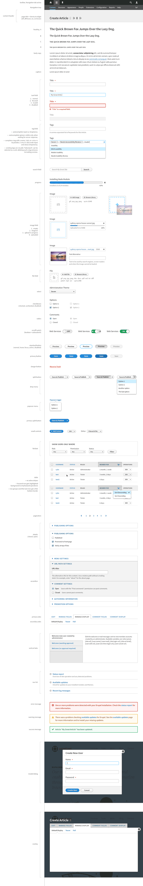
yoroy commentedA quick update. Ry5n is doing amazing work defining an updated look and feel for Seven. Bojhan and I are reviewing. Still needs an iteration or two, but here's a sample of what's in the works:
Comment #3
Bojhan commentedFYI, we are not discussing the design here - we are posting on g.d.o/usability in a few days.