
Closed (fixed)
Project:
Drupal core
Version:
8.0.x-dev
Component:
color.module
Priority:
Normal
Category:
Bug report
Assigned:
Unassigned
Issue tags:
Reporter:
Created:
22 Dec 2012 at 09:47 UTC
Updated:
29 Jul 2014 at 21:41 UTC
Jump to comment: Most recent, Most recent file

Comments
Comment #1
vijay.cgs commentedProposed resolution
Change position absolute from position static using media queries for id #placeholder in core/modules/color/color.admin.css file
Old CSS
New CSS
Comment #1.0
shyamala commentedAdded link to meta issue
Comment #2
lewisnymanAdding novice tags
Comment #3
rachel_norfolkI'll put a patch together for #1 and run it on iPhone etc (at Drupal Sprint in London...)
Comment #4
rachel_norfolkHere's the patch so far...
Comment #5
rachel_norfolkOkay, so the first patch fixed the issue but I noticed that the following form elements were not resizing appropriately for mobile. I've improved them, at least on iPhone. Needs testing against other devices at least.
There is also some js that highlights the appropriate form element when adjusting the colour. It is not lining up with the correct form elements in mobile views and the js is a little beyond my (current) skills...
Comment #6
rachel_norfolkComment #7
crazyrohila commentedI think #1 and this should work.
/core/themes/bartik/color/preview.css.
/* ---------- Color form ----------- */
#color_scheme_form #palette .form-item {
+  max-width: 100%;
   width: 25em;
}
#color_scheme_form #palette .form-item label {
+ max-width: 100%;
width: 15em;
}
Comment #8
lewisnymanOk, Ive had a look at the surrounding CSS in color.admin.css and bartik/color/preview.css
I don't think we need to touch the Javascript, the main issue is that the default, non media query css is really not set up to be fluid, a lot of fixed em based widths and fixed heights that don't play well with fluid layouts. The problem with the highlighting of form elements breaks because there is a height set on line 18 of color.admin.css. Your media query CSS looks like it's being overridden by ID selectors in bartik/color/preview.css
Comment #9
lewisnymanComment #10
crazyrohila commentedI tried media query in preview.css.
but Its overridden by color.admin.css in color module.
So should I put this in color.admin.css ?
(I am little afraid to edit core things)
And for fluid layout I set form-item max-width to 100% in preview.css in bartik.. this is working fine with small screen.
/* ---------- Color form ----------- */
Comment #11
crazyrohila commentedComment #12
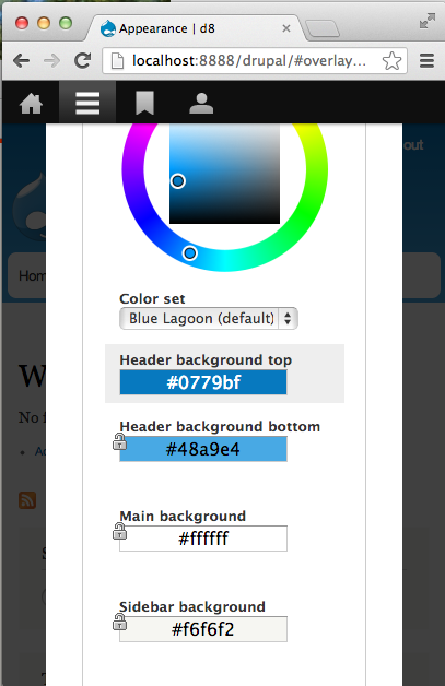
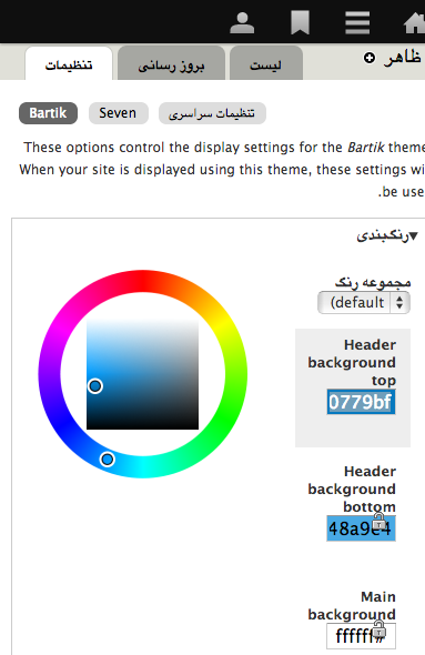
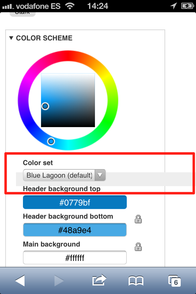
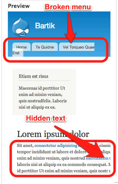
rteijeiro commentedHi, tested #5 patch and it seems ok in Chrome, Firefox, Opera and Safari but it doesn't look well in iPhone. There is an element with wrong width as shown in the following image:
I have also noticed that some preview elements should be fixed in order to fix with small screen sizes, as shown in the following image:
Comment #13
lewisnymanOk, so I kind of hacked away at the color.admin.css with a machete. It should work pretty well on all screen sizes. I also ported over some of the responsive work done on Bartik into the preview.css.
I feel dirty, I'm going to take a shower.
Comment #14
rteijeiro commentedHey, great work, Lewis ;)
Reviewed in Chrome, Safari, Firefox and Opera. Also tested with an iPhone ;)
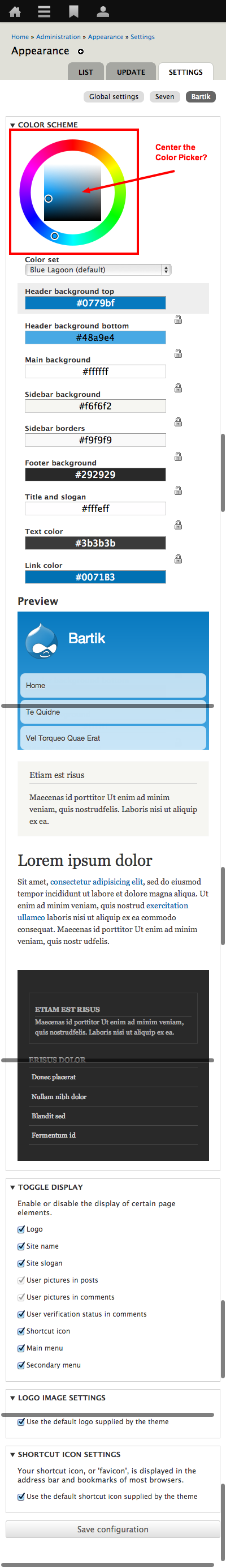
Now it seems ok, as shown in the screenshoot (sorry for the scrollbars):
The only thing I noticed is that the color picker is not centered but I guess it's out of the scope of this issue ;)
Well done!!
Maybe RTBC?
Comment #15
lewisnymanI've centered the colour wheel.
I would be morre concerned about the usability of the colour wheel on touch devices. It's just about usable but it's not great.. maybe we should open up another issue for that?
Comment #16
Bojhan commentedHeh, yes - lets split that off.
Comment #17
rteijeiro commentedWell done Lewis, now it looks perfect!!
It guess it's ready to be merged :)
Comment #18
webchickThis looks great!!
It looks like there are changes to the main stylesheets that affect(ed) RTL styling, but no corresponding hunks in a -rtl.css stylesheet. Methinks that's wrong. We should make sure to test this explicitly in an RTL language (e.g. Arabic or Hebrew).
Comment #19
webchickOh. And can we please get a follow-up issue (or cross-link it if one already exists) for making Color module work better on touch devices?
Comment #20
xjmComment #21
lewisnymanTouch follow up: #1957400: Improve Color's admin interface on touch devices
Ah I forgot about RTL... I haven't figured out interdiffs but just check out the changes in color.admin-rtl.css. I've actually removed quite a bit of CSS because I re-styled some of the elements using display: inline-block so they should obey text-align changes.
This will need a proper test as I can't seem to install other languages on my d8 local
Comment #22
xjmThanks @LewisNyman!
Comment #23
shyamala commentedNeeds follow-up issue (or cross-link it if one already exists) for making Color module work better on touch devices? as highlighted by webchick
Comment #24
echoz commentedfollow-up was created in @21
Comment #25
shyamala commentedThanks @echoz, missed that :)
Comment #26
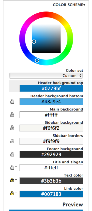
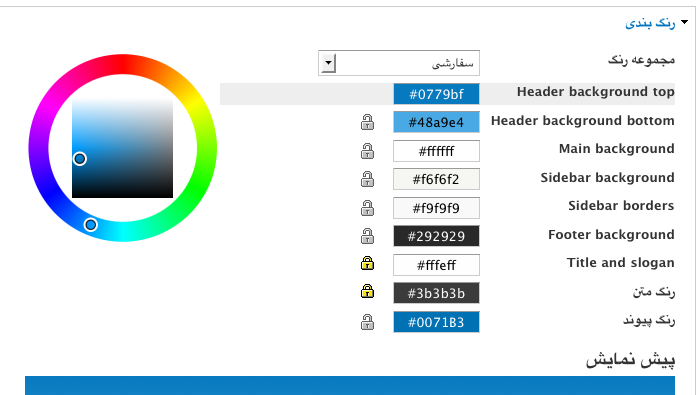
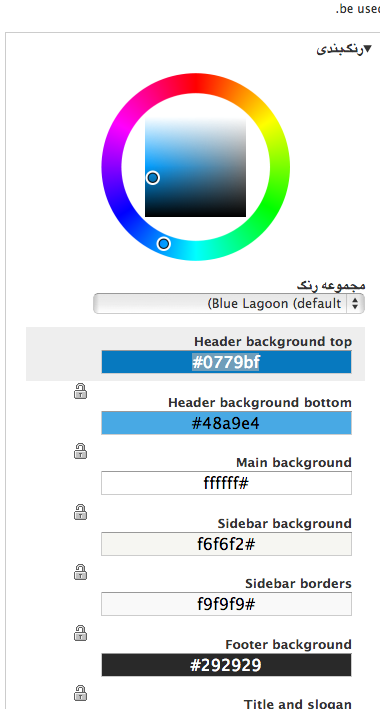
rteijeiro commentedTested RTL styles (with Persian language) and it seems need work in the color picker and color textboxes. The rest of the page is ok (see screenshoot)
Comment #27
djbobbydrake commented@LewisNyman - I amended your patch to address the RTL issues. Screenshot of resolved RTL issue is attached. You can see there's also an additional bug with the color codes. The "#", I'm assuming, should still be on the left. Will open up a separate issue.
Comment #28
djbobbydrake commentedSetting this to Needs review. Also, issue with hex codes created here: http://drupal.org/node/2003570
Comment #29
drupal930 commentedI received this message:
Fatal error: Call to a member function get() on a non-object in /home/scf08b589026e5c3/www/core/lib/Drupal.php on line 147
Comment #29.0
drupal930 commentededited meta link
Comment #30
ge commentedFatal error is just with simplytest.me because the test bot is having problems.
Manually applied the patch and the display is fixed in iOS Simulator LTR. Testing in Chrome on Mac the display is fixed with the patch if the Overlay is turned off, but locks next to hex color areas switch from right side to left side when I resize the Chrome window as shown in the attachment.
Will still need to be tested in RTL browsers.
Comment #31
lewisnymanI think we can veto the narrow-chrome-with-overlay bug because the overlay shouldn't be active at that size. If you reload the page and click on it after you resize the window the overlay shouldn't open. If someone thinks it's a use case then we should be checking the overlay width on the click even as well as on load.
Comment #33
djbobbydrake commented#27: bartik-settings-page-on-small-screens-1872598-27.patch queued for re-testing.
Comment #34
echoz commentedmarked #2081237: color palette of color module breaking in mobile devices. as a duplicate.
Comment #35
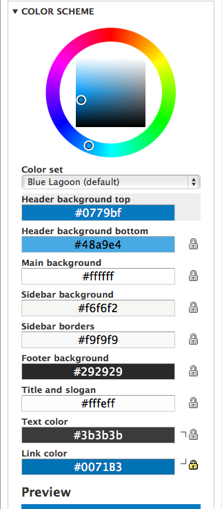
echoz commentedRe-wrote from scratch, mobile first FTW :-) Screenshots demo a selected item and the lock / hook thing.
wider viewport
320px viewport
Someone please test RTL.
Comment #36
echoz commentedComment #37
will_richards commentedTested RTL wide and 320px viewport with selected item - both look great, but are missing hook image (css is there but image can't be found).
Wide Viewport
320px viewport
Comment #38
echoz commentedThanks for the RTL testing! New patch.
RTL Wider viewport
RTL 320px viewport
Comment #39
echoz commentedRather this is actually the 320 screenshot, editing above to display this one.
Comment #40
BarisW commentedIt looks great on the iPhone. I've tested English and Arabic (RTL), both in portrait and landscape.
Let's get this in.
Comment #41
echoz commentedLost an important tag
Comment #42
alexpottThanks for the screenshots!
Committed 54cc3d7 and pushed to 8.x. Thanks!
Comment #43.0
(not verified) commentedUpdated summary.