
 Come together with the global Drupal community in Rotterdam, 28 Sept – 1 Oct 2026. Sessions, contribution, connection, and Early Bird savings until 8 June.
To evaluate splitbuttons from the MR, enable the splitbutton_test module and go to
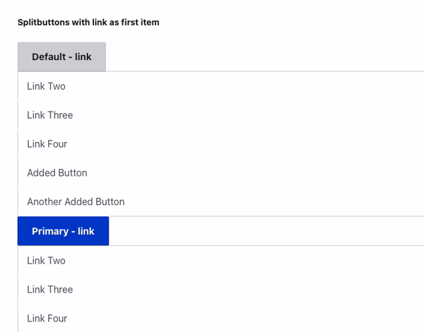
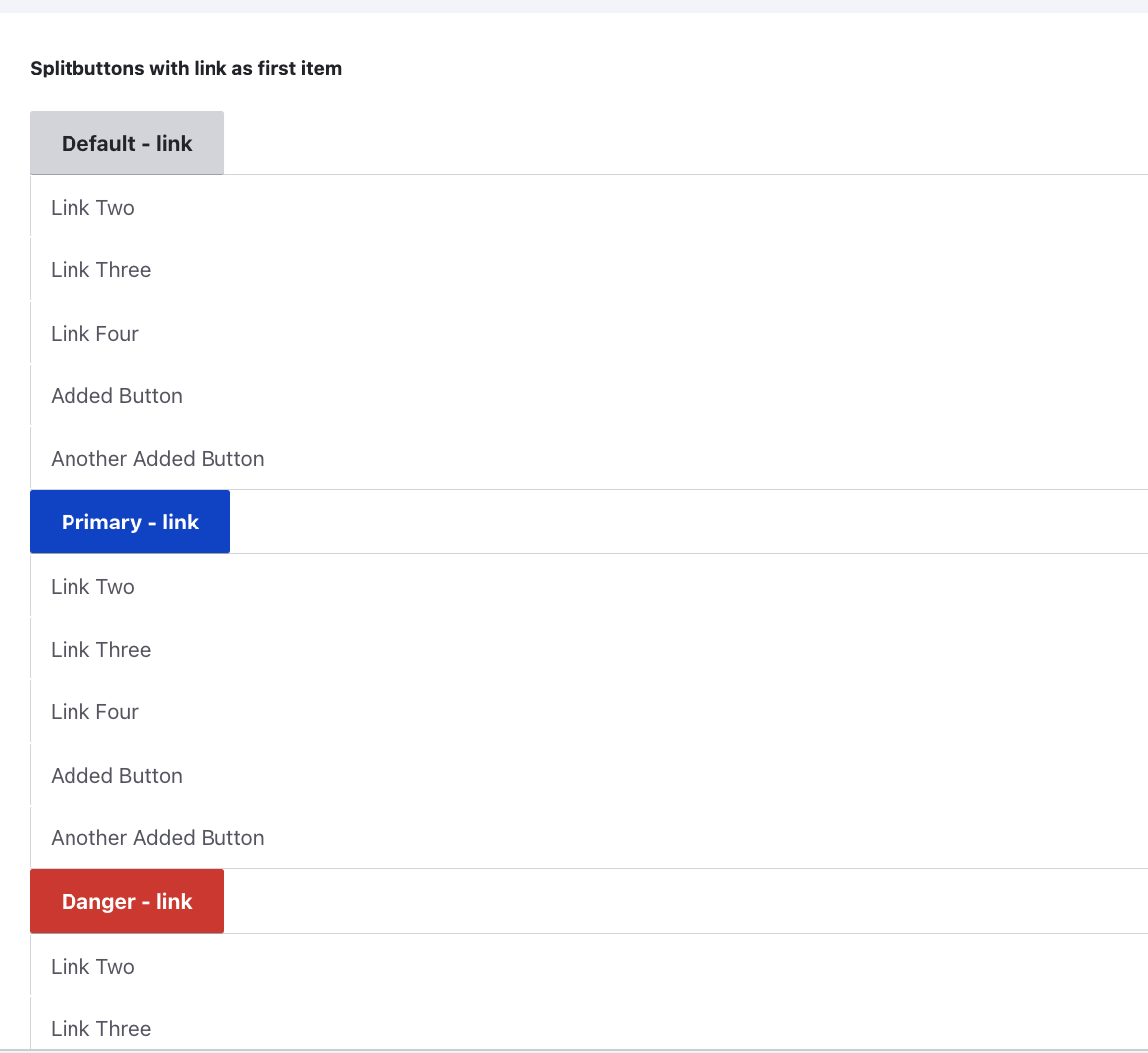
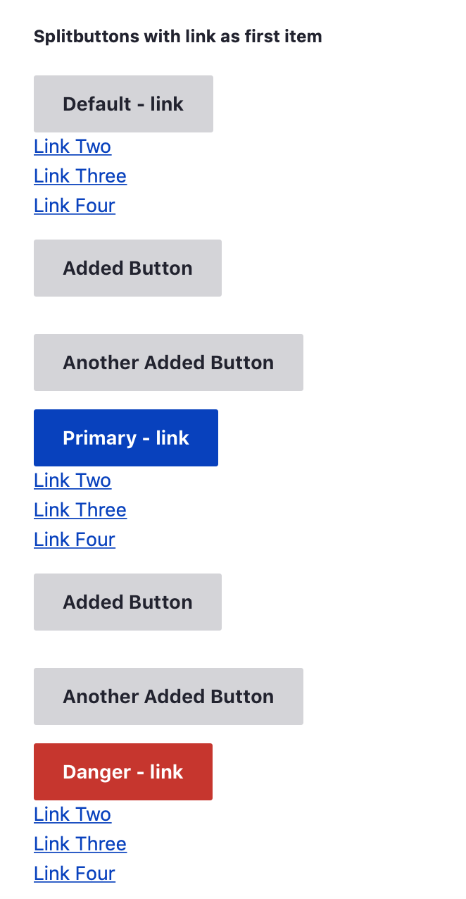
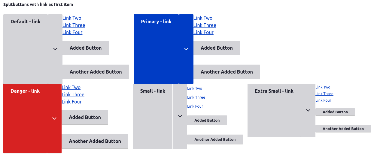
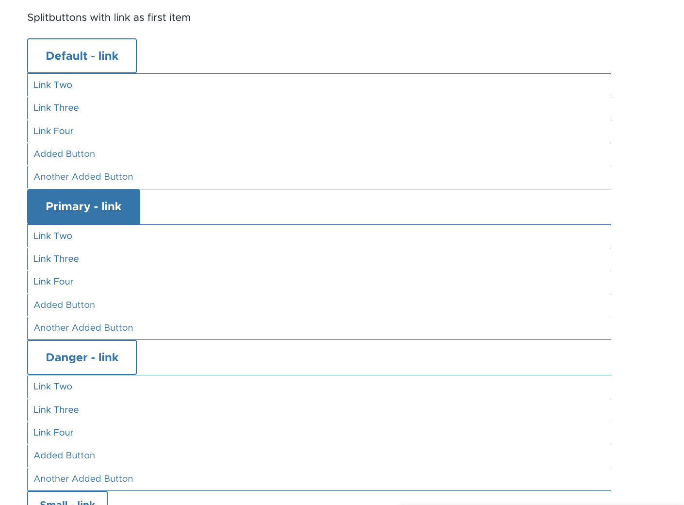
/splitbuttons
. You must have
$settings['extension_discovery_scan_tests'] = TRUE;
in your settings.php for this test module to be available.
Problem
- Drupal has adopted Views’ dropbutton in several common places in core. Since its introduction in #1608878: Add CTools dropbutton to core, we've spent lots of time refactoring the existing button: #1799498: Improve dropbutton and others [which?]. This component is now even being used for primary form actions on the new node edit form: #1751606: Move published status checkbox next to "Save". However, the implementation there has made the dropbutton harder to theme by pushing it beyond its initial design. (Specifically, allowing its to consist of buttons instead of links, and by introducing sub-elements using #prefix and #suffix).
- From a UX standpoint, the existing dropbutton’s behaviour is sub-optimal. Since the sub-items are contained within the button, when the button is opened it often must grow in width to accommodate the width of the sub-items. This change moves the click target out from under the user’s cursor, forcing them to hit a slightly different spot in order to close the menu again. In some cases, such as the one reported in #3168326: Dropbuttons in table cells are potentially unusable if it includes options with long text length., opening the dropbutton can result in a reposition that takes the pointer off the dropbotton, which results in it being closed moments after it was opened. The standard implementation of this design pattern does not suffer from this issue: Twitter Bootstrap, Zurb Foundation, jQuery UI. Drupal is the odd one out here.
- The open/closed state of the menu isn't conveyed to assistive technology, it is only apparent visually.
- The current focus style for the more-actions button is weak, and won't pass WCAG 1.4.11 Non-text contrast.
Proposed Resolution
Since we cannot change the current Dropbutton (and Operations) implementation for BC reasons, the way to move on is:
-
Create a new Splitbutton element with the required markup, functionality and (accessibility) features.
- The new Splitbutton element must allow having buttons as well as links, and it should be able to replace the hard-coded fake Dropbutton in Views UI.
- It should be easy to add modifier CSS classes (described in #2160481: Componentize the dropbutton CSS).
- Use aria-haspopup and aria-expanded to define the list and toggle to assistive tech.
- Should have the proper focus styles, to satisfy WCAG success criteria 1.4.11 Non-text contrast. Using an outline (i.e. shape) change is recommended, rather than changing colour alone.
- Use the popover api for visiblity toggling
- Use the Floating UI library for positioning. Positioning will likely switch to use the anchor positioning API when browser support is better.
- In followup: Replace core's Dropbutton and Operations usage where appropriate with the new Splitbutton element.
- In a followup: Potentially deprecate Dropbutton. (?)
User interface changes
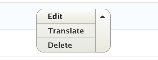
Splitbutton is a slightly different experience than dropbutton. Dropbutton has a primary item that is always visible. Although it's a primary item, it's semantically part of the the list that is fully visible when the dropbutton is open.
Seven Dropbutton Seven no longer in core
Claro Dropbutton
Claro is styled so the primary and list items look different although they are part of the same list. This visually resembles what splitbutton will be doing semantically.
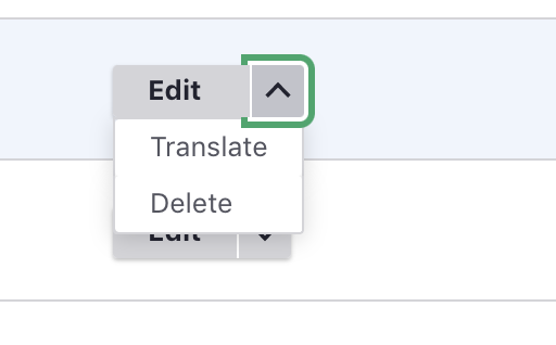
Seven Splitbutton Seven no longer in core
Claro Splitbutton
Uses Claro's existing component styles, applied to this new element.

Dependency Evaluation
The Popover API is pretty close to being adopted in all Drupal supported browsers, but at the moment still needs a polyfill. There appears to be only one easily found option - https://github.com/oddbird/popover-polyfill. Going with the Popover API is highly preferable to adding this logic in core. It completely removes the need to decide on the proper z-index, and splitbutton CSS is only responsible for how it looks - not whether or not is it visible.
- Maintainership of the package: Issues appear to be responded to in a timely manner, and there is regular activity on the project. It looks like the maintainers use this in their own projects so I imaging there is incentive to continue for the likely-brief time it will take before native adoption renders this unnecessary
- Security Policies Nothing official that I could find, so I posted an issue requesting clarification https://github.com/oddbird/popover-polyfill/issues/110. The nature of the feature/polyfill does not introduce huge exploitation opportunities, but it would still be good to get some clarity on this.
- Expected release and support cycles This was asked in the same issue where I inquired about security info. This appears to release as-needed, which seems especially appropriate given the very-specific purpose of this polyfill and the fact that it will potentially be obsolete before Drupal 11 is even tagged.
- Code quality The job requirements of this polyfill are quite straightforward. The code is easy to read and largely self explanatory but there are decent comments where needed.CSS is used to manage visibility when there isn't a browser API isn't available to do it, and it does a good job of mimicking the native implementation specs.
Dependencies added No runtime dependencies, dev dependencies are all popular build/lint/test tools + typescript.
API changes
TBD.
Original Proposed Resolution
- Refactor the implementation in core to allow for buttons as well as links in the element while maintaining theme-ability. This is a good opportunity to implement the splitbutton design. — #2278479: Change the dropbutton theme function to ensure consistent output and accommodate the splitbutton design
- Refactor the markup, CSS and JS to be as simple as possible — #2278473: Simplify Dropbutton markup in line with our CSS standards
- Componentize the primary and regular dropbuttons — #2160481: Componentize the dropbutton CSS
- Convey the behaviour and state to assistive technology, in line with the Menu Button pattern from the WAI-ARIA Authoring Practices.
- Follow the keyboard-control behaviour from the Menu Button pattern in the WAI-ARIA Authoring Practices.
- Improve the focus styles, to satisfy WCAG success criteria 1.4.11 Non-text contrast. Using an outline (i.e. shape) change is recommended, rather than changing colour alone.
| Comment | File | Size | Author |
|---|---|---|---|
| #191 | 1899236-nr-bot.txt | 90 bytes | needs-review-queue-bot |
| #188 | sbstark.png | 212.64 KB | bnjmnm |
| #188 | sbclaro.png | 149.26 KB | bnjmnm |
| #188 | sbolivero.png | 134.57 KB | bnjmnm |
| #188 | sbumami.png | 182.27 KB | bnjmnm |
Issue fork drupal-1899236
 Show commands
Start within a Git clone of the project using the version control instructions.
Or, if you do not have SSH keys set up on git.drupalcode.org:
 changes
Comments
Comment #1
sunComment #2
tim.plunkettThis pertains to VDC since dropbutton was brought into core for Views.
I'd like to see the link-based one stay, abusing it to wrap buttons is what I think is causing your frustration.
Comment #3
sunComment #4
ry5n commentedI support replacing the existing dropbutton. Using actual
buttonelements should be possible, and in places where the action is JS-driven we probably shouldn't use links.Besides the theming issues, the current dropbutton is not optimal from a code reuse point of view. Functionally, the dropbutton is just a button group plus a separate dropdown-menu component. Taking a more modular approach would allow button groups and dropdowns to be used separately in other situations, and also solves the problem of the current dropbutton having to change size when it's opened.
I'm in favor of implementing something very much like what Bootstrap has.
Comment #5
tim.plunkettUp until the save/published issue, none of the elements inside dropbuttons were buttons. So sue us for the naming. But they are all links.
Just because another part of core used #prefix and #suffix to mock the markup of dropbuttons, doesn't mean the original ones should be hosed.
Also, this is is not major. If the other issue should be reverted, it should be reverted. But we'll have to be very very careful here to not introduce any regressions in the Views UI or any of our entity listings.
Comment #6
ry5n commented@tim.plunkett I think the issue here is that the dropbutton represents a design pattern that, when we tried to re-use it in a slightly different (and legitimate) way, turned out to be problematic. Why not take the opportunity to make something that is more flexible, more re-usable and more straightforward in its implementation?
Comment #7
tim.plunkettThat's a noble goal. But I'd think it would make more sense to fix the hacky usage, rather than completely rewrite it.
"Common implementations" are not accessible. Most of the work put into dropbuttons have been for accessibility purposes.
If the naming is all that is a problem here, then this should handle it.
Comment #8
sunUntil the other issue is reverted, or its effects are corrected, this issue is major.
And, no, this is not about a name. It's about a utterly broken implementation.
Comment #9
ry5n commented@tim.plunkett I do have a tendency to shoot for the stars :)
I don’t really think the name is the issue. I am willing to bet that what we all want is the same thing: a usable, themable, accessible dropbutton. If the realistic path is to adapt the current implementation to support the new use case, then that’s what we should do. However, I can see lots of room for improvement in several areas, outlined in the OP and in #4. I’m not aware of any reasons why a solution similar to Bootstrap’s couldn’t be made as accessible as the current dropbutton, but I would be genuinely interested in the details.
Comment #10
tim.plunkettI'm not saying bootstrap couldn't be accessible, just that it isn't. And in spending the time to make it so, we've duplicated work already done and still ended up with a custom solution. If you want to fix ours to work with more than just links, that's great. But let's retitle the issue to reflect it.
Comment #11
webchickWe need something approaching an actionable bug report here, rather than ranting. Avoiding insulting and meaningless terms such as "unholy" and "unacceptable" would do wonders to get anyone to care about this issue.
Comment #12
sunThe current situation of "Dropbuttons that may contain links but sometimes perhaps also buttons" is the problem for themers.
Can you demonstrate how easy it is to style these classified-but-arbitrary elements in a consistent, cross-browser way?
Comment #13
webchickOk, so is the actionable task here "We need to introduce a new splitbutton element to differentiate it from a dropbutton element, so that themers can write targeted CSS?" If so, let's get a spec on what that looks like in the issue summary.
You keep insulting people's efforts and insinuating that they're stupid for not giving you what you want, so be a leader. Educate them.
Comment #14
yesct commented@sun pointed out this is related to #1914800: Dropbutton width is smaller than longest item
Comment #15
dawehner@sun
Is there a way how we can move forward on this issue? It seems to be that your oppinion is that we should not have both buttons
and links in there? The @todo in form_pre_render_actions_dropbutton() seems to assume that there should be just links, so we maybe should not use it for buttons?
Comment #16
ry5n commentedI built a prototype as a proof-of-concept, at least for the front-end implementation and accessibility challenges. I’ve got a demo up that shows all the various components that would make up a split button: buttons, menus, and popups. The code is over at GitHub for those interested. I’ve made sure this is keyboard-navigable, and have tested using VoiceOver with good – but not perfect – results. I haven’t done cross-browser testing yet, and everything is pretty rough.
I’m looking to get very general feedback at this point, and spark further discussion.
Comment #17
klonos@ry5n: I have no comments on the actual code, but I do have some feedback on the controls. Do we do that on this issue here or would it be OT?
Comment #18
ry5n commented@klonos Thanks! I guess it depends. This issue is about whether we should replace the core dropbutton with a split button. The demo (though imperfect) attempts to show that this is possible, and would work for us. If your feedback bears on that, then here is great. If it’s more general feedback on the style outlined in the proposed Seven style guide, then I’d say post it there.
Comment #18.0
ry5n commentedUpdated issue summary.
Comment #19
ry5n commentedI’ve updated the summary, expanding on the rationale (it’s not just about implementation and themability). Summary now includes a list of what has been done and what remains.
I have working prototype code that demonstrates a solution including addressing #12, i.e. that works with 'a', 'button' and 'input' elements. I’m assigning this to me with the task of posting that code here for review. It won’t be a core patch, but will be html/css/js that is easier to review than where it is now.
Comment #19.0
ry5n commentedUpdate summary to include additional rationale (UX and front-end architecture POV) as well as developments from the Seven style guide.
Comment #19.1
ry5n commented“Original Report” should be h3
Comment #20
ry5n commentedCode attached. It feels a bit weird to attach static html/css/js to a d.o issue, but there it is. If there’s a better way to share this, please let me know.
Reviewers: please look at this prototype especially for:
- JS implementation
- Accessibility
- Feasibility for integration with core. I want to have a minimal affect on APIs.
Comment #22
nod_Couple of questions, how much is taken from bootstrap? (if any, haven't checked)
It uses jQuery widgets, ask jesse or wim all the good they think of it from their work on edit. Also from the file: "This is dumb, reasons are inline." not looking good for core :p
But the real reason: our current dropbutton takes 1ms (on desktop) to initialise and 10ms is a safe estimate for mobile. Here I can see 5ms on average. Now think of the content listing page shown on a mobile. Currently 50*10ms =500ms to render all buttons. With this 50*50 = 2.5s to render only the buttons.
( edit ) actually that's 8ms, 5ms is the minimum. So 50*80 = 4s
Comment #23
ry5n commented@nod_ None of the code is from bootstrap. I don’t like the dependency on jQuery UI either, for a bunch of reasons.
I pretty much knew this JS would need a re-write; your feedback is exactly the kind I was looking for: specific issues to address. I was worrying more about my general structural approach, but yeah: performance :)
My plan is to re-write the JS for this:
- Remove the dependency on jQuery UI
- Use native DOM methods instead of jQuery where support is IE8+ (eg. querySelectorAll)
- Testing for init speed
- Merging the 'menu' and 'popup' into a single component. Right now they are completely separate JS plugins. The reason is flexibility: you can put anything inside a popup, and use a menu outside of one. However, core has no use cases that I know of for that, and I want to keep new theme functions to a minimum. Merging them should remove some JS complexity and overhead.
Comment #24
ry5n commentedGah, how did those tags get removed?!
Comment #24.0
ry5n commentedFix broken list markup
Comment #25
ry5n commentedStatus update: working on it :) I’ve managed to reduce the JS complexity quite a bit, and am planning to have new code for review in the next week.
Comment #26
ry5n commentedAttached is a refactored version of #20 with:
- no dependency on jQuery UI
- positioning of popup menus in CSS rather than JS
- fewer internal function calls
Note:
- fully commented!
- still uses standard jQuery plugin patterns (would need to be adapted to use Behaviors etc.)
- the Menu and Popup plugins remain separate. When I got into it, there is so little overlap in functionality that I didn’t feel right about merging them.
- profiling in Chrome’s dev tools shows an average of ~4ms of combined execution, as far as I can tell. (I’d appreciate advice on how best to profile this.)
Some of the performance difference could be because there’s more going on for keyboard navigation and screen readers than in the current dropbutton. Focus is managed programmatically using aria attributes, requiring ids to be set on the individual menu items at init. There are also more event handlers being registered, mostly for keyboard navigation. Of course, it would be great if this was as fast as the current dropbutton.
I’d like to ask specifically if you think this is headed in the right direction for D8 core.
Comment #27
nod_Gave it a quick overview, much better. I like the Menu/Popup separation.
Times I got with the same setup as before is similar to yours:
Popup: 1.8ms
Menu: 2.1ms
I get why we'd use arrow down/arrow up but it feels strange since I'm used to tabbing. The menu takes a long time to init. Seeing how it's not unusable without it I'd like to discuss if there is something we can do about it.
Popup time as 1.8ms is okayish, digging into it the $(documen).on() and this.trigger.on() takes about 500ms each and the Class adding and this.$element.on() take about 100ms each.
The current implementation doesn't do much. At most it'll add a class, 4 event listeners (on the same element) and add some HTML (that'd be the most expensive bit). The button action of toggling the popup is a delegated event on the body. If we can get the events on the document be delegated listeners and cut down the time of Menu by half it'll be good to go. It'd still be a bit slow but then we can explore if it's possible to delay initialisation of the menu until the user actually tabs on a splitbutton.
Since we're not using an existing plugin we don't have to make the items "standalone" and we can cheat to make things faster and delagate when useful.
Best thing I like here is that there is no extra markup added from JS. I'm not digging to much the class names, i'd rather use data- attribute to target things but that's details.
Nice work, thanks :)
Comment #28
nod_So it's getting close but still NW. It'd be cool if someone could wrap that up to be used in the core UI.
Comment #29
tim.plunkettComment #30
ry5n commented@nod_ Great feedback; thanks! Glad this is on the right track.
- I really like the idea of initializing the Menu only when a Dropbutton gets focus. Since the Menu plugin is entirely devoted to keyboard interaction, that should work very well.
- I would be happy to use data-* attributes to attach behaviors. I assume that’s just for attaching, and we’d still use classes within a behavior for picking up additional DOM nodes. (Bonus: you could look at the markup alone and know where behaviors were being attached.)
- RE: class naming, the style used here follows the new CSS standards (affectionately: 'ugly classes').
- The 'is-{componentName}' and 'is-listening' classes are completely speculative. In D7, I believe the convention is '{componentName}-processed', and there is no pub/sub mechanism AFAIK.
- As far as keyboard interaction, I’ve tried to follow the ARIA best practices for menus, which recommends up/down key navigation.
I’ll make some adjustments to use data-* attributes and delegate more of the listeners.
.@tim.plunkett If this is a feature we should talk sooner than later about how the theme layer might output this markup.
Comment #31
ry5n commented- I’ve switched to using a 'data-behavior' attribute to initialize plugins ('js-*' classes are still used to find child elements).
- Popups now delegate most handlers to the body, and init time is down to ~1.5ms.
- Menus are now initialized by the the Popup script only on focus, so they have no overhead on load or when using only the mouse or touch.
- Some CSS and comment tweaks.
Comment #32
jibranVery nice an beautiful.
Beauty need screen shot :)
Expanded
I think blue dropbutton expanded should be blue.
Comment #33
ry5n commented@jibran Thanks for the screens :)
I don’t think there’s a need to make the popup menu blue for primary buttons. There isn’t a usability win there and I don’t think it would look very good either.
If there are no objections, I’d like to move on to making this an actual patch. The core button styles will need to go in first #1986074: Buttons style update, but in the meantime I’d like to ask for some help/pointers integrating the JS with the behaviors system.
Comment #34
nod_Here is a patch that is horribly trying to integrate that in Drupal.
It's super-messy, haven't deleted the dropbutton files, nor renamed everything and the style is a mess because we don't have the right classes on elements.
Js is pretty much ok now, it's time to get this in.
Comment #35
ry5n commented@nod_ Thanks! Anything to get started is good. I have earmarked some time this weekend for this too.
Comment #35.0
ry5n commentedRemove redundant intro sentence
Comment #36
ry5n commentedI’m a bit burned out, and dealing with some health issues. Need to ease back a bit for at least a few weeks. However, this likely needs to get in before code freeze. If someone wants to take it on, please do.
Comment #37
Bojhan commented@nod is this something you can pick up? I'd like to get the consistent dropbutton styling into core and its being held up on this.
Comment #39
nod_I got zero time these days. Not sure I'll make it on time.
Comment #40
lewisnymanThis patch should apply now, which is a start...
Comment #42
ry5n commentedSince this requires API changes and we are short on personnel and time, I gave this another go today. It’s now working for some admin pages, but currently breaks views UI.
Specific changes:
- moves theme stylesheets into Seven under /css, where they belong. If this gets closer these will need to be styled in Bartik too.
- introduces a theme_ui_menu to handle the menu and menuitems, since the markup does not use ul >li and so theme_links is more trouble than it’s worth.
This is probably all I’ve got left. Someone else needs to pick this up.
Comment #43
lewisnymanI had a quick look over this patch on my commute. It looks like we're having some issues with the views edit forms because views is trying to theme a regular button as a dropbutton. I'm not sure if we should make the dropbutton theme function flexible enough to output an regular button when there is no meny attached or if we should create a button theme function, and then views decides which one to call.
Comment #44
lewisnymanI spent a lot of time looking at the views UI and figuring out how to fix it. It's a lot better now but the code isn't great. It woud be good to get a few eyes (or at least a bot) on it.
We need to figure out a way to specify a small variant when calling the theme function.
Comment #46
lewisnymanHere's a little bit more work on the drop buttons. I'm struggling with the top display drop button. I seems to be passing in a different data structure. The views edit page is look pretty good to!
Comment #47
yesct commentedComment #48
yesct commentedJust set that to needs review so the bot can have a go at it.
Back to needs work per #46 @LewisNyman
Comment #49
joelpittetneeds reroll
Comment #50
tim.plunkettI don't understand why this qualifies for any of these tags.
The issue summary has a lot of opinion and bias, and not much fact.
Comment #51
ry5n commentedUnsubscribe
Comment #52
sunOh behave. If you do not understand the issue, then you should probably not comment in the first place, thanks.
If you disagree with that, then I can ask a random person on the street to process all of your issues in the exact same manner.
Comment #53
tim.plunkettAlways a pleasure to interact with you.
Comment #54
lewisnymanThis issue kind of pulled the new style guide visuals into it. I'm concerned this patch is getting too weighty and more complex than it can be. It's a good idea to split the visual styling into #1989470: Dropbutton style update for Seven. Hopefully this will be easier to pick up after that issue is in. There are some UI improvements that rely on this patch.
Comment #55
sylvain lecoy commentedThis dropbutton has caused so much harm starting by #1608878: Add CTools dropbutton to core, but Views will guide us in the implementation so we'll think about not introduce any regressions in the Views UI or any of our entity listings at the very first step instead of re-factor it to embrace best practices and improve usability/maintainability/dependability.
Re-adding VDC as per #2 since dropbutton was brought into core for Views.
For the record, Jesse was not really OK (#1608878-167: Add CTools dropbutton to core) to rely on jQuery UI, its true, but sun didn't proposed to reuse jQuery, nor bootstrap, just being inspired by the separation of components, which is a good practice for themers and for code (de-)coupling.
Comment #55.0
sylvain lecoy commentedAdded twig related
Comment #56
lewisnymanLet's figure out what this issue is about now. I think it might be better as a meta.
Comment #57
lewisnymanComment #58
lewisnymanConverting this issue into a meta.
Comment #59
lewisnymanComment #60
joelpittetComment #61
tim.plunkettSee #50.
Comment #67
andrewmacpherson commented@lauriii just pointed me towards this issue, and I like the direction. I have a few points for accessibility, which I'm adding to the plan.
<ul role="menu">. That's good, the ARIA menu button pattern calls for it. However it's not sufficient to just put that role on the list container. We also need to manage the roles for the descendant LI and A elements, as well as some dynamicaria-*properties.drupal.tabbingManageris probably overkill for this; in particular, the "tabbing is now constrained..." message isn't needed if we handle the aria-expanded property correctly. I've added this focus constraint to the proposed resolution. Note that because our current menu collapse when focus moves out of it, it doesn't leave any extra tab-stops behind as litter. So this part is really about following the Menu Button pattern completely, rather than doing things by half.It'll need a detailed accessibility review. The ARIA usage is very fussy about what roles and properties go were.
Comment #71
huzookaI discussed this with @lauriii.
It seems that we cannot solve these Dropbutton issues for BC reasons (especially, we need dramatic markup changes to make these happen), the way to move on is:
IS updated.
Comment #72
huzookaComment #74
bnjmnmI'm aware this is a meta, but the child issues aren't necessarily applicable and it wasn't possible to build off of any of them. It seemed best to reawaken this effort with a patch here, which can be split into other issues if needed. There's still work to be done but this is a working splitbutton

About the implementation:
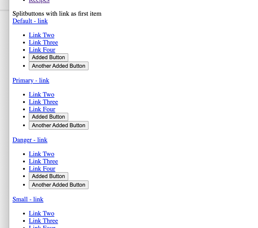
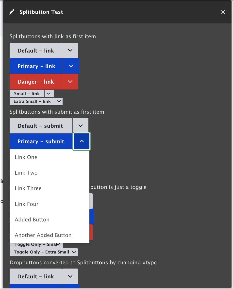
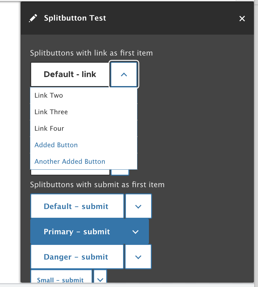
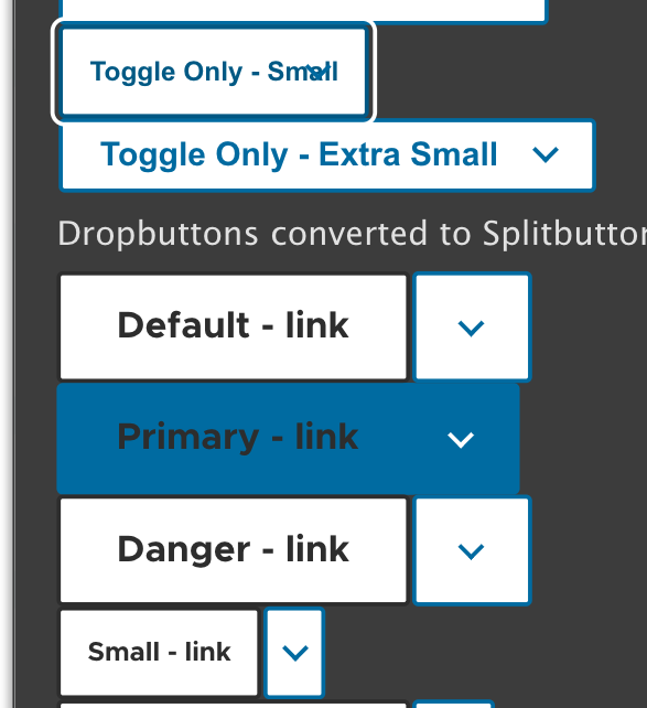
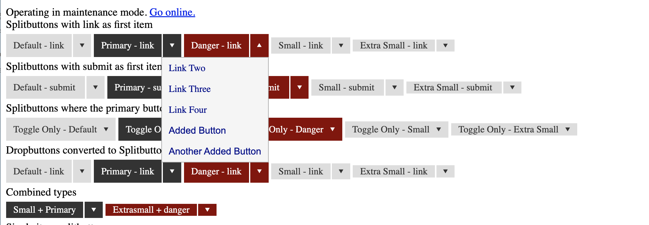
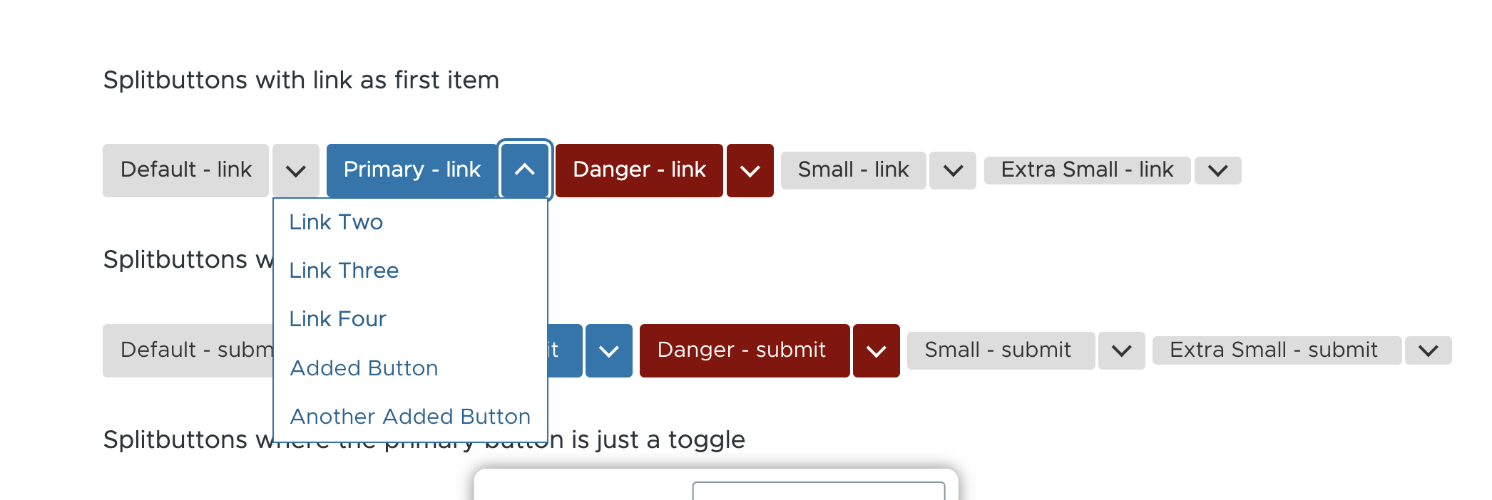
#typeto'splitbutton'. These uses will trigger a deprecation error for 10.0.0#splitbutton_typeaccepts strings and arrays, so multiple types (such as primary and small) can be added.#titleproperty is present, the main button is just a toggle with that title - as opposed to the default behavior of the main button being the first item plus a separate toggleThere is a testing module called Splitbutton Test that provides a page with most (all?) splitbutton variations at /splitbuttons
Although this module exists, there are no automated tests at the moment, so tagging with "needs tests"
Comment #75
nod_Thanks for the patch, looking good :)
Agreed we either need a new issue or make this one an actual issue and not a "plan".
On the implementation a few things:
type="button"attribute, otherwise it behaves like a submit button#splitbutton_items, why not#itemslike in lists? since it's more or less a fancy list. Dropbuttons were thought for actions links so the specificity comes from here. And there is no naming conflict that requires us to prefix with splitbutton.no-jsclass on the html element anymore. might want to bring that back.Glad to see this moving !
Comment #76
nod_Comment #77
bnjmnm#75.1 added
type="button"#75.2/4 JS was fully refactored to use class and the more expensive operations only occur as needed.
#75.3
This is to distinguish an operation list from a normal list. In this case, only link, button, and submit elements will get sent to the template. I was concerned #items would bring with it an expectation that a wider range of render elements could be added.
#75 Good catch on the disabled JS, I added a few
html:not(.js)styles that seem to take care of it. Screenshots attached,This patch also adds docs and keyboard navigation support based on the menu button pattern https://www.w3.org/TR/2016/WD-wai-aria-practices-1.1-20161214/examples/m...
Setting to NR since additional review is welcome, but aware that tests are still needed.
Comment #79
vsujeetkumar commentedFixed Test, Please review.
Comment #80
nod_no jQuery, nice :)
But use it still, don't duplicate the .once feature in the behavior please.
Would avoid having a extra function with :
this.splitbutton.addEventListener('mouseleave', this.pointerCursorOut.bind(this));And would put
this.splitbutton.addEventListenerin a variable to shorten this whole thing:Too bad we have support for IE11, could have used
Array.frominstead.if it's only one char:
firstCharno?I would return early instead of nesting the switch in that if.
Nice, surprised by how helpful it is :)
Comment #81
nod_for the jQuery.once thing, we could split the files, the class in it's own file, and the behavior in a different file, would be easier to override things if jQuery is an issue.
Comment #82
nod_Comment #83
bnjmnmComment #84
bnjmnmThese reviews are great @nod_!
#80.1
To avoid the need for using
once()I added anot()in the selector of elements to initialize:'.splitbutton:not(.js-splitbutton-enabled)'. Since.js-splitbutton-enabledis added during initialization, the selector would not find dropbuttons that had already been initialized. This selector, plus the fact that it is queryingcontextinstead of the whole document, seems like it would provide the same guardrails asonce(), but it's possible there are edge cases or performance considerations I'm not aware of.#80.2 I tried the
approach and it resulted in scoping issues. Events were broadcasting to every splitbutton on the page. I tried a few variations but ran into these problems unless I used my original formatting.
#80.4 I named it
firstCharssince it's an array - to me each item within the array would be afirstCharand the arrayfirstChars. Keeping as-is for now, but if this naming still seems counterintuitive I'll change.#80.5
Agreed. I thought eslint wasn't allowing this, but that was a mistake on my part 🙂.
#80.7
Wow, that needed some work!
#80.8+9
I ran into these symptoms after implementing the suggestion in #80.2, but not running into problems if I revert it. If this isn't the case on your end, I should be able to take care of it with a few additional details on how to reproduce.
This patch also adds tests.
Comment #85
bnjmnmAdded missing test groups
Comment #87
nod_About the .once it's actually how things were done back in drupal 6 so no worries about this working. It's about consistency If we do something we should always do it the same way, that way when the inevitable refactor comes, it'll be easier. We move the processed marker out of the classes to make sure we won't have performance impacts. If you want a no-jquery version have a look at #2402103: Add once.js to core. But we do have to use .once() and I would separate the files to have a file with a class and one with the behavior.
I see some problems with the JS crashing when there is only one item in the splitbutton, it can happen with permissions and whatnot.
About the .bind(): i see that, something weird in the compiling maybe. In any case, happy with what you have, as long as it works :) would still like a intermediate variable to make everything fit on one line.
firstChars: that makes sense too, ok with that.
keyboard works, my bad.
That feels not very overritable? can we have a template for that? not sure, asking for advice here.
Comment #90
nod_Adding credits from duplicated issue #2278473: Simplify Dropbutton markup in line with our CSS standards
Comment #91
nod_Comment #92
droplet commentedcredited myself from another issue :p
I don't know how to test it but look at the code......
To remove the dropdown and replace it with Splitbutton, or add a TOTALLY NEW splitbutton is not smart.
Splitbutton = button + dropdown.
1. Code a Dropdown (there're dropdown usages in Core already. Re-use or re-made it)
2. Style the Dropdown to Splitbutton
Comment #93
nod_@droplet it's to avoid breaking code for people.
Make a splitbutton, tag dropbutton deprecated => replace all core dropbutton with splitbutton => wait for D10 to remove dropbutton code.
not sure what the issue is. Once core dropbuttons are replaced we don't really need to fix dropbutton bugs if there are any we tell people to use splitbutton.
Or maybe i didn't understand the issue?
Comment #94
droplet commentedI meant we should make a shared component for the Core or common usage.
There're some dropdown usages. We can share the same codebase for that part.
For example, we have QuickEdit Button, which is a dropdown. A dropdown menu is too common for every site. Even on the Contrib Toolbar modules
And Splitbutton is totally the Button + Dropdown. There's no reason not to split it into 2 parts and take the advantages of code sharing
Comment #95
bnjmnmTo test, enable the splitbutton_test module provided in the patch, then go to
/splitbuttons.This was anticipated and it's already part of the solution in the patch. If a splitbutton has a
#titleattribute, there is no separate toggle button behaves like a dropdown. In the /splitbutton page provided by the splitbutton_test module, you can see examples of this in the "Splitbuttons where the primary button is just a toggle" section. A little bit of styling (which would be needed for any approach) would be all that is needed to provide a full dropdown experience.Providing selectors to style it as a dropdown could be as simple as adding a "dropdown"
#splitbutton_type, or by creating a '\Dropdown' render element that extends\SplitButtonand makes#titlemandatoryAnd code reuse was a priority in this approach overall. Unlike dropbutton, Splitbutton uses existing button styles, aside from changing border-radius in a few spots. This includes variants - unlike dropbutton a splitbutton can use primary/danger/small etc.
I believe this addresses all the concerns I saw. If not, perhaps spend some time on the /splitbutton page provided by splitbutton_test and come back with your concerns.
Comment #96
droplet commentedHmm. nice.
Personally, I don't really like how it mixed. I preferred the bootstrap naming and structures
https://getbootstrap.com/docs/4.5/components/dropdowns/#split-button
If I think in Splitbutton side...first..
splitbutton__main--with-toggleshould besplitbutton__main----
A bit odd.
----
I preferred (, actual it should be ....)
----
Add a new
.splitbutton__button. And add to below 2 buttonsThen, move the shared style on
.splitbutton__main-buttonto.splitbutton__button----
----
with-togglestyling the arrow with a different way.----
Missing
aria-*for dropdown. eg.aria-haspopup="true" aria-expanded="false"-
I stopped now. It's too confusing. Leaving the remaining for next round.
Comment #97
droplet commentedComment #98
bnjmnm@droplet the suggestions regarding selector names were very helpful! It made is possible to remove some repetition from the CSS, among other things.
Re: #87
once()in a separate file. Looks like #2402103: Add once.js to core may have some momentum, which is exciting, but I now see why we need to stick withonce()splitbutton_arrowfrom the render array. This was originally pulled from dropbutton, but isn't efficient here and Claro doesn't use it at all. All the arrows can be added by styling.splitbutton__trigger, like Claro already did, and the screenreader text can be added with an aria attributeRe #96
Also these changes:
Comment #99
lauriiiWhile it's nice to be able to control the attributes of all list items at once, it could be a bit limiting in some cases. I think traditionally we have allowed controlling attributes of each item individually. This is the case for item-list for example.
I'm wondering is we should also assert the type so that we could trigger an exception in dev environments.
Could be move some of the theming aspects of this render element to a template? We still have #2655374: Move classes from render elements to templates to resolve but I guess it would make sense to try to avoid adding more classes to the scope of that issue where possible.
I think we have pretty consistently prefixed our data attributes with
drupal-to avoid conflicts.Should this be something that could be overrided for theming purposes?
Nit: Extra space before the attributes.
Comment #100
lauriiiShould we add something to the open button in Stark just to make it usable?
Comment #101
jonathanshawAs a developer, I wouldn't expect to make a drop-down by modifying a split button. And even if it worked, I'd worry that what I'd done was unanticipated, might break in edge cases I hadn't considered, and might be brittle to future changes.
If SplitButton extended Dropdown, then I'd understand that what I was doing was reasonable and intended. It would signal that to me.
Comment #102
bnjmnmThere's currently no
Dropdownrender element. I mentioned in #95, onceSplitbuttonis added to core, we could then introduce aDropdownrender element that extendsSplitbuttonAdding a dropdown would be as simple as something likeComment #103
droplet commentedmy expectation:
dropdown-core
dropdown-core + splitbutton-core
dropdown-core + splitbutton-core + splitbutton-core__submit_button_handler
dropdown-core + (splitbutton-core) + autocomple-core
dropdown-core + selection (replacing HTML select)
dropdown-core + many+many
both RED & BLUE are buttons
RED is button
BLUE can be called dropdown also
ALL BLUE should be the same structure (code)
RED can be different than BLUE
To make a great component, we should consider more fixable usage, e.g. using on Toolbar.
In another word, the below case should be accepted: No direct hierarchical dependency.
Drupal needed a coder to annotate the UX style-guide to figure the common issues and suggestions from the NEW style-guide before actual patching.
Comment #105
bnjmnmThis addresses #99 and #100.
Additional changes were made to make extending splibutton more flexible. This was inspired by #3076171: Provide a new library to replace jQuery UI autocomplete, which proposed leveraging splitbutton for a new autocomplete element. The tests were expanded to include a custom element extending Splitbutton. This element is not a full autocomplete, it's more to prove that it's possible to extend splitbutton in certain way. It is close enough, however, that it could be used as a starter for an autocomplete render element.
Note that I didn't see #103 until I was posting this. I don't yet fully understand what is being asked there (I'll read through a few more times), but wanted to make it clear that this patch is not informed by anything in that comment despite appearing after it.
Comment #106
bnjmnmMissed #99.5 in the patch in #105. Will take care of that in the next patch that will be needed regardless -- there's bound to be changes needed in that 97k
Comment #107
lauriiiThis seems quite specific. Maybe we could make some changes to the item_list element to support splitbutton use case.
This seems pretty functional. Can we target js- prefixed classes or data-drupal-selector attributes to make sure people don't accidentally break these?
Can we remove these in Stable? According to consensus banana, we should have only functional classes in core / stable. Functional classes should be prefixed with js-.
@nod_ pointed out on another issue that he would prefer us to use data-drupal-attribute instead.
Comment #108
aaronmchaleTagging for review at future UX meeting
Comment #109
andypostNice to see that finally 👍
It also paves the way to the last missing peace of view 7 to land in core 9 - https://www.drupal.org/project/views_jump_menu
Comment #110
saschaeggiI'm also glad to see this happen soon :)
Comment #111
bnjmnmThis addresses #99.5 and #107.2-4. It was a significant refactoring to separate functional from visual.
Re #107.1
I tried a few different approaches before deciding on this one - the first was to declare
item_list__splitbuttonas#theme, but that kind of override won't work in a module. I then looked into leveraging the existing item-list element. This would work if using the template in modules/system/templates, but all of the overrides add a wrapper<div>around the<ul>, which would make this deviate from the a11y menu button pattern. Adding a conditional property to include/exclude the wrapper<div>seems too unweildy, but perhaps there's a way to use template suggestions on the module level that I overlooked?Comment #112
bnjmnmConfirmed with @rain that the div sometimes present in item_list does not break the menu button pattern. This eliminates the need for a separate
'splitbutton_item_list'. The existing item list can be used.Comment #113
lauriiiShould we explicitly document that this is based on the accessible menu button design pattern?
Nit: s/splitButton/splitbutton
I'm wondering if we should document that we have used the example from W3C as a starting point and reference to the original license https://www.w3.org/Consortium/Legal/2015/copyright-software-and-document 🤔
What if the theme has overridden the template and is using another class for targeting it? Unfortunately, I think we need a backend solution for this. Maybe we should use the theme system hack that allows modules to provide templates for theme suggestions.
Should we name this with something specific to splitbuttons?
Do we want to focus the first item even when using mouse for opening the tray?
Can we add explanation why this is needed here?
This is v cool 😎
Nit: This should be intended with 4 spaces instead of 6.
Nit: The indentations need some adjustments.
I think rendering the focus ring inside the tray would look better. You can look at the primary tabs on mobile for an example.
How should this look like?
Seems like text inside the tray in Seven need some adjustment because for some reason it looks distorted.
I think we should increase the right padding to ensure that long texts don't overlap with the arrow.
Comment #114
bnjmnmThis addresses everything in #113, but it's likely some items will need another round of attention.
#113.3
I'm not sure I fully understood the license requirements on the w3 page, but I provided my best attempt - at worst it's probably easier for a reviewer to point out what needs changing instead of having to write it entirely.
#113.6
Subjectively I don't prefer this, when using the mouse there's an expected correlation of pointer position and focused element. The W3 examples don't do this either. I did, however, notice that some examples were able to open on hover, so I added a
#hoverproperty to the splitbutton element. WhenTRUE(provided that#titleis not empty), the splitbutton will open on hover. This defaults toFALSE.#113.13
This is due to using text-shadow because using font-weight:bold changes the width of the items on hover/focus. I changed the values a bit to see if that helps. If not, another approach should be explored, or the design may need to be changed a bit. The dropbutton styles I used for reference at https://groups.drupal.org/node/283223#Split_Buttons_and_Dropbuttons were from 7 years ago, so it probably isn't necessary to adhere to that specific vision
Comment #116
bnjmnmNeeded to copy the new templates to Stable/Stable9 to address the failed tests in #114.
Comment #118
lauriiiI think #115/#116 starts to feel quite nice! ✨I think also the Seven designs look good after the changes in #114. 👏
However, I'm getting lots of following errors on the page:
I think the next steps should be to:
Comment #119
bnjmnmThe error in #118 was due to the theme system hack being a little more complex than the
system_branding_blockhack I referenced in order to do it for splitbutton. A change totemplate_preprocess_item_list__splitbutton()takes care of it, and I'm definitely open to feedback if there's a more effective way to accomplish this.Comment #120
lauriiiDiscussed with @rainbreaw and @bnjmnm about #113.6 and we agreed that when using a pointer device, the focus should remain on the toggle button because users using the pointer could find it confusing that the focus doesn't match with the pointer after the tray has been opened.
Comment #122
lauriiiCrediting @rainbreaw for accessibility guidance.
Comment #123
bnjmnmAddresses #120
Comment #124
lauriiiThank you @bnjmnm 👏 I believe the next step is to get thorough UX and accessibility review on the new element, as well as get review on the licensing requirements from a member of the licensing working group and/or committer more familiar with licensing.
Comment #125
bnjmnmThis patch:
Comment #126
lauriiiWould it be possible to implement this in a way that wouldn't cause this slight change in the position of the text when an item in the tray receives focus?
Comment #127
lauriiiThis was discussed as part of the usability call yesterday. People on the call recommended two next steps:
Comment #128
lauriiiOne more todo is to add splitbutton to the cspell dictionary
Comment #129
bnjmnmCreated an issue for assistance with licensing: #3167444: Guidance on adhering to w3 licensing guidelines.
Created followup for creating a dropdown element that extends splitbutton: #3167446: [PP-1] Create "dropdown" render element that extends splitbutton
Comment #130
droplet commentedI'm still don't understand why extend dropdown from splitbutton. BUT not to extend splitbutton from dropdown.
Comment #131
bnjmnmThis patch addresses #126 and refactors the svg use to comply with the approach implemented in #3085245: Un-inline SVGs in pcss.css files, add build tool to inline them when compiled.
There is some additional work needed to address some issues in Claro when the .touchevents class is present.
Regarding #130
This explanation has more to do with process and circumstances rather than a architectural ideal, but hope this helps.
I personally prefer the approach of dropdown extending splitbutton as this will require very little additional code, it simply needs to be a splitbutton that requires #title and adds a wrapper class. The complexity is centralized in the splitbutton render element, which I find easier for debugging.
While this is my personal preference, I'm open to discovering why the other approach is more beneficial for Drupal overall. Fortunately, determining that does not have to prevent the current splitbutton implementation from being added to core. That decision can be made in #3167446: [PP-1] Create "dropdown" render element that extends splitbutton, and splitbutton can be refactored to extend dropdown if there are compelling arguments to do so.
Comment #132
bnjmnmThis addresses the padding issue I mentioned in #131. Figured out enough about the direction of #3083256: Create smaller variations for form elements to determine it shouldn't block this issue.
Added a deprecation for dropbutton and that deprecation is included in
\Drupal\Tests\Listeners\DeprecationListenerTrait::getSkippedDeprecationssince replacing every dropbutton in core isn't easily done.Comment #133
bnjmnmReceived usability review & usability blessing at #3165887: Drupal Usability Meeting 2020-08-25
Comment #134
bnjmnmReroll
Comment #135
bnjmnmReroll
Comment #136
andrewmacpherson commentedI no longer think we should use the ARIA menu roles here. Sorry to flip-flop on this one!
Looking back at comment #67, I'm embarrassed by what I wrote there. I was basically saying "Oooh, here's an ARIA thing. Let's use it!". But I didn't stop to appraise whether it was useful or appropriate for the contexts in which we currently use the dropbutton.
Some important points:
I'll dig out some material I already have bookmarked about this.
Comment #137
aaronmchaleQuoting myself from #3165887-17: Drupal Usability Meeting 2020-08-25 this issue was discussed during the meeting and unfortunately I missed the meeting.
Comment #139
bnjmnmI was reconsidering the implementation of Splitbutton based on what I'd learned from an accessibility course I recently completed, and it turns out #136 made essentially the same conclusion (with a far better explanation than I could muster 🙂).
The information in #136 would be all I'd need for making the appropriate changes to Splitbutton, but I'd like to make sure this is implemented in a way that facilitates easy extensibility and reuse. It would help to know a bit more about the bit mentioned here:
This could give me a better sense of how the functionality provided here could potentially be used for dropdown navigation. There are some reasonable assumptions I can make, but more details will help predict how this may get used.
Regarding this from #137
I'm leaning towards "we put the responsibility of fixing any broken UI on the developer". In the next patch I'll add docs that list the render elements guaranteed to work without the need for further customization.
Comment #140
bnjmnmThe following articles provided me a much better sense of where menu roles should/shouldn't be used
Based on what I learned there it became pretty clear that the menu pattern is not appropriate in this case, and it's probably also worth reducing some of characters commandeered by keypresses.
The next step would be to figure out the best way to rein in some of splitbutton's functionality while continuing to offer it in a way that facilitates easy reuse such as dropdowns. This may require splitting this into multiple render elements. I'm assigning to myself as I have an idea of how do this and intend to provide a patch. I may not be able to do this immediately so if anyone would like to have a go at it, ping me on Drupal slack and we can coordinate!
Comment #141
bnjmnmThis patch changes the accessibility implementation inspired by #136, the articles I mentioned in #140 and an an additional article https://www.marcozehe.de/wai-aria-menus-use-with-care/. A toggleable list of links/buttons doesn't require all the extra baggage that the menu button pattern introduces. It should be sufficient to have a button with
aria-haspopupandaria-expanded, with the first item being focused when the list is expanded.The greedy keyboard handling has been reduced to arrows, escape, enter and space. Arrow up/down still work like the previous implementation, but it's now also possible to tab through the items instead of having it close the list and advance to the next tabbable item. Some of the reasons informing this decision:
Tests were also updated to reflect these changes, plus the render element in the splitbutton_test module can be repurposed fairly easily for #3167446: [PP-1] Create "dropdown" render element that extends splitbutton, and demonstrates why creating a dropdown element that extends splitbutton winds up being easier to manage than a splitbutton extending a dropdown - despite the latter scenario seeming like the better way to do it.
Comment #143
bnjmnmHad to update
SplitbuttonDeprecationTestdue to changes in #141 and the@expectDeprecationannotation being deprecated.Comment #144
andrewmacpherson commentedDeleting this from the issue summary (introduced in #132 without explanation):
Oh yes it does! It's a simple disclosure button, and it works pretty well. You press it, and additional content is revealed. Press it again, and that content is hidden.
It could be greatly improved by conveying it's behaviour and state programmatically, for which we have #2893663: Dropbutton should report open/closed state to assistive technology. At the time when dropbutton was created, support for
aria-expandedwas patchy. So the approach of using the button name to convey the behaviour and infer the current state was good enough.Comment #145
mgiffordtagging
Comment #148
darvanenThis appears to have gone through several robust code reviews, I think a decent next-step would be condensing the knowledge here into a change record.
Comment #149
marcoscanoHiding patches now that we have a MR.
Comment #150
marcoscanoI acknowledge this is way over my head (props to all contributors 👏) so my review is mostly cosmetic, feel free to disregard anything that doesn't make much sense. I'll try to get more involved in the coming days if I can.
Comment #152
kristen polMoving back to needs work for some cleanup based on feedback above.
Comment #157
tim.plunkettComment #158
lauriiiHiding files + removing tags
Comment #159
mherchelThis is looking really good. A couple things that need to be fixed.
Comment #160
mherchelTalked with @lauriii and we came to the conclusion that we need to do the following to get this over the finish line.
Comment #162
hooroomooPushed commits that addressed some of the items in comment #160.
Remove hover variant - move to followup. This is currently unnecessary, and has issues on touch devices, and focus issuesAdd basic styles for starkConvert to CSS logical propertiesFix olivero stylesHere is the followup issue created for hover states from item #1: https://www.drupal.org/project/drupal/issues/3347690
Comment #163
mgiffordNoting that this is an ATAG issue.
Comment #164
bnjmnmNo-JS Styles
Claro

Olivero
Stark
Off-Canvas Styles
Claro
Olivero
Comment #165
bnjmnmComment #166
bnjmnmComment #167
hooroomooIt looks pretty good, I just noticed a few minor things when manually testing.
1. Visual focus is lost when tabbing through the splitbutton dropdown options when JavaScript is disabled

2. Off canvas styling (text covering the toggle in small button and different colors on the button in olivero)
3. Stark element extending splitbutton looks a little off
Comment #168
hooroomooComment #169
hooroomooComment #170
mherchelIn the commits above:
Still to do
Comment #171
mherchelGot some scaffolding in place for the initial styling of the off-canvas splitbutton. Still lots of work to do there, but it's coming along.
Comment #172
mherchelPushed some work on making the splitbutton look good in both Olivero and in the off-canvas menu.
It's looking pretty good now (including RTL and focus styles), however I still want to put in a bit more TLC into abstracting the variables, and simplifying the CSS, so leaving at NW till next week.
Comment #173
mherchelRefactored the base styles to use PostCSS and have properties defined by custom CSS properties
Comment #174
cosmicdreams commentedHi all, just found this issue so I'm sorry if my question was asked before.
What if we wanted to have the options in a splitbutton store a user preference? Would it be possible to:
Comment #175
mherchelCross linking #3361315: Dropbutton quickly shows/hides its menu on pageload causing layout shift. The dropbutton component has an issue where the non-JS styles cause a layout shift. Split button will have the same issue, and we should probably take care of it before adding to core.
Comment #176
bnjmnmRe @cosmicdreams from #174, while nothing you've listed is supported out of the box, the splitbutton architecture is intentionally designed to accommodate this kind of flexibility. It's great to know about use cases such as yours that make this a benefit to core.
input[type=submit]are the the elements that are tested and have default styling, but fortunately it's not exclusive to those elements.This could potentially be a simple as running some js in a behavior to add a class as needed to the element, and since it's in a collapsed element you don't have to worry about it flashing as a different color. If it needs to be done earlier, check out toolbar.module for some wild-but-effective ways of letting localstorage change styling before the first page render (which I can explain further if needed.. again find me on Drupal Slack 🙂
Comment #177
cosmicdreams commented@bnjmnm it is great to hear that the intent of the splitbutton is to be flexible and allow more elements that the currently supported: link, button (which I learned recently isn't a
<button>but is basically a submit button) and literally a submit button. I don't see how that flexibility is achieved without overriding the splitbutton element's filterItems method though.see: https://git.drupalcode.org/project/drupal/-/merge_requests/3377/diffs#c5...
That method is what provides the limitation of the render element to support ONLY those three #types. If you wanted to maximize your flexibility you might want to consider adding
html_tagto the list. Then you could have all kinds of things. Or make the$allowed_typesa property on the object so that overriding objects would just need to override that property and keep everything else the same.In working on same_page_preview, I've had to turn to javascript to provide me the kind of flexibility that I need. I think I see a path to success if:
1. splitbutton actually allowed
<button>s2. maybe achieve that via supporting html_tag as a #type
3. allow me to override the allowed_types so I can do that myself.
Comment #178
cosmicdreams commentedAlso; Hello! is this native nested CSS in core? ( core/misc/dialog/off-canvas/css/splitbutton.css line 127 )
Yes please.
Is there an initiative to spread this enhancement to all of Drupal's CSS yet? That makes me think back to my first contributions in Drupal where we used SCSS to "modernize" Drupal's CSS.
Comment #180
bnjmnmClaro and Umami are currently looking a little funky, which I suspect is due to some of the in-progress changes recently added by @mherchel. Perhaps that can either get wrapped up or provide a comment describing what needs to be done to complete the intended changes?
Comment #181
mherchelexactly. I've been going back and forth in between Olivero and Stark and tweaking the default styles' custom properties to make it easily themable by all themes.
Still haven't gotten back yet to Umami or Claro.
Comment #182
mherchelJust pushed my local changes to the base styles and Olivero's styles. I also pushed a JS fix to not close the dropdown if the dropdown contains focus (we had to do something similar within Olivero's menus).
Still to do:
I feel that we're starting to get really close here!
Comment #183
mherchelCSS is much cleaned up and default styles are looking good. Setting back to NR
Comment #184
smustgrave commentedCC failure.
Have not reviewed.
Comment #187
bnjmnmTo prepare for the dependency evaluation, I posted an issue to the Popover polyfill project to see what their security policies are https://github.com/oddbird/popover-polyfill/issues/110
Comment #188
bnjmnmCSS got overhauled.
Visibility & stacking is now managed by the popover API (polyfill dependency evaluation in IS). The version of Chromedriver on DrupalCI does not support popovers, so this effectively tests the polyfill, too.
Positioning is now managed by floating UI
This significantly reduces the unwanted surprises of a splitbutton conflicting with another z-index, causing unwanted reflows, or being inaccessible to due position on a page.
This is again reviewable.
Stark
Claro

Olivero
Umami

Comment #189
smustgrave commentedWonder if those screenshots could be added to the CR?
Comment #190
mherchelThis is a great idea, but the MR still needs review.
Comment #191
needs-review-queue-bot commentedThe Needs Review Queue Bot tested this issue. It no longer applies to Drupal core. Therefore, this issue status is now "Needs work".
This does not mean that the patch needs to be re-rolled or the MR rebased. Read the Issue Summary, the issue tags and the latest discussion here to determine what needs to be done.
Consult the Drupal Contributor Guide to find step-by-step guides for working with issues.
Comment #193
kostyashupenkoRebased
Comment #194
smustgrave commentedSeems reroll caused some failures.
Comment #196
catchIs the polyfill still needed here, it looks like popover has support in all supported browsers now?
Comment #197
finnsky commentedCool! I just removed polyfill from toggletip
https://www.drupal.org/project/drupal/issues/3197758
Comment #198
mherchelAs of now, it's needed. But I'd guess that it won't be needed by the time this finally lands.
So... TLDR, we need it now, but likely won't need it in a few months as newer versions of the browsers get released.