

Closed (fixed)
Project:
Drupal.org site moderators
Component:
Site organization
Priority:
Normal
Category:
Support request
Assigned:
Unassigned
Reporter:
Created:
31 Jan 2013 at 19:55 UTC
Updated:
17 Apr 2014 at 20:04 UTC
Jump to comment: Most recent, Most recent file

Comments
Comment #1
killes@www.drop.org commentedThanks for bringing this up! I was wondering about this too. I've no idea what causes this.
Maybe we should make
https://drupal.org/node/add/project-issue/webmasters
more obvious? Blink tags?
Comment #2
silverwing commentedOn our documentation pages, the "Report to moderators" links to the webmaster queue - so users are probably clicking that link for help. ( example doc page: http://drupal.org/node/878784 )
I believe that link used to do to the Documentation queue, but since there's no active Person In Charge there, it was changed to here.
Comment #3
killes@www.drop.org commentedI tried to add some classes, but it doesn't seem to work.
Comment #4
killes@www.drop.org commentedhttps://drupal.org/node/3202/edit/issues
for anybody else who wants to try
Comment #5
kingandySeems to be stripping out most HTML code apart from what's provided in the rich text editor, and no way to switch input format... I've gone ahead and emboldened that whole first paragraph, that should at least draw the eye a little more.
Comment #6
WorldFallz commentedThat still requires folks to actually read what's there and my guess is, the type of users finding their way there to report personal support issues are exactly the type least likely to read anything there. :-(
Comment #7
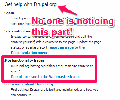
WorldFallz commentedI think I might have found where they're mostly coming from. On https://drupal.org/support:
If someone scans the page fast, the eye is drawn right to "Site functionality issues" right past the "Get Help with Drupal.org" part. I'm no designer, but to my eye the bold trumps the font size/font family of the heading there.
Comment #8
silverwing commentedhttp://drupal.org/support needs some attention, but in the meantime I added an ugly pink notice about the drupal.org section. (I used the error class since I couldn't find the name of the not-as-ugly beige-ish one.)
Comment #9
kingandyI think you're thinking of "warning" (or "messages-warning"). Is that better?
Comment #10
silverwing commented@kingandy - much better! thanks
Comment #11
dddave commented