

 The 2026 Drupal Business Survey is open. Your response will help shape the future of the Drupal business ecosystem.
Simpletest really needs to add an icon of some sort to the list of tests so that it is easier to find broken tests. We've addressed this in other parts of the UI & just need to apply it to the Testing infrastructure - admin/config/development/testing/results/3
As a practical example for how a user with over 20/20 vision can benefit from this, I reverse my screen colors so that I can work late at night and not disturb my partner when I'm working on bugs with Drupal. With the colors reversed I have no idea when there is a failed test or not as I can't distinguish easily by color.
WCAG reference is:
http://www.w3.org/TR/2008/REC-WCAG20-20081211/#visual-audio-contrast-wit...
| Comment | File | Size | Author |
|---|---|---|---|
| #7 | Tests-errors-icons.png | 96.91 KB | kattekrab |
| #4 | green-too-light.png | 38.68 KB | mgifford |
| #3 | SimpleTestColor-NoRedGreen.png | 122.38 KB | mgifford |
| #2 | SimpleTestColor.png | 101.88 KB | mgifford |


Comments
Comment #1
star-szrCould you please provide a screenshot? I'm not clear which part of the UI you're talking about here. On admin/config/development/testing/results/NUM, there is a 'status' column on the right that shows an icon for each assertion.
Comment #2
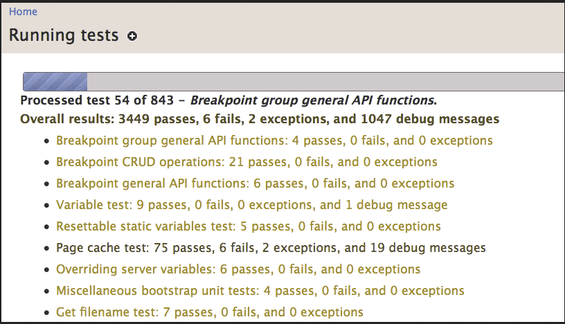
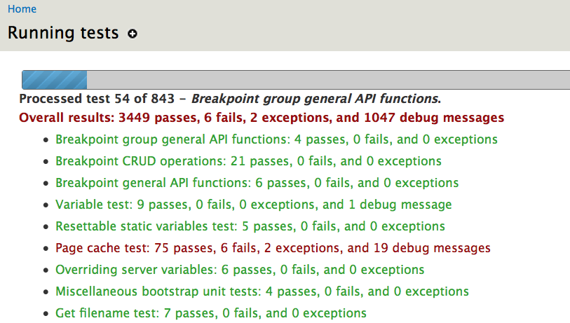
mgiffordHere's an example from /batch?op=start&id=9
Comment #3
mgiffordMore importantly though, compare what it looks like to 90% of us:
to what it looks like if you strip out the red/green using something like http://colorfilter.wickline.org/
Adding an icon for failures (as we have with other error messages) would help.
Comment #4
mgiffordThe green is now #33A333 which only works on large text http://leaverou.github.io/contrast-ratio/#%2333A333-on-white
I haven't checked that the red is good (as all the tests are passing here).
EDIT: The main point here though would be to have a check or cross associated with each test to give a quick visual representation of whether the test worked or not. Something that does not rely on color.
Comment #5
mgiffordLet's look at this in 8.1
Comment #7
kattekrab commentedHas this been resolved?
I followed the instructions on how to Run Tests.
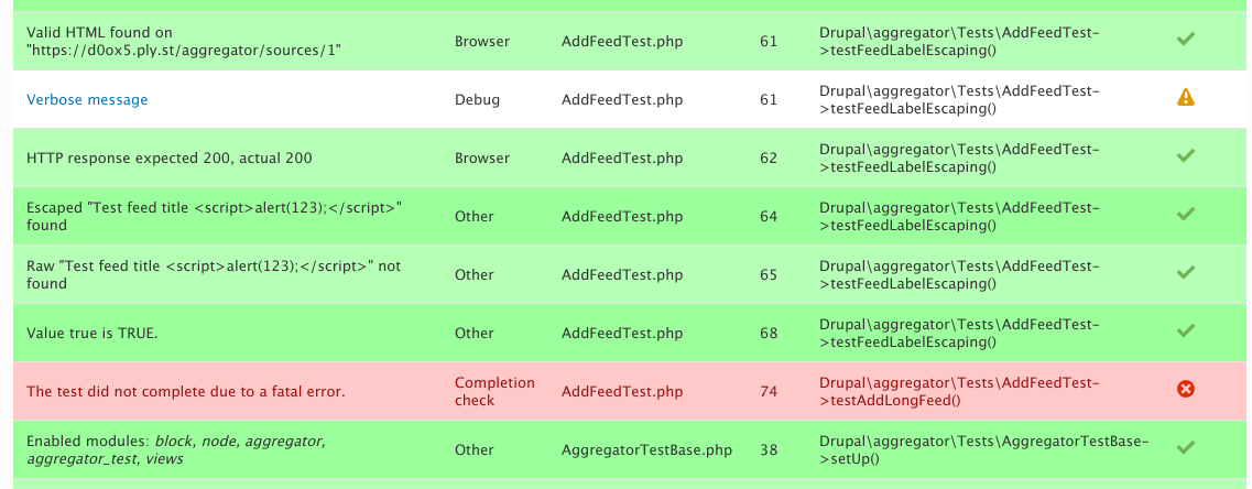
This gives results that do show status icons as well as colour.
Although I would consider moving the status column to the beginning of the row rather than the end
Comment #8
mgiffordThis looks good to me from an accessibility point of view. Moving the icon would be an improvement though as it isn't generally where folks expect that type of thing to be.
I haven't tested this recently but will close the issue based on the screenshot. Thanks.