

Closed (fixed)
Project:
Drupal core
Version:
8.0.x-dev
Component:
views_ui.module
Priority:
Normal
Category:
Bug report
Assigned:
Unassigned
Issue tags:
Reporter:
Created:
24 Feb 2013 at 01:11 UTC
Updated:
29 Jul 2014 at 21:56 UTC
Jump to comment: Most recent, Most recent file


Comments
Comment #1
echoz commentedComment #2
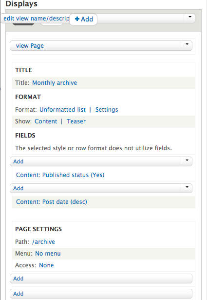
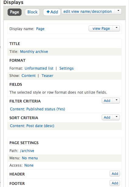
dawehnerThe screenshots are looking pretty good, though I have no clue about whether that css is the proper fix :)
Comment #3
echoz commentedComment #4
echoz commentedAlternatively, rather than overriding in views-admin.css, in dropbutton.base.css, we could target only where needed, thereby excluding views_ui.
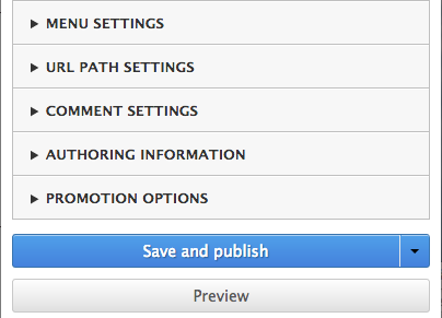
We could do - .js .node-form .dropbutton-wrapper - which targets the node create/edit screen as shown in the first screenshot. This would be smarter keeping it in dropbutton.base.css. Can anyone report if it's used elsewhere?
Comment #5
andymartha commentedIn a fresh installation of Drupal 8.x-dv on March 6, 2013, the views-dropbutton-1925748.patch fixed the mobile problem on IOS and in Google Chrome and Firefox on the desktop (screen resize). See attached screenshots.
I want a little time maybe tonight to further investigate this on Android and echoz's comments because I like mobile.
Comment #6
damiankloip commentedYeah this certainly looks better, anyone who wants to edit a view on a mobile is surely crazy though.
Comment #7
webchickWow, that is much better indeed. :D
Committed to 8.x, thanks! I'll push once testbot has caught up a bit.