

 The 2026 Drupal Business Survey is open. Your response will help shape the future of the Drupal business ecosystem.
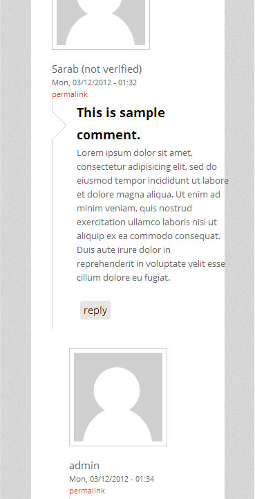
I think left and right margins are excesive, specially in the movile versions.
| Comment | File | Size | Author |
|---|---|---|---|
| #3 | screen.jpg | 14.59 KB | bigcrunch |
| #2 | best_responsive-responsivetheme-1963708-1.patch | 2.39 KB | chris.smith |
| #1 | comment.jpg | 47.98 KB | chris.smith |
| #1 | best_responsive.patch | 2.39 KB | chris.smith |


Comments
Comment #1
chris.smith commentedAll these changes were implemented into the patch I have provided.
Comment #2
chris.smith commentedPatch file attached.
Comment #3
bigcrunch commentedIt looks great.
Only problem I see mid-sized screens, the logo you step through the menu, and the text "menu" is out of place (see attached file).
Thank you very much!
Comment #4
bigcrunch commentedI've solved the wrong "Menu" position by changing "position: inherit;" to "position: center;" in " /*navigation top menu*/
#navigation {" of responsive.css file, but the logo remains hidden because of the menu.
Comment #5
ArlethS commented@bigcrunch
change position back in inherit, turn on title site edit it in css to be black and unselectable,some margins should be adjusted to fit the menu. downside - on the smallest screens there will be a black area under the logo about the same size as it