
 Come together with the global Drupal community in Rotterdam, 28 Sept – 1 Oct 2026. Sessions, contribution, connection, and Early Bird savings until 8 June.
I get this in an iPhone simulator on admin/structure/block:

echoz explains this as:
you're seeing that the blocks table (scroll down) can't reduce in width as narrow as the viewport, and is pushing out to the right to show the table.
Here's an issue to fix it. :)
| Comment | File | Size | Author |
|---|---|---|---|
| #5 | blocks-structure-mobile01.png | 24.89 KB | drclang |
| #4 | Screen shot 2013-08-10 at 6.11.22 PM.png | 96.54 KB | u.rodionov |
| #3 | iPhone-permissions.png | 74.2 KB | echoz |
| #1 | iPhone-blocks-table.png | 63.29 KB | echoz |

Comments
Comment #1
echoz commentedThis path, admin/structure/block is on the list to review at #1876196: Handling admin pages with tables
Webkit's select element only squishes in width as narrow as its widest option element within. We see gecko (FF) or trident (IE) squishing (technical term) the select element narrower.
Genuine iPhone screenshot:

Comment #2
echoz commentedComment #3
echoz commentedMarked #2061873: Toolbar and Page pushed over at admin/content on iPhone as duplicate.
This is also true anywhere visible table cells are wide enough to push out to the right. This happens when the table is too wide for any reason, as it is at admin/content and admin/people/permissions. On the phone what happens is rather than a scrollbar, the table scales down so we get small text, along with the part above the table having the space on the right where it's getting pushed over by the table's overflow.
It seems like wherever this shows up, a solution might be to further implement the priority table cell technique, hiding another cell at that point.
It's really too bad about the webkit select element, where there is really nothing we can do besides -webkit-appearance: none; and style a custom select, needing the dropdown arrow - not an option IMO, so webkit would cause us to loose another cell at admin/structure/block.
Comment #4
u.rodionov commentedOverlay on low size.
Comment #5
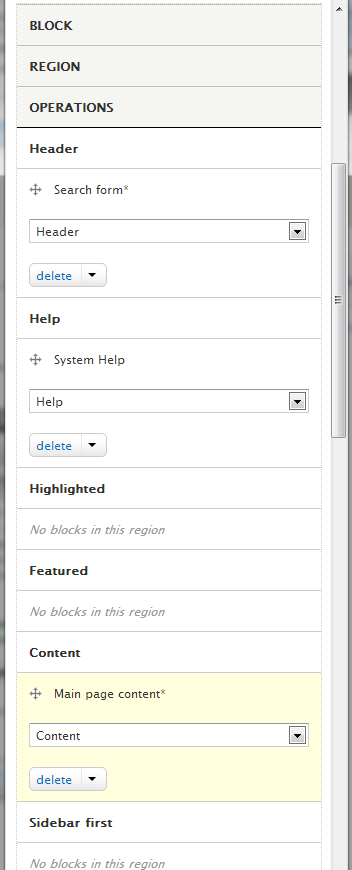
drclang commentedHello guys!
What about an idea to alter table on the path "admin/structure/block" for mobile devices? We can just declare table elements as blocks and then get something like this:
It also solves an issue with the table wider than a viewport.
Comment #6
echoz commented#4, If you begin to navigate from a narrow width (or on a mobile device), before clicking into an admin section, the overlay is not invoked.
Comment #6.0
echoz commentedc
Comment #7
echoz commentedSelect element is narrowing on newer Webkit.
Comment #8
lewisnymanThis feels like a duplicate of #2152525: Several admin pages with tables on them have enormous white gap on side on mobile and solution for this problem is being worked on here: #2280035: Add another responsive tables solution that doesn't hide content