Closed (fixed)
Project:
Superfish Dropdown Menu
Version:
7.x-1.8
Component:
Documentation
Priority:
Normal
Category:
Support request
Assigned:
Unassigned
Reporter:
Created:
25 Apr 2013 at 12:25 UTC
Updated:
11 May 2013 at 07:30 UTC

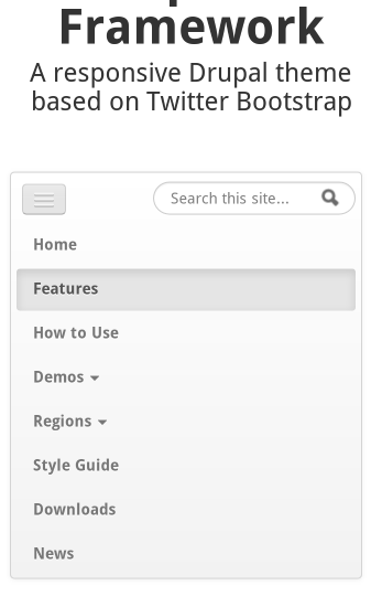
Hi, i am using the Open Framework theme together with superfish and i would to get it to work on mobile devices using responsive design like this (see attachment).
https://openframework.stanford.edu/
How i can do this ?
thanks
| Comment | File | Size | Author |
|---|---|---|---|
| responsive-menu.png | 23.16 KB | aiphes |

Comments
Comment #1
mehrpadin commentedHey,
For the time being you can just turn the menu into a
<select>using the sfSmallscreen.Comment #2
aiphesok, where can i set this ? which superfish version do i need ?
thanks
Comment #3
mehrpadin commentedIt's enabled by default, just resize your browser window to see it :)
Comment #4
aiphesi replace the 1.2 by the 1.4.8 and added the path in
/admin/config/user-interface/superfishlike :empty cache,but no change on my opera mobile emulator or when resizing window...the menu shrink but no select...
Comment #5
aiphessuperfish library 1.4.8 + module 7.x-1.x-dev (2013-04-18) do the job...great
Comment #6
mehrpadin commentedRepeating myself from the other issue, you're using this? https://github.com/mehrpadin/Superfish-for-Drupal/archive/master.zip right?
Comment #7
aiphesyes
Comment #8
mehrpadin commented:)