Closed (fixed)
Project:
Documentation
Component:
Marketing
Priority:
Normal
Category:
Task
Assigned:
Unassigned
Reporter:
Created:
12 Dec 2007 at 15:42 UTC
Updated:
31 Jan 2008 at 17:11 UTC
Jump to comment: Most recent file

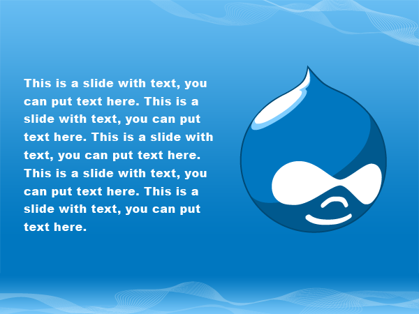
As step one, upload or link your 5 different styles, as pngs or actual slides.
| Comment | File | Size | Author |
|---|---|---|---|
| #38 | Picture 3.png | 85.96 KB | sutharsan |
| #34 | oo_pres_final.zip | 475.9 KB | luciasoneil |
| #34 | pres_final.ppt | 552.5 KB | luciasoneil |
| #32 | pres_final.ppt | 552.5 KB | luciasoneil |
| #32 | pres_final.odp | 186.76 KB | luciasoneil |

![marc.robinsone__Slide1[320x200].PNG](https://www.drupal.org/files/issues/marc.robinsone__Slide1%5B320x200%5D.PNG)
![marc.robinsone__Slide2[320x200].PNG](https://www.drupal.org/files/issues/marc.robinsone__Slide2%5B320x200%5D.PNG)
![marc.robinsone__Slide3[320x200].PNG](https://www.drupal.org/files/issues/marc.robinsone__Slide3%5B320x200%5D.PNG)
Comments
Comment #1
webchickSubscribing. Thanks a lot, Wim! :D Great task.
Comment #2
webchickMoving to the documentation queue.
Comment #3
wmostrey commentedIt's been 3 days since the task has been claimed so I posted a request to submit the progress so far in this thread.
Comment #4
wmostrey commentedStill no reply, that's a real shame. webchick or aclight, could you open up the task again?
Comment #5
add1sun commentedThe deadline for this task is not until Dec. 19, 2007 so we need to wait until the deadline at the least.
Comment #6
aclight commentedI've marked this as action needed at http://code.google.com/p/google-highly-open-participation-drupal/issues/...
We'll give the student a couple of days to respond and otherwise reopen the issue.
Comment #7
luciasoneil commentedHere are 3/5 of my styles, I hope this is what your guys are looking for. I will have the other two up in about 10 minutes.
Thanks,
David
Comment #8
aclight commentedSo far these look pretty good. I think #1 and #3 are my favorites so far, but I'm looking forward to the other two.
Comment #9
luciasoneil commentedHere are the other two, they play off of each other the main differences are the gradient vs rounded rectangle.
Comment #10
rohandhruva commentedI like the slide_four.jpg
The design in the top right is very nice, I like the waves and stripes. Also having the logo prominently displayed in the bottom is nice ..
If not four, my vote would go for one, where the text is clearly legible, but the logo is not prominent enough ..
Comment #11
keith.smith commentedIndeed, slide_four is very nice. My second place pick would be slide_three.
Comment #12
luciasoneil commentedIf you like a few ideas out of two I can combine them, if you'd like.
- David
Comment #13
luciasoneil commentedIf you like a few ideas out of two I can combine them, if you'd like.
- David
Comment #14
luciasoneil commentedIf you like a few ideas out of two I can combine them, if you'd like.
- David
Comment #15
wmostrey commentedWow that's really great work! My favorites are slide two and four. Counting the votes, slide four is winning. I'd give this another day, and then we'll see what style comes out on top. Thanks for the great work so far!
Comment #16
aclight commentedHere are my critiques for each of the designs:
So, my vote would go to #4, and my second favorite is probably #5 but I would remove the blue header in that case.
I've extended the deadline for this task until Sunday, Dec. 23, to give you some time to make the final templates once the votes are in.
Overall, these designs look very good, and you've done a great job on this task so far.
Comment #17
luciasoneil commentedWould you like .ppt and .odp templates, I can do both.
- David
Comment #18
wmostrey commentedAs per the task's description, .ppt and .odp would be great.
Comment #19
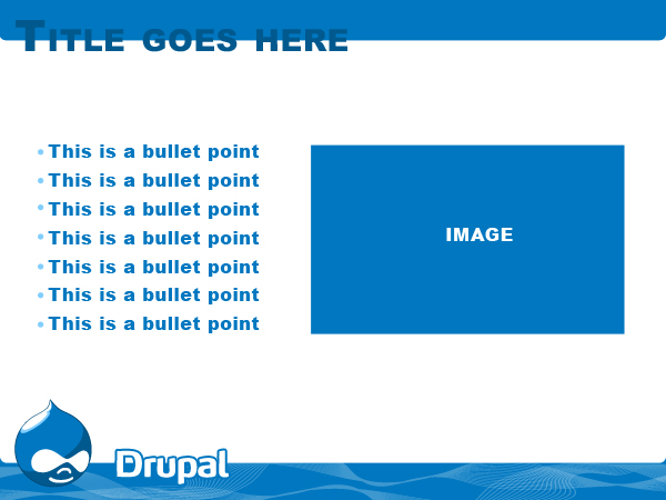
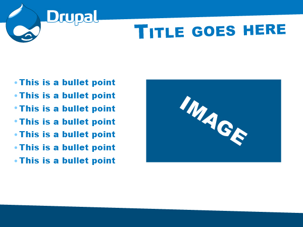
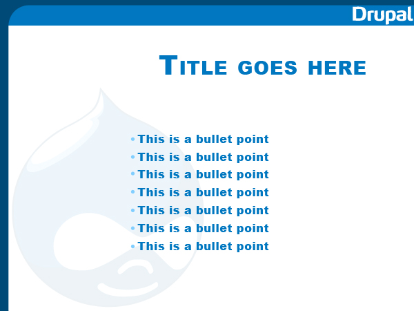
marcrobinsone commentedI love slide #4.
I'm hoping to recycle my template. The previews are attached with this comment.
Comment #20
yoroy commentedIn general:
- put the logo at the bottom seems best to me. When along the top it could interfere with the actual title of the slide. Try to keep druplicon and the word Drupal at the same proportions as in the druplicon sourcefile, don't scale them independently.
- Which typeface are you using for the body text?
- Would have been nice to see a slide template based on the default Garland theme.
- White backgrounds are very harsh on the eyes, I'd like to see a variation with tinted backgroundcolor
1: looks like you are showing a cropped view of a all 4 rounded corners slide. Centered heading is not so good, better to keep this left aligned, works much better with long, wrapping titles. I'm not a fan of the putting the logo real big and faded in the background trick in general. A nice and clean rounded corner design would surely be nice though.
2: slide two: no rotating the text please! logo top left makes it too prominent.
3: better. efficient. Not sure about the yellow. There's so little of it, it almost looks like a stain. I think you should choose this one to do some more variations with. aclight is right thoug about the loss of screenspace especially with 2 coumn layouts.
4: I advise to just keep the title left aligned. The waves are ok, but why fade them out with a gradient? (bottom one). I like the wave better directly on the white as it is behind the title. If you want to do some more work on 4/5 I'd suggest using a wave only along the bottom. These are really subtle lines though, have a look at how you could make it workd with the more robust and solid Drupal logo. tinted background could work great, use whites for the wave, etc.
5: Title is unreadable like this. 4 is better.
so, I'd say work on option 3 OR 4 some more. Better not combine elements from the different designs but pick one direction and progress from there.
Comment #21
luciasoneil commentedShould I go with #4 then? It seems that it has the most votes.
- David
Comment #22
aclight commentedI would say go with #4. You might consider yoroy's comments in #20 though when creating the final style.
Comment #23
wmostrey commentedHey David, #4 seems to be the most popular, so you can go ahead with it. Thanks!
Comment #24
luciasoneil commentedI will submit the finals today for critique.
- David
Comment #25
wmostrey commentedHey David, if you could find some time to upload your final work, that would be great.
Comment #26
bertboerland commentedsubscribing (looks good and a very old feature request can be closed)
Comment #27
luciasoneil commentedFinals of Version 4, let me know if I forgot any of the slides.
-David
Comment #28
aclight commentedIt looks like you got all of them to me. You were still planning to post the powerpoint and OpenOffice templates, right?
Nice work so far.
Comment #29
bertboerland commentedunder what copyright/license (cc, gpl, versions, etc) will this be released?
Comment #30
aclight commented@bertboerland: That's a good question, and probably something that we should have specified in the task description. I would suggest CC-BY-SA (http://creativecommons.org/), since I think that's what Drupal.org recommends for screencasts, etc. Since the templates include the Druplicon there must be some restriction on what license can be used, since that's probably not in the public domain.
@all: I'm not very familiar with the world of licensing and copyrights, so someone with more knowledge in this realm might want to step up and make a recommendation here.
@luciasoneil: Can you include some indication in the templates as to the license they have been released under please. I'm not quite sure how you would want to do that--perhaps you can create yet another slide type that just has the copyright/license information. But you definitely should include this information somewhere, so others don't have worries as to how they can use the templates.
Comment #31
luciasoneil commentedaclight, Yes I am, I wanted to get the final go ahead on all the slide templates before I submitted that. || I will have a look into the copyright information as well.
- David
Comment #32
luciasoneil commentedTemplates attached
- David
Comment #33
yoroy commentedGood work!
2 issues:
- The blue titles are almost unreadable. Please make these white and lose the drop shadow.
- The .odp version you uploaded is incomplete, these graphics are missing from the file:
export_front_bg.png
export_front_logo.png
export_main2_bg.png
l_logo.png
When I suggested using a colored background I was thinking about some light tone where the text could still be dark, but this, with the strong blue and white text, also works well. I'm still not a fan of the right-aligned titles but ok.
If you correct the above two points this can be marked rtbc.
Bonuslink: http://blog.guykawasaki.com/2005/12/the_102030_rule.html
Comment #34
luciasoneil commentedHere are the changes you requested, the titles are centered now as well. The OpenOffice.org version is in a zip file with all the external images/resources used. Let me know if there any other changes.
- David
Comment #35
aclight commentedLooks good. I tested with OO 2.3 and PowerPoint 2007 and the templates work well. Great job!
Comment #36
yoroy commentedYes that's better. Good to go indeed. Thank you!
Comment #37
luciasoneil commentedYou are most welcome!
- David
Comment #38
sutharsan commentedLooks good, well done!
Tested in Keynote '08 and Powerpoint 2000
Some comments:
- Sheet 1, Powerpoint: Druplicon and "Drupal" text have rough outer edges probably due to conversion of the gradient on the outer edges. (screenshot attached) Since this is a very old Powerpoint version you may treat this as a minor issue.
- Sheet 2 vs 3/4: "Drupal" text has different size. Is this intentionally?
- Sheet 3 and 4: Text area have a different horizontal position.
- Sheet 5 and 6: Druplicon has different vertical position. Text areas have different height.
Comment #39
gábor hojtsySo where is this ending up? I bet contribs/docs/marketing, right?
Comment #40
eigentor commentedYust saw this thread today. Yes, I also think blue text on blue background is rubbish.
I would vote for having two or three color styles ready. The graphics are o.k. How about a Version with white background of the current samples and one with lighter blue.
Too strong color like the full blue or the orange in the other suggestions limit the flexibility because it bites with colored images in the content. So I go for a graphic solution with color only as an addition.
Comment #41
greggles@sutharsan and @eigentor - the main window of opportunity for our criticism was shut before your comments. Perhaps David will continue with this now, but I know that I personally don't respond well to people calling my work "rubbish." I encourage you to get involved in these tasks earlier so that your feedback can be more immediately useful.
@luciasoneil - Do you have a particular name that you want to give this? I'm about to commit an S5 theme that is based on this and I wanted to be sure that I'm naming it properly.
About licensing - anything that is based on a Druplicon starts GPL and therefore must remain GPL. Any new artwork, CC-BY-SA is probably best. So, unless we hear otherwise, we can assume this is GPL for Druplicon and CC-BY-SA for the rest.
Comment #42
gábor hojtsyGreggles: as long as it is committed to drupal.org CVS, it can only be GPL, not CC-BY-SA.
Comment #43
bertboerland commentedDoes have google any guidelines for this? I mean it is the /open/ project so I expected they have some criteria for copyright?
Technically, if CVS is the reason it has to be GPL then we might not want to place it there. I think a "presentation template" (like all other non code stuff) shouldnt have a GPLicense, the license was not designed for that and it will bring extra complexity.
Comment #44
gábor hojtsyWell, AFAIK there is a license file in the contrib CVS root, and that governs all things committed to CVS on drupal.org no matter what it is.
Comment #45
sutharsan commentedI have tuned the presentation according to my comment#38.
The Powerpoint version (pres_final.ppt) has some minor differences with the OO version (pres_final.odp). Since the Open Office file can be saved as PPT and (and not the other way around) is therefore the most suitable source format.
I will upload it to CVS once the final version gets there.
Comment #46
aclight commented@bertboerland: According to the official GHOP rules at http://code.google.com/opensource/ghop/2007-8/rules.html (section 12),
I don't know if we have specified a open content license for GHOP or not. We specified an open source code license (GPLv2), but Google separates the code license from the content license. I guess our content license would be what is specified in the handbook pages (Creative Commons License, Attribution-ShareAlike 2.0.).
Maybe we need to consider creating a separate repository for content which doesn't fit well into a code style license, so it can be licensed separately.
For now, perhaps luciasoneil could add another slide to the template that indicates the licensing of the template.
Comment #47
webchickFor content license (e.g. handbook) I'd go with Creative Commons License, Attribution-ShareAlike 2.0, since that's the license our docs are under.
For anything in CVS, though, the contributions repository's GPL requirement trumps our 'standard' content license. It's impossible to commit non-GPL code to contrib.
Comment #48
Anonymous (not verified) commentedAutomatically closed -- issue fixed for two weeks with no activity.