
Closed (won't fix)
Project:
Drupal core
Version:
7.x-dev
Component:
base system
Priority:
Normal
Category:
Task
Assigned:
Issue tags:
Reporter:
Created:
17 Jan 2008 at 09:44 UTC
Updated:
8 Jul 2009 at 22:19 UTC
Jump to comment: Most recent file

Comments
Comment #1
morphir commentedRule #8) Reduce the short-term memory load.
if you look at the admin interface, the description is turned on by default. And all that text becomes overwhelming. I personally don't read them, and I never really do.
Possible solution: have all fields collapsed by default, and only showing description when user wants to by clicking open/close just that field the user wanna see (jquery). Today, it opens and closes everyone, and is open by default.
One page thumb of rules:
I've added a simple wireframe mockup that we can start work on (see attachment). Rename the wireframe_mock.svg_.txt to wireframe_mock.svg
I use and recommend www.inkscape.org for drawing wireframes (and creating web graphics in general). There are lot's of tutorials out there btw. Just google for them. The colors in the current wireframe are not set, just used to easier separate the different parts of the layout. Usually I do not decide for colors in the wireframe. We can decide for colors further down in the process.
Lastly, I've made a wiki on g.d.o. - http://groups.drupal.org/node/8247
"The 8 golden rules" (backup) - http://groups.drupal.org/node/8248
morphir.com
Comment #2
stevebayerin commentedHi, I'm adding the following thoughts of mine regarding UX (by request from morhpir from the chat we had on freenode)
Quotes of what i said on #drupal-support
[15:27] but i think the create content beanching needs to go
[15:27] *branching
[15:27] basically the menu a user sees should not have a create menu option
[15:28] just direct, add page, add blog , etc
[15:28] the create menu folder should only appear to admin roles
Comment #3
morphir commentedI've attached a admin mockup from http://sotak.co.uk/ - credits goes to him:)
As you can see, marek has made 5 respective categories (with icons) in the header. Where they are:
They make a lot of sense imho - as they form the basis of the 5 things you can do with your drupal site.
All subcategories appears as a submenu in the left sidebar. They have some interesting visual elements (see colors) as you click your way down in the hierarchy.
I'm taking notes! Huge thanks to marek for this contribution !
Comment #4
westwesterson commentedlink to the theme: http://drupal.org/project/rootcandy
Comment #5
morphir commentedstevejb said:
well. You are missing a important point here. The #1 user == admin has all privileges (that is only one user). However, a role called 'moderator' does not have to have menu administration privileges, and thus it wont show up in site building menu at all. I'm not convinced about moving menu administration yet :-)
Comment #6
stevebayerin commentedWell the sites I've made with drupal haven't had a chance to have moderators yet. What I meant by:
[15:28] the create menu folder should only appear to admin roles
should be:
[15:28] the create content folder should only appear to promoted roles such as admins, moderator, reviewers, etc.
Comment #7
Bevan commentedsubscribe
Comment #8
stevebayerin commentedSmall changes:
Attachment with the words mock1sjb the, design is based on morphirs drawing
In the attachment with the words mock2sjb is my idea of of a menu system that could be easy to use in Drupal. My knowledge of core is not very good, so I'm not sure if the separate level for breadcrumbs is workable or if a footer that falls below the content and sidebars is workable
For quick viewing (no need for inkscape):
http://www.scribd.com/doc/1037607/wireframe-mock1sjb
http://www.scribd.com/doc/1037608/wireframe-mock2sjb
Edit: http://www.scribd.com/doc/1037648/wireframe-mock2rev2sjb (added space for site logo and a tertiary menu if desired)
Comment #9
morphir commentedhttp://www.scribd.com/doc/1037648/wireframe-mock2rev2sjb :
Menu
I like it a lot, specially the menu system. As it does not take up a lot of space.
A side note for the future:
How can we fit icons? Do we want them? I think we do :) But where and how? What icons do I talk about? The 5 admin icons (see previous posts). They should however be clean and only 1 color (black). I know icons are theming specific, but don't we need to allocate space for them?
Sidebars
The right sidebar should be left as well (just for choice). But I recommend that the sidebar(s) is filled with content only, not menu systems.
Search and logo
Perfect. I like the breadcrumbs part too.
Comment #10
stevebayerin commentedK, if its that usable, attached is the inkscape file.
I've changed the filename to ~drupalUI v1.2x2
I added the ~ to have the file float to the top of my documents
The next file could be named v1.2x3 if it were to have minor changes
However I think the changes maybe much more than minor so I could called it 1.21 or 1.3 depending on how much gets added to the design.
P.S I got Umbrello running in Kubuntu as vmware (virtualbox.) I'll check if that supports tabbed pages (excel style)
Have yet to check out Dia and the that other cross platform Wireframer.
P.P.S
I still think the site building menu and site configuration menu, to both have the word 'site' in them gets very confusing for a new user.
Site configuration to me looks like it should be a sub menu folder to modules (with the current module menu items going into a submenu folder called module activation)
What I mean is that there can be a Admin>Site Building>Modules> (and the next option can be)
Module Activation or Module Configuration
If Site Configuration gets folded into Modules as a Module configuration submenu, there would only be 4 icons needed (going with sotak.co.uk s theme)
[Content Management] [Site Building] [User Management] [Reports]
However (this is getting way too big for a P.P.S)
I think there oughto be 5 main admin menu items (with or without icons) for the admin as in
[All] [Content Management] [Site Building] [User Management] [Reports]
Site Building might as well be Site Management with Admin>Site Management>Modules having submenus of module activation and module management. (That makes it a 4 levels of Menus (not easy for all new themes or modules to support) unless site configuration gets called module configuration without moving it around (keeping support for existing themes and modules at the price of having 6 icons (confusing brand new users) instead of just 5)
Comment #11
stevebayerin commentedHere's a draft with icons:
http://www.scribd.com/doc/1040608/drupalUI-v1-3draft
Edit: x2 (rev2) of version 1.3
http://www.scribd.com/doc/1040660/drupalUI-v1-3x2
Edit: Scribd's taking its time to process the files so here's the inkscape for 1.3x2
Comment #12
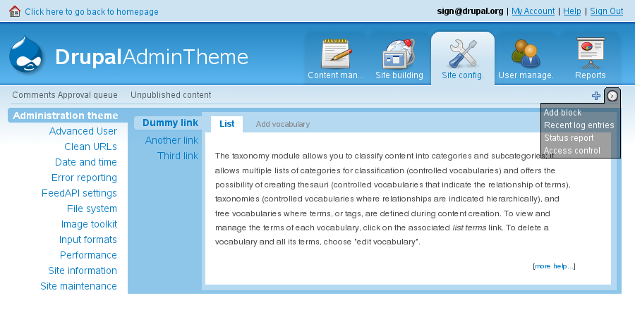
jeremycaldwell commentedHi there, I just wanted to throw this out there. I designed and built a little Drupal Admin theme for Drupal 5.x a couple of months ago and wanted to show it off a bit in hopes of bringing new ideas to the table.
http://nerdliness.com/article/2007/12/02/drupal-admin-theme
I created a project page for it and the theme can now be downloaded from there. It needs a new name too as it goes by: Nerdalistic.
http://drupal.org/project/nerdalistic
It has a similar header to the Root Candy theme which I just found this morning, so we are kind of on the same page here. If you have any ideas on how to improve it or have a need for my help or anything of that nature please reply to this post.
I like what I see so far from these postings. Look forward to seeing what comes from this as well.
Comment #13
stevebayerin commentedThanks Eternalistic,
I'll install your admin theme on one of my drupal installs (the theme doesn't have an issue queue so congrats on that) and see if I can bring its features into the wireframes.
Edit:
Attached is version 1.31 that can be viewed in inkscape
The icons may not be necessary but for new users, it makes things much easier.
@Eternalistic, your theme makes things easy to see (it made things much easier to create the attached wireframe.) However, I don't think there's any need for the primary links (the links in the blue boxes). The 'view site' link at the top left is enough to navigate to the normal part of the site. I like how clean the highest level of links are.
If the primary links of nerdalistic was replaced with hard coded links such as admin/build, admin/content (to link to content management, site building) and so on, that menu would be much more usable.
Comment #14
jeremycaldwell commented@stevejb,
Thanks for giving my theme a test run and for the feedback. I see what you mean by the "View Site" link on the top left being enough for to navigate back to the normal site and adding the "admin/" type links to that navigation. I'll go ahead and update that shortly.
Comment #15
morphir commentedNote that this thread might spawn many possible solutions and different themes. The one I'm designing now will aim to have a header oriented administer menu. I've attached an update of my admin menu wireframe, and I'm pretty sure this is the way I want it. I feel that I've found a proper, clean and easy solution for fast navigation in the admin hierarchy.
The menu is all expanded here. This is only a mockup of where the menu is located. Mind that I also found a place for the admin menu icons. (again, you can download the wireframe and bend it to your will in inkscape)
Do we have a winner? Let's hear your thoughts!
Comment #16
sign commentedsubscribing
Comment #17
stevebayerin commentedPlease See post Below
Comment #18
stevebayerin commentedTry populating the menu levels to get a better idea to see if that menu can actually function.
I use Admin>content> for populating my newer wireframes with menu items, because admin>content has got a fair amount of menu items
Admin>Site Configuration has the most items and the theme should be prepared to handle all of them.
I'd prefer if core had variants of the same default theme activated for users and admin
as in DrupalUI could have one variation for users (DrupalUserUI)
and another variation for Admins (DrupalAdminUI) with both sharing the same color swatches.
Regarding core and who choses the themes that get packaged in core:
I am aware that Dries Buytaert has a say what goes into Drupal Core. Who else is involved in the decision for what goes into core, especially regarding the default themes or the changes that may need to be made to core code for more user friendly themes (as morphir stated in the earlier posts?)
Attached is a file with a few small changes.
Edit:
1.4 series: http://www.scribd.com/doc/1083058/DrupalAdminUI-v1-4x1content
1.3 and 1.4 can be turned into individual themes
For 1.4, I've taken a leaf out of Joomla's Admin Home Screen, lots of easy to recognize Icons. The 1.4x1content wireframe should work for site building, site configuration, users and logs. I'm working on a separate wireframe (tabbed pages for wireframes could be more handy now, so they all print into a single pdf) for the 1.4 series to handle the root /admin screen to handle menu choices such as organic groups and panels.
In the 1.4 series I've kept manage users and manage content to be next to each other (easier for moderators) and build site and configure site have been renamed (keeping the verb before the noun makes it easier to read for new users.)
I could call the 1.4 series, more moderator friendly.
Comment #19
stevebayerin commentedFrom the above post
http://www.scribd.com/doc/1083091/DrupalAdminUI-v1-4x1all
http://www.scribd.com/doc/1083092/DrupalAdminUI-v1-4x1allwithhover
http://www.scribd.com/doc/1083058/DrupalAdminUI-v1-4x1content
The root admin screen is now ready for the 1.4 series (http://www.scribd.com/doc/1083091/DrupalAdminUI-v1-4x1all).
1.4x1-all-with-hover (http://www.scribd.com/doc/1083092/DrupalAdminUI-v1-4x1allwithhover) could be possible with JQuery. (I'm a wireframer by profession so my Javascript and PHP skills don't have to be top notch. I'd like some feedback on wether the features of the 1.3 and 1.4 series of wireframes can be made workable and if there are additional features that could be added to them.)
Comment #20
stevebayerin commentedAs per whats on http://groups.drupal.org/node/7929
The 1.4 series of wireframes would suit the category of
Comment #21
morphir commentedWhen a user logs in, the first thing he/she might wanna get updated with is the status quo on issue tracker, or if anyone made a comment on the blog, or if anyone answered your question in the forum.
When I log in, I always start with updating my self on those discussions or issues I've participated on earlier.
So why not redirect a user log in directly to a tracker status page?
The problem: The user do not want their surf pattern broken in a unpredictable manner. Eg, if you read a blog and want to comment. You fill in the log in form and expect to continue on the very same page you logged in too (consistency).
However, if you have 4 new comments to your blog and 2 new posts to your forum thread, why not sum up those and say: User Account (6 new). Note that your User Account will always be reachable from the very top menu bar. And you don't have to redirect the user when he logs in.
Better screen real estate
One of my clients pointed out two things:
Possible solutions:
- Align field sets next to each other. Make real use of screen width.
- When a user opens one collapsible field set, the other ones should close, as they are uninteresting at that moment, and forces to user to scroll even more (it becomes easier to loose overview).
Comment #22
stevebayerin commentedAbout fields: http://groups.drupal.org/node/8305#comment-25362
Comment #23
wim leersSubscribing.
Comment #24
morphir commentedI've started the work on a new theme. I've ruled out the Drupal 5 branch as the new and improved menu system in Drupal 6 is much much better to bend my way (all thanks to chx's hard work).
I wont provide any screenshots yet as it's on a very early stage by now. But I can say already now that we are succeeding with the header-oriented-admin-navigation approach =)
@SteveJB: Great job on the wireframes! keep'em coming.
Comment #25
stevebayerin commentedNode Forms have been improved quite a bit since that last wire frame with horizontal tabs.
Vertical Tabs seem more useful: http://groups.drupal.org/node/8365
Comment #26
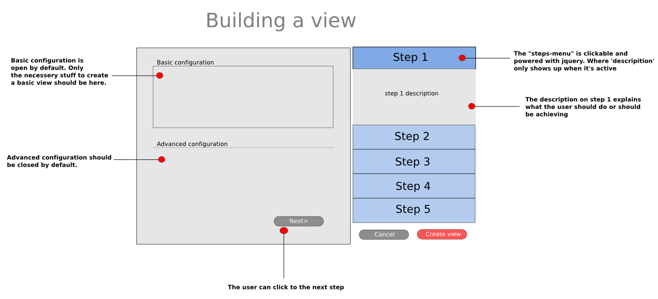
morphir commentedLarge configuration example - here with views module.
I've attached both a png and the source (svg) which you can edit with inkscape.
Hope you like it!
PS! I'm gonna use this layout/technique for node/add page too.
Comment #27
morphir commented*Updated*
I've added the views configuration categories as steps. All 8 of them!
Comment #28
stevebayerin commentedSeems workable,
I'll follow it on http://groups.drupal.org/node/6288 , its best to consolidate efforts on Views 2 UI on one thread.
We could continue with the New themes on the same thread we're on right now or start a dedicated one on groups.d.o/usability (it should be ok to start one there since its for a new theme.)
Comment #29
eigentor commentedWhy not including a nice Dropdown Menu in Admin Theme?
One could just use admin_menu and maybe adjust colors a bit.
Dropdown is by far the fastest way to navigate in Drupal backend.
Comment #30
morphir commented@eigentor: If you mean drop down menu like the sucker fish menu, then no. Sucker fish menus are not that usable.. (i think). I got a better solution. But we can actually implement some of the sucker fish menu elements into the the new admin menu.
Comment #31
stevebayerin commentedDrop downs menus doesn't solve the problem of nested menus (third layer of links which I think can and should be avoided)
Before I go any further with an admin theme design/layout, I'm checking out the suggestions on http://www.peterpixel.nl/writings/introduction-to-good-usability/
Page 13-14 in the pdf also warns about the difficulties of Nested Menus.
Comment #32
eigentor commentedWell, I'm using admin_menu for quite a while now and I'm very much faster with it. sure - if you got submenus, sometimes you miss. But you save one click - which is quite valuable and as drupal page loads are not that fast - quite a time saver.
I believe Sun is doing a very good job with admin menu, I think and he's quite open to suggestions. If anyone did not try it yet - go ahead, it is a quick install.
Hehe, I read Peter's PDF. Quite a puristic attitude to me, but he is mostly right, I think. Too many people neglect those rules. One thing he neglects, though, is the urge to play within people. I believe a gimmick here and there keeps you at things, even in Usability.
Comment #33
Bevan commentedadmin_menu is great. I prefer it to simplemenu. Is till use DHTML_menu on some sites. My only gripe about admin_menu is it's too intuitive; http://drupal.org/node/220100
Comment #34
sunI agree with eigentor and Bevan: this issue should not focus on the administrative menu. http://drupal.org/project/admin_menu already exposes that along with some other useful links and information. Instead, it should rather focus on a interface for administering a Drupal site. Eye-candy, and of course, usability tricks. Looking at existing modules like http://drupal.org/project/controlpanel is worth considering, too.
Comment #35
birdmanx35 commentedsubscribing
Comment #36
morphir commentedBevan has mocked up a potential new node/add fields. I like it. But what if added a drag and drop handler to this as well. So the user can choose whether the post settings are showing up in the right, left or bottom (like the picture shows). We might wanna do this because some use smaller screens (like iphones) where as some use widescreens and wanna make use of their horisontal width (rather than the vertical height). This all applies to rule 7. Support internal locus of control. from Shneiderman, thus we wanna give the different users full control over the user interface. Technology wise this is already in core, so implementing it will actually be a small task.
Comment #37
morphir commentedError handling:
On Microsoft Windows this is done in a somewhat horrible way. Because when you receive a error message (dialog box) you usually have to accept it, like: [ ok ], [ cancel ] etc.
Windows are making all users responders, both novice and advanced users. Drupal actually does this better today, as you are being explained what went wrong, and sometimes you are being pointed to where you can fix this.
So here is what I purpose:
Novice users:
Explain what is wrong - in a way that don't require the user to know all the drupal linguistics.
Point user to a solution (with href) and let the user be a responder to have the problem fixed.
Automatically commit error(log) to drupal.org/issues. Where users can fill in their drupal.org username and password and username on their local install. This can help accelerate development/testing as well.
Expert users:
But sometimes one can't simply have the problem fixed with point and click (responder mode) - one have to be the commander or what is defined as the initiator. So providing the user with a command recipe (unix commands) or being introduced to handbooks that require some reading and work. Expert users care about having the problem fixed - and if that means reading some handbooks or committing a series of tasks - then that is what they will do. They will want references where they can dig deeper into the issue, they will want a solution(s). Here we have to use Drupal linguistics, serverside linguistics. In other words terms and explanations that are written by geeks for geeks. Even pointing to api.drupal.org might be a valid solution sometimes, depending on the type of error.
Comment #38
stborchertsubscribing
Comment #39
stevebayerin commentedHows that theme coming along Morphir?
Does it handle 3 levels of menus right now?
I'm building a hobby site where I have nice menus used to provide drop down menus that connect the first level of menus with the second level of menus.
How would your theme handle integrating the second level of menus with the third level?
Here's a pdf of what I plan to have and I think it could be close to what you have in mind for a 3 level theme:
http://www.scribd.com/doc/2324431/Drupal-Tertiary-Menus?ga_uploads=1
Edit:Its probably best to download the pdf to see the functional specification to the right of both pages:
http://www.scribd.com/word/download/2324431?extension=pdf
Comment #40
sutharsan commentedMoving issues from User experience project to Drupal core usability component.
Comment #41
sun.core commentedSorry, but this issue tried to change too much at once. In the meantime, we have an entire usability team and many, many usability tasks in issues on d.o. Please participate in those.