
 Come together with the global Drupal community in Rotterdam, 28 Sept – 1 Oct 2026. Sessions, contribution, connection, and Early Bird savings until 8 June.
Hi, I'm current developer of http://drupal.org/project/subscriptions_og
delius and me discussed about subscriptions controls are handled by the subscriptions_ui module and our module just uses whatever that provides and is going to look closer to: http://develcuy.ixum.net/subscriptions_og/req1.html. We also elaborated 2 suggestion to improve your current new and nice subscriptions controls.
req1c: http://develcuy.ixum.net/subscriptions_og/req1c.html
req1d: http://develcuy.ixum.net/subscriptions_og/req1d.html
delius and me prefer req1d because we don't see the need to be subscribed just for updates and don't get new post, or receive only new posts but not updates.
Please let us know your impressions on it.
Blessings!

Comments
Comment #1
gustav commentedJust to clarify my view on this: the suggestions that develCuy has posted he developed while we were discussing how the current subscription controls can be a bit confusing to new users. We were unfortunately not 100% happy with any of the alternatives we came up with.
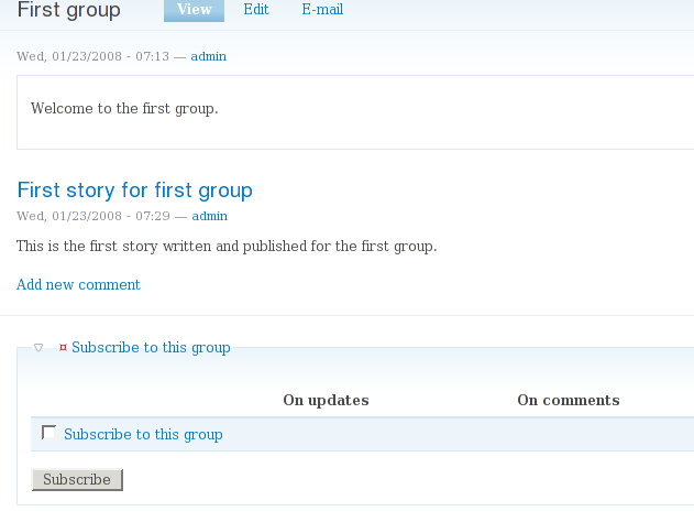
Some users are confused by the fact that there are checkboxes for "On updates" and "On comments" but none for "New posts". Of course the main checkbox has that meaning (except in front of "Subscribe to this post") but this is not made entirely clear to the user.
The problem is that the main checkbox has several different functions, depending on circumstances:
1. It expands the control to show additional checkboxes for further options
2. It fills the checkboxes with defaults
3. It may subscribe the user to receive notifications on new posts
The designs for the controls that develCuy has posted were trying to disentangle and clarify these functionalities a bit. However each attempt introduces new shortcomings.
Comment #2
moshe weitzman commentedi fail to see how this large fieldset at bottom of home page is a better/cleaner UI than on the 'my subscription' page offerred by og. i know why you show it like this, but i don't think it is an improved user experience.
Comment #3
salvisI can't find it right now, but there was an issue from someone complaining that they had received half a dozen notifications within an hour, because an author had kept updating his post again and again. So, I'm not sure whether you really want to enable sending notifications on updates by default. I tend to disable them and let the user enable them for themselves if they really want to. Subscriptions will ship with both On Updates and On Comments turned off by default.
@moshe: The patch in http://drupal.org/node/208631#comment-702471 is my proposal for replacing the "large fieldset" with a "Subscribe" link as in 1.x. Clicking on the link reloads the page with the fieldset visible. Also, you can move the fieldset from where we've had it so far (above the links and comments) to a block (which you should put into the contents area, so that it appears below the comments). Unless someone suggests better alternatives, this will be in the next beta, but since you've commented on the subject before, you may want to take a peek.
Comment #4
moshe weitzman commentedyeah, og doesn't even try to notify on updates right now because of that issue.
your simple link solution sounds great. if admin can somehow prune what shows up in the resulting block, that would be ideal. nice work.
i guess if you were going to go further, you could build upon your patch so that jascript enabled browsers skip the refresh an see a nice thickbox or something with their subscription options. the key though is to start with a simple link, as you've done.
Comment #5
salvisThanks! The admin can certainly prune the rows by limiting the permissions he gives. I"m not sure why you'd want to prune it any further.
The fieldset bothered me all along because it was pretty intrusive, but now that it's on demand, I don't see why there's a need to artificially limit the rows.
This is not likely to happen. :-)
I'm fundamentally opposed to enabling JavaScript in a browser; I do make compromises sometimes to accommodate the masses and I read up and implemented the JS support on the master checkbox, but if there's server communication going on anyway, then I'm very comfortable with a reload.
If anyone wants to develop it, I'm open for reviewing it, though...
Comment #6
salvisFeel free to reopen...
Comment #7
extexan commentedI re-opened this because I feel my "issue" relates to "a cleaner interface".
The attached screenshot "subscribe-example.png" shows what my forum users see.
The wording below the option(s) is the problem in this case.
First, in this case, there is only one "column" so the references to "master checkboxes" are confusing (i.e. there are no "other" checkboxes).
Also, the way the second sentence is worded is from a dev or admin point of view. That is, we (devs) know this is a Drupal site, and that "subscriptions" are provide by an add-on module, and that there are "options" we can turn on/off during the "setup of the site". But the end-user doesn't know (or need to know) that information, and any "additional options" will be showing (somewhere), so that fact doesn't need to be stated here.
In my opinion, that description should just be removed entirely. I know I can (and will) hide it via CSS, but I shouldn't have to resort to that method to eliminate text a module puts on my pages that users shouldn't see.
Comment #8
salvisThis issue has been closed for over 5 years. I appreciate your effort to find a pre-existing issue, but after such a long time and two major versions later it doesn't really make sense.
I see your point, but there's another angle: Contrib modules cannot aim to work perfectly for everyone. The "dev or admin point of view" is a very important one. It helps our users to figure out how things work and reduces the need for support.
Adding configuration options would make Subscriptions harder to administrate, so that is not an option either, especially for things that can be achieved with reasonable effort in a different way. I think you'll just have to make the best of what's there.