
 Come together with the global Drupal community in Rotterdam, 28 Sept – 1 Oct 2026. Sessions, contribution, connection, and Early Bird savings until 8 June.
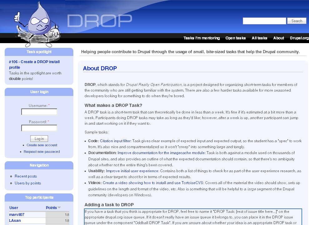
DROP needs a suitable logo in order to promote the program, and also just because it's fun.
The logo must meet the following requirements:
a) Must use Druplicon (see http://drupal.org/node/9068 for SVG/PNG/etc. versions).
b) Must only use GPLed images, and the source files of the final work must also be GPLed and submitted with the task.
c) Must contain pancakes. Yes, we're deadly serious about that.
d) Must be approved by one or more DROP administrators.
Logo should be scalable to several sizes, including approximately 64x73 so that it can be used as a default logo in the Garland theme.
| Comment | File | Size | Author |
|---|---|---|---|
| #18 | favicon.zip | 771 bytes | eigentor |
| #13 | rockin-pancakes.jpg | 14.37 KB | eigentor |
| #13 | Packet.zip | 192.71 KB | eigentor |
| #10 | Logo-with-page.jpg | 185.25 KB | eigentor |
| #7 | logo-beta-1.jpg | 41.04 KB | eigentor |

Comments
Comment #1
eigentor commentedHere we go: first attempts.
Comment #2
sepeck commentedAnother concept page
Comment #3
webchickSweet!
eignitor, I like your style. but it must have something to do with pancakes. Yes, I'm seriously not joking. ;)
sepeck: Cool! I like the Druplicon "dropping" down on the stack of pancakes, as well as the syrup "Drop" on the pancakes. I wonder what it would look like to Photoshop together a bottle of syrup with Druplicon on it? :)
Comment #4
eigentor commentedI'm off to do some field studies in Pancakehouse Hannover. Having got deeper insight into the topic, it will be easy to integrate ;)
Comment #5
eigentor commentedO.K. Lets keep the ball rolling and hit the pancakes... Some new sketches attached.
Comment #6
cwgordon7 commentedOk, I LOVE these three:
Can't wait to see where this goes!
Comment #7
eigentor commentedOK, Drop Logo goes to alpha ;)
I believe I'll go basically with the sketch attached.
Just polishing. Do you like the pencil-like drawing style
better or do you want solid vector lines?
I mean a better pencil drawing, for sure ;)
What do you think?
Comment #8
dmitrig01 commentedMe likey!! this is great.
Comment #9
cwgordon7 commented"OM AWESOMENESS" was my initial response on irc. This is completely awesome!!!! Feel free to mark this needs review if you decide this is the final one, or you post an updated sketch, or whatever. Just keep up the awesomeness!
Comment #10
eigentor commentedPre-Final Version. The pancakes are terrible and have to be worked upon, but the fella should be O.K.
I'd like to incorporate it into the site header. For this it has to be taller. The theme is nice, but isn't it table-based? Urrrhh...
Comment #11
cwgordon7 commentedLooks awesome! Can we get a finalized version? :)
Comment #12
eigentor commentedHi Charlie.
Argh. I gotta sit down and finish this.
Will get going.
Comment #13
eigentor commentedHey ho, here we go.
There is a packet.zip with all files: the jpeg once more, and also a Photoshop CS2 File, if anything does not fit.
The jpeg should work: throw away everything in the upper right corner (also the header.png). If you position it absolute top 0 left 0 within the div#container, it should make a perfect fit ;)
Comment #14
cwgordon7 commentedLooks awesome!
And we now have pancakes: http://drop.cwgordon.com/ ! :)
Comment #15
eigentor commentedHehe. Such a greedy one, keeps all the pancakes to himself...
Please add a "position: relative" to div#container, then he will sit even more comfortable and a bit more to the right...
(ya know, these themers are splitting hair all the time ;) And I'm a themer)
Comment #16
cwgordon7 commentedDone. :)
Comment #17
cwgordon7 commentedoo, would it be possible for you to turn it into a favicon too? :)
Comment #18
eigentor commentedSure thing :) Done.
Comment #19
cwgordon7 commented!! AWESOME!!! :D
Comment #20
Anonymous (not verified) commentedAutomatically closed -- issue fixed for two weeks with no activity.