
 Come together with the global Drupal community in Rotterdam, 28 Sept – 1 Oct 2026. Sessions, contribution, connection, and Early Bird savings until 8 June.
Michelle - I'd like to show you a non-advanced-forum implementation:
http://letschangethegame.org/forums/find-team/want-get-team-together-hav...
and get your comments on it. Specifically, I'd like to see if we can get this layout (document structure) and CSS into advanced forum instead of the abomination that is currently in there (which, yes, you've admitted to not being a designer). The advantage of the above version is that it's a lot cleaner in the source and is "better" CSS (no forced "clears", no BRs, better CSS names, etc.). Let me know if the above looks OK to you; if so, I'd like to do this implementation before I consider moving it to Gamegrene. (Naturally, I'm talking only about the structural approach and CSS - stuff that's missing in the example, such as post number, etc. - would also be apparent in the retheme.)
| Comment | File | Size | Author |
|---|---|---|---|
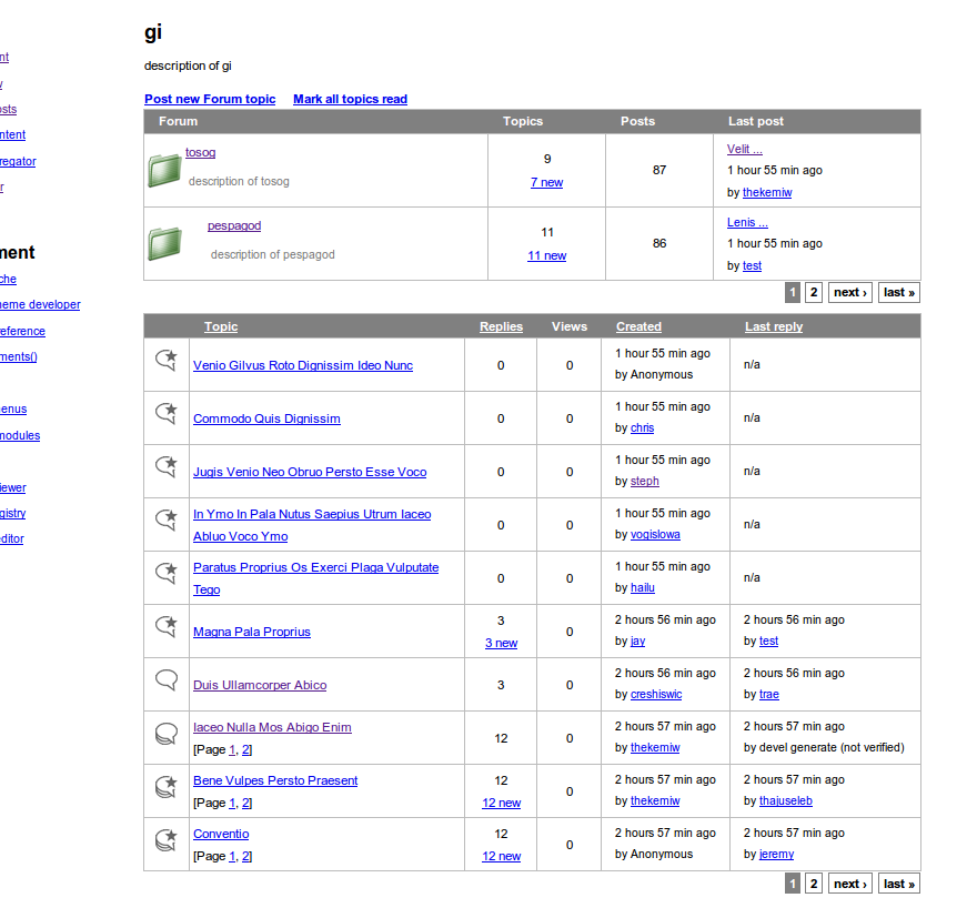
| #27 | topics.png | 102.94 KB | stephthegeek |
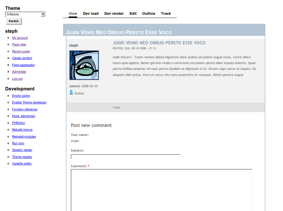
| #27 | singlepost.png | 66.72 KB | stephthegeek |
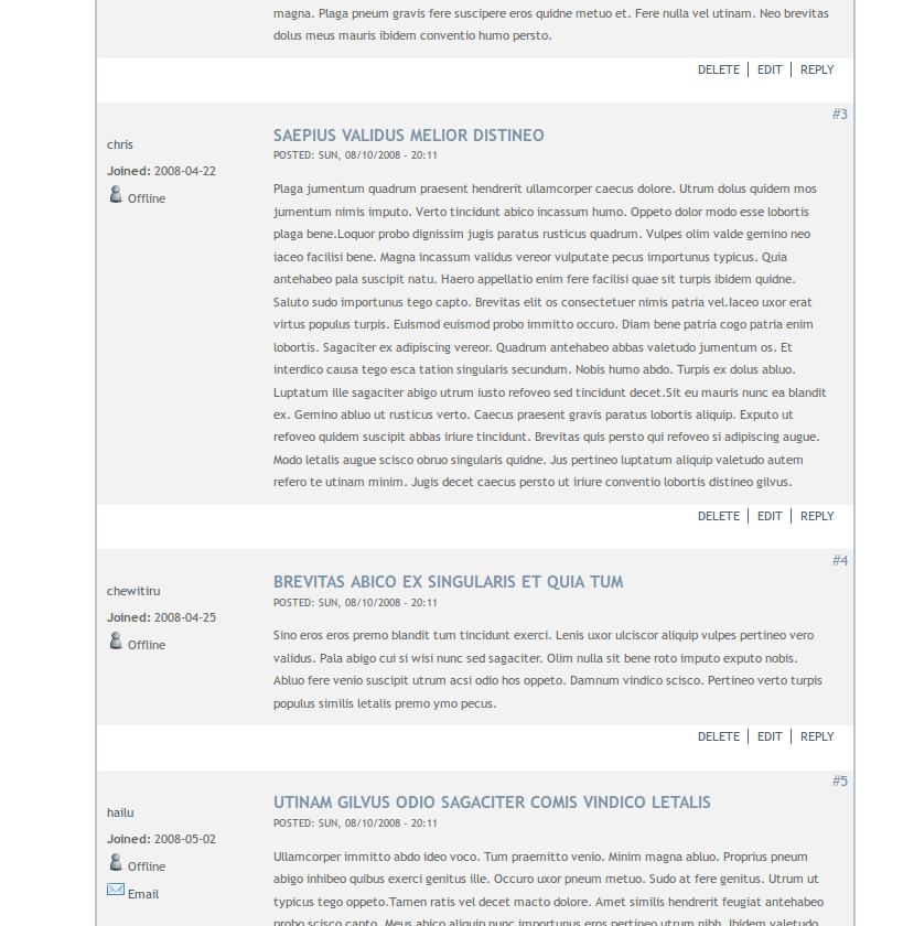
| #27 | comments.png | 103.22 KB | stephthegeek |
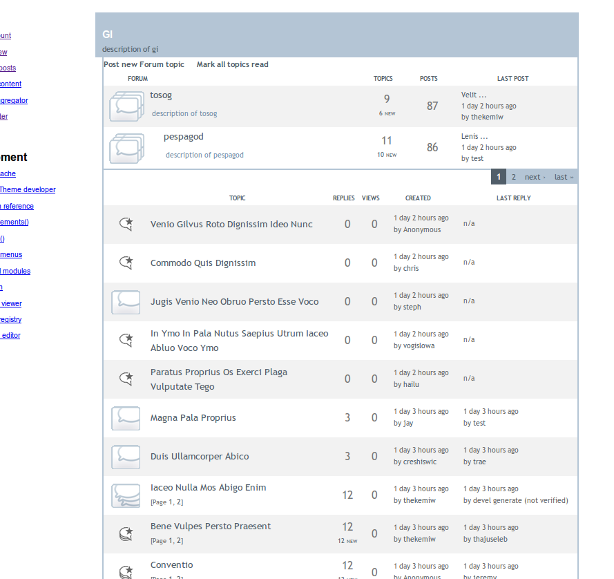
| #27 | topiclist.png - naked theme | 93.03 KB | stephthegeek |
| #22 | Design idea for Advanced Forum | 484.43 KB | stephthegeek |

Comments
Comment #1
dnewkerk commentedHi Morbus... very cool. Would you mind posting the CSS file(s) separate from the aggregated version?
I agree that we should have as solid and clean a HTML/CSS base as possible to work with... having that, theming it to look however someone wants is a piece of cake :)
Thanks.
Comment #2
michelleFine by me. I'm a coder, not a themer. I searched around and found a tutorial that gave me the layout I was after without tables and did my best to make it work. Eigentor made it pretty but he was building on my poor foundation. So I would be perfectly happy throwing all the layout stuff and replacing it with something done right.
Michelle
Comment #3
morbus iffKeyz - the CSS is the "forum" related stuff in http://letschangethegame.org/sites/default/themes/aberdeen-lctg/style.css.
Comment #4
catchLooks much better. At first look, it seems like the letschangethegame.org theme could probably lose that empty div and negative margin with a bit of thought, if it gets ported across I'll take a look at that - just reading throught he issue queue and trying to get up to speed on where things are at the moment. Our D5 forum template is a mess, but it has fairly odd stuff like user post count/sig etc. in the header of comments and no left column which we're fairly happy with in terms of appearance/space - looks like this has a better chance of accommodating at least some of that.
Comment #5
maulwuff commentedWe also should care for keeping the HTML valid.
One of my users encountered problems with the "new"-Tag.
Right now (alpha10), there is a
<a id="new"></a>-Tag for every new post. This is ok, if there is only 1 new post.If there are more than one, id is not unique anymore (as it should be). This confuses Konqueror, so it does not jump anywhere. :)
Never noticed that in FF, IE or Opera. Therefore it's not prio 1, but can be cared for, while re-doing the styles.
Comment #6
dnewkerk commentedGood point... it ought to be
<a name="new"></a>for making an anchor (e.g. to #new)http://www.w3schools.com/HTML/html_links.asp
It looks like this is incorrect on drupal.org itself as well.
Comment #7
michelleIf it does it on drupal.org then it's probably part of core forum. TBH, I've never actually looked at how the comments get tagged "new". That would be good to fix, then.
Michelle
Comment #8
maulwuff commented@Michelle:
Ok, at least there are only 2 ids called "new" on the core forum :P
@Keyz:
<a id="new"></a>is XHTML 1.1 syntax.@all:
The problem with advforum is in post.tpl.php line 40++
Only the first new post must get
<a id="new"></a>.All other new comments must omit this part!
Comment #9
michelleOk, yeah, that was copied right out of core. That shouldn't be too hard to fix. Just need to set a static var to be able to tell the first comment from the rest.
Michelle
Comment #10
morbus iffcatch: actually, the empty div (at the bottom of the left hand column) was intentional - it was meant as a "we don't have anything to put here yet, but someday we will" sorta thing. The negative margins... yeah, it'd be nice to get rid of those, but I can't recall if this was required for the Aberdeen theme or required as part of this particular forum structure. It's something we'd want to reexamine when/if it gets into Advanced Forum.
Comment #11
michelleFinally getting back to this module after a long absense. Are you still planning on doing this?
Michelle
Comment #12
morbus iffYep, still planned. Was waiting for activity again before I started.
Comment #13
michelleOk, great. I finally comitted your other patch and am now tackling the infamous "last topic" issue. Once I have that sorted, I'll hit the other bugs and then move on to new features.
Thanks,
Michelle
Comment #14
psicomante commentedadvanced forum vs phpbb?
I think (imho) that Drupal should integrate a more user-friendly and easy-to-use theme for forums. Morbus Iff theme is great but look at the new prosilver theme for phpbb, it's more user-friendly:
New topic button/link
Search in the forum
user titles
number of post in the thread
forum rules
top link
display controls
button/link to reply
[...]
What d oyou think about it? Should it the goal that style or not?
http://www.phpbb.com/community/viewtopic.php?f=46&t=579376
Comment #15
michelleMost of that has nothing to do with theming. This issue is about cleaning up the theme code, not adding features to the module.
Michelle
Comment #16
stephthegeek commentedJust jumping in on this as something I'd like to assist with if possible. Morbus, I'm not sure exactly where you're starting, but please let me know if there's anything I can do.
Comment #17
michelleJust so you guys know, I'm totally open to changing the HTML/CSS however is needed to make it solid. I know I'm not a themer. :)
Michelle
Comment #18
psicomante commenteda syrian forum in drupal. Wonderful theme and icons. IMHO.
http://www.csc-sy.net/node/8356
Comment #19
michelle@Psicomante - I'm not open to switching to a table based layout.
Michelle
Comment #20
psicomante commentedoh you're right, but i was seeing the theme's look 'n' feel, not just the html structure. I totally agree with you, no tables, only divs, but that, as like as phpbb theme, could be a initial step towards a beatiful theme for drupal's forum.
Comment #21
michelle@Psicomante - That theme doesn't look all that much different. Just has the user info on the right instead of the left. What we're looking at in this issue is overhauling the underlying HTML to make it more sound and correct and touching up the CSS. As far as "looks" are concerned, what we have is fine. I'm concerned about making the structure better.
Michelle
Comment #22
stephthegeek commentedA couple months ago I had a bored designer friend take a look at the default advanced forum styling and create a mockup to improve the design without drastically changing positioning or structure. I looked briefly into coding this and came to the same conclusion as Morbus ;) Maybe something like this would make a good default look and feel?
Comment #23
psicomante commented@stephthegeek
:O Amazing! That's wonderful :)
Some buttons and quicklinks at bottom of thread and comments, and it will be perfect. imho!
Comment #24
michelle@Psicomante - I like it, too. It's more polished looking without being drastically different from what we have. Curious what specifically you like about it?
Michelle
Comment #25
psicomante commentedi think it's clean, lightweight and easy readable.
Also it has: user-title under name, good use of colors, use of bold when necessary, user name greater, good css for quotes, number aside of comments, pages under forums titles, wonderful icons, "when", "who" and "where".
IMHO i would add the date of the posts, not "time ago", like other forums programs do. In addition i would add "yesterday" and "today" for special dates. But it could be a core issue, not adv_forum one, i don't know.
Comment #26
michelle@Psicomante Thanks. Helps to know what, specifically, you like. We may not use that theme exactly as in the mockup so knowing the important parts is good.
user-title under name That we already have
user name greater I don't know what you mean by this
good css for quotes That would be handled by the site's theme
number aside of comments I don't understand this one, either
pages under forums titles Yeah, that's a good idea. I have it on the topics but not the forums.
"when", "who" and "where". I like that, too.
IMHO i would add the date of the posts, not "time ago", like other forums programs do. In addition i would add "yesterday" and "today" for special dates. I was just looking at some other forum software yesterday and thinking of how that could be done. I'll add it to the to do list.
Thanks for the input,
Michelle
Comment #27
stephthegeek commentedOk, I've made a big chunk of progress on this.
I started by:
- removing br tags and clearing divs
- a few misc CSS syntax cleanup things
- standardizing class names with hyphens-as-separators
- converting all em-based structural dimensions to px
- removing the blue/CRO-specific styles
- removing background images (after discussing with Michelle, we're going to not include a striped background image by default for faux columns)
- adding classes for icons, table headers, post counts (eg. all view/post/reply counts all get a .num class now)
- putting in some neutral default styling (using this somewhat as inspiration: http://forum.weblamp.net/index.php/board,33.0.html)
Then I got totally bored and figured it'd be best to try putting this into practice to see how the markup held up :) So I started to implement a style similar to the screenshot I attached above. A few things came up in doing this, some of which I still need to roll back into the original advforum theme, and some which Michelle will need to make some adjustments for:
- we need a forum class around the comments. I did this by adding a comment-wrapper-forum.tpl.php to my theme with a
<div id="forum-comments">, but I think Michelle said she's going to put this in adv forum- it would be extremely helpful to get a custom class on the page's h1.title tag, since that is used by Drupal throughout the forum for the forum/post titles. For this blue/grey theme, the page title needs to be styled. I did this in my theme for now but I'm not sure what the best way is to possibly attack this in adv forum
- I changed the icons from inserting img tags to CSS. I still need to get this back into the default theme, plus I need to clean up these icons a touch and make a couple that are missing (these are original icons so we can actually GPL this, fyi)
- we discussed getting a bit more of the logic out of the tpl files, into preprocess functions. This is a bit outside my realm but it would be nice to have these tpl files a little less PHP-heavy. Even core's forum tpl files have quite a bit of PHP, but I think the more we can get out of here, the better
- there are a few things not addressed in the mockup that I need to figure out what to do with, like the Post/Mark all links at the top
- comment form needs some styling
- I'd love to get better icons in the default theme
Testing:
- I still need to do some cross-browser adjustments for both themes
- also will need to do a bunch of testing for the different drop-in modules, themes, anon users, different size avatars, sidebars, etc.
I tried the default theme in a few different themes of ours and it does a pretty good job of picking up the main theme's styling.
I'll be travelling and then very busy after this Thursday, so my goal is to get everything I can accomplish in another few hours wrapped up by then.
Attached are some in-progress screenshots for posterity!
Comment #28
stephthegeek commented"user name greater" -- I think he means the larger font size
"good css for quotes" -- still need to do this for the flatgrey theme
"when", "who" and "where" -- need to do this in flatgrey
i would add the date of the posts, not "time ago" -- I totally agree -- I love the today/yesterday that most forums use but it's just kinda weird when it gets past that with the "time ago"
Comment #29
morbus iffDo you have a live site of this somewhere? I'd like to look at the HTML/CSS.
Comment #30
michelleThanks so much for working on this. I'm excited for this module to have a solid base theme for people to work from.
As for Morbus' notes about things that will be different from the rest of the site... Maybe a good compromise would be to not have them in the default theme but include them in one of the nicer alternate themes? Keep the default as simply themed as possible, mostly just a blank slate for users to adapt to their themes.
Michelle
Comment #31
psicomante commented@stephthegeek and @Michelle
i'm sorry for my english writing, it's not the best :(
I mean that, thanks.
i mean the number to the right of comments.
great work stephthegeek, one step beyoond :P
i agre with michelle for almost all issues (edited last sentence).
Comment #32
stephthegeek commentedHey, I think you guys misunderstood a little. The blue/grey theme isn't intended to be the default style, that's a, uh, styled style :) It's just a lot easier to find out how well the markup and CSS does when you put a pretty face on it. It's not up anywhere live, I don't have a D6 site up that I can make public right now.
Comment #33
michelle@steph - Ah, good. I _thought_ that was the plan but Morbus' response made me think I had misunderstood what was going in the default theme.
@Psicomante - Those two items are already in advforum.
Michelle
Comment #34
michelleComitted a simplified style switcher and steph's naked style. Leaving this active as I still have some things to do:
Add code to find comment wrapper
Add code to choose $forum->icon on forum listing
Figure out table header class issue and empty fields
Add steph to readme credits
Backport it all to D5
Michelle
Comment #35
stephthegeek commentedAn update of where things stand from my end...
"Naked" style
This was created with new, cleaned up markup and CSS and is intended to have no styling, designed to fit in with your own theme's look and feel. It should look very similar to what core's forums look like in your theme, just with advforum's additional functionality. There are only a couple of design elements specified (1px grey border between comments in forum threads, for example) where it was reducing visibility/usability to not have anything in place.
There's a fixed width on the far right columns which may be too wide in some very narrow or three column themes, but should work in most cases. Icons have been changed from CSS backgrounds to inline img tags.
Still to do:
- Bang on it more cross-browser (I briefly checked it in a plain base theme, Garland, and a couple others in FF2/3/IE6/7/Opera 9.5/Safari 3)
- Test different configurations and themes, such as different sized avatars, comment settings, additional modues (user badges, points, etc)
- Add formatting for quotes if necessary
- Update sticky class names
- If possible to get unique classes in the topic listing table headers, adjust alignment here
Blue grey style
- This needs a couple more hours' work still, but I'll try to get it solid so it can go in the next alpha as another style option
Comment #36
michelleThanks, Steph. I ran into a Drupal bug trying to do the comment wrapper part and that's all the farther I've gotten. I'll try to get back to this again soon.
Michelle
Comment #37
michelleCommitted backport of what I have so far to 5.x.
More to do:
#234593: Special comment theming
#263892: Forum names not indented when browsing a parent category
Michelle
Comment #38
michelleOk, I committed the initial "style manager" written by merlinofchaos & sdboyer. merlin adapted the panels plugin code and sdboyer went through and simplified it and adapted it further. I did the final little bit of getting it working in advforum but this code is really all them and I want to say thank you again to them for helping me out.
Next step is I need to do a UI for it because it is hardcoded to use the 'naked' theme. Will tackle that tomorrow.
Michelle
Comment #39
michelle"Figure out table header class issue and empty fields"
Ok, got these two sorted but I'm out of time. I'll commit them later tonight.
Michelle
Comment #40
stephthegeek commentedHey Michelle, I went to go back to the bluegrey theme today... updated my local advforum install and can't seem to get the styles working. Then I saw this in the changelog: "Theme changes: The default advforum style as well as any customized themes won't work at this point. Instructions coming once this stabalizes."
Soooo... specifying a different style isn't working now, right? Is there a way I can trick it into using another style so I can work on it?
(PS. yep I saw your msg on IRC)
Comment #41
michelleOk, fixed the flatgrey problem in D6 and got naked in D5. Still more to do but we're getting there.
Michelle
Comment #42
michelleOk, this issue has meandered all over the place. I'm marking fixed as the transition to using the new styles is complete. The styles themselves still need work and I am opening up specific issues for them:
#303553: Finish naked style
#303555: Add flatgrey style
#303556: Add blue style
Michelle
Comment #43
Anonymous (not verified) commentedAutomatically closed -- issue fixed for two weeks with no activity.
Comment #44
maulwuff commentedsorry for reopening this issue, but #234593: Special comment theming is not fixed, yet - at least for D5.
Comment #45
michelleI unduped that one. No sense having this thing all open for that one issue.
Thanks for reminding me. Totally forgot about it.
Michelle