
Needs review
Project:
Austere
Version:
6.x-4.3
Component:
User interface
Priority:
Normal
Category:
Feature request
Assigned:
Unassigned
Reporter:
Created:
26 Aug 2008 at 16:48 UTC
Updated:
27 Apr 2010 at 19:40 UTC
Jump to comment: Most recent file

Comments
Comment #1
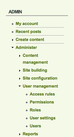
onejam commentedI agree there should be some kind of indication of the hierarchy of the menu with some visual clue.
I must confess, due to not having a lot of time to spend on this project, it was a quick hack up to release this template. I kept the design relatively simple so that it could be used as a starting point for anyone to built upon it.
Anyway, will try and get some time to include your request.
Thanks,
Comment #2
onejam commentedHere's what the new navigation menu looks like now, not the primary nav (top vertical menu).
(See attachment)
Comment #3
verta commentedI think it's very attractive.
At this point, although I changed status to "needs review" it might very well be "reviewed and tested" now, since it's in the pipeline, I think that clears the path for the system to close the issue.