Problem/Motivation
For short form fields it makes sense to have the #description appear below the form widget; however, in long lists of checkboxes and/or radio buttons it would be nice to be able to have a toggle whether the #description appears above, or below, the form widget.
Although this can be themed with theme_form_element, it is difficult.
Some site builders ask clients to include their instructions for long form widgets in the "label" (#title) instead of the #description so that the instructions appear at the "right" end of the form.
Steps to reproduce
- make a module that has a form
- notice the description is after

- add
'#description_display' => 'before' to the module
- notice your description in the form is now before

Proposed resolution
Add a form api option "description_display" which has three allowed values: before, after, invisible.
Keep the current behavior the default of the description being after
by adding
+ '#description_display' => 'after',
to core/lib/Drupal/Core/Form/FormBuilder.php
which all forms use.
"invisible" instead of "visually-hidden" is for consistency with the title_display property: https://api.drupal.org/api/drupal/developer!topics!forms_api_reference.h...
This issue does NOT add a UI to core to expose the configurability per field.
Remaining tasks
Contributor tasks needed
| Task |
Novice task? |
Contributor instructions |
Complete? |
| Update the issue summary |
|
Instructions |
done |
| Review patch to ensure that it fixes the issue, stays within scope, is properly documented, and follows coding standards |
|
Instructions |
|
User interface changes
No changes. (but adds a way for things to change.)
API changes
Change to form api.


Comments
Comment #1
BrightLoudNoise commentedTagging so it's identified to the usability team
Comment #2
Bojhan commentedNot sure whether this should be an option in the GUI, this will only occur if the description needs to be read in order to successfully fill out the form. emmajane, could supply more context when you ask your clients to do something like this?
Comment #3
yoroy commentedNot convinced either. I'm not really seeing a reason *why* you want to do this.
You are putting more text in front of the user before you let them at the actual task of filling in the field. Drupal already has a (bad) habit of showing help text *before* functionality (see the block admin page for an extreme example), the way I see it you are proposing to replicate that same behaviour on a per-field basis. I don't think that will make for more productive forms.
Comment #4
emmajane commentedThe help text includes instructions on how to fill out the form. For very long form options (e.g. multiple images or very long lists of checkboxes) it is important to explain what is being filled out before people start filling out the options. A label should be a label. It should not contain instructions on how to complete the form.
For example: some of my clients are "unsophisticated" and do not understand the difference between the visual of a checkbox and a set of radio buttons. In this case the information on how to fill out the form must appear BEFORE they start filling out the form especially when the list of options is longer than the page is tall (making the instructions invisible as they are at the bottom of a long list of options). The same is also true for multiple images. People need to see what images they are meant to select before they start choosing images.
Comment #5
adshill commentedI completely agree with emmajane. IF you have a textarea field that is 20 rows high, and you want to supply help text, it's not until you get to the end you actually see what you were "supposed" to put in the field. In addition if you have 10 or 20 check boxes you also have the same problem. I am creating a funding application form for a client in D6 and its imperitive on a number of the items that the user gets the instructions before setting out to answer the question.
These forms will be filled out by the general public and they need the information in a logical way, which to me would be Label, Help text, input.
Just as a side note and would hope for a PM - not to be answered on this thread but emmajane if you had a method to do this in D6 for your clients I'm in dire need of finding one and would really appreciate if you could help me out!!
My 2 pennies :) Adam
Comment #6
rob5408 commentedJust piling on here, but I would also like to see this. Also, the 'description' internal name is a bit misleading as it's labeled as 'help' text when creating/editing new fields. Maybe a simple solution to this problem is to have a 'Label' field, a 'Description' field below the label but about the widget and a 'Help' field below?
Comment #7
sunComment #8
webchickHm. I'm not sure. I don't like the idea of FAPI embedding presentation logic.
Could you not work around this with #prefix?
Comment #9
yoroy commentedI would prefer to see this solved in contrib, not in core. I can see the use case but overall still looks like an edge case. The proposal is to make this a per-field option? That would mean mean an extra checkbox for each field in your content type. Overkill for core imo.
Comment #10
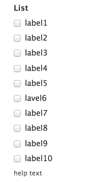
stborchertAs you can see in this screenshot the description for the set of radios is placed below them instead of between title and first radio button.
What if we make this "hardcoded", but only for radios and checkboxes?
Comment #11
Bojhan commentedLet's not :). Although I understand the need for this, Drupal descriptions are not ready yet.
Comment #12
Bojhan commentedI am fine if this is hidden in code, or in contrib.
Comment #13
stborchertbtw: the code used in my previous patch can be done also in your theme by overriding
theme_form_element()(as I do on every of my sites).Its just a simplification and changing of default behavior.
Comment #14
emmajane commented#prefix won't work (that comes before everything and cannot be edited from the field config screen). If #description were broken into "help above" and "help below" that would work. I'm specifically looking to have optional help text between the Field Label and the input field(s). The solution doesn't need to have a toggle, but I do need to be able to configure the location of the help text per field from the GUI.
Comment #15
danepowell commented+1... on my site users specifically told me that they were very confused by the descriptions being below form elements, especially text areas, so I themed it such that descriptions always appear above the field (just below the label). This looks very good IMHO as long as a label is present. However, for fields that don't have labels this becomes confusing and looks awkward. A good solution for me would be to place descriptions between the label and the field if a label exists, and below the field if there is no label.
Edit: I achieved this by adding a conditional to my theme's template.php that outputs the description prior to the field if a title is present and after the field otherwise
Comment #16
Bojhan commentedSorry, but as explained above - there are clear reasons why we don't do this in core yet. I would be fine, if our descriptions were short -to the point, and get users to understand what we mean - but a lot of descriptions simply don't. And we won't fix this before release - by far. Lets keep this as an overwriteable theme function, which enables the clients that do request this to get this.
Comment #17
mgiffordhttp://www.smashingmagazine.com/2009/09/24/10-useful-usability-findings-...
"A study by UX Matters found that the ideal position for labels in forms is above the fields. On many forms, labels are put to the left of the fields, creating a two-column layout; while this looks good, it’s not the easiest layout to use. Why is that? Because forms are generally vertically oriented; i.e. users fill the form from top to bottom. Users scan the form downwards as they go along. And following the label to the field below is easier than finding the field to the right of the label."
Comment #18
danepowell commentedJust FYI, this is the solution I used for my site and theme, and it's received unanimously positive reviews: #557162: Position field descriptions more intelligently
I completely understand hesitancies about implementing this in core, but it does seem to me that this is the most logical default and thus I don't think every single module should have to re-implement it like I did
Comment #19
RobW commentedThanks for the multiple patches / snippets to fix this. While I agree an option per each field in core is overkill, descriptions above the input and below the label are essential for most of my client work. Consider a wysiwyg textarea that by default fills the screen (i.e. CKeditor), or an unlimited field, or a field collection (multigroup). In each instance the user will not see the help until they scroll, in last case sometimes for a screen or two. This is compounded when a user is editing content that has already been created in unlimited fields or field collections case.
In my opinion help text that gives a user information essential to completing a field must be visible to the user before they begin to fill out that field. It's a clear usability pass/fail.
Some core descriptions are long, multiple lines including allowed html tags and the like. I can see them being distracting above the field. Possible solutions seem to be:
If I had to choose one or the other for my whole installation, I would choose top no questions. Lots of text above the field can be a usability speed bump, but not having access to instructions or an essential piece of help text is a usability failure.
Comment #20
realityloop commentedMoved and edited from http://drupal.org/node/1122894
From a usability standpoint I believe that the description text should always be shown between the Field Label and the Field itself.
As it currently stands the text is semantically after the Field which I assume means those using screen readers don't hear the text until after they have encountered the field negating it's use.
This is also relevant for sighted users, as most people don't read ahead when filling out forms.
Either way I believe if it is an option it shouldn't change the semantic placement of the description, but only the visible positioning ie. via CSS.
Reference material:
http://www.slideshare.net/cxpartners/web-and-mobile-forms-design-userfri...
From slide 61
http://www.w3.org/TR/2008/WD-WCAG20-TECHS-20080430/H65.html
Suggests use of title element on input's
http://www.smashingmagazine.com/2011/04/06/fundamental-guidelines-of-e-c...
Section 2
Comment #21
yoroy commentedThanks. What would argue against this though, is that too many of our descriptions are still way too long. Increasing distance between label and form field by more than one line would look silly and I assume be counter-productive too.
#17, @mgifford, that quote refers to labels, not descriptions. Drupal form labels are already on top by default.
Comment #22
realityloop commentedYoroy, I don't think we really have an option it we want Drupal to pass wcag recommendations.
And many organizations websites are required by law to meet the wcag, but most of all I'm concerned about the affect on visually impaired users.
Comment #23
mgiffordTitles & Labels are both valid ways to identify form controls. In Drupal 7 & FAPI we weren't able to get both elements into the API. In Drupal 8 I am hoping that FAPI gets rewritten so that the concerns expressed about including a title element. The invisible label was a work-around.
I'm updating the link here to the final (rather than 2008 draft) of WCAG 2.0 - http://www.w3.org/TR/WCAG-TECHS/H65.html
The usability team has done some great work on encouraging the community to think more closely about the language that we use. So much of the time it isn't clear enough. Having a one line description would usually be sufficient.
I don't think it's a huge issue, but do think it would be great if there were a default setting where one could switch the location of the description to either above or below the field. Heck, maybe even stuff it into a tooltip type of functionality like http://hanshillen.github.com/aegisdemo/
Comment #24
droplet commentedYes. I have same issue. sub first
Comment #25
Everett Zufelt commentedIMO, not a WCAG 2.0 requirement, should anyone disagree please provide SC that we are currently not passing.
I agree that it could be useful for fapi, if not field api to provide this option.
In fapi we could add a new property:
This is a theme setting, and might not be appropriate as a fapi property, however, the options are:
1. Do nothing
* Keep things as we have them now and individuals can solve this themselves with theme overrides (sometimes very complicated if you only want this to apply to certain elements).
2. Use #description_before #description_after
* This would require refactoring of every Core / Contrib module that uses #description. It would also not be semantic and would cause some accessibility problems. There is a 1 - 1 relationship between element and description semantically (elements do not have two descriptions), and in accessibility APIs there is a 1 - 1 UI control - description relationship.
3. Allow for a fapi property to indicate if the description should be rendered before or after the element, and modify theme_form_element() to use this. Field API could then possibly leverage this (in core or contrib) as an additional setting when creating a field.
Comment #26
penyaskitoI attached a patch to #1325488: Add an option to show help text before field and marked as needs review before finding this one. I'm not sure if I should mark it as duplicate, because there have been some comments there too. How should I proceed?
The approach taken is the same one that is described at comment #25 -> option 3, but called #description_display for consistency with #title_display, but #description_position seems to be a better name. Should I change it?
Comment #27
yoroy commentedpenyaskito: attach your patch here to continue the discussion. I marked the other issue as a duplicate of this. Thanks for checking in here :)
Comment #28
penyaskitoPatch attached.
Comment #29
penyaskitoNew patch using #description_position instead of #description_display.
Comment #30
les limTesting the patch in #29, and it doesn't work yet for text fields with the text format dropdown selector. The description text for those fields is being output in
theme_text_format_wrapper(), nottheme_form_element(). Here's the api.drupal.org link:http://api.drupal.org/api/drupal/core--modules--filter--filter.module/fu...
Comment #31
penyaskitoThanks for catching it and pointing to me to the right direction, @Lis Lem.
However, if I edit that function the description will be print before the Body label. I'm looking at field_multiple_value_form to see if I find where to put it just after the Body label.
Comment #32
kaareNever noticed this issue, but I have a sandbox module for d6 solving this. Ancient code, I know, but I believe FAPI didn't change that much between D6 –> D7, so if you need something immediately, porting this wouldn't be all that difficult.
Comment #33
penyaskitoHi kaare. Didn't know about your sandbox. I had a look and the feature is the same than in this patch, but the unsolved problem here is with text with summaries and with formatted text areas, that have changed a lot once fields are included in core since D7.
Thanks anyway for sharing!
Comment #34
spartan300 commentedHi emmajane it really helped many thanks
Comment #35
mgifford#29: description-position-314385-28.patch queued for re-testing.
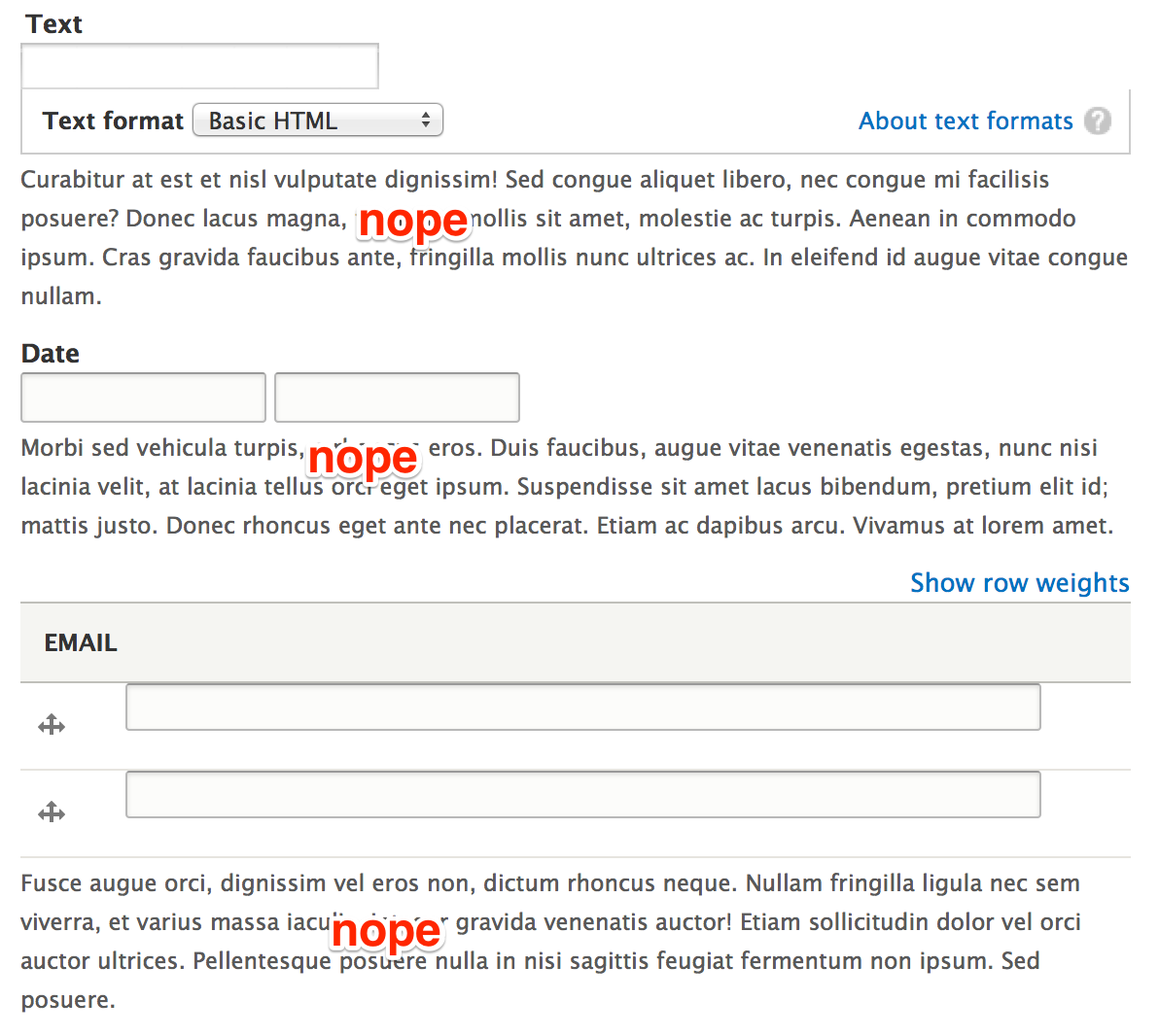
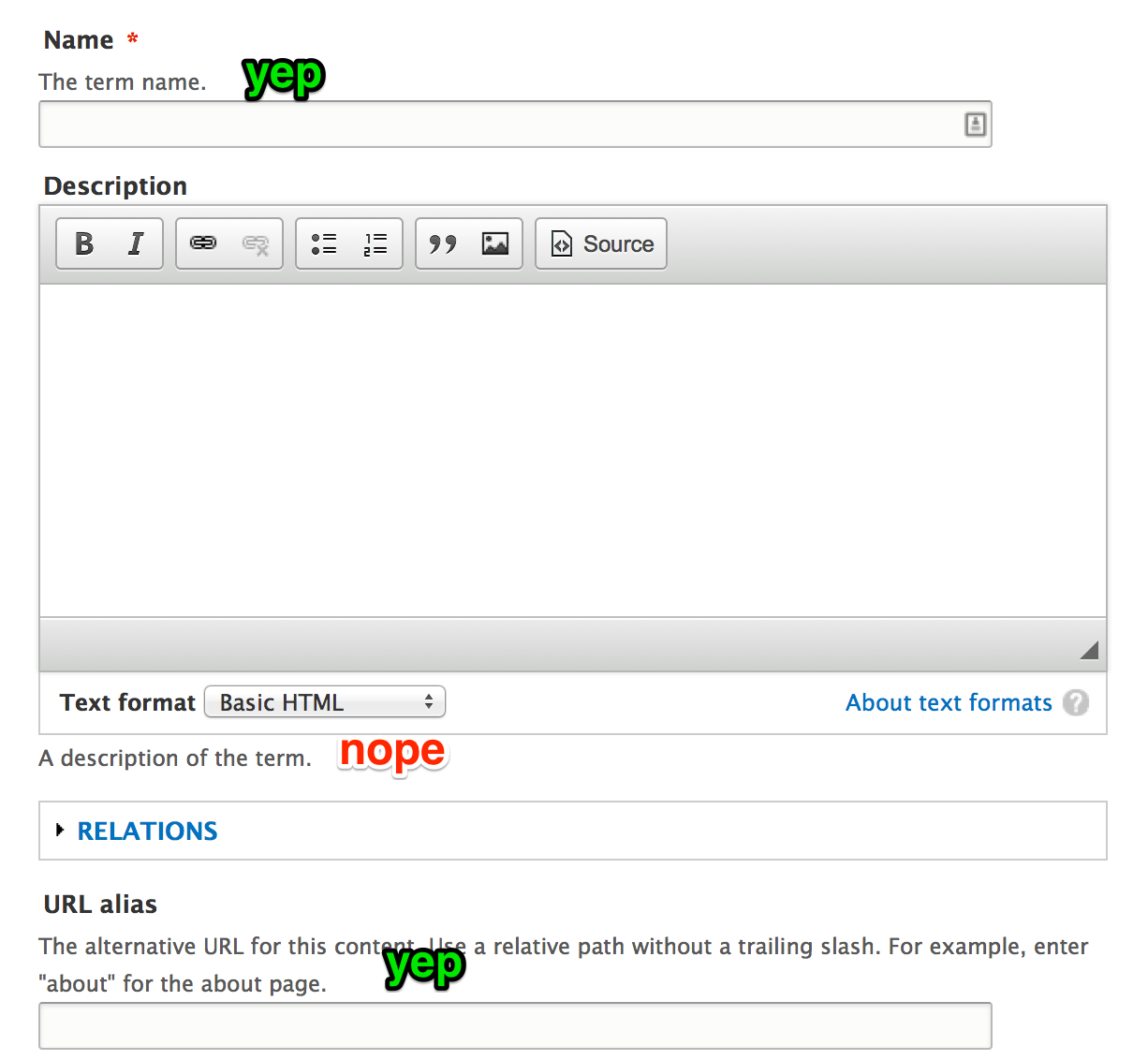
Comment #36
mgiffordThe accessibility issue can be addressed by using WAI-ARIA described-by as per:
http://www.w3.org/TR/wai-aria/states_and_properties
Comment #37
mgifford#29: description-position-314385-28.patch queued for re-testing.
Comment #39
jbrauer commentedA long time in coming but to answer webchick's question in #8 this can't readily be handled by #prefix because at least in certain cases (i.e. select fields) the #prefix is rendered before the #title/label. While I can see the desire to not embed presentation logic in FAPI it seems it's already doing so.er... or it's been too long since I had real sleep...
Comment #40
mgiffordtagging
Comment #41
mgiffordThis might be resolved for AT by: #1645420: Use @aria-describedby for fieldset descriptions
Comment #42
penyaskitoComment #43
mgiffordThe tests have moved.. So this doesn't include the tests. But it's a re-roll that hopefully applies better.
Comment #44
albert volkman commentedSetting status.
Comment #45
Bojhan commentedI still think this is a bad idea. This is not part of the 80%, and adding it to core should be about that.
Comment #46
mgiffordOk, I'm going to mark this as postponed until someone comes back with a solid usability argument or study which says that the position of the description (not the label) should be above (not below) the input field.
When we've got a study to point to then we can re-open this.
Comment #47
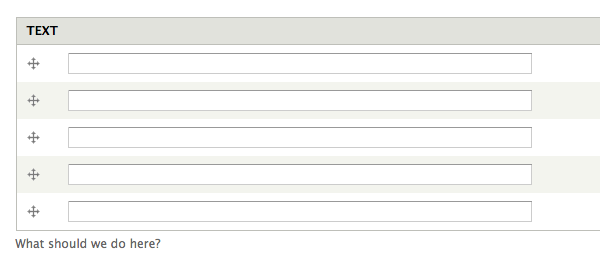
dave reidI believe the biggest reason for this change is multiple-value fields that take up a lot of space. When you go to enter those fields, the help description text is at the bottom, possibly after you had to scroll past the field label and all the actual fields. For small vertically-limited forms, having the description at the bottom makes sense. But not for fields that use large vertical space, commonly multiple-value fields.
Comment #48
mgiffordThat's a good reason to make it configurable... Hard to argue with that image.
Comment #49
webchickWell, that's a good argument for core to make it possible to move a description to the top, but not a good argument for this being an 80% usage and something that should be part of the core framework.
Is there a reason a custom theme function override couldn't do what you need to do there, Dave?
Comment #50
yoroy commentedYeah, in #12 (and #16) bojhan pointed out that 'make possible' is fine. But lets not provide a UI for it in core and the core default should stay below the form field. I agreed then and still think that's the part that core can provide (and nothing more) now.
Comment #51
dave reidI think part of the problem is how Field API outputs it's fields since technically it's not possible to put a field description inbetween the label and actual input fields since the label is actually *inside* the multiple-value table.
@webchick: Because I shouldn't have to implement a custom theme function to fix a UX issue on every single site that I have. I can live with API-level support for this in the theme functions, but this not being exposed to the field UI at all. That's perfectly acceptable to me. Fixing the multiple field table may be a separate issue as a follow-up.
Comment #52
panchoI like this approach, not only for the presented use case but also for hiding the description while it remains available for screen readers.
In some cases this would be helpful - even in core - where we are having compound widgets that go with a single description for visual usage, but need per-widget descriptions rather than per-widget titles for screen readers.
See cardinality field in field_ui_field_edit_form() resp. a generic select-or-other widget as proposed in #1207060: Interface pattern for custom option as alternative to predefined choices. There might be more use cases.
Besides consistency with #title_display, this is one more reason we should call this attribute #description_display, not just #description_position.
For the accessibility aspects IMHO this is a task, though a normal priority one.
Comment #53
panchoHere's a new patch introducing a #description_display property with the possible values 'before', 'after' and 'invisible'.
Compared to #43, I refactored and simplified quite some code in theme_form_element() and moved the actual implementation to a new theme_form_element_description(). I also partly rewrote the docs which could use some more love.
Worked fine on some preliminary tests, might fail though on ElementsLabelsTest and possibly some more.
Of course we need tests for #description_display, but I wasn't sure whether I should better add some minor tests to ElementsLabelsTest or create extensive tests in a new ElementsDescriptionsTest.
In case of an invisible description, the
<div>should possibly also be a<span>instead.Comment #55
panchoAh, this is because #1838310: Remove st(), get_t() and $t for good landed the day before. Here's a new patch.
As I said in #53, some tests would need adjustment, so there might be some more fails.
Comment #56
panchoCool, no fails.
Still needs tests, either in ElementsLabelsTest or a new ElementsDescriptionsTest.
Comment #57
mgiffordI'm mostly attaching an interdiff.
This is all stuff that you can control with code, but not through the UI, right? At the moment there's no way to say from admin/structure/types/manage/article/display set where the description sits.
Not a big deal if this is the case, this looks like a good jump ahead.
Comment #58
mgiffordI didn't even realize there was a module for this already - https://drupal.org/project/label_help
Seems like something that should be in Core though.
Comment #59
panchoNeither did I, but that really is another good use case.
Yes, it should be in core, because it's not about some edge cases but improves usability of some core widgets.
Comment #60
mgiffordAbsolutely! So, what is the best way to test this?
We need screenshots at least.
Comment #61
mgifford#55: description_display-314385-55.patch queued for re-testing.
Comment #62
mgiffordWith this patch applied, I'm still not sure how to configure this so that the help text is closer. Same problem described in #47.
Comment #63
penyaskito#55: description_display-314385-55.patch queued for re-testing.
Comment #64
panchoRe #62:
Should do it. No?
Or do you rather mean that it's not yet exposed to the UI? That's true.
Comment #65
panchoSo now, we need to identify all possible situations where putting the description right under the title is desirable, or where we want the description not to be displayed at all. Clear cases might possibly be resolved automatically, if that's not a WTF. For the other cases we might need to expose a setting to the UI.
Comment #66
Bojhan commentedWe do not need to expose this through the UI, this can easily be done in code as you shown.
Given that this seems close from an API standpoint, I'd say we get it into core.
Comment #67
mgifford@Pancho Yup --> "it's not yet exposed to the UI?" -- That's exactly what I meant.
@Bojhan - Absolutely. Let's get the API in first then open another issue for the UI. If that needs to wait till D9 to get in so be it. Changed the title.
Comment #68
panchoOK. So patch #55 is up to be extensively reviewed for:
Also, it would be cool if someone identified a possible implementation in core to be added rightaway.
Note that the implementation in NodeFormController of course has to go away. Seems like leftover from my own testing.
Also still needs tests. Will fix that all in one go, so for now I'm marking patch #55 as "needs review".
Comment #69
penyaskitoQuick note:
Because of #1757550: [Meta] Convert core theme functions to Twig templates, we shouldn't include new theme_* functions. Use twig instead.
Comment #70
sheldon rampton commentedI'm the maintainer of the Label Help module described previously. Getting similar functionality into core would be a good thing. I just want to point out some things to consider:
Comment #71
panchoBack to needs work per #69.
Replacing theme_form_element_description() and probably also theme_form_element_label() by a Twig template.
Re #70:
So do I get it right, this patch is on par with what Label Help can do for the admin?
But true, the placement should be overrideable just as the themer wishes. If it isn't, I'd propose this to be a followup, because it should probably be discussed in a larger context.
Comment #72
sheldon rampton commented@Pancho: This patch is different from what Label Help does. This patch appears designed to control the placement of the description field, by adding a parameter which specifies where the description should be placed. This patch also does not provide a user interface for controlling that parameter when a site builder is adding a field to an entity. It simply adds the parameter.
From reading over the patch, I don't know if it will actually work for all of Drupal's field types. When I wrote the Label Help module, there were a few code recipes floating around providing ways to move the description text, but they didn't work consistently for all field types, and I couldn't figure out how to make any of them work consistently. To make it work consistently, it seemed that you have to (1) insert the description text in a different place, and (2) prevent Drupal from inserting it in the place where it is accustomed to inserting it. I couldn't figure out how to do that because I think it involves logic inside drupal_render which varies based on a variety of factors. For example, with a textarea field the logic varies depending on whether the field is plain text or formatted text (in which case the logic also inserts an input format selector and input format help text).
After puzzling through that for awhile, I finally decided, "Forget it, I'm just going to create a separate help field entirely from the description field and call it 'Label help.' Then I don't have to mess with all that other stuff."
If the current patch works consistently with all field types, it's probably an improvement over my Label Help approach. Has anyone tested to see how it actually displays the help test across a full range of available field types?
Comment #73
penyaskitoFor the tests that are still needed, maybe the patch at #1325488: Add an option to show help text before field can help.
Comment #74
panchoConverted the new theme_form_element_description() to a nice little Twig template, so we're not introducing additional stuff to be converted.
Also some more minor fixes in code and docs.
No UI yet, as this should be left to a followup, covering both title and description.
From all manual tests, this worked nice with different kinds of fields. Not surprising, because it parallels existing #title_display functionality.
Tests still needed, thanks @penyaskito, I will look into the other one. Let's start with the functional code anyway.
Comment #76
panchoNow, here is a version with some basic tests adapted from #1325488: Add an option to show help text before field, however testing also the @aria-describedby attribute.
I also tweaked the HTML output a bit, so new lines and indentations should be even cleaner than before.
In-line comments improved as well.
Tests passed locally, and additional manual testing suggests the attribute works fine with all kinds of fields. Now even more ready for review.
Comment #77
penyaskitoTests are nice and cover all the possibilities. From my point of view, only #69 is still pending.
Great job @Pancho, looks like we are really close to RTBC a 5-years-old issue.
Comment #78
mgifford@penyaskito I'm definitely in favour of converting stuff to twig, but that's beyond the scope here.
There are no new theme functions added here. I'm just following the guide I found in GoogleDocs, but really don't see from reviewing the patch what's been added that needs to be done in twig.
Yes, there are lots of theme_* functions that need to be changed in form.inc, but that should really be done in another issue.
EDIT: Note docs seem to be in https://drupal.org/node/2025313
Comment #79
panchoBoth of you, thanks for reviewing!
Converting the already existing theme functions in form.inc is done in #1898480: [meta] form.inc - Convert theme_ functions to Twig.
So we're just making sure we're not introducing more stuff to convert, so the new one already is a Twig template.
Came up with three more points of discussion:
If yes, then would it make more sense to refactor the 'description_display' parameter to take either of the values 'after_element' vs. 'following_title', instead of 'after' vs. 'before'? It was chosen to be in line with 'title_display', but does not necessarily have to.
However, while there is use for calling theme_form_element_label() with an empty label, in order to display the required marker, there is no use for calling template_preprocess_form_element_description() with an empty description.
Normally it shouldn't do any harm unless $element['#description'] is explicitely set with an empty string, but we could be a bit stricter for descriptions in order to avoid the unnecessary overhead in this case, sacrificing the similarity between the two theme functions.
So that seem to be the remaining fineprint nitpicks, apart from possible test improvements/expansions. :)
For 'title_display', I also believe we don't need to have both 'invisible' and 'attribute', so the latter could be integrated into the former. If a title is set, why would someone want it not to be displayed in a tooltip, where it's not distracting at all. But this one really is out of scope here. Would like to do a followup though.
Comment #80
sheldon rampton commented@Pancho: You wrote: "However IMHO the description should never precede the title if both are displayed. Should we make sure this isn't possible, or should we just leave it to the discretion of the developer."
I'd say, leave it to the discretion of the developer. Drupal should be enabling developers by providing them with good tools and encouraging them to make good design choices, but it should not be forcing design choices on developers. There may be some use case you or I haven't thought of where the developer will have a good reason for doing something even though we don't currently think it is a good idea.
Comment #81
panchoRe #80:
Fine, I even agree, just wanted it to be a conscious decision.
How about the other two points in #79?
I also thought about some actual usage of the new attribute in core. Think that it would be nice to roll in a few uses, and found quite some of it:
a) Beyond an invisible one for screenreaders, I'm wondering if a description shouldn't provide more information about what is happening in a tooltip. We might actually implement this or not (probably not within scope of this issue here) but we should probably allow for it, so would need either
$element['#description_display'] = 'attribute'or the tooltip functionality rolled into 'invisible' mode.See also the very last paragraph in #79.
Note that the HTML5 specs explicitely allow instructions to be included with the title attribute, see this.
b) If we'd be adding this as an option, I'd propose to use 'tooltip' which might be better than 'attribute' for both '#title_display' and '#description_display', because 'attribute' doesn't really say what's going to happen. Renaming it might encourage developers to make more use of descriptions, so improving usability. This could be another followup though.
$element['#description_display'] = 'before'is more complicated, so should be deferred to a followup.While a lot more descriptions are missing, 1) should be enough to at least have some implementation rightaway.
But 2a) should be taken into consideration now, in order to have the API cover all possible uses.
Comment #82
panchoTagging.
Comment #83
panchoHunting for an actual application really turned out to be a good idea, because I hit some more real cases.
@Sheldon Rampton was right in that a number of elements types need special considerations. This was all too easy to be a complete solution. We'd also need more than these few basic tests.
Let's start with the two container-style types 'fieldset' and 'details' which aren't rendered by theme_form_element() and therefore need to be separately covered.
Container in this case means that everything is contained between the opening and closing tags, both in the HTML source and visually. This has a number of consequences:
Most importantly: 'before' and 'after' is not what we'd usually expect here. Both ways the description would fall out of the container.
What we'd rather need is 'top' and 'bottom', with the former currently being hardwired.
In the 'details' case, the distinction between 'before' and 'top' is even more important, because in the 'before' case, the description would be rolled into the summary, while in the 'top' case it would be not.
And for both container types, the distinction between 'bottom' and 'after' is that in the former case it is rolled into the container, while in the latter case it falls out of it.
In principle, this also holds for the 'checkboxes' and 'radios' element:
So while for titles the current approach is fine, for descriptions we'd need four instead of just two possible placements.
Containers should default to the description being on 'top' (like 'fieldset' and 'details' now do) or on 'bottom' (like 'checkboxes' and 'radios' currently do) of contents, but also allow either of the other placements.
Monolithic elements (as most others) however should continue defaulting to 'after', while also allowing 'before', either disregarding or leniently matching the other two placements.
If you agree in principle, I'd roll a new patch following this logic. I'd also add a few more tests covering the whole range of cases, and extend documentation.
So while the patch needs work, the concept is for review.
Comment #84
xjmWe don't add change notifications (or the tag) until an issue is committed. Use the API change (if there's a BC break) API addition (otherwise) tags to indicate when something will need a change notification after commit, and maintainers will tag it then.
Comment #85
mgiffordSo just trying to rephrase a bit here.
There are more options for descriptions placements based on the type of input field involved.
I didn't get 4 options though. From the UI, I can't see how there would be more than 2 for any given item.
I'd like to see a patch though following this line of thought.
Comment #86
mgifford#76: description_display-314385-76.patch queued for re-testing.
Comment #87
mgifford#76: description_display-314385-76.patch queued for re-testing.
Comment #89
mgiffordJust a re-roll, other than the rejected $items['form_test/form-descriptions'] piece which I've included as an attachment. I don't know if the form_test.module still needs this or if this needs to be modified and added somewhere else.
Comment #91
mgiffordI had trouble installing this on STM too. Applies no problem locally.
Comment #92
sheldon rampton commentedI hate to throw a curve this far into the discussion of this ticket, but I'm starting to wonder if the problem as stated in the title of this ticket should be reconsidered: "Make position of #description configurable via the API." The configuration options that are currently proposed are: before, after, and hidden. Does this really capture the range of options that developers might want or need for positioning the #description? Consider, for example, a WYSIWYG text field. It contains the following components:
Site builders might actually want to place the #description in several places, including:
This suggests that the options of "before/after/hidden" may not be adequate for all field types or all design use cases. Offering these options would provide greater flexibility than currently exists, but does it make sense to put development effort into adding a couple of additional options that still don't provide enough flexibility?
Perhaps instead the focus should be on making it easier to change the positioning and behavior of the #description using theme_form_element, which currently I find difficult to use.
Comment #93
mgiffordThere's also dealing with how to style for mobile content.... Would having a hidden-on-mobile be useful?
I would like to see some UI element, but can see how you might want to have even more control than before, after & hidden.
We might also want to set some more sensible defaults. Dave Reid's suggestion in #47 should definitely be fixed for everyone.
I'm not sure how to approach implementing your suggestion though. Ideally we'd be able to do more with theme_form_element() - more easily - and then simply have a UI that works with it.
In the mean time we've got a patch that helps give D8 a more flexible #description element...
Comment #94
sheldon rampton commented@mgifford I'm not against getting this patch into D8. I think it's at least some kind of step forward.
Comment #95
Bojhan commentedYhea, I think the wish list of "other positions" than above/below is endless. Lets get this in first.
Comment #96
mgiffordAhh, finally had time to look at the install error again:
Unable to find template "core/modules/system/templates/form-element-description.html.twig" (looked into: /home/s772c3c09b7cb761/www).
Then search to determine that form-element-description.html.twig wasn't included in the last patch.
Comment #97
mgiffordGo bot.
Comment #99
penyaskitoRerolled. form_build_form moved to FormBuilder::doBuildForm().
Comment #102
mgifford99: description_display-314385-99.patch queued for re-testing.
Comment #104
jlbellidoI'll work on this.
Comment #105
jlbellidoComment #106
mgiffordThanks. This is especially important for #47.
Comment #107
jlbellidoUpdated tags
Comment #108
jlbellidoTest failed because path '/form_test/form-descriptions' didn't exists, added it with @joe_carvajal!!
Comment #109
jlbellidoComment #111
jlbellidoRe-rolled #108 and try again.
Comment #112
mgiffordThanks @jlbellido - great to see this test finally pass!
For testing it is a matter of writing a form (via a module or the template.php) to use FAPI to position the description above or below as per #92.
I'll try to test that in the coming week. I just applied this in SimplyTest.me but there are no UI changes.
Comment #113
rootwork@mgifford did you get a chance to test this? I'd love to see this get in.
I unassigned @jlbellido since it seemed like his work was done.
Comment #114
mgifford111: description_display-314385-111.patch queued for re-testing.
Comment #115
mgifford@rootwork - I haven't had time sadly. I did quickly check though and this needs a re-roll.
Comment #117
jjcarrionI'm going to try the re-roll
Comment #118
jjcarrionComment #119
lewisnymanLooking at this patch, it looks like it's now affecting a lot more than just the position of the description, can we clarify this is within the scope of this patch and update the issue title and description?
Comment #120
jjcarrionFinally, I haven't make the reroll, ther was many changes around the initial change.
I have just add a new $variables['description_display'] with the value 'before', with that variable in the twig file we can render the description before or after de element.
Comment #121
penyaskitoI would move the definition from template_preprocess_form_element to FormBuilder::doBuildForm(), so we still have the option of defining where it would be rendered from Form API.
Please take the tests from last patches, they should work or at least provide a good start.
This would need an issue summary update as Lewis pointed out.
Thanks!
Comment #123
jjcarrionI have changed the patch with the modifications that penyaskito proposed. Here is the patch and the interdiff.
Comment #125
risse commentedI'll take a look at this reroll.
Comment #126
risse commentedComment #128
lewisnymanComment #129
jacobsanfordPatch applies cleanly, removing 'Needs reroll' tag
Comment #130
jacobsanfordMy mistake, I was squelching file-not-found errors. Resetting tag.
Comment #131
jday commentedHi, new contributor here, working on re-rolling this patch.
Comment #132
jday commentedReroll of patch description_display-314385
Comment #134
mgiffordComment #135
penyaskitoRerolled.
Comment #136
penyaskitoNow it should get back to green.
Comment #139
penyaskitoPart of the tests were missed after #111.
Comment #140
penyaskitoNow it is green for real.
Comment #142
penyaskito(facepalm) Forgot to add a class.
Comment #143
alimac commented@YesCT and I are going to review this patch later (but if anyone wants to jump in, please do).
We were wondering why the setting is called "invisible" instead of "visually-hidden" like the class that's used to make it visually hidden?
Comment #144
penyaskito"invisible" instead of "visually-hidden" is for consistency with the title_display property: https://api.drupal.org/api/drupal/developer!topics!forms_api_reference.h....
If we consider renaming, we should do that on both, it is an API change, and I guess it is out of scope of this issue.
Comment #145
yesct commented1. Thanks, that makes a lot of sense.
2. but I didn't see where the new key and possible values for it was documented...
does not document the element array and the possible values at all anyway.
ah, this is the whole form api documented in the big table thing.
We can have a separate issue to document this new #description_display array key and it's possible values.
Or find the issue to document form api stuff for drupal 8, and make sure that issue also documents this new key.
3.
still looking at this code and also working on an issue summary update with @alimac
Comment #146
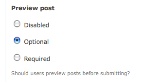
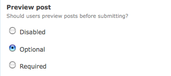
alimac commentedAdded steps to reproduce. Will add an "after" screenshot and steps in a bit.
Comment #147
yesct commentedRe #145 2. created #2318105: Add documentation for new #description_display key for form api documentation to document this new property.
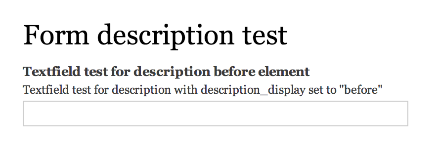
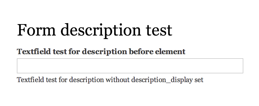
I think the steps to reproduce would really be like:
make a module that has a form, notice the description is after,
add this line to the module, notice your description in the form moved... or something.
We can probably use the test module for the before and after screenshots.
Comment #148
alimac commentedSorry, I misunderstood. I updated the steps to reproduce (based on @YesCT's comment in #147) and added before and after screenshots from an example module.
Comment #149
alimac commentedI updated the comments to use third person tense in the summary of classes (https://www.drupal.org/coding-standards/docs), and more accurately describe what the code is doing. There was also an indentation issue that I fixed.
The current options make visually hiding the description mutually exclusive from changing the positioning of the description -- so the option to have the description appear before a form element is not available to screen readers. We are going to use a screenreader test whether or not it should be mutually exclusive.
Comment #150
yesct commentedissue summary updated.
Comment #151
yesct commentedturning on the accessibility screenreader on my mac, the description is not read for me. hm.
oh! it does, if I pause long enough in the field.
And, it's using aria-describedby, in which the pattern is to read it "the help tag is ...."
so, there is no such thing as visually hidden before or visually hidden after.
OK.
oh, spotted one small nit. Having someone make the new patch right now.
Comment #152
akalata commentedWorking w/ YesCT @ TCDrupal2014!
Nitfix: Documentation wrapping beyond 80 characters. See https://www.drupal.org/node/1354#drupal ("Lines containing comments (including docblocks) must wrap as close to 80 characters as possible without going over").
Also added a test-only patch for the tests that were added.
Comment #153
yesct commentednice fixes. issue summary updated. and I read the whole patch.
Comment #155
penyaskitoAwesome, thanks!
Comment #156
alimac commented@Les Lim and I found that this patch didn't work for multiple value form elements (the description appeared below the fields in those cases). Going to write a test first, then work on a fix.
Comment #157
les limElements with text format selectors are also a problem. Here are screenshots from our testing.
Comment #158
alimac commentedChanging it back to RTBC.
In #51 Dave Reid recommended creating a follow-up issue to this, for multiple value field widgets, so I just created it #2318757: Make position of #description configurable via the API for form field widgets.
Comment #159
alexpottCommitted b366d7d and pushed to 8.0.x. Thanks!
Comment #161
penyaskitoThanks! Focus moves to #2318757: Make position of #description configurable via the API for form field widgets.
Comment #162
fabianx commentedChange notice on how to use the new API?
Comment #163
penyaskito@Fabianx, you are right, thanks! Created https://www.drupal.org/node/2324025
Comment #165
penyaskitoCreated #2412881: #description_display is ignored for fields
Comment #166
vitalie commentedCreated #2421445: Text format wrapper does not honor description_display
Comment #167
arla commentedCreated #2396145: Option #description_display for form element fieldset is not changing anything (a while ago)
Comment #168
Anonymous (not verified) commentedI'm very glad this issue has been addressed for Drupal 8.
People with low vision may use the site at an extreme zoom level, in which case the issue of the help text being below the field is exacerbated because they only see a very small portion of the screen at one time. Imagine the image in comment #47 but at 500% zoom. That's a TON of scrolling. ARIA doesn't really help users in this scenario.
Comment #169
imiksuCleaning up drupalcampfi tags.