
Closed (duplicate)
Project:
Comment Notify
Version:
7.x-1.x-dev
Component:
Code
Priority:
Normal
Category:
Feature request
Assigned:
Unassigned
Reporter:
Created:
12 Oct 2008 at 13:12 UTC
Updated:
5 Feb 2009 at 03:09 UTC
Jump to comment: Most recent file

Comments
Comment #1
gregglesIt definitely makes sense to me to provide a single checkbox if there is only one mode available on a site.
It doesn't make sense to me to provide it as two checkboxes. If you subscribe to "all on a node" then the other checkbox wouldn't actually subscribe you to anything. Do you feel radio buttons are an improvement over a select? Selects are more visually compact, but hide the option. Radios take up more space...but allow people to see all the options without having to click...I think having it compact is more important.
Comment #2
PeterZ commentedYes, I was thinking about the two checkbox option some more as well, and that doesn't work, because they are exclusive (as you point out). So, the main options are a drop down or radio buttons. Another advantage of radio buttons is that it allows the user to see all choices without having to click anything. As you point out, a disadvantage is that it takes more space. I don't recall having done any UI testing on this (although the issue does come up frequently) so I don't have measures to justify a view, but I'd probably lean toward radio buttons.
Comment #3
gregglesUpdating the title.
Also, the point for selection should be near the place where you enter the the e-mail.
Comment #4
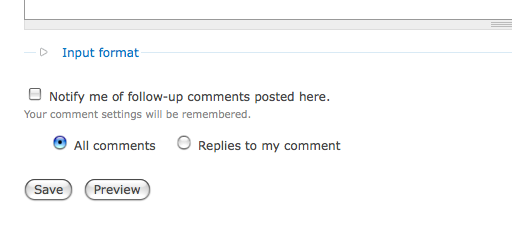
aclight commentedHere's a screenshot of something that I think would work.
I think it might be fine to get rid of the interface for the per-user default option, and just store whatever option the user selects and then use that as the default for that user the next time the form is built for that user.
In the case where only one of the two radios would be vaild (for example, if the administrator only provides one option, or if comments are not threaded, in which case allowing replies to only my comment doesn't make sense), then I think we could just get rid of the radios and use only the checkbox.
The radios/checkbox would be populated using the site's default settings if the user had never commented before.
BTW, I don't love the strings I've chosen to use here, but those can be discussed later.
Comment #5
gregglesI'm glad you posted this idea - it's pretty interesting.
From a high level, here's what we need to allow:
1) A way to subscribe to comment notifications
1.1) Either for the whole node
1.2) OR for replies to your comment
1.3) If threading is disabled OR the admin only allows one subscription mode then 1.1 and 1.2 should be condensed into a single checkbox.
1.4) If the current user is the node author and the node author has notifications enabled then we should probably hide the checkboxes are disable them with a note about why.
2) A way to unsubscribe while the comment is being entered or edited.
3) Some way of communicating the concept of a default for registered users
This UI you propose achieves all of those goals (and could easily be expanded for 1.4).
I'm kind of torn about the idea of removing the default UI and just remembering the last method they used.
It also takes up a bit more space than the current system for the most complex cases.
Comment #6
aclight commentedI see your point. It seems like we should be able to revert the removal of the description about how to set your preferences, but make the link to the account edit page open up in a new window. That should solve the problem of people accidentally navigating away from their comment.
Just a little, but I would be less concerned about space and more concerned with usability. I personally think my example improves usability, but I admin I have no numbers to support that claim.
Comment #7
spiffyd commentedSubscribed!
Comment #8
gregglesWe can fix this in #319830: create a simplified user interface.