
 Come together with the global Drupal community in Rotterdam, 28 Sept – 1 Oct 2026. Sessions, contribution, connection, and Early Bird savings until 8 June.
Doh!
When the password field does not have any description text, the password suggestions don't have anything to attach to, and so don't show. This is the case on the installer. The patch changes this so that the description is now applied after the confirm box instead; which we can always rely on existing.
Leaving as needs work because I think I need to fix some cross browser css issues.
| Comment | File | Size | Author |
|---|---|---|---|
| #32 | password_checker_fix_10.patch | 2.21 KB | alpritt |
| #31 | password_checker_fix_10.patch | 0 bytes | alpritt |
| #28 | password_checker_fix_9.patch | 2.21 KB | alpritt |
| #28 | installer.png | 28.1 KB | alpritt |
| #28 | user-edit.png | 31.55 KB | alpritt |

Comments
Comment #1
alpritt commentedNote to self: in future check CSS patches are theme independent.
Comment #2
alpritt commentedThere is also an issue with the page not scrolling adequately to see the entirety of the password checker widget. This is especially true if you tab to the password field.
Comment #3
alpritt commentedThis fixes 3 things:
1. Some cross theme breakages. (Hopefully I haven't broken IE in the process).
2. The password suggestions are now showing whether there is descriptive text or not, by appending them after the password input box rather than placing it inside the description box.
3. When the password input receives focus, we check to make sure the bottom of the entire checker fits inside the browser's viewport. If not it scrolls into view.
In theory I could split number 3 into a different issue, but I think it is easier to test together.
I'm leaving 'needs work' until I've checked IE.
Comment #4
alpritt commentedThe version that works in the Internet Explorers...
Comment #5
alpritt commentedMore attractive code.
Comment #6
catchalpritt - could we have screenshots to easily review the changes?
Comment #7
catchComment #9
alpritt commentedRerolled.
Also removed the automatic scrolling (see comment #3 bullet point 3). I think we need this still, but it should be another issue.
I'm not totally satisfied with the CSS, but it is an improvement. The primary reason for this patch is not the CSS but the fact that the password suggestions do not appear in the installer because there is no description for them to attach to. I've altered the CSS because I had to alter the markup slightly to fix the missing suggestions in the installer; not to change how it looks.
I'm hoping the CSS can be improved beyond its current state since the alignment is a little off in different browsers/themes. However, the changes here should be more stable than what we currently have. No major breakages, just not quite aligning as I'd like.
Note that while I did a thorough cross browser check several months ago, I only did a rudimentary check on this reroll.
Reason for critical:
* Well, it's broken in the installer.
* Also this is affecting at least two other issues #370835: Improve password checker in the Stark theme. and #331893: Add colouring (and description) to password checker
Comment #10
webchicka) There's no patch in #9, although it sounds like there should be. :\
b) Before/after screenshots would be insanely helpful.
Comment #11
alpritt commenteda) :p
b)
The Installer Before:
The Installer After:
Comment #12
alpritt commentedJust another quick note. You'll notice the width of the checker has shrunk. I did that so the CSS didn't break in themes with particularly narrow columns. This correction should perhaps be revisited now, since we have removed some of the old core themes. On the other hand it may be wise to leave such questions to the #370835: Improve password checker in the Stark theme. issue.
Comment #13
geerlingguy commentedI like it... but just to be certain, the suggestions won't be popping up and going away all the time while people are typing in passwords, right? That was one of the most jarring and un-user-friendly experiences in Drupal that I know of.
Comment #14
cburschkaNo, the code shouldn't do that, from looking at it.
Will this need cross-browser testing?
Comment #15
alexanderpas commentedComment #17
alpritt commentedMarking as duplicate of #370835: Improve password checker in the Stark theme. which has effectively swallowed this issue.
Comment #18
alpritt commentedReawakening this because the other thread seems to have stalled and is doing much more than a bug fix. 'Needs work' since the design has now completely changed, which will have affected the CSS and maybe the mark up.
ARGH!
Comment #19
alpritt commentedReroll.
Comment #21
alpritt commentedSeems unlikely. Retesting.
Comment #23
sun.core commentedPatch looks good, needs manual testing, RTBC if it works.
Comment #25
alpritt commentedPrevious patch was broken because CSS file was renamed. I've just got rid of the CSS changes in this reroll to keep things as simple as possible. So there are CSS misalignment problems, but those exist already so ignore them when reviewing.
Comment #26
alpritt commentedComment #27
seutje commentedTried patch in #25
It fixes the issue but it adds a "description" class to div.password-suggestions
which causes a bunch of styles to get overriden and makes it look like this, when removing the "description" class, it returns to looking like this
I could not find any reasoning as to why this class was added, and as it changes the looks of things, I don't think it was intended
attached patch is the same as #25, except that it does not add this "description" class
Comment #28
alpritt commentedReroll for the added aria support. The "password-strength-text" div was also removed by accident in previous patches, so corrected that. And it looks like one of the CSS misalignments was caused with this patch, so removing the change in source order that caused that as well.
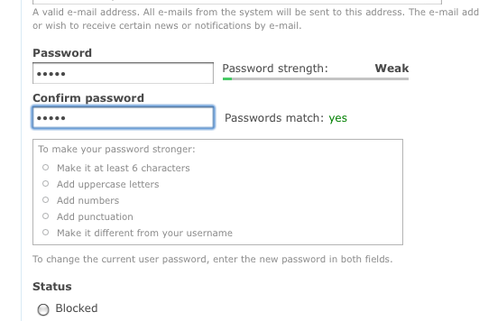
I've been thinking about the description class as mentioned in #27. Originally the password suggestions were part of the description div and so obviously inherited its style. Without inheriting this style, IMO the suggestions look wrong. So in this patch I added that class back and amended the CSS so that the style doesn't get overridden. This is how the password suggestions looked originally. However, I'm not satisfied with how it looks in either case since the progress bar was redesigned; so I don't mind this getting committed either way. This patch should be closest to what the current behaviour is though so it is probably best to keep it there.
Screenshots show patch applied in installer and then in a user edit page.
Comment #29
alpritt commented#28: password_checker_fix_9.patch queued for re-testing.
Comment #31
alpritt commentedReroll.
Comment #32
alpritt commentedLet's try that one again!
Comment #33
yoroy commentedWorks! I'm assuming the general behaviour of this (tips showing on focussing the first password textfield) remains unchanged? Haven't seen these tips for so long I can't remember :-)
Comment #34
webchickAwesome, thanks! Committed to HEAD.