
 Come together with the global Drupal community in Rotterdam, 28 Sept – 1 Oct 2026. Sessions, contribution, connection, and Early Bird savings until 8 June.
By Amazon on
Update: we are organizing a series of developer sprints to implement the site upgrade and redesign and would welcome your kind donations.
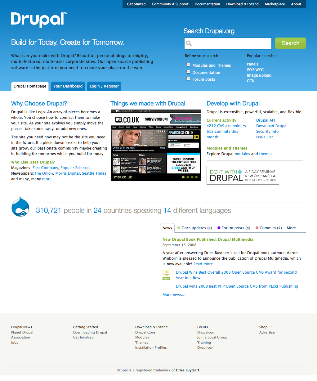
The Drupal Association is excited to announce that the last iteration, iteration 11, of the Drupal.org redesign is now available for review. Hundreds of Drupal community members and designers have participated in the redesign of Drupal.org.
We have had over 450 comments on 10 posts in the Drupal.org redesign group. Leisa Reichelt, our user experience research lead, has posted over 26 blog entries about the Drupal.org redesign with over 300 comments! Over on Mark Boulton Design, Mark has blogged 6 posts with over 430 comments. Who knew that open source contributors were so passionate about fonts, logos, and brands? Mark Boulton has also blogged three posts on his personal blog. It's been an exciting, educational, and insightful process for everyone who has been involved. If you haven't had a chance to review these 42 blog posts, or the numerous posts about the redesign on Planet Drupal, please take a few hours and get involved now!
Where do we go from here?
Drupal.org base theme
We are now recruiting theme developers from the community to help create both the base theme and Drupal.org site specific themes. The base theme will implement the design style guide developed as part of the redesign deliverables. The Drupal.org specific themes will remain exclusive to Drupal.org web sites: http://association.drupal.org, http://api.drupal.org, http://security.drupal.org, http://infrastructure.drupal.org.
Drupal.org redesign infrastructure team
The migration, development, and staging of the redesigned drupal.org will take place on the Drupal.org infrastructure. Developers and infrastructure contributors will be given access to a virtual machine with the Drupal.org code base as well as a scrubbed version of the Drupal.org database for development. If you would like to help with the porting of Drupal.org to Drupal 6 or help develop new features, please join the Drupal.org redesign infrastructure group.
More design
The design process for Drupal.org is ongoing. The community has stepped forward to show that they can be valuable contributors to the design process. For a detailed review of the many design techniques that have been used as part of this redesign, see Are we there yet?.

Sponsoring part of the redesign
Community members and Drupal related businesses should consider contributing to the Drupal.org redesign. If your business would like to sponsor part of the redesign implementation through direct contributions of resources, feel free to blog about your contributions on Drupal Planet. If you would like to fund development of specific features or help fund the porting of Drupal.org specific functionality, like the project module, please contact the Drupal Association for further details. If your organization is not yet a member of the Drupal Association please consider joining the 870 individuals and organizations whose financial contributions have helped make this redesign possible.

Comments
After recently getting back
After recently getting back to the Drupal action I found out about the drupal redesign project which I am very excited and hyped! The design works and as I read more blogs/post about the planning for this design it makes more sense.
My best regards to drupal family.
~~~
Daniel Gallegos
http://imzenko.com
Much Improved
Very clean, very web 2.0. Glad to see this in the works. The navigation is much more intuitive and well-organized in the mock-up. The current layout is decent but getting a little worn around the edges. I think Drupal will benefit greatly from the new iteration. Can't wait to see it in action and tinker around with what's new under the hood.
2.0
I really like the web 2.0 look. Maybe more themes like this will attract more bloggers to switch from WordPress...
I like the new design, let's
I like the new design, let's hope that it stays as clean as it is at the moment regarding content to HTML ratio.
- Michael
Owner of Absolutely free pictures, a free pictures resource.
I would like to see a large
I would like to see a large call to action DOWNLOAD button on main screen. Prolly along the lines of get started with drupal.
Otherwise looks very professional.
Drupal.org can now be called a pro CMS venture
http://tax2009.org
Love the new layout. Can't
Love the new layout. Can't wait to see it live on Drupal.org
It's just a suggestion but I think you guys could find a better gradient colors for the header.
Overall it looks great!
---------
Computer Tips
CMS Themes
Really really well layed
Really really well layed out! I love the structure and the order of each block. It makes perfect sense and I believe it will greatly raise the initial adopting curve for the new users.
Template Monster templates 20% cheaper
Christopher Skauss:my personal blog
A healthy disregard for the impossible.
holy ass this went a lot
holy ass this went a lot faster than I expected
it looks pretty good so far, but I hope functionality won't be lost
ofc, it'll be a while to get used to it entirely... like when a store moved all the products around :P
btw, there's a typo at the end of the first paragraph: "in the redesign of Druapl.org."
Spelling
Thanks for catching that. Now fixed.
Kieran Lal
Kieran Lal
Also...
"they can be valuable contributors the design process"
:)
Fixed, thanks.
Now fixed.
Kieran Lal
Kieran Lal
The theme looks good and the
The theme looks good
and the layout even better
can't wait to try it out
------
GiorgosK
Geoland Web development / web marketing
------
GiorgosK
Web Development
I just like the new design.
I just like the new design. Can't wait to see it live!
---
Drupal Theme Garden
Great
New design is great. Best from all CMS. Drupal is number one in webdesign too now.
Libor Fikr
-----------
Online Hry Zdrama
Funniest comment from Dries
Funniest comment in the redesign had to be Dries remark on this logo:
"am I the only who thinks the L is ejaculating?"
- Dries Buytaert
Lot of interesting comment
Lot of interesting comment :-) Thanks for pointing it out.
Great looking site !!
- Victor
Better Way to Search Drupal.org | Drupal Jobs | Income
Beautiful. Perfectly
Beautiful. Perfectly implemented.
i really thought that the look was keeping drupal back. The first install is really ....aah....something. But this is georgous. Hopefully all those sites out there using the stock theme will replace it with this!
black text on blue background...
in the header is hard to read. Even the skinny white text below the search bar is hard to read, and I've Ctrl-plussed twice in Firefox. A little bit of reverse type (on buttons, for instance) is nice, but this is just plain difficult. I've been wearing glasses since kindergarten, 'tis true, but I don't tend to have trouble reading other websites.
I suggest increasing the gradient (to a lighter color) so that the black "What can you make with Drupal" is more legible, an then shifting the suggested search terms to a darker color
Comment on the redesign
Hi, be sure to add your comments where they will be seen. http://groups.drupal.org/node/17106
Cheers,
Kieran Lal
Kieran Lal
Iteration #11
Better use the thread for Iteration #11. ;)
Loved the new page!
It´s amazing the dashboard page. Hope you guys will mantain the ennumeration of the modules that are being used on drupal.org, because it´s very good, very good indeed the new homepage.
Congrats!
A new 2.0 homepage!
Rosamunda
Buenos Aires | Argentina
www.ligadelconsorcista.org
Not sure if it's clear...
But if you go to http://drupal.markboultondesign.com/iteration10/ you can see redesigns of many, many more landing pages than just the home page. Check 'em out!
Lullabot loves you
--------------------------------------
Join us at Do It With Drupal!
A large scale, curated education event
December 10-12, New Orleans
Yes webchick, there is about
Yes webchick, there is about 17 landing pages :-P
that is what is exciting seeing all those parts in action
------
GiorgosK
Geoland Web development / web marketing
------
GiorgosK
Web Development
After redesign, newbie like me will pick Drupal at first look.
I thought J! was the best CMS,
until i found the article from PACKT about 2008 Winner
Can't wait to see the new "theme" go live here.
Great job guys.
alita
BorneoCamp
help us upgrade to Drupal 6
All these designs will only come to fruition if we can put functionality behind them. That requires a Drupal.org to Drupal 6 upgrade first. Just blogged about this with even more concrete pointers on how you can help: Help us upgrade Drupal.org to Drupal 6 to get to the redesign!
nail on the head
that sums up pretty well what my first impression was
"I hope this slick look isn't gonna be covering up some not-so-slick functionality"
Absolutely agree
Absolutely agree with Gabo. I don't expect this new layout to be a "Drupal 5" theme!
---
Dee
iScene.eu :: UK Drupal Consultancy
Awesomeness... so simple yet
Awesomeness... so simple yet just *the* thing that's needed.
+infinity :-)
Looking really good, well
Looking really good, well done everyone involved!!
But why get rid of the Drupal head/logo!?!?!
Dan
Drupalicon: Hot or Not
http://drupal.markboultondesign.com/iteration11/druplicon.html
Cheers,
Kieran
Kieran Lal
Amazing!!
good job!!
Does the new design pass W3C Validation?
The current Drupal.org does not. I raised this subject a while ago in this thread because I am in the process of picking a new CMS. Here's your chance to not only make it look beautiful in all browser flavors, but to make it valid as well. Drupal.org is the project's flagship website and it is a reflection of the quality of the product. After all, since a plain vanilla Drupal 6.x installation passes validation (as XHTML 1.0 Strict) right out of the box, shouldn't the main website also be composed of valid markup?
Just sayin'.
Make it valid yourself
One of the problems with the current theme was that it was maintained in closed way. We are inviting the community to help maintain this new theme, by expanding access to a private repository.
We hope, that many browsers will be supported. We hope that the site will be valid. But that's going to be up to the community to step forward and make sure it is.
To keep the theme exporting valid output join: http://groups.drupal.org/drupalorg-theme-developers
To keep the modules exporting valid output join: http://groups.drupal.org/drupalorg-redesign-infrastructure-team, or file patches in the drupal.org infrastructure queue.
Cheers,
Kieran
Kieran Lal
The design looks great...but
The design looks great...but the logo needs work. The roundless of the type logo is a big too playful. But my biggest concern with the logo is the modulation of the r (where it connects to the stem), the p (where it connects to the stem) and the a (also where it connects to the stem). Every other part of the letters in the typeface have no modulation, so it looks very odd to have modulation in the stem area.
Vital things that need to be added or altered
There are severe flaws, missing links or blocks, breaking of well functioning things.
For example missing DEMO link, missing DOWNLOAD block with Translations link and a lot more.
For example, not keeping FORUM &/or ISSUES as the first support link, instead making commercial the first one; absence of play patch bingo play bug bingo blocks and more.
The details I wrote are here : http://groups.drupal.org/node/17304#comment-59131
And if permitted I quote that below :
For example, not keeping
For example, not keeping FORUM &/or ISSUES as the first support link, instead making commercial the first one;
Agreed. As Drupal is an open source project, then I definitely feel Forum should be top of the list and Commercial Support lower down the list. Maybe just switch the position of the two ;-)
Forum in the secondary navigation, Search results are the focus
There's a lot of navigation on the community and support page. The right most block is by no means the top link, at least for right to left readers.
The Community and Support page has the following secondary navigation for that page:
* Community Home
* Local groups
* Online groups
* Chat
* Events
* Mailing lists
* Member directory
* Forum
To address your concern, it may make sense to move the forum tab from the far right to the left to emphasize the forums on the site.
After that is a search box, which will have relevant search results. The mocked-up search results may not accurately reflect what you would find in actual search results but I suspect you would find links to the installing Drupal and post installation forums in the search results. Advanced users are used to working through issue queues, but this design definitely pushes to meet the needs of the silent, less technically advanced majority. There are valid questions about where and how prominently issues should be bubbled up. I will speculate that the intent of this page is to draw users to answer the question "How can we help you?". The search results from that query, in this case "Installing Drupal" will be the main links and those links will lead to the handbooks, forums, and issues queues.
The link to commercial support aims to provide options for those who don't have the skills themselves. Many of the people who come to Drupal try to get a WAMP stack set up on their laptop and finally give up on Drupal after failing to become a successful web server system administrator within a few hours. Clearly those people should be directed to a Drupal hosting company, or a demo, so they can evaluate Drupal.
We can look at the results of the click throughs on that page and move blocks around based on click-through results.
Cheers,
Kieran
Kieran Lal
Kieran Lal
>> There's lot of navigation
>> There's lot of navigation ...
And this is CONFUSING. ( For example, does "member directory" help in Support ? )
The set of tabs, as some users already pointed out, should be meant for local tasks
or navigation in that particular page. ALSO they are in very small and insignificant fonts.
If search results are the focus, they are NOT clear : its just assumption they help there.
The big "Installing Drupal" apparently does nothing - is it a big button? A header? What?
Instead a narrower block clearly mentioning "HELP TO INSTALLATION" "DOCUMENTATIONS" would be of much help, which may be followed by a short list of search results.
THE MAIN AND MEANINGFUL ATTENTION ON THIS PAGE [ http://drupal.markboultondesign.com/iteration11/community.html ] is drawn to the BIG fonted question WHERE IS OUR COMMUNITY accompanied by a giantsized most prominent icon of this page
The first answer to this is "Commercial Support".
This is at best confusing, unless Drupal now intends to move in that direction subtly.
If we really want to help people who have failed to set up Drupal themselves we can have a secondary block or a block following the above or a prominent button that says "Unable to do-iturself? Find commercial help!" ( OR "Paid Installation Services") . This can clearly demarcate and uphold those services. See for example the Services block here http://www.silverstripe.com/ . I am not asking to mimick but without bias can someone say which is clearer and stronger between the two and drives home the things much better ?
Everyone will need hosting whether they set up on localhost or not, so HOSTING can have a separate link altogether.
I also believe Drupal is NOT that difficult and installing Drupal is a breeze as of latest versions, and if there be one or two bottlenecks it should be addressed by necessary corrections in the installer itself first and foremost ( rather than by links in the support webpage ) Moreover, people who find it hard to set on localhost and cannot do so, have high chances of failure as real life "web server system administrator" even if set up by a third party. Displaying "Commercial link" as the first link will not help them much to be successful server admins.
Please bring back Forum ( or Forum and Issues) as the FIRST LINK of support in each or any of the " lot of navigation" . If you ask the readers or new users I do not think any one will disagree.
"How can we help you?"
The focal point of the page is clearly the the question/search box in the center of the page. I'll agree it could be more recognizable, with a search button.
But now that we've pointed it out, you are just arguing.
Kieran
Kieran Lal
......
Kieran, I am sorry - I am not arguing.
If you think there are arguments just cut out those.
Simply put and simply said : Please bring back Forum ( or Forum and Issues) as the FIRST LINK of support in the applicable navigation links/tabs/menu/block on SUPPORT page. NO ONE here disagrees to this point! By 'first' I mean relativity - in normal order of reading from left to right or from top to bottom 'Forum" should occur first - move "Commercial" to the second ! I am not sure whether you clearly agreed to this.
If yes, Great!
The Community and Support
The impact of that secondary navigation isn't very clear then, as I really wasn't drawn to see the other tabs, probably because they aren't clear as tabs.
My attention, after the search was to the block on the right, and the ordering for that is totally wrong. It should reflect that of the tabs. Fine, have Commercial support there, but not at the detriment of the Forums which is currently way down that column and below the page fold.
It would make sense for the order of the tabs and the right column to mirror each other
I don't think that less technical users should be pushed towards commercial services, they should first be pointed to the Forums and the Handbook, as I know for me the best way to learn was to get stuck in. If I'd of been pushed to Commercial servvices I'd of looked elsewhere, after all I came looking for Open Source solution and I suspect that's what other do to to begin with; come looking for a free solution to start to learn things, getting support and help from the community.
In fact, there should definitely be reference to the Handbook on the Support page, after all, that's a really useful way for people to get answers.
I agree.
I agree.
A sidenote ( since this is an open-ended discussion ):
I find that this path : new less technical users--> more towards commercial services--> such services like Acquia plan to have BIG download block http://acquia.com/files/HomePage_finalOption_B_0.png while Drupal org homepage for new users/less tech users plan to do away with the Download block.
"How can we help you?" focus
The main body of the community and support page is to point users to the community generated content.
Users who come to the support page are encouraged to ask questions, in the "How can we help you?" field with a javascript type ahead. The results will point to forums, documentation, issues, possibly even blogs in Drupal planet, or other Drupal sites.
This rush to judgment means we aren't even discussing the intention of the page, searching for help, but instead we are criticizing what it isn't. Can we get back to discussing what the real intention of the design is?
Kieran
Kieran Lal
Discussed ... BUT ...
Kieran
Your or the so called cms/cfw research team's plan to make the SEARCH the central focus of SUPPORT is very well appreciated. It is not that it has not been discussed. There is SUPERBIG search already on the homepage, and you must have noted how many, many responders have discussed about this already many many times.
Contrary to the belief it is not being discussed, it is a decision already taken : there is not much left to discuss at this stage it seems. And people here belong to two schools of thoughts : some beleive that Search should not be the only main focus, and some beleive that Search == Support.
If any one has found on research that Drupal IS a search site, one needs to ponder and remedy it - instead of aggrevating it by MORE of Search - this is just one school of thought.
People were not clicking search (a link to the clickthrough hot maps will be helpful) because they loved or needed it but beacuse they were missing something in documentations, wikis, not getting quicker response in forum, whatever or just by habit. This is known as false positive results in investigative statistics. This is one source of deadly error unless interprated correctly.
Thus "the real intention of design" has already been really discussed MUCH if you kindly read through all the posts. Can you clearly say by points what are the new discussions wanted ?
The suppport page does NOT contain search only - it may have been planned to be the main focus but there are other areas of focus too. Since the main focus has been discussed already and there is a MASSIVE DISCREPANCY in other area of focus that was now being discussed.
This discrepancy is solved by making FORUM ( and Issues/handbook) the first link of Support in any area of navigation in this page. No one disagrees to this point. Perhaps you also agree. Am I right ? yes ? If yes, then there is not much to discuss. The problem is solved at least in part.
The rest of the problem that you find : lack of discussion on the SEARCH part : this has been actually discussed many times. Many people think it need not be one and only one major part of the SUPPORT PAGE : it can be ONE of the two major parts but perhaps not the SOLE major part. And there are many new users who think the same also.
One interesting point to note : defocussing Forum and Issues and obliterating CREATE CONTENT there will be LESSER content on the site; what will the people Seach if there is not sufficient content - dont we need to have balanced focus so that both of them get focussed ? A small point but probably not unwanted in 'discussion'.
I once again assure you that I appreciate your explanation of usefulness of search and apart from the iterations discussions I also took time to went through many pages of drupal org to see how or where from this is coming :)
I think : we have assumed, may be rightly, that people post too much in forums and issues without first searching SO search needs to have a very important place.
Now the questions are :
# do we make the Search main focus and subtly discourage reading of Docs, Issues etc first and suggest directly jump to search ? May be yes, may be no. You have your research results :)
# can we make BOTH run in parallel ? giving focus to both equally ? This is what many of us are 'arguing' :)
# is this "main focus" Search guaranted to work wonders, at least in part : real life ( as opposed to lab research ) problems are that people are NOT always typing proper words, drupal search is not of the highest level of intelligence to 'catch' intention of the searcher, multilingual user base --> improper english, and many such issues ( see discussion below )
Regarding disussion on Search many issues were raised : either not sufficiently answered or NO PROPER demo/iterations given :
.... has search improved so that people no longer need 'google' drupal pages ? ( please provide such a demo, unless we can ever make the backend there is no use in discussing frontend )
.... will the huge number of results, many of which will be off the mark like any search, be really not confusing to new users ?
.... since the actual search that can replace google has not been developed can the research on actual utility ( users finding it useful resultwise) be said to have been done ?
.... design foreplan : what elements or stuffs to use in the big search areas if like past search has to be closed at certain moments of server overload like it had to be in the past in drupal org
.... will the normal user expectancy (for example those new users from other cms-es) of finding prominent support links like Forum, Issues , Handbooks be not broken by showing so much of Search
.... why new users here http://acquia.com/files/HomePage_finalOption_B_0.png will not be needing so superbig search and why new users here will be needing it so superbig
.... will there be such nifty things as starring/flagging ( and destarring) the needed search pages for personal use so that they need not be searched again ( iteration designs not provided despite request )
.... will there be useful and nifty auto-complete of relevant words as one types in the search word
.... etc
It will be nice to have answers or discuss these.
The "follow" feature is
The "follow" feature is going to be a monster to implement in a scalable way. Various elements of the dashboard look unpolished.
You love these challenges
David, thanks for pointing out the challenges of the follow feature. But come on, you love these challenges, I am confident you'll advise a reasonable and scalable solution.
:-)
Cheers,
Kieran
Kieran Lal
Fair enough :-)
Fair enough :-)
what I love most is the
what I love most is the dashboard, its a killer. the icons are great too. really wonderful work guys
just wondering, why not separating the search option between Modules and Themes?
===========
Mediasastra Literature Social Networking
Fropsware Free and OpenSource Software Downloads
itechstyle IT needs some styles
Yes, the dashboard it´s the
Yes, the dashboard it´s the best part of the new drupal.org.
Rosamunda
Buenos Aires | Argentina
www.ligadelconsorcista.org
Worse for small display sizes
While the design looks good on big displays it is a step backwards on small displays (<=1280x960) in comparison to the current drupal.org style. Two aspects are breeding this: The header size and the "fixed" width. Removing the search from the header and using a dynamic/adjustable width would solve this as I have written in my technical notes for iteration #11.
Furthermore the number of blocks in content section is way too high when using small displays. At the first look it is similar to cluttered myspace pages.
The big header occupies too
The big header occupies too much of "above the fold" particularly for 1024 resolutions as well as mobile browser. The other problem is the flash or animated map does not work in all browser or takes undue time to load / incomplete load on slower connections.
The number of blocks on the dashboard which is supposed to be main transit area once I am in ths site is really cluttered !
I have the same exact
I have the same exact comment that the home page header takes a bit too much vertical space. I understand the need for it to breathe and have the proper space, but it could be tightened up a bit to reduce the amount of space it takes up and allow the most important content on the page just below it to be placed higher on the page.
--
Gravitek Labs
Great Work!
The design looks really nice.
A short question: What module is in use for the ajax tabs?
best wishes from germany, Holger
IT-News und IT-Jobs auf w3Projekt.com
Absolutely AMAZING!!!! You ALL Rock!!! Well done!! :DDD
WOW! WOW! WOW!
Absolutely AMAZING!!!! You ALL Rock!!! Well done!! :DDD
BIG Congrats for a Superb work!
We are getting the image Drupal deserves. Great stylishing of the brand name too!
This site is going to make things even sweeter for our project and give a solid image to the world.
Can't wait to see it live!
Best Xmas present ever!!!! Thanks!!! :)))))
Happy Holidays!
Best regards,
Nicolás Amado
Universe Inside Entertainment S.L.
http://universeinside.com
.Universe Inside Consulting
Designing Comprehensive Digital Experiences for your Brand
.Universe Inside Studios
Digital Entertainment Studios
.........................................
Hard to say ....
The spirit to make Drupal better and better come to this great theme! Wow!!!
Been looking round it some
Been looking round it some more and am really pleased to see that on the module/theme pages there's going to be details such as:
* Number of installs
* Community rating
* Last Updated
As these will make it so much easier to find the best modules out there, both for new people to the Drupal fold but also for more experienced users venturing into new functionality with a particular project.
It would be useful to have a download link for modules/themes/etc on the page where they are listed (http://drupal.markboultondesign.com/iteration11/modules.html)
The right most column on the Support page doesn't fit the styling of the rest of the site. That column on other pages has a blue background, but on the support page it has no background. The styling should be consistent through the site ;-)
Definitely a huge improvement over the current site
Case story some time in the future?
Is there going to be a collected case story at some point? It could be quite interesting to read how you build up a community site as large as drupal.org + subsites.
Use of Modules, setups etc.
-----------------------------------------------------------------
They are birds that cannot fly, They are birds that think they're fish.
/penguins
Being brutally honest
Hate the search box - seriously could it be any bigger, its completely out of proportion to the rest of the design.
Green search button on a blue background, surely not
Green and blue dont work together at all - the contrast is much too strong, it looks awful.
I know drupal has always been blue but their are other colours to choose from.
Dont like the primary links at the top of the page, thats not a area of page you focus on.
Also the contrast of the dark blue background is too strong.
The size of all the banner elements doesnt work, they need to be in proportion to each other.
Some of icons look like they just been copied from delicious or other sites, some originality would be nice
Home page the banner is far too big, it puts all the content below the fold.
It will take up far to much space on a laptop and you will have to scroll down the page to see the content
The homepage is a complete mishmash of stuff you cant take in when you scan over the page.
Drupal is a cms for orgainising and displaying content - the homepage doesnt reflect this at all
This is the classic drupal trap - blocktitis
Seeing how may blocks you can possibly fit in a page
The typography is better though
yer and what do i know
Heres my site clean and simple
The less is more approach
http://deadlydesign.co.uk
Can anyone tell me what is
Can anyone tell me what is the best place to submit comments and ideas on the new Drupal logo? Isn't it too late?
RussianWebStudio: improving the web
amazing!
Updated design looks great!
-- Sree --
-- Sree --
IRC Nick: sreeveturi
Looks amazing! just what the
Looks amazing! just what the drupal community needs. only thing I'm not too sure about is the logo.. it seems very plain with no identity to it. anyone know what will happen to the old mascot? will it still be used?
__________________________________________________________________________________
www.DrupalBased.com - Showcasing Drupal Powered Sites.
two of three
Two of the three screenshots above feature it in some form. The last one links to a full admiration gallery to the different forms of it :)
Could we include a featured
Could we include a featured modules block right on the wrong page that could rotate based on download stats or community votes? :)
Review Critical
ClipGlobe - World Travel
My Drupal sites:
Great design
Great design. Drupal.org will now look as good on the outside as on the inside.
Yes good design. good looks
Yes good design. good looks
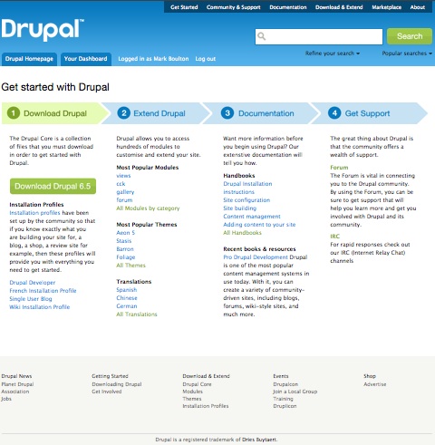
Dashboard - How?
I've always liked the idea of the dashboard at Drupal.org. Is there currently a set of contributed modules that support this functionality or is this a module that has yet to be designed?
Bryan
I second that, would love to
I second that, would love to know how the Dashboard was created. Would love to use something like that on mysites, especially as the MySite module is no longer being developed.
Anyway, well done, fantastic redesign.
Nick
----------------------------------
Nick Young
www.nickbits.co.uk / www.drnick.me.uk
------------oOo----------------------
Nick Young (www.nickbits.co.uk)
The process
I've been reading from time to time on the process (and progress) of the Drupal.org redesign and I have to say that I'm fairly pleased with the results so far. Of course, it is fairly complex and it would probably be fair to say that it is impossible to please everybody.
I've been reading up the comments and I tend to agree on the point that the search is quite prohiminent and that it would not be required if the content itself would just be accessible ( I for one would just jump to documentation and/or apis to try to get my head around things and then maybe forums... lastly I would use search to pin point a specific thing). All that said, I believe this implementation is FAR better accessible and easy to navigate (and just more pleasing) than the actual version of d.o.
One last thing, like all things drupal, isn't it just a first step toward improving things? Trying to knock all the problems in one shot is always hard. Even if this itteration brings a lot of good stuff, I'm sure there will still be rough edges that will need to be polished. As long as the redesign is just a step forward and that this open up more opportunity to improve drupal overall, I think this is very good indeed.
Just a heads up; this itteration has serious margin/padding problem in IE7 (probably in IE6 too)... this makes things look super cramped. Will need to be addressed if this is to be implemented.
I look forward to see all this come alive.
Looks awesome. Much clearer
Looks awesome. Much clearer and intuitive. I sense a bit of facebook-style here and there... the good part! :P
:: http://www.federicopistono.org
Too brochure-like?
Great to see this tremendous work.
But imo the new homepage does not reflect the vibrant community enough.
- "Things we made with Drupal" are important to show; "why choose drupal" / "Develop with drupal" could be behind tabs.
- "Activity within the community" like news, firms, users, posts, commits, channels, could be more prominent.
The "logged in" dashboard is great.
Drupal in my Eyes: The Use of Fonts in the Re-Design
Without being able to dive into the discussions that deep, here are 2 recommendations and 1 comment for the new design:
Recommendation #1
Recommendation #2
Comment - Just an opinion!
IMHO a logo being charmfull (roundness) and a bit dirty (shadow line) makes place for a logo being constructed (Guten Tag, BAUHAUS! Guten Tag, FUTURA!) and sterile (Where is your dirty little secret?).
Thank you for reading this! My name is Schmidt.
Font enlargement; fixed-width fields
Many website designers fail to appreciate that their preferred font and screen sizes are not necessarily what their website visitors will be using. People with poor eyesight, or just aging eyes, will probably set there font sizes (including minimum font sizes) larger. When they do so, a well designed webpage will scale gracefully to accommodate the larger text. The re-design prototype fails in this regard. Looks great at smaller font sizes, but looks like crap when larger font sizing is used (i.e. elements are not aligned properly, become completely invisible, etc.)
A similar problem is using fixed-width fields. Fixed-width fields are evil; they often become unwieldy and annoying as font sizes are scaled up.
I am putting my weight
I am putting my weight behind keeping the existing (old) font and font-size as is. It has taken a while to evolve to the point where it's high up on people's "likeability" list.
Verdana and the big font size was definitely a factor in why I decided to read the homepage of drupal.org instead of joomla/mambo a few years back. Since then, I haven't had a reason to look back.
---
Dee
iScene.eu :: UK Drupal Consultancy
mostly very nice
Whats with the demon-vomit green highlights??? call me an old fart, but the lettering on the primary/secondary links are entirely too small!
who did the map with the way cool pop-up ballons? I have got to learn how to do that.....
alignment IE7
Looks very good!
Only the headers "Why Choose Drupal?" etc. look not well aligned in IE7
Search needs better quality
I think Drupal search really needs much better quality before receiving that prominence in the new design.
For example, if any user searches for the main CCK page, it appears not in the first but in the third page of the search results. And, if we use the other search form (downloads, for modules, etc.), the CCK project page doesn't appear at all after many pages (I reviewed over a dozen result pages before giving up).
On the other hand, with a quick Google search, there it is, CCK in the first position of the first result page.
Google search?
Should we just be using the google search for our searches?
Re: Google search?
neoliminal wrote:
>Should we just be using the google search for our searches?
It seems many people use it as an alternative. Also, some people is using integration modules such as apachesolr, sphinxsearch, sphinx... At least until Drupal's core search is improved (there is a group for this essential task).
In any case, if search is going to have central prominence in the new design, I think improving search should have high priority, like other important Drupal features that also deserve priority: user friendliness (usability), performance (caching), etc.
We are currently using an
We are currently using an integration module with external tools on Drupal.org.
Core search + Xapian?
>We are currently using an integration module with external tools on Drupal.org.
I didn't know that. I've searched for related info - with Google naturally ;) - and just found the following at Drupal.org to Drupal 6 upgrade collaboration (drupal.org is currently running on Drupal 5):
"Drupal.org uses the core search and xapian module. Xapian provides the backend data. Plans include to eliminate this and move to an apache solr based search which would support facets."
There are also a few details and links about Xapian and Google search for drupal.org at Search on Drupal.org disabled during high load.
In any case, if it's either core search + Xapian or other implementation, drupal.org's search does not seem to be working very well right now. Let's hope Solr will be better, and that it will be ready in time for the new search-centered design.
Apache Solr search for Drupal
>Let's hope Solr will be better, and that it will be ready in time for the new search-centered design.
About this, I've just seen an interesting slideshow at ApacheSolr search presentation from Do it With Drupal.
Careful with IE7
It looks like using a CSS framework (here, Blueprint CSS) is not the answer to all of our CSS layout woes.
Many pages have layout problems in IE7. It won't list the problems here, because they're obvious.
[EDIT] Also, the rounded corners script does not run in Internet Explorer. And there is a JavaScript error there as well.
Caroline
11 heavens.com
Blueprint is used here only
Blueprint is used here only for demo purposes, we can make our own choice for the actual implementation: http://groups.drupal.org/node/15532
Does that mean we can
Does that mean we can finally get to use the old Drupal design that was reserved for Drupal only ?
Marcel
http://Howtodiary.com
http://Drupalthemes.com
the information-design needs work
There seems to be no clear path on any page for my eyes to follow and easily digest information.
While the design is attractive enough (with the exception of the logo), if there is no clear path for users eyes to follow, then the design fails. The "Getting started" page does the best job in terms of leading the user/viewers eyes on a specific path by using color, chunking, font size, and precedence. But on the rest of the pages I looked at, my eyes just darted from place to place on the page, never really finding a spot to rest and absorb the information presented. IMHO this is a serious problem with the UI.
On a more subjective note, I hate the new logotype. It's too whimsical, silly and informal. Granted, I'd hate to see Drupal with an overly formal, stuffy logotype. But given how powerful, fun, and appropriate Drupal is for so many websites and organizations, I'd prefer to see something that conveys those qualities.
Anyhow, thats just my two cents. Clearly, as large as our community is, a redesign that everybody loves is a tall order. I appreciate all the work that's being done!
brendan, fresh-off.com
Creative Direction & Consultation: Web | Print | Brand
http://fresh-off.com
seatte.usa
Wow, good stuff!
edit: Sorry Brendan, I didn't mean to reply on your post (which are valid points btw), but on the main post. I clicked too fast.
Wow, good stuff! It's a big step up from the current design.
Minor note: you should use labels with the checkboxes. And HTML Tidy reported the following warnings on the homepage (which you're probably already aware of, but I'll post 'm here anyway, just in case):
WOW LOOKS AWESOME
What a major rework, look terrific. This will give new users a good looking introduction that matches Drupals potential genius. Amazing job to all involved. The next question would be...how we can implement some of this cool design into a new base site lol.
Cheers!
venusrising
venusrising
Rounded corners on top menu?
Hi,
The corners for the top (dark) menu and the search box are square for me. Given the corners of the main menu are rounded, it feels a bit incoherent for me.
My Drupal sites:
Beautiful!
Very, very nice.
Please consider enhancing the font when typing inside the search box a la www.dictionary.com.
cool
new design is very cool, lively, fresh and the best design under the sun. can i use it for my website ?
Fantastic!
This is soooo much better than what we have now. I'm so excited I donated 20 bucks and encourage other members to contribute too. This will really improve user experience for all of us.
My Very, Very Heartfelt Gratitude
Hugs and kisses all around. Beer and pretzels if that is just way too foo-foo for our resident code gurus. As an all-drupal shop I am thrilled over the target-search feature. Also, my next fav is that the module hunt may be down from hours to minutes.
A usability suggestion: a change in the order of the top nav to: About / Get Started / Download & Extend / Documentation / Community & Support / as that is the linear process for using Drupal for most, this also mirrors the "Get Started With Drupal" 1-2-3-4 configuration which is great.
Typo: "About" / Next to wrench / Personalisation = Personalization
Thank you, thank you, thank you!
Susan
www.greenbirdmedia.com
And the usability?
I am not so happy about this screen layout [1]. See books and websites about web usability and Web Accessibility! But the design is good.
[1] http://groups.drupal.org/node/17106#comment-59057