Checkbox and Checkboxes
Last updated on
26 August 2025
This documentation needs review. See "Help improve this page" in the sidebar.
Use when
- A user may turn a single option on or off. (In this case, a stand-alone 'checkbox' is suitable.)
- A user may select none, some, or all pre-defined options. (In this case, 'checkboxes' with multiple options should be used.)
- A user must consciously select an option that is unselected by default. (As in form consents and policy agreements.)
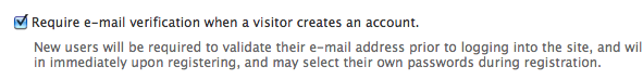
Example of stand-alone checkbox
Example of multiple checkboxes

Recommendations
- If labels for the description items in a stand-alone checkbox cannot readily include the words “True” or “False”, or “Enable” or “Disable”, then it is better to use two radio buttons instead.
- If the outcomes from selecting multiple checkboxes are mutually exclusive (can't happen at the same time), radio buttons should be used instead.
- When allowing the selection of multiple related options, use a single 'checkboxes' element with multiple options instead of multiple “checkbox” elements.
Wording of labels and descriptions
- The label for a checkbox should be a statement or a descriptive phrase.
- The label for a checkbox should describe the expected outcome of selecting that checkbox.
- Avoid
- beginning with “Enable …” or “Is…”;
- beginning with “Select to…” or “Choose to…” because these are usually redundant;
- ending with a question mark or a period;
- using negative expressions such as “Don't show this on the page”, as that means the user has to make sense of a double negative.
API
Stand-alone checkbox (Checkbox): Drupal 11, Drupal 10, Drupal9, Drupal 8, Drupal 7, Drupal 6
Checkboxes: Drupal 11, Drupal 10, Drupal9, Drupal 8, Drupal 7, Drupal 6
The problem this solves
The user may select zero, one, or more options from a pre-defined set.
Help improve this page
Page status: Needs review
You can:
You can:
- Log in, click Edit, and edit this page
- Log in, click Discuss, update the Page status value, and suggest an improvement
- Log in and create a Documentation issue with your suggestion
