

Closed (fixed)
Project:
Ubercart
Version:
6.x-2.0-beta5
Component:
Code
Priority:
Normal
Category:
Feature request
Assigned:
Issue tags:
Reporter:
Created:
21 Mar 2009 at 03:15 UTC
Updated:
3 Jan 2014 at 00:07 UTC
Jump to comment: Most recent, Most recent file


Comments
Comment #1
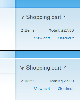
rszrama commentedThoughts? I'd give you a big fat bearhug if we were still in DC. I cringe every time I see the existing shopping cart icon on a dark background. My only beef is it's a little difficult to see that the cart actually has stuff in it. Any way to show that a little clearer? For example, the current full icon has products bulging out the top of the cart in addition to removing the transparency.
Comment #2
stephthegeek commentedYay!
It's a little hard to see on Garland because it's a shaded background, clearer on other themes... but fair enough, here's a version that has more goodies piled up in the cart :)
Comment #3
stephthegeek commented(also, these are 8-bit PNGs with transparency rather than 24-bit, so will have no problems with PNG transparency in IE6)
Comment #4
Island Usurper commentedThey look good, Steph!
Here's the patch I committed, minus the part about the binary files.