
 Come together with the global Drupal community in Rotterdam, 28 Sept – 1 Oct 2026. Sessions, contribution, connection, and Early Bird savings until 8 June.
ok, so really excited at installing drupal7, saw some new installer things which made me go "oooh". then after installing, i see the "congrats, now onto your new site" ... and excited, i'm greeted with lots of...text that just blends together and looks rather dull.
i think it would be a huge boon for drupal if each of the four steps could be described with an image (split across four cols) and a brief description underneath. i think it'd be a great visual clue, memorable, a nice welcome to the new drupal site.
i'm not a designer, but i think the steps lend themselves well to visuals anyway.
what do you think?
if you think it sucks, then another criticism would be i think there's too many hyperlinks that look disjointed, so if you're all against the above idea, then i'd like to propose the text as being something like:
Administration (link to somewhere)
Drupal makes life easy for site administrators. The administration section is where you tailor your site to your exact needs, manage your content and users.
Modules (link to admin/build/modules)
Drupal is extendable. Modules allow you to expand Drupal to add extra features for your site, such as (basic examples)
Themes (link to admin/build/themes)
Make your Drupal site look the way you want by using themes. Drupal has a few default themes, and you can find many more at drupal.org/project/themes/. If you can't find one you like, then feel free to design your own.
Content (link to create section?)
Drupal makes it easy to add content for your site. Catagorise it using taxonomy, and manage it in the administration section.
---
the text is still trying to 'sell' drupal - with it being so easy to install now with sqlite, people could just as easy uninstall it, and has a consistent title with link and description style.
| Comment | File | Size | Author |
|---|---|---|---|
| #23 | help-text-image.png | 118.19 KB | heather |
| #23 | help-text.pdf | 31.67 KB | heather |
| #21 | helppage-seventheme.png | 104.74 KB | heather |
| #10 | admin-help2.png | 72.59 KB | emmajane |
| #10 | admin-by-module.png | 43.34 KB | emmajane |

Comments
Comment #1
George2 commentedwireframes will follow when i get access to windows...
Comment #2
yoroy commentedWelcome page should def. be improved. Not sure if these 4 steps should even remain.
I suspect Mark and Leisa will work on ideas for this very important end-of-installation-now-get-started as well. Not saying we should look at ideas for improvement ourselves, in contrary, think bigger than just re-writing and designing what we already have.
Have a look at #295369: Welcome message re-ordering as well.
Wireframes are very welcome and are supposed to look crappy, so don't hold back.
We found working on design and code within the same issue is very difficult and tends to make for veeeery long issues that are hard to keep on track. Let's make this a 'design' issue in which we brainstorm ideas instead of work on code. Once we're done with the design, decide on the best solution and open a new issue for the actual patch. This let's us work on both copy and layout here.
George2: Thanks for bringing this up, don't mean to hijack this issue but rather make it set for succes! :-)
Hope to see some ideas.
Comment #3
George2 commentedgreat - thanks yoroy! yes, i've seen some design and code issues, and they're very difficult to pick out what is code, and what isn't.
i still haven't had a chance to switch on over to windows, but another idea i had was that the expert install profile should provide a different welcome page to that of the 'normal'/beginner profile. ie. maybe on the normal profile, blocks of popular modules pulled from d.o, latest news, themes, site writeups, latest tutorials etc could be included in the profile to add a dynamic and multifaceted welcome page showing off drupal. After all, those who choose the normal profile probably won't be *that* familiar with all drupal has to offer...
Comment #4
webchickThe welcome message has now been moved to the /help landing page after #475596: [meta-issue] Fix the unholy abomination that is the welcome screen. Re-adjusting title.
Comment #5
matt2000 commentedCross referencing webchick's screenshot as a starting point:
http://img.skitch.com/20090601-xky1gf33g8gqth2tib78217csq.png
Comment #6
George2 commentedimo still too much text. i think if points 1,2,3,4 became sub tabs, not only would it show a logical progression, but would also take the load off the front page and not look half as verbose.
Comment #7
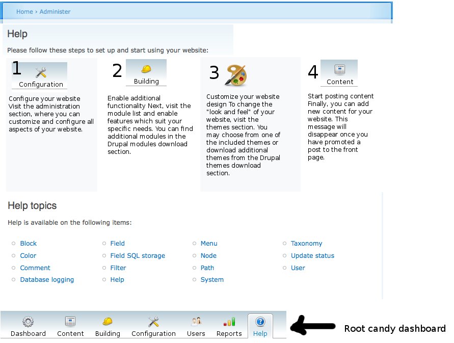
emmajane commentedI've attached a variation for the help "start" page which includes some graphics that I ripped out of the Root Candy admin theme. I put the dashboard into the bottom if you want to use it as a base for your own playing. The "art" image is from http://art.gnome.org/ (and also GPL). The text is unchanged and just placed under the icons.
Comment #8
George2 commentedemmajane - i like it. i think the numbers aren't needed though, the natural ltr order, and the titles suggest the order
Comment #9
matt2000 commentedBut what about languages that aren't read left to right?
Of course, a proper theme function would let us easily change from
<ul>to<ol>anyway...Comment #10
emmajane commentedWithout the numbers it goes back to "wall of text" with no clear direction of where to start. There's no real reason for the information to be stacked in columns other than I think it looks nicer. In theory the floats could be language-dependent with information stacked LTR or RTL as appropriate.
Attached are two screen shots:
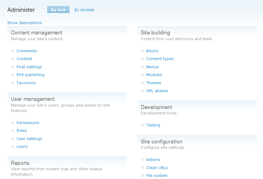
- admin-help2.png shows numbers removed and "integrated" help topics. I don't like it, but i do think that the help topics could be sorted by topic according to their groups on the main admin screen.
- admin-by-module.png shows the admin screen with the descriptions turned off. Sometimes it's nice if you don't have to reinvent the wheel. I think it's too wall-of-text-ish, but note that we do have categories available.
Comment #11
emmajane commentedSee also:
#228236: Redesign /admin
#374490: Bikeshed: Re-work top-level admin categories
Comment #12
yesct commented#13911: Drupal GPL icons Since images are in the mockup dose want to discuss them specifically here for this case of the welcome screen?
Comment #13
yoroy commentedI don't see enough thinking/talking about what should actually be on this page, I see mostly re-ordering of existing welcome page.
Here's some prior art done during the ux-sprint in Szeged last year which also states a content strategy:
http://groups.drupal.org/node/14387
Does it have to be the 4 steps we are using now? Are they all equally important? Most screens in here still put creating content last. Even if this is admin facing, first goal should be to get some content going, only then all the other stuff becomes relevant (literally even: why create menus if you have nothing to link to?)
Forget about the existing welcome page content for now and ask yourself what you (and your clients?) would expect to see there first, second and third.
Comment #14
David_Rothstein commentedThe main thing that bothers me about the current page (besides the giant wall of text, which would be solved nicely with the icons in the above screenshots) is this: It honestly feels like I'm reading instructions for assembling a piece of furniture: "Step 1. Configure this. Step 2. Configure that. Step 3. Insert rod A into hole C."
Building a website should be fun and free, but an ordered list of commands sends exactly the wrong message about what Drupal is and how it works. @yoroy has a point that there are some admin pages that make more sense only when other things have been done first, but I think that should be considered a bug that needs fixing rather than a limitation to be worked around :) -- In fact, for many people, adding menus to their site is exactly the first thing they would reasonably want to do.
So I'd personally love to see us embrace the chaos and let people start wherever they are most interested, maybe with text a bit like this:
Comment #15
emmajane commentedI've scanned through http://groups.drupal.org/node/14387. There are some good ideas there, but a few seem to reference content that doesn't exist in core yet, and/or hooking into a "help in core" system that doesn't match what we have. I really love big picture thinking, but I also think change is more likely if we work with what we have instead of trying to be a whole new system with content that doesn't exist in a framework that isn't approved. Remember this is issue is *JUST* the front page of the existing help system. :)
The help screen needs to match what happens in the rest of Drupal. It doesn't need to be a four step process, but it needs to:
1) be easy to scan (not a wall of text)
2) use Drupal language (terms need to match what you'll find throughout the rest of the site/admin)
3) be relevant once the site is up and running (it must go beyond a "quick start" guide and actually hook into the documentation that exists for the core modules)
4) match any new categories that are established for the admin screen #228236: Redesign /admin.
I disagree with the statement that content *must* come first in the list. What people want to access is going to depend on (1) Level of experience (2) goals/roles and (2) at what stage in the site's development the person is accessing help. If you're a designer you want to theme first. If you're importing content from an existing site you need to create content types first. And there are a LOT of people who use brute force to start working in new software and then resort to help only when they have a problem or get stuck.
I completely appreciate the desire to chuck the bath water, but let's take a look at the baby before re-inventing the wheel. ... just to mix a few metaphors. ;)
Comment #16
Sunshiney commentedI looked at the above png through the eyes of a newbie/non-developer, which I am/was when I started with Drupal in Dec. 2009. I recall that introductory screen giving me the expectation that the path ahead would be easy. I eventually learned to discount the steps because creating the site I'm working on, with a custom theme, has been anything but easy. My PR/Marcom background says that you need to target the page to the user segment that is viewing it. Many of the Drupal communication issues boil down to targeting of publics challenges, imho. But absent creating three diffferent page types, which I think would do it, I would encourage writing:
Step One: Skim the online Drupal Getting Started Manual.
Before you do anything, do a quick read of the manual. At a later time, you can revisit and read it more carefully. You'll find it will save you considerable time.
Step Two: Install the most commonly used Modules, which provide functionality that most Drupalers find themselves using sooner rather than later. Modules are add-on's to Drupal's core program that add functions. They can removed later, if, after becoming experienced you decide you're in one of the small camps of people who don't need them.
*How to install modules
Modules:
* CCK
* Panels
*Admin Menu ( will help eliminate those forum 'help, I cannot log in questions')
*Views
Step Three:
Configure
etc.
Quite frankly, it's not the art or eye candy that was ever the issue. (And that's coming from someone who believes that design engages people in the communication process.) Get into the head of the never-seen-Drupal-person. They really want to know what to do first, second, third - and their brain is on empty, as far as Drupal goes (let's hope, anyway). Configure...that really isn't the first step for a newbie. Now? Sure. But not as a never-seen-Drupal-person.
My suggestion is to get a focus group of never-seen-Drupal-newbies to provide some input. Maybe people who've only been at it for one month.
If there's a way to target the page, then I'd break the target publics into: 1) blog group; use it out of the box. 2) Developer group. They've got the language and can work at a higher level. 3) Web site html/css'ers.. My status. If I had been pushed to read the manual, next view online videocast, next install those highly pop. module, I'd have been way ahead of the game.
I also think it's important to state right up front ..on the start screen.... that good things come from hard work... and that Drupal does require you to buckle down and dedicate time to it for it to blossom into a system that you'll come to love. If I'd know that right up front, I could have prepared people who have been tapping their toes, waiting, waiting. ...and who just don't know why I'm taking so long.
Just my two cents.
Comment #17
webchickWow. That's great feedback, nwwoman. Thanks a lot!
This is the danger of using issue queues to figure stuff like this out... it's easy for most of us to forget (or mis-remember) our experiences back when we were brand new to Drupal. Really appreciate you taking the time to educate us. :D
Comment #18
Sunshiney commentedGlad to be of some small help. The only reason I still have hair and have not become an alcoholic is because people on the forums have stopped their work and helped me during trying times with what seems now to be stoopid questions. I'm happy to give back.
Comment #19
George2 commentedi've been forced to used wordpress a lot lately, and you know, there isn't a landing page for that. just a "here's your password...off you go" type page. then you're thrust to the admin section where you see most things laid out infront of you and i think it works quite well.
this thread is discussing in a round-about-way a helpful (admin) ui, something that should and is being incorporated into the admin ui. except, this landing page just disappears once content is assigned to the front page, so what help is that?
also, i've been thinking that website dev just isn't a linear process, so how dare drupal try and make it so from this landing page? ie, my workflow is different to someone elses, and vice versa. i may prefer to do steps 2,3, oh bugger i'm stuck, 1, 3, 4 etc instead of 1,2,3,4. and will all drupal newbies start by reading help, or setting up the description of their site etc. i doubt it!
so, instead of trying to dictate to the user WHAT they SHOULD do next (or even what they COULD do next) how about just dropping the landing page, in favor of straight to the admin section?
Comment #20
yoroy commentedYeah, I don't think we're discussing the actual welcome screen anymore here but an index page for the Help section.
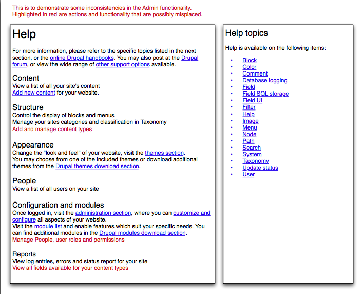
Comment #21
heather commentedIn the Seven them, when the page is maximised, the lines are long, and make reading difficult. As well, there is no spacing between the list items, as in Emma's screenshot.
Should this be fixed in the Seven theme? Does it need a new issue?
Comment #22
webchickI think that should indeed be fixed in the Seven theme, and should be a new issue. This issue is to discuss the content of this page.
Comment #23
heather commentedThanks, Webchick. I am having a look at this page.
The target of this page is likely a new user seeking to understand the general basics of their new site, and seek specific help about their installed modules.
This is an opportunity to familiarise the user with some Drupal terminology, as well as the location of important tools within the admin area.
At minimum, we need to update the terminology to correspond with new admin menu and structure. Notwithstanding additional top-level admin menu items which may be inserted by modules, the default help page should correspond to the headings in the default core admin menu.
1) There is a serious problem with the location of the "people" configuration- which can be only ameliorated slightly with fixing the listing on the help page. However, this should be looked at more seriously: What is the user expecting when they click on "People"? This came up in all of 6 user tests conducted in Belfast. The task was to control permissions for a user. Each user clicked on "People" surprised to see only a list of users, then assumed they needed to configure permissions *per user*, and they only found the roles listing with difficulty. In fact, in some cases when they did locate it, it was also difficult to re-find as there is confusion between the "Administer" page and the "Configuration" page which have some, but not all the same settings available.
2) Content is a listing of content, yet controls for Content are interspersed throughout the Admin area. Adding new content, managing existing content, configuring new content types, and viewing all existing fields on content types should be located together. (much the same as with "people" section).
The attached image only rearranges the current text (intro on left, and list of help topics on the right). There are alot of good ideas on the UX Sprint page http://groups.drupal.org/node/14387 - however, considering time we may not be able to realise these ideas.
At minimum, we should at least associate the heading on the help page with the headings of the admin menu.
However, this brings up the two important problems from within the admin area.
Comment #24
Bojhan commentedI am really liking the approach of heather, the left definitly needs tuning and the right needs styling - but the overal concept to me sounds oke.
Comment #25
Sunshiney commentedHi there... I come from 37 years (yikes, yeah, I know......but I am NOT OLD..;-) ) of a PR/Marcom background. So, my first instinct when seeing Heather's work is that it is now at a stage where I'd present it to a focus group composed of my target publics and get their reaction before proceeding with any additional tweaking. My suggestion is to post to the Drupal forum a request for about 10 really new-to-Drupal folks to gather and confab about it...maybe use Skype and log-me-in, with a desktop display. Develop a set of questions. I'm willing to help. And then, survey them, with closed-end and open-ended questions, compile the results and then use that to drive the resulting modifications.
If the target is new-Droops, then my gut reaction is that there are still word-choice issue on the left side of this version, although it's so much better than anything prior. You have to visualize yourself as a themer -- not coder -- with none of the Drupal jargon in your brain or experiences. Once you can truly get into that frame of mind, you then read the text. The longer you have worked around Drupal, the harder that becomes, which is one of the very good reasons for a focus group.
Just my two cents.
Comment #26
heather commentedNwwoman! That is a great idea. Time is short, so please start on this as soon as you can.
I felt the same, and a few weeks ago organised user testing at a drupal-meet up. This is a great way to get involved.
Come join the team and to talk to us in the #drupal-usability IRC channel sometime. Or also the Drupal Usability team group. http://groups.drupal.org/usability
We can have our discussion there. (it's better than having discussions in issues queue). I'd be glad to give you any support you need.
Comment #27
Sunshiney commentedAt this very moment, my workload is far too high to take on anything new as the leader. If my work wasn't consuming my evenings up until midnight and on weekends, then I'd jump. I can, though, consult. But, of course, my current work "knot" is a temporary situation. Can you clarify what you mean by: time is short? 24 hours? A month? Two months? Once I know that, I can decide the best course of action.
Comment #28
heather commentedI don't know how to proceed on this.
- My proposal is to link the main headings to match the sections of the site.
However it does little more than repeat what is already on the main /admin page or configuration page. It also used the same strings.
Why do people click on help?
1) Something isn't working as expected. They are looking for how to get it done, and how it actually works. This would require main concepts and procedural directions.
2) They are looking for advice on how to do something 'correctly.' Guidelines on best practices and examples would work here.
In both those cases, the Handbook is the best place for this content.
There won't be enough time to create individual help pages. And I have learned you apparently can't add the little blue (?) anywhere you like (.e.g., you can't add a Theme help topic, because that is a list of help topics from modules).
It would be better to make this page a landing page for the Handbook, and offer a handbook overview.
Best solution: Match sections like People and permissions to handbook pages with concepts, directions and guidelines.
Anyone else care about this page? I'd love to chat about it. But I never get anyone in IRC when I am around. Alas. I'm nearlythere on IRC. Ping me!
Comment #29
arianek commentedso, after doing the big core help revamp, status is that the main landing page has not changed. i could definitely stand to see that main block of text be updated, but obviously we're well past the string freeze deadline, so that will be something to work on for next time.
we had a lot of discussions about what exactly the help section is, and at present, it is a reference for devs and site admins, explaining what the various modules do and how they can be used.
what seems to be looking to be addressed here, is the site admin and end user targeted help, which is sort of a separate entity housed under the same umbrella of "help". we'd only started talking about how to deal with that, but a lot of it will probably end up in additional context-sensitive help, so i'm not sure if it's appropriate to put on the main landing help page.
definitely need to keep sorting this out though, there is a little ways to go yet before all of the "help" resources built in are completely helpful. ;-)
Comment #30
yoroy commentedComment #31
xjmCrossposting #152482: Help.module should make use of the menu descriptions under the titles.
Comment #32
yoroy commentedNothing to review at this stage so removing that tag for now.
Comment #33
arianek commentedNote, this may also be moot depending on how quickly http://drupal.org/node/1095012 (Help initiative) comes to fruition. Follow #1031972: Discussion: What would a better help system for D8 be? for the latest.
Comment #46
smustgrave commentedWonder if this is needed for D10 though?
Comment #48
quietone commentedI think #33 is correct that the work moved to the #1031972: Discussion: What would a better help system for D8 be? and other issues related to help topics.