Active
Project:
NineSixty (960 Grid System)
Version:
6.x-1.x-dev
Component:
Miscellaneous
Priority:
Normal
Category:
Bug report
Assigned:
Unassigned
Reporter:
Created:
15 Apr 2009 at 06:57 UTC
Updated:
12 Mar 2013 at 20:50 UTC


Hallo,
novice here.
I noticed that when applying .push and .pull classes to nested grids the .alpha and .omega classes do not work as expected.
In the example below I want a top section (#top-article + #top-featured) to appear above #left-sidebar and #main, but not above #right-sidebar.
I also would like to keep the original approach to have #main first in the source order, so I have applied .alpha and .omega in reverse order.
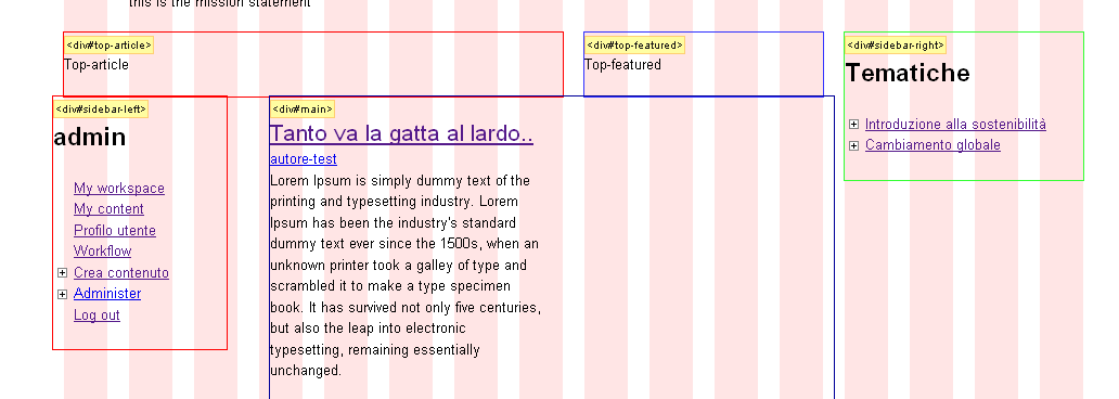
Unfortunately this pushes #main additional 10px to the right and pulls #left-sidebar additional 10px to the left, breaking the grid (see attached image).
Note that inverting .alpha and .omega apparently brings back everything in place but the margins are obviously on the wrong side.
Is this a caveat of .push and .pull classes or I am doing something wrong?
Thanks!
    <div id="page" class="container-16 clear-block">
      <div id="site-header" class="clear-block"></div>
      <div id="site-subheader" class="prefix-1 suffix-1 clear-block"></div>
      <div class="grid-12">
        <div id="top-article" class="grid-8 alpha"></div>
        <div id="top-featured" class="grid-4 omega"></div>
        <div id="main" class="column grid-9 push-3 omega"></div>
        <div id="sidebar-left" class="column sidebar region grid-3 pull-9 alpha "></div>
      </div>
      <div id="sidebar-right" class="column sidebar region grid-4"></div>
      <div id="footer" class="prefix-1 suffix-1"></div>
    </div>
| Comment | File | Size | Author |
|---|---|---|---|
| push-pull.png | 22.32 KB | bohz |

Comments
Comment #1
dvessel commentedHrm, seems I missed the email notification on this.
I'll look into this.
Comment #2
dvessel commentedOkay, it's because the "alpha" and "omega" must follow source order. Not the presentation order. It's counter intuitive but that's how it is.
Comment #3
bohz commentedThanks a lot, dvessel.
I understand.
At the moment I am not able to test my setup; i'll let you know if that works or not for me.
cheers
Comment #4
sbuttgereit commentedI think there still may be some 'funkiness' when you try to mix 3 columns that are grid elements, nested in a parent, with push and pull directives. I realize that highly technical description may not help much, but I might not get there before I come up with a brute force approach (more important for me to get something up than get it right right now) and thought I should let you know there might still be something up.
The source order .alpha and .omega helped with the outside grid elements, but the inner grid element still gets shifted by about 10px to the right when all 3 elements are present.
I'm basing my page.tpl.php off of the one that comes with the ninesixty base theme, but I'm going to a .container-12. I'm also putting a div around the main, sidebar-left and sidebar-right areas, that is a grid-12 and is only there to add a background-image tile. So main gets alpha (source order), and I've tried various combinations of sidebar-left and right getting .omega class designations. I maintain the ns() calls to manage if the sidebars are active or not.
To this point the only way I've been able to get it right is to reorder the sections in source and avoid the push/pull classes and mandate more 'staticness' or hard-coded structure in the layout; probably ok for me since I'm using it on my own site, but pretty rigid. Granted, I could simply just be missing something, too.
Thanks,
Steve
Comment #5
dvessel commentedIn most cases, I think the push and pull classes for reordering are only useful for large content regions. With that in mind, I haven't tested complex embedding with these classes. I could look at it but could you post an example that illustrates the problem?
Comment #6
wagnerock commentedI have a somewhat related issue: when dynamically resizing grids in an area using the ns() function, there seems to be no way to assign alpha and omega classes effectively. Hence, in order to avoid completely breaking your layout by stuffing too much total width into a container, you either have to just pick a grid to give the alpha/omega classes to, or constrain yourself to using fewer total grids than the container has room for. Either way, this causes inconsistency in the grid layout.
For example, I have a 16-grid containing a 3-9-4 layout set to dynamically become 12-4 or 3-13 depending on which sidebar is present. If the left sidebar is present, it should get the alpha class. If it is not present, the main content area should get the alpha class. But I can find no way of ensuring this happens correctly.
If this is a known issue I apologize for the redundancy; I couldn't find anything quite matching this behavior.
Comment #7
samwillc commentedI know this an ancient old thread but I found it because I had the same problem. I use display suite and because it takes over the content region, you are guaranteed to end up with nested grids. That's ok as you can add alpha/omega classes to them (for example CONTENT|SIDEBAR), but when this is in mobile, the content is above the sidebar.
For my site, I wanted the sidebar below the content on mobile, so I did this in my display suite tlp.php file:
Gamma class takes the extra 10px margin out left and right for mobile displays. If you notice, you always end up with 20px margins on a mobile using nested grids in Omega theme, something that never seems to have been addressed. I always add:
to my global.css at the beginning of every Omega project. This way, all I have to do is add this class to the row/grid whatever, has no effect on desktop, and takes the margins back to normal on mobile :) Win!
Maybe this will help someone in the same position that wants to:
a) Use display suite to nest grids
b) Change the position of the grid areas for mobile (i.e. what you see on screen is opposite in order to what is in the source code)
Of course, now I can't change the content width in the appearance settings for the page template without having to change all this also. I'm always looking for a better way. Will try Omega 4 soon :)