Well, this is an idea, maybe need a bit of work.
I'm using views 2 for a while, and still now I'm discovering hidden options into config forms for filters, handlers, etc.
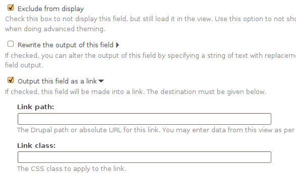
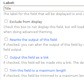
I think that will be a great improvement in the usability of view if users can know wich elements will display new options.
I have created and small patch that change the color of the checkboxes that expand new options into views admin.
It would be great if radio buttons like 'between' in Node: nid or User: uid filters will be highlighted too, for now this patch doesn't do that.
I have attached two screenshots to illustrate the changes in views UI.


Comments
Comment #1
manuel garcia commentedI think it's a nice useability enhancement, though i think putting an icon next to it would be even better visualy.
I like the fact that the patch only touches css, less code to worry about i guess =)
+1
Comment #2
dagmarOk, maybe icons will be more usefull.
Because we have to use GPL icons, I'm only modify images/arrow-active.png creating a new images/arrow-active-reverse.png
This patch also add a padding to all the new options displayed when user click on a checkbox. Now users can see wich options are activated after clic in an checkbox.
I change my opinion about that, because if a user select a "Between" option, all others options will hide parts of the form, for this reason we should have an icon in each radio. Bad idea.
Comment #3
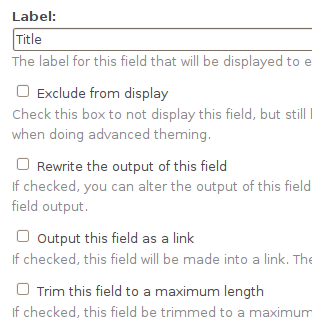
dagmarSmaller patch.
I have changed the image of the expanded options. See screenshot.
Comment #4
merlinofchaos commentedCommitted. Let's see how people like this!