
 The University of Prince Edward Island is a public university located in Charlottetown, PEI on the east coast of Canada. This project is the second phase of our build of Drupal at the university. In it we are hoping to use our theming layer to provide context for clients who may be lost around our various multisite installations. We are also considering how to effectively repurpose the content that we are creating on our main website to make an interesting and effective mobile site.
We've been using Drupal full-time at the university for two years now and it has actually shrunk to 'only' a 100 database multisite installation. All development, maintenance, design and conceptual/marketing consultation are done by our little shop of three at Integrated Communications. Our clients on campus are responsible for the content on their own sites. The project's lead is Dave Cormier, our lead Drupal developer is Yuxing Huang, and our all 'round client services/Drupal guy is Shawn Arsenault.
Introduction
The upei.ca that the world sees is (mostly) copied from our Drupal server to our externally accessible server using httrack – which gives us a static copy of Drupal to serve out to the world and added security. We proxy through any of the content (say comments on a blog) that needs to be accessing database content. Our theme grew out of the excellent NewsFlash theme by RoopleTheme (Thanks, Bill) and has now become fully custom coded. We have a few custom modules, some for theming and some for integrating with XML exported from our UIS, but for the most part we are using core and standard contrib modules combined with template files and some increasingly nifty CSS to get our work done.
There are a number of significant challenges to running a site of this size for an institution that has many different departments, services, and information that need to reach a varied clientele. The biggest is simply allowing people to make informed decisions before they click on a link. We wanted to offer some contextual information with each major link to tell people a little bit about where they are going. This both offers some context for the information that will follow as well as allowing people to make better clicking choices overall.
We also wanted the design to enforce a different layer of uniformity to the diverse installations. In looking at any page on the site (and we're certainly not there yet) we'd like someone to know what 'depth' they are at, and how far it is to the information they are looking for. Our solution for our Web-based site is very different than the one that we chose for our mobile site. For the Web, we are using the sorter (powered by AJAX Endpoint) and on the mobile site, we are going for simplicity and real time information.
As we're also moving into our second iteration of our mobile Drupal platform, I thought I would check in with the community and get a little feedback. Our goals have shifted from Revision One to Revision Two. Our initial goals were to simply and efficiently get our existing content from the web versions of drupal into our m.upei.ca installation. Our current goals are a little bit more focused: now we're trying to think a little bit more about how people might be using our mobile site and have taken the assumption that our primary mobile audience consists of people who are on or near campus. The secondary audience is still being served, but our goal is to forward the location specific content (emergency messaging, maps, directions, directories) and focus our efforts for those people looking for content to push them back to the main website for more information.
Non-mobile
Our site is currently being designed for four main tiers of content (with two options at Tier 2), each represented by a scaled design drawn from the original design on the front page. I'll describe the pages in terms of what is visible on a 'standard' screen resolution. The top fold is visible on all pages, the fold is visible on some and below the fold requires most people to scroll down.
Top Fold
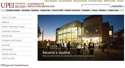
Tier One is the frontpage of the university. The only content at the top of the page are the main sorting that is happening for the university. As the site client roles over the menu the text and image swap out and offers some context to the link before it is clicked. That top section of the page is done by harvesting an AJAX endpoint view to a block location. Users simply fill in the required fields in a content type and upload the image. A transparent PNG is overlaid over the image, the text is placed by CSS and we're good to go. These links should be going to Tier 2 or Tier 3 pages:
Tier Two v. 1 is our top level sorting pages where the content changes less and informing the client is more important. These are for major sections of the university that have multiple departments or very complicated internal structures that require the high level sorting offered by this scaled down version of the front page. The design for this draws slightly different CSS, mostly just the widths are different, but it does include a section for 'important links' and our campus feeds. Some of these links will go to Tier 3, some to Tier 4:
Tier Two v. 2 is for top level pages where content is shifting, i.e., the client has a need to update content on a regular basis. It offers nice functionality for a blog or for media releases, as the top left hand corner prime real estate has an abbreviated blog post replacing the roll over sorter. The rest of the organization for this site is the same as Tier 2 v1. Most of these links will go to Tier 4:

Tier Three is a departmental sorting page. It has a smaller sorter on the left hand side which takes up much less width on the page, more room for dynamic content brought in by campus (or off campus) feeds. There are more directional buttons and it is, in a sense, a combination of Tier 2 v1 and Tier 2 v2. There is more information included with each of the items in the sorter, the argument being that by this point people are making more specific kinds of decisions:
Tier Four is a content page. Once a client has reached this far, we hope that they have taken on enough context from a previous tier to understand a longer piece of information. There are persistent links here to the content creator and to a custom print version (still our most common request) as well as a placed image along with pull quotes or similar. There could also be a similar items link on the side:
The Fold
We talked about this little film strip for almost a year before we built it. It came in many incarnations and has been a pretty popular (not to mention flexible) tool for us. On the Tier 1 page it is a way for us to highlight photos and events that have happened on campus. It allows our photography department a place to show their work and it allows us to have new, interesting content on the main page without upsetting the standard look on that page that make people feel comfortable. On Tier Two, it may be a record of past news stories, or a record of events for that particular part of the university. We've set it up so that our clients can control this space and it serves as kind of a contextual photo gallery. This can be handled in different ways, it is either a separate content type on an individual site, it can be a feed from a different site or simply steal content from an existing node. Again, AJAX Endpoint Views and CSS:

Below The Fold
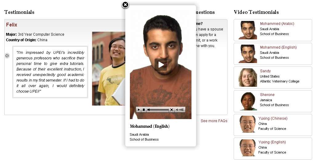
There are a number of different items that appear below the fold. We've not been as stringent in standardizing this content. These are sometimes departmental descriptions, FAQ boxes, profiles of students, and video (the video player on http://upei.ca/futurestudents/international is one that we are particularly proud of.). We've given our clients a fair amount of flexibility here, but are trying to maintain a 50%, 25%, 25% layout wherever possible. These are simply block locations that are fed via Views - Block:

Footer
I love the footer. We replaced that thing a hundred times until we finally realized we could shove all of our links down there. We were faced with constant (and well founded) complaints that our important links were moving around all the time and just when people got used to where they lived they moved again. Someone had a brain flash, we bit the bullet of moving them again, and they have found the long term home. Each of the six columns here is a block and are filled centrally but can be overridden on each local site if necessary:
Behind the Veil – some thoughts about theming.
The philosophy behind theming is the MVC pattern. Our theme is the View that requests information directly from the Model (whose content is at the same site) or from the Controller (whose content is off-site). In the View-Model interaction, our theme follows the Drupal theming guide to layout the information in a page. In the View-Controller interaction, Drupal's Views module serves as a provider and our theme consumes Views AJAX Endpoint's output with our cached version of drupal_http_request or with jQuery AJAX support. Views AJAX Endpoint's output is either in HTML or in JSON format.
Our theme's template file is split into pieces according to the page flow. And we also load CSS override file to allow CSS to an individual site. Every page that comes with a node type, a node id, or a view id is assigned with a CSS id to give fine-grain control to web developers. This flexibility could be abused, but we limit our use and have gotten good results.
Bringing It Mobile
So we have lots of interesting content, videos, and stuff that we want to tell people. We've worked our way to the point where our website is founded on a plan (not that we've finished, but we know where it's going). We thought it might also be useful for us to do a mobile version of the website. We set some basic goals of feeding our notices, media releases, some basic university information and our videos to our mobile site and to make it platform sensitive. We apologize for the design looking better on an iphone, but that's what we have. We try to torture people with different systems to give us feedback, but as it's not here all the time, it's hard for us to make them look as good on other platforms.
Old Front Page
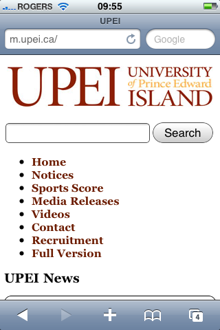
The main page (redirected on smartphones from http://upei.ca/ to http://m.upei.ca, a separate multisite installation that gathers feeds from around our installation) has a logo, search box and list of eight links on it. We went for a simple clean design that would hopefully work on as many browsers as possible:
Media Release Page
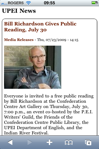
As you scroll down the main page the content is gathered from our 'media releases' on the http://upei.ca/news site. We pull the title, the date, a scaled down image and the set character limit on text:
Notice Page
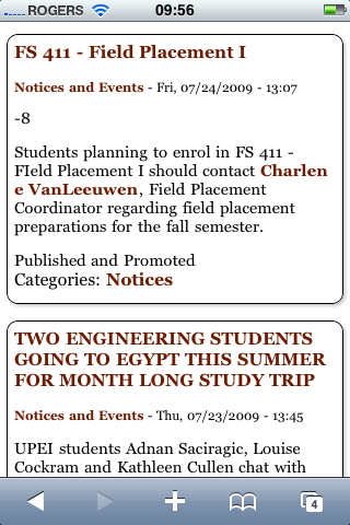
The Notice page content looks like this. The content ends up being a bit messy occasionally, as it is client- produced and they have the freedom to do what they like. We've been trying to convince people not to use ALLCAPS but, for some, it's a hard habit to break:
Video Page
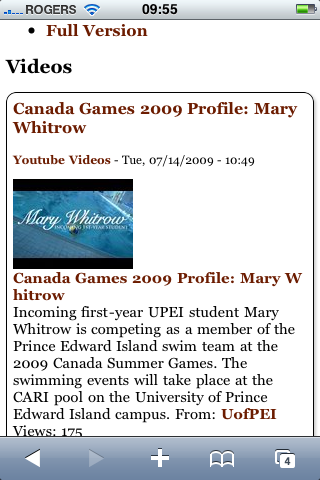
The Video page is a feed from our YouTube account where we collect all the video created by our department. This allowed us to avoid the difficulties that can come up on different platforms as well as giving us a consistent feed of videos, which is something we didn't have on our site at the time:
Why we're changing
We've spent seven months with our little mobile site, and have found ourselves asking “who exactly would be using this thing anyway”? The more we thought about it the more obvious it became that we really hadn't thought our way through our audience for the site. Under what circumstances would someone want to be using our mobile site? Where would they be? What would they be doing? Given the freedom that we have in designing the site (there are no expectations, and no historical precedents to satisfy) we decided to think about it from the ground up.
New Mobile
Landing page
We've moved away from list of text links to having 8 main icons on the front page for the things that we've identified as important to our now far more specific audience. Our work here owes a great deal to the excellent work being done at http://mobi.mit.edu and elsewhere. The rethinking of navigation from Web literacies to smartphone literacies is key in our rethinking as we are using mobile devices:
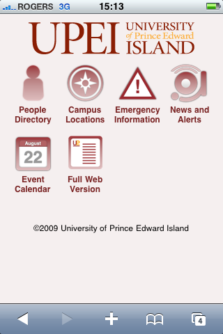
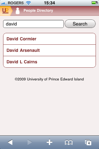
People
We've been working with computer services on campus to get an XML file from which we can parse relevant information about people. Names, buildings and phone numbers are already available for all staff, just not in a format that we can re-purpose easily. For the mobile site, we are hoping that people can search and browse for people and then make instant calls or send emails to people. Content will be fed into Drupal, parsed by xmlsynchroniser and then sent via JSON to the mobile site:

Buildings and Location
You can now search for buildings, and the buildings themselves are location sensitive thanks to the Location module and GMaps. http://www.upei.ca/facilities/interactive-campus-map We're drawing the building information from the building content type on the facilities page and allowing a description of the building and the occupants of the building. If we get lucky, we'll also be able to coordinate this with the people information so that you can find a building from a person and a person from a building. I'm hoping for this to be working soon. The page will currently also tell you how far away you are from a given building, and then the click will bring you to a live map that will help you get where you're going:

Events
We've been vacillating about which of our event solutions to go forward with. Our current usage of the Location module may tilt the balance of this in favour of an entirely Drupal-based solution. (the other contender is Virginia Tech's excellent events calendar). The calendar will integrate with the building/venue functionality and list events for the current day by time in the default view. The idea being, again, that someone is on campus, or near there, and needs to get to the event that is starting or will be starting soon.
Emergency
The campus community has been working very hard on coordinating emergency messaging and we would be remiss to not put something effective here. Our current thoughts are a clickable phone number to call and the simple instructions for the current emergency. Nothing too complicated... no second clicks:

The Rest
The news and alerts, help link to full web version and home buttons fill up the rest of the screen. We might also sneak a video button in here at some point or integrate that into the one of the other pages. We're trying to keep the number of options on the page as limited as possible in an attempt to focus our clients. We'll see... link bloating is a big problem at an institution this size.
Conclusion
We've tried, through design and a few tricks to coordinate our message using Drupal's flexibility in node design(CCK), the power of views with a couple of tweaks, and the theming layer to enforce a uniformity across 100 installations. What we've layed out here is a way of trying to make a one hundred installation multisite work together in a coherent way where the theming suggests the relative location that a web site viewer might be and allows them to make informed decisions before they actually click on things. We're also trying to repurpose our content to serve a very focused market on our mobile site and allow people who are actually on campus or near there have a simple, productive experience. As a side benefit, people trying to call and email by smartphone from away will be able to do that too.

Comments
A bit more background on this
A bit more background on this project: http://groups.drupal.org/node/6655
also: http://buytaert.net/upei-goes-drupal
Great write-up. It's nice to
Great write-up. It's nice to read about the thoughts behind the different tiers etc, organizing something this big is the real challenge, it requires a lot of thought and it's important to get it right.
People directory
Cool... structured user data... how many email addresses can spammers download at once? *g*
The UPEI Library is also using Drupal
The UPEI Library is also using Drupal for a number of things, including workspace/repository services for research groups, and to serve as a font-end to the Fedora respository platform.
Excellent case study
Thanks for detailing this info. Great to see success in highered with Drupal.
Dave, Great work. Which
Dave, Great work.
Which module have you used for photographs?
Great job
Great job and nice article.
Question:
which module have you used for "online gallery" white-box ?
----
Drupal Theme Garden
Location Sensitivity Question
Could you explain a bit more about the location sensitive campus map, mainly how are you are getting the users current position. Thanks!
Great work!
We are also in the process to migrate our legacy site to a Drupal site :)
You Need Mobile Codes Module
David, this is great stuff. Thanks for developing this fascinating presentation. I am going to be reading this again when I have more time to absorb it all.
If you don't know about the Mobile Codes module (http://drupal.org/project/mobile_codes), you really need to look into it. This would allow you to make all the GPS-based building information available to anyone whose phone is not GPS-aware. In fact, counterintuitive as it might sound, the codes used by Mobile Codes can actually help people who are blind find their way around better.
Here's a rough idea of how it works: At significant locations around campus, such as the entrance to each of your buildings, you place one of the two-dimensional codes on the wall or an appropriate marker. Anyone who scans that code with their cell phone's camera would find out information that is tailored to their role:
You get the picture.
These 2D codes could also be put on campus IDs and scanned when needed for similar uses:
This sounds high-tech, and it is, but that doesn't mean it's expensive. A small and not particularly wealthy town — Manor, Texas — is using this technology to improve communications, and they have found that with it they can in many ways provide more and better service to their residents at less expense.
You are doing so much that is right and innovative that you really do need to check Mobile Codes out.
I look forward to following your progress.
– Cliff
the white house, colleges, is
the white house, colleges, is there any type of site drupal *can't* be used for?
;D